|
Quarry
|
 |
« Reply #20200 on: October 27, 2012, 11:53:23 AM » |
|
I find the lack of contrast and saturation to be more appealing for that piece
|
|
|
|
|
 Logged
|
|
|
|
|
Ashkin
Guest
|
|
« Reply #20201 on: October 27, 2012, 12:34:13 PM » |
|
Imo the old one was much better than this.
While I liked the "simplistic" style of the original, I like the slightly detailed style a lot more. Also, the old palette was a bit too low contrast. Here's a side-by-side comparison of the two:  I like the second one. Here's a W.I.P.:  |
|
|
|
|
Logged
|
|
|
|
|
SolarLune
|
|
« Reply #20202 on: October 27, 2012, 01:13:57 PM » |
|
A small dog in front of his house? I think you need to up the contrast between the back objects (the back of the house) and the front objects / GUI. I think the dog might be a bit too small to really see well on the dark background.
|
|
|
|
|
Logged
|
|
|
|
|
rivon
|
|
« Reply #20203 on: October 27, 2012, 01:22:39 PM » |
|
The second one looks at first a bit more appealing but the first one with a better contrast is imo better. I did a quick edit here:  The colors in my edit are not the best ones (I just used Levels) but overally IMO it's better. The second version has this weird pillow shading and it doesn't look right. |
|
|
|
|
Logged
|
|
|
|
|
moi
|
|
« Reply #20204 on: October 27, 2012, 02:06:14 PM » |
|
While I liked the "simplistic" style of the original, I like the slightly detailed style a lot more. Also, the old palette was a bit too low contrast. Here's a side-by-side comparison of the two: the first one would be perfect with just a bit more contrasted colors, notably the green. The second looks overworked |
|
|
|
|
Logged
|
subsystems subsystems subsystems
|
|
|
|
beetleking22
|
|
« Reply #20205 on: October 27, 2012, 02:23:39 PM » |
|
Hope this help.  |
|
|
|
|
Logged
|
|
|
|
|
happymonster
|
|
« Reply #20206 on: October 27, 2012, 03:00:23 PM » |
|
You could change the colours like this:  |
|
|
|
|
Logged
|
|
|
|
|
impulse9
Guest
|
|
« Reply #20207 on: October 29, 2012, 03:25:05 PM » |
|
Trying to create some seamless rock tiles.  |
|
|
|
|
Logged
|
|
|
|
|
SolarLune
|
|
« Reply #20208 on: October 29, 2012, 03:53:05 PM » |
|
^ The rocks look a bit shiny and flat. Try pulling some rocks out, shading the ones below them, and shading the rocks that stick out as being brighter and more 3D than the rest. It looks pretty good, though.
|
|
|
|
|
Logged
|
|
|
|
|
Maud'Dib Atreides
|
|
« Reply #20209 on: October 29, 2012, 03:57:55 PM » |
|
 more concerns should be placed on the circled areas. your depth is fine but the rectangular endings for some rocks force the tileset to look seamed, and notes to me that this indeed is a repeated texture as opposed to some fantastical large and unique terrain |
|
|
|
|
Logged
|
Guy: Give me all of your money.
Chap: You can't talk to me that way, I'M BRITISH!
Guy: Well, You can't talk to me that way, I'm brutish.
Chap: Somebody help me, I'm about to lose 300 pounds!
Guy: Why's that a bad thing?
Chap: I'M BRITISH.
|
|
|
|
Quarry
|
|
« Reply #20210 on: October 29, 2012, 09:20:31 PM » |
|
 I know these can happen but because that they are little circles it seems very obvious, maybe reduce the stone shading and make the parts inbetween lighter? |
|
|
|
|
Logged
|
|
|
|
|
|
|
impulse9
Guest
|
|
« Reply #20212 on: October 30, 2012, 06:06:42 AM » |
|
@Everyone: Thanks for tips and pointing out problematic parts. What I probably want is more emphasis on 3-dimensionality. I will need to study these techniques further. @beetleking22: thanks for the link, that pixel art is stunning.  Edit: 2nd attempt, still not exactly how I wanted it.  |
|
|
|
« Last Edit: October 30, 2012, 07:23:40 AM by impulse9 »
|
Logged
|
|
|
|
|
Quarry
|
|
« Reply #20213 on: October 30, 2012, 07:31:40 AM » |
|
There are still a lot of noticable jaggies
|
|
|
|
|
Logged
|
|
|
|
|
caffeine
|
|
« Reply #20214 on: October 30, 2012, 08:55:17 AM » |
|
Edit: 2nd attempt, still not exactly how I wanted it.
Try to understand how light affects the different rocks that make up a "wall". Envisioning it as different geometrical shapes will probably make things easier. 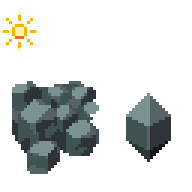 |
|
|
|
|
Logged
|
|
|
|
|
beetleking22
|
|
« Reply #20215 on: October 30, 2012, 12:19:22 PM » |
|
My old zero metroid mockup. You know this guys if you are metroid fan.  |
|
|
|
|
Logged
|
|
|
|
|
DustyDrake
|
|
« Reply #20216 on: October 30, 2012, 12:48:01 PM » |
|
reminds me of the one from the end of fusion.
Jesus I could not beat that thing.
|
|
|
|
|
Logged
|
|
|
|
|
DustyDrake
|
|
« Reply #20217 on: October 30, 2012, 12:54:24 PM » |
|
reminds me of the one from the end of fusion.
Jesus I could not beat that thing.
That actually is the same creature, well it's an x mimicking one. If you play metroid 2 then play fusion you'll notice ALOT of stuff from metroid 2 is used in fusion. The sr388 section, the room with all the different omega metroid forms in glass tanks, the final boss like you mentioned, etc. ...I know that. That's why I said it reminds me of the one from fusion. |
|
|
|
|
Logged
|
|
|
|
|
caffeine
|
|
« Reply #20218 on: October 30, 2012, 02:00:06 PM » |
|
My old zero metroid mockup. You know this guys if you are metroid fan. Didn't st0ven help you with this thing? If so then I have seen it before. |
|
|
|
|
Logged
|
|
|
|
|
beetleking22
|
|
« Reply #20219 on: October 30, 2012, 02:20:54 PM » |
|
"...I know that. That's why I said it reminds me of the one from fusion." I see.. you ment the art style.  It does resemble the gba sprite alot know that you mention it. You can tell by my metroid-style profile pic I'm a fan! My old zero metroid mockup. You know this guys if you are metroid fan. That's awesome! Were you planning on making a Metroid 2 remake? Also do you have any of the other forms of that monster made? This was for my super metroid hack that I stopped working a year ago.  Yeah I wantend to make zero to same style as omega metroid from metroid fusion..  |
|
|
|
|
Logged
|
|
|
|
|
 Developer
