|
Ashkin
Guest
|
 |
« Reply #22020 on: April 07, 2013, 11:36:59 PM » |
|
I tend to not use clusters, it's a style choice
says "naw man it's cool it's just my style" The question is, do you, Carrion have more than 6 colours that you could use? :1
turns around and puts down someone for their style i just i can't |
|
|
|
|
 Logged
|
|
|
|
|
BomberTREE
|
|
« Reply #22021 on: April 08, 2013, 12:33:29 AM » |
|
Yaaay Hawt Koffee's back!
|
|
|
|
|
Logged
|
|
|
|
|
DustyDrake
|
|
« Reply #22022 on: April 08, 2013, 12:41:31 AM » |
|
  haven't done pixel art in a long time anyone want to make dungeon games? I... I do... Oh my god <3 Edit: That image made me forget why I came to this thread, a post about a Flash sprite I'm trying to work on:  I like the thinner stance because it seems to fit more with the flash's speed. But I like the thicker stance because it matches up more with the JLU edition of flash. The more I look at it, the more I prefer the thicker stance, but he looks a bit fat... Colors may be wonky because I'm used my laptop to make it. Also I'm just trying to get his stance down right now, hence the flat colors. |
|
|
|
|
Logged
|
|
|
|
|
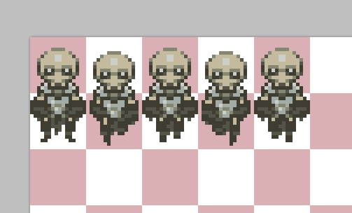
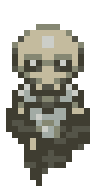
Carrion
|
|
« Reply #22023 on: April 08, 2013, 12:48:37 AM » |
|
|
|
|
|
|
Logged
|
|
|
|
|
Cellusious
|
|
« Reply #22024 on: April 08, 2013, 01:45:44 AM » |
|
Awesome work  Your steampunky style would maybe go awesome with a variation of cold steel colours and brown sepia tones? i dunno. I tend to try to keep my stuff to warmer colours because i fail to make stuff look cold   |
|
|
|
|
Logged
|
|
|
|
|
happymonster
|
|
« Reply #22025 on: April 08, 2013, 02:01:09 AM » |
|
I'd like Carrion's work to have more contrast like Cellusious, and Cellusious's work to have less noisy patterns like Carrion.  |
|
|
|
|
Logged
|
|
|
|
|
Eigen
|
|
« Reply #22026 on: April 08, 2013, 02:28:17 AM » |
|
It's like watching Zeus battle Jupiter.
Basking in the punyness of self.
|
|
|
|
|
Logged
|
|
|
|
|
Quarry
|
|
« Reply #22027 on: April 08, 2013, 08:02:02 AM » |
|
I'd like Carrion's work to have more contrast like Cellusious, and Cellusious's work to have less noisy patterns like Carrion. I think Carrion is Cellusious' alternate personality, experimenting with different styles |
|
|
|
|
Logged
|
|
|
|
|
JCity
|
|
« Reply #22028 on: April 08, 2013, 08:05:24 AM » |
|
Gotta go fast!  |
|
|
|
|
Logged
|
|
|
|
|
rek
|
|
« Reply #22029 on: April 08, 2013, 08:58:39 AM » |
|
Please say this is going to be a game.Never mind; wrong thread.  |
|
|
|
|
Logged
|
|
|
|
|
JobLeonard
|
|
« Reply #22030 on: April 08, 2013, 09:09:25 AM » |
|
Gotta go fast! I know this is a reference to Japanese animation, but I'm quite curious what it would look like with ehm... what's the name of the effect? That thing is so famous for (and I don't mean the Runabout joke). |
|
|
|
|
Logged
|
|
|
|
|
JCity
|
|
« Reply #22031 on: April 08, 2013, 09:21:51 AM » |
|
Gotta go fast!
-snip-
I know this is a reference to Japanese animation, but I'm quite curious what it would look like with ehm... what's the name of the effect? That thing is so famous for (and I don't mean the Runabout joke). You mean motionblur? |
|
|
|
|
Logged
|
|
|
|
|
DustyDrake
|
|
« Reply #22032 on: April 08, 2013, 09:28:28 AM » |
|
Like Sonic's shoes?
|
|
|
|
|
Logged
|
|
|
|
|
JCity
|
|
« Reply #22033 on: April 08, 2013, 10:37:04 AM » |
|
Like Sonic's shoes?
Like this?  |
|
|
|
|
Logged
|
|
|
|
|
Bandages
Guest
|
|
« Reply #22034 on: April 08, 2013, 10:39:37 AM » |
|
That's a step backwards. You have motion lines or clearly defined limbs, but not both.
Really what you need is about 2 more frames of motion.
|
|
|
|
|
Logged
|
|
|
|
|
JobLeonard
|
|
« Reply #22035 on: April 08, 2013, 10:40:56 AM » |
|
You mean motionblur? Kinda, but I don't think that's the animation term for it. There's also a subtle difference between what I have in mind and what I think of when I hear "motion blur". It's more "stretchy" than blurry. is quite a nice summary of different animation tricks to convey speed with minimal frames, with both blur and stretch used at different times - the part where they pull The Flash back out of the portal is the clearest example of the stretch thingy. Like Sonic's shoes? That would be a good example, yes. Although it doesn't work for just two frames. |
|
|
|
|
Logged
|
|
|
|
|
JCity
|
|
« Reply #22036 on: April 08, 2013, 11:11:24 AM » |
|
Yea adding motion lines doesn't really fit anyways so I will continue adding more frames. Also just adding 2 more frames made a big difference in my opinion! 
Also I should stop spamming now.. |
|
|
|
« Last Edit: April 08, 2013, 11:21:10 AM by JCity »
|
Logged
|
|
|
|
|
Happy Shabby Games
|
|
« Reply #22037 on: April 08, 2013, 11:51:15 AM » |
|
i suggest making the far leg and arm a darker blue. that would add some depth and separate the limbs. an example would be my avatar. i used the next darkest color in my palette for the far tentacle.
cool character, though. i'd love to do an edit on the animation when i get home
|
|
|
|
|
Logged
|
|
|
|
|
JobLeonard
|
|
« Reply #22038 on: April 08, 2013, 12:07:53 PM » |
|
Yea adding motion lines doesn't really fit anyways so I will continue adding more frames. It wasn't a serious suggestion - the two frames thing seemed like a stylistic choice - just something I was curious about as a contraast. Just adding those two frames help a lot with conveying motion though. |
|
|
|
|
Logged
|
|
|
|
|
JCity
|
|
« Reply #22039 on: April 08, 2013, 12:19:47 PM » |
|
It wasn't a serious suggestion - the two frames thing seemed like a stylistic choice - just something I was curious about as a contrast. Just adding those two frames help a lot with conveying motion though.
Experimenting is always good though and I there is alot of things which can be done different! i suggest making the far leg and arm a darker blue. that would add some depth and separate the limbs. an example would be my avatar. i used the next darkest color in my palette for the far tentacle.
cool character, though. i'd love to do an edit on the animation when i get home
Ok last update on the run animation using your advice + I added the "skirt" which she is supposed to have.  I am really excited how you will change the animation!  |
|
|
|
« Last Edit: April 08, 2013, 01:06:45 PM by JCity »
|
Logged
|
|
|
|
|
 Developer
