|
gggfhfdh
|
 |
« Reply #27660 on: August 12, 2014, 02:27:58 PM » |
|
 pbbbbbhththhththtbbthhthrrrogress |
|
|
|
|
 Logged
|
|
|
|
|
Ellian
|
|
« Reply #27661 on: August 13, 2014, 06:09:11 AM » |
|
Still working on Majora's characters~ 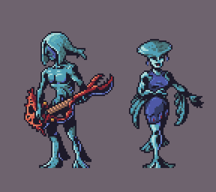 |
|
|
|
|
Logged
|
|
|
|
|
Cellusious
|
|
« Reply #27662 on: August 13, 2014, 06:17:52 AM » |
|
|
|
|
|
|
Logged
|
|
|
|
|
Ingenoire
|
|
« Reply #27663 on: August 13, 2014, 07:27:01 AM » |
|
So I've been digging through my Drive folders, when I found my "french boulangerie" pixel art of croissants, pain au chocolat and baguettes of three varieties.  |
|
|
|
|
Logged
|
|
|
|
|
Sik
|
|
« Reply #27664 on: August 13, 2014, 02:38:23 PM » |
|
You're making me hungry.
|
|
|
|
|
Logged
|
|
|
|
|
Ellian
|
|
« Reply #27665 on: August 13, 2014, 03:47:18 PM » |
|
More Indigo-go~ 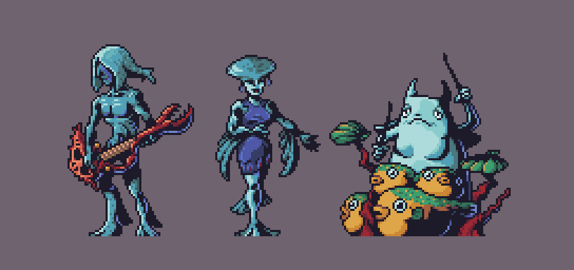 EDIT: Also the Poe Collector, because why the heck not?  |
|
|
|
« Last Edit: August 13, 2014, 04:51:10 PM by Ellian »
|
Logged
|
|
|
|
|
Geti
|
|
« Reply #27666 on: August 13, 2014, 04:31:11 PM » |
|
@Ellian I almost forgot a lot of stuff from that game. Need to go play it again  pbbbbbhththhththtbbthhthrrrogress
Nice. Good likeness, sad motive. |
|
|
|
|
Logged
|
|
|
|
|
Gravitaria
|
|
« Reply #27667 on: August 13, 2014, 08:23:36 PM » |
|
 Remaking tiles for our game! Top is old, bottom is new! Of course not! |
|
|
|
|
Logged
|
|
|
|
|
Zanhuf
Guest
|
|
« Reply #27668 on: August 14, 2014, 05:00:37 AM » |
|
Hey folks, Here is an updated animation of my character Steak Blisterin from Aporkalypse Now. I would love to hear what you all think.  The game-play requires that the character's turning animations are quick and snappy. His shooting arm needs to be separate from his body, too, so it can be rotated in code for aiming during play. I'm a little concerned that his body is quite stiff while he shoots, though, but I'm at a loss what do to with him that feels natural. Any thoughts? Cheers, Paul This looks and feels really smooth, really liking the animation? What's the frame count? I haven't posted in here for some time, so here's something i am working on:  Tried sub-pixelling to add a breathing/idle-like animation but i still haven't got the concept down. I also feel it looks a bit stiff during the idle animation, but im not sure how to make it look more fluid or natural. Current frame rate is 44. |
|
|
|
|
Logged
|
|
|
|
|
|
|
BomberTREE
|
|
« Reply #27670 on: August 14, 2014, 05:19:25 PM » |
|
pbbbbbhththhththtbbthhthrrrogress <3 Keep pushing |
|
|
|
|
Logged
|
|
|
|
|
Jared C
|
|
« Reply #27671 on: August 14, 2014, 05:34:31 PM » |
|
|
|
|
|
|
Logged
|
|
|
|
|
joseph ¯\_(ツ)_/¯
|
|
« Reply #27672 on: August 14, 2014, 05:34:58 PM » |
|
ggggooooooooooddddd
|
|
|
|
|
Logged
|
|
|
|
|
unseven
Guest
|
|
« Reply #27673 on: August 14, 2014, 07:43:28 PM » |
|
I LOVE this "angular" style. Maybe try the same for the clouds? |
|
|
|
|
Logged
|
|
|
|
|
|
|
DoomCube
|
|
« Reply #27675 on: August 15, 2014, 12:43:33 AM » |
|
This looks and feels really smooth, really liking the animation? What's the frame count? Hey, the frame count for this sample 141 frames, but it's made up of smaller animations looped and joined together. The run is 8 frames, the shooting is 5. Turning to the left is 7 frames and turning back to the right is 3. I also feel it looks a bit stiff during the idle animation, but im not sure how to make it look more fluid or natural. This is a good start, Zanhuf. You're trying to achieve a lot in your animation. I also find it is hard to lose the stiffness when I'm animating in pixel art. As a matter of process, though, I think you should probably focus on the idle animation on its own so you can figure a natural feeling loop. You can then introduce the swords swing afterwards. Your sword swing is also a little stiff, too. It could use some more frames and a quicker frame rate to help smooth it out. It could also use a little more work on anticipation and reaction ends of the swing. I did a quick and dirty edit to suggest a few changes. I hope you don't mind.  |
|
|
|
|
Logged
|
|
|
|
|
DoomCube
|
|
« Reply #27676 on: August 15, 2014, 12:52:32 AM » |
|
Maybe some subpixel animation in the character? You could be right, jtfjtfjtf. I must give it a shot. The gun is moving in a way that looks as if it weighs nothing. You could indicate its heft by having the swing start a bit slower then speed up. Also as he levels the gun, you can further show inertia by having the gun drop a bit below where you want to aim and have it bob back up. Is there any way to indicate recoil and muzzle flash on the body sprite? That would help a lot as well.
Thanks for this suggestion, Scut Fabulous. It's great feedback. Also as a matter of format, signing posts is needless when all your info is available right next to your posts.
Sorry this bugged you so much... Just make his torso shake accordingly to the arm.
Thanks Spooky, I'll need to try something like this. This mixed with a few suggestions I've gotten from other places online will help me figure it out. Honestly it'd be distracting as heck to see that flashy swoosh on his gun as you aim for the entire game.
The swoosh is only visible while the player is turning from left to right and vice versa, not while he is shooting. I take your point, though. I'll need to get this animation in game soon to see how distracting it is. |
|
|
|
|
Logged
|
|
|
|
|
Kingel
|
|
« Reply #27677 on: August 15, 2014, 04:40:51 AM » |
|
I think the new run animation is better, but could still use some tweaking. I find the frames of the run animation difficult to read for two reasons. One is that the animation is a little jerky. The other is that it's difficult to tell the boots apart, so my eyes don't really have a point to focus on. At this speed, there's much less room for ambiguity.  Here's a quick edit of the nearest leg. I added a rough highlight to the boot so that it's easy to distinguish between the near and far boot.  I also changed the position of the legs for more natural-looking arc motion. |
|
|
|
|
Logged
|
|
|
|
|
DoomCube
|
|
« Reply #27678 on: August 15, 2014, 05:01:22 AM » |
|
Here's a quick edit of the nearest leg. I added a rough highlight to the boot so that it's easy to distinguish between the near and far boot.
I also changed the position of the legs for more natural-looking arc motion.
Thanks a lot for the edits and suggestions Arachne. They're brilliant, they'll be of great help. Cheers! |
|
|
|
« Last Edit: August 15, 2014, 05:13:10 AM by DoomCube »
|
Logged
|
|
|
|
|
eddieion
Guest
|
|
« Reply #27679 on: August 15, 2014, 05:44:28 AM » |
|
I'm having some trouble choosing a colour pallette. I need 5 colours - in a traffic light system (Dark green (or green), light green (or yellow-green), yellow, orange, and red.. They shouldn't be too bright but i'm not looking for washed out colours either. Preferably something that would let either white or black text display consistently (and legibly) so that the text is easily readable at quite small sizes despite the background colours. These are some ideas so far -    I think my problem is that i've been choosing colours almost at random rather than doing it a bit more objectively like I know some of you guys do when chosing pallettes. Although they're all 'nice' colours, none of them seem to relate to each other or feel like they're part of a set, or harmonious (which is what i'm after). Does anyone have any advice on how to pick / calculate which colours would work best with each other? Currently pulling my hair out. |
|
|
|
|
Logged
|
|
|
|
|
 Developer
