|
matwek
Guest
|
 |
« Reply #27960 on: September 11, 2014, 12:36:38 PM » |
|
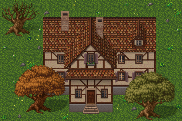
Going back over old assets to improve them.  |
|
|
|
|
 Logged
|
|
|
|
|
Thomas Finch
|
|
« Reply #27961 on: September 11, 2014, 12:45:51 PM » |
|
@matwek: I really love most of those changes and the piece looks awesome in general, but I think the blue may have become too cluttered.
|
|
|
|
|
Logged
|
|
|
|
|
muki
|
|
« Reply #27962 on: September 11, 2014, 01:31:15 PM » |
|
I half agree with Thomas.
I like the clutter, but I think I would lessen the contrast in light/dark blue on the wall details. Make stuff like windows/pipes/poster stand out a bit more. It shouldn't take much....
|
|
|
|
|
Logged
|
|
|
|
|
Cellusious
|
|
« Reply #27963 on: September 11, 2014, 01:52:59 PM » |
|
|
|
|
|
|
Logged
|
|
|
|
|
eigenbom
|
|
« Reply #27964 on: September 11, 2014, 01:59:56 PM » |
|
Cell - those remind me of a frequent poster to pixel dailies Dario, and also Mrmo to some extant. But I love them, little biomorphic Pokemon or something.
|
|
|
|
|
Logged
|
|
|
|
|
Quarry
|
|
« Reply #27965 on: September 11, 2014, 08:03:13 PM » |
|
Anything 45 degrees is Mrmo
|
|
|
|
|
Logged
|
|
|
|
KaiserCVR
Level 0

Amateur Artist/Professional Drinker

|
|
« Reply #27966 on: September 11, 2014, 08:07:02 PM » |
|
Some pixel-y peeps for an adventure game project:  |
|
|
|
|
Logged
|
|
|
|
|
ANtY
|
|
« Reply #27967 on: September 11, 2014, 10:51:10 PM » |
|
Kaiser this is fucking awesome, I love the style. I also love the animated one u posted in a different thread I think.
|
|
|
|
|
Logged
|
|
|
|
|
Sazem
|
|
« Reply #27968 on: September 12, 2014, 04:29:58 AM » |
|
Yeah I agree on that.. Kaiser your style is awsome and I like the character design too! I will take the quality bar little lower. Today I made some concept for my first game. Maybe I will make DevLog later on this week.. lets see   |
|
|
|
|
Logged
|
|
|
|
|
SolarLune
|
|
« Reply #27969 on: September 12, 2014, 05:07:06 PM » |
|
@Kaiser - I love the characters and colors, but I'm not a fan of the gradient or uneven pixel style. Interesting set of characters, too, though the right-most woman looks kinda normal and ordinary next to the more eccentric other people.
@Sazem - Not bad! I like the desaturated colors, and the UFO filled with particles is pretty interesting and makes me think of what could be in there. I think the player lacks contrast with the background - I think it might just be because of how thin he is and how dark and pale the sky is.
|
|
|
|
|
Logged
|
|
|
|
KaiserCVR
Level 0
Amateur Artist/Professional Drinker
|
|
« Reply #27970 on: September 12, 2014, 05:19:30 PM » |
|
Thanks guys! I'm still experimenting with the style. I'm trying to make the characters super easy to animate with relative fluidity, hence the non-shaded flat colors. I added the stepped gradient to make them pop a little more, but I'm not sold on it. Need to do some more animation experiments.  Nice man! Love the bleak mood you got going on. Only suggestion would be to knock back the debris behind the ground plane by lightening it up a touch. Might help the character read a little better. |
|
|
|
|
Logged
|
|
|
|
|
|
|
BBreakfast
|
|
« Reply #27972 on: September 12, 2014, 09:28:24 PM » |
|
 Finished that tree! |
|
|
|
|
Logged
|
|
|
|
|
Miko Galvez
|
|
« Reply #27973 on: September 12, 2014, 10:19:24 PM » |
|
Cemetery Parallax Background (click for full resolution) holy mother of god this is amazing. i think the aura around the moon goes a little against the entire piece's "not made of pixels" feel. EDIT:Did a design change, is it better?  ->  |
|
|
|
« Last Edit: September 13, 2014, 04:44:30 AM by Medevenx »
|
Logged
|
|
|
|
|
surt
|
|
« Reply #27974 on: September 13, 2014, 12:19:41 AM » |
|
|
|
|
|
|
Logged
|
|
|
|
|
Raku
|
|
« Reply #27975 on: September 13, 2014, 12:57:31 AM » |
|
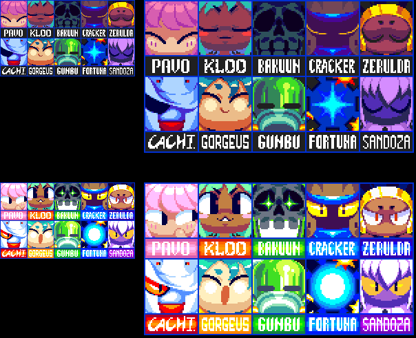 just finished these character select portraits. how'd I do? Also, Thomas, that's really well done! I love the colors. And Surt, I always love your palettes and compact tiles. The trees and foliage on the top are especially good! |
|
|
|
|
Logged
|
|
|
|
|
rj
|
|
« Reply #27976 on: September 13, 2014, 01:39:20 AM » |
|
aw dang those are cute!
i might make the lower shadow on gorgeus one pixel lower across the board in both counts, but that's ME
|
|
|
|
|
Logged
|
|
|
|
|
Miko Galvez
|
|
« Reply #27977 on: September 13, 2014, 03:15:03 AM » |
|
just finished these character select portraits. how'd I do? They're great! However, is there a sleeping theme in the game? Why are their eyes shut when you don't select them yet? Maybe a normal facial expression for non-select then a change in expression that represents the character for the select? For example: a serious character would close his eyes when you select him or something. Otherwise, nice work! |
|
|
|
|
Logged
|
|
|
|
|
Raku
|
|
« Reply #27978 on: September 13, 2014, 06:02:30 AM » |
|
aw dang those are cute!
i might make the lower shadow on gorgeus one pixel lower across the board in both counts, but that's ME
Thanks! The shadow is so high because the character is supposed to have chubby cheeks. They're great! However, is there a sleeping theme in the game? Why are their eyes shut when you don't select them yet? Maybe a normal facial expression for non-select then a change in expression that represents the character for the select? For example: a serious character would close his eyes when you select him or something. Otherwise, nice work!
Their eyes are shut because they're sleeping, yes. You wake them up when it's time to use them, but otherwise they're dormant. Only one can be awake at a time. |
|
|
|
|
Logged
|
|
|
|
|
Conker534
Guest
|
|
« Reply #27979 on: September 13, 2014, 08:01:03 AM » |
|
I'm saving all of your work and learning as much as I can from them Rakugaki-Otoko
Its all so great
|
|
|
|
|
Logged
|
|
|
|
|
 Developer
