|
eigenbom
|
 |
« Reply #28300 on: October 08, 2014, 10:45:55 PM » |
|
Loving the style, scut. Glossy, oily... Here's my steampunk pixel art for today's comp.. 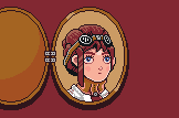 |
|
|
|
|
 Logged
|
|
|
|
|
SolarLune
|
 |
« Reply #28301 on: October 08, 2014, 11:05:00 PM » |
|
tried to do a sub pixeling for the eye and failed. It's weird that nothing else tilts anyway.
Yeah, it's kinda weird - you'd probably do well to keep the eye solid; perhaps try to imply the shape of the face a bit more. It's kinda lumpy at the moment. The back leg changes size as well - I think it's because of the back leg where the tail hits not changing size. In any case, nice, cute sprite overall. @Scut - Oh, that's a cool sprite. Like eigenbom said, it does appear oily. Nice! @Eig - Hah, cool pocketwatch. |
|
|
|
|
 Logged
|
|
|
|
|
Ellian
|
 |
« Reply #28302 on: October 09, 2014, 03:07:01 PM » |
|
I love lamia. Lamias are cool. Right? So what about... 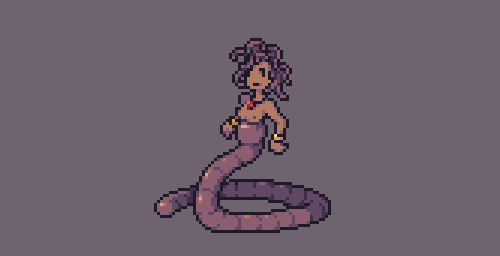 .. Earthworm lamias. |
|
|
|
|
 Logged
|
|
|
|
lunchbagart
Level 0


|
 |
« Reply #28303 on: October 10, 2014, 04:28:21 AM » |
|
I love the Earthworm Lamia!
|
|
|
|
|
 Logged
|
|
|
|
|
|
|
rj
|
 |
« Reply #28305 on: October 10, 2014, 05:06:57 AM » |
|
cute!
|
|
|
|
|
 Logged
|
|
|
|
|
Ellian
|
 |
« Reply #28306 on: October 10, 2014, 05:31:55 PM » |
|
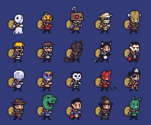 Game jammin', jammin', hope you like jammin' too~ (doing the Spookyjam, even though it's been cancelled) |
|
|
|
|
 Logged
|
|
|
|
Armageddon
Level 6


|
 |
« Reply #28307 on: October 10, 2014, 06:09:38 PM » |
|
 Game jammin', jammin', hope you like jammin' too~ (doing the Spookyjam, even though it's been cancelled) Are you using a specific color palette? Those are some hot colors yo. |
|
|
|
|
 Logged
|
|
|
|
|
Miko Galvez
|
 |
« Reply #28308 on: October 11, 2014, 03:30:14 AM » |
|
 Game jammin', jammin', hope you like jammin' too~ (doing the Spookyjam, even though it's been cancelled) Lovely colors and excellent technique!  High-Five! |
|
|
|
« Last Edit: October 11, 2014, 03:41:11 AM by Medevenx »
|
 Logged
|
|
|
|
|
Ellian
|
 |
« Reply #28309 on: October 11, 2014, 03:53:18 AM » |
|
 High-Five!  I'm always amazed that people like my colors, because it's a really shitty palette I made a few years ago, with a few tweaks here and there as years go by... I'm planning to rework it completely, so I'll probably share both versions when I'm done with it. |
|
|
|
|
 Logged
|
|
|
|
Nu-Type
Level 1

Pathfinder

|
 |
« Reply #28310 on: October 11, 2014, 08:08:44 AM » |
|
Worked this some more. Balanced out the Background against the Foreground better. First one was way to busy. Here is a little backstory for those that missed the post on page 1422: All she wanted to do was enjoy her time at the pool party. Until a few terrorists decided it would be more fun to crash the party with bombs and bullets. NOT AMUSED at all, she decided a little payback for ruining her perfectly good day was in order. Good thing she keeps her SMG handy at all times.For comparison: 1st Edited: Bettered the pool area highlight without overpowering the focus too much Edited: Bettered the pool area highlight without overpowering the focus too much |
|
|
|
« Last Edit: October 11, 2014, 08:52:54 AM by Nu-Type »
|
 Logged
|
|
|
|
Krumbs
Level 1

Huun Huur Tu

|
 |
« Reply #28311 on: October 11, 2014, 08:21:18 AM » |
|
I think the cityscape looks better in the second one Nu, the brown fence is a good addition. I preferred the water in the 1st variation though, the reflections and the white parts just enhanced it I think, it looked more like a real pool I would want to jump into.  Was wondering if anyone could give me some feedback on this? Don't really want to get started on the maps until I have a good idea of what works. Using Arne's 64 colour palette. |
|
|
|
|
 Logged
|
|
|
|
Nu-Type
Level 1

Pathfinder

|
 |
« Reply #28312 on: October 11, 2014, 08:45:37 AM » |
|
I think the cityscape looks better in the second one Nu, the brown fence is a good addition. I preferred the water in the 1st variation though, the reflections and the white parts just enhanced it I think, it looked more like a real pool I would want to jump into.  Was wondering if anyone could give me some feedback on this? Don't really want to get started on the maps until I have a good idea of what works. Using Arne's 64 colour palette. Hey thanks for that Krumbs! I struggled a bit with the pool highlight, but I felt that it detracted too much from the character, considering she is also pure white (stylistic choice, considering I pixelized one of Patrick Nagel's artwork), so I toned it down a bit. But I hear ya on wanting to jump into the pool. I might try a few extra white pixels to make it more appeasing. On your art, the problem here is that your foreground elements (the trees) are competing with the midground (the grass, rock details, etc). This is becuase they are too similar in value. So they are competing for attention. That background can be a bit darker, with a higher saturation. While that brown in the midground can also be a bit darker from its normal color. Try playing around with the palette. By the way, send that palette my way, I'd like to play around with it too! |
|
|
|
|
 Logged
|
|
|
|
|
Lexonite
|
 |
« Reply #28313 on: October 11, 2014, 08:46:51 AM » |
|
Krumbs, maybe you could add some second ground that connects the floating ground islands.. they look too disconnected to me. So like, some walls basically in the back so it looks like the pieces aren't floating. Everything else looks good, and I think if you can make it mappable, would be cool.
|
|
|
|
|
 Logged
|
|
|
|
Krumbs
Level 1

Huun Huur Tu

|
 |
« Reply #28314 on: October 11, 2014, 09:30:52 AM » |
|
Hey thanks for that Krumbs! I struggled a bit with the pool highlight, but I felt that it detracted too much from the character, considering she is also pure white (stylistic choice, considering I pixelized one of Patrick Nagel's artwork), so I toned it down a bit. But I hear ya on wanting to jump into the pool. I might try a few extra white pixels to make it more appeasing.
On your art, the problem here is that your foreground elements (the trees) are competing with the midground (the grass, rock details, etc). This is becuase they are too similar in value. So they are competing for attention. That background can be a bit darker, with a higher saturation. While that brown in the midground can also be a bit darker from its normal color. Try playing around with the palette.
By the way, send that palette my way, I'd like to play around with it too!
Cheers Nu, yeah a couple of white (or light blue) pixels here and there wouldn't detract too much from the character and could give it a bit of a shimmer effect which I think is what it needs to give it that watery feel. I agree with your crit about the colours, I thought about making the background darker but I wanted to stick to the palette. I think I'll just use it as a base to work off of and add the colours I need if there's no alternative. Here ya go: http://androidarts.com/palette/64_color_palette_imac_v3.gifThanks Alex! Yeah I had some walls in the original sketch I did: http://i.cubeupload.com/xvgLg2.pngI think I just got carried away with the background rock highlights and didn't want to cover anything up, I'll add some in. |
|
|
|
|
 Logged
|
|
|
|
|
Lexonite
|
 |
« Reply #28315 on: October 11, 2014, 10:01:48 AM » |
|
ah cool, nice sketch btw.
|
|
|
|
|
 Logged
|
|
|
|
Nu-Type
Level 1

Pathfinder

|
 |
« Reply #28316 on: October 11, 2014, 10:22:27 AM » |
|
Hey thanks for that Krumbs! I struggled a bit with the pool highlight, but I felt that it detracted too much from the character, considering she is also pure white (stylistic choice, considering I pixelized one of Patrick Nagel's artwork), so I toned it down a bit. But I hear ya on wanting to jump into the pool. I might try a few extra white pixels to make it more appeasing.
On your art, the problem here is that your foreground elements (the trees) are competing with the midground (the grass, rock details, etc). This is becuase they are too similar in value. So they are competing for attention. That background can be a bit darker, with a higher saturation. While that brown in the midground can also be a bit darker from its normal color. Try playing around with the palette.
By the way, send that palette my way, I'd like to play around with it too!
Cheers Nu, yeah a couple of white (or light blue) pixels here and there wouldn't detract too much from the character and could give it a bit of a shimmer effect which I think is what it needs to give it that watery feel. I agree with your crit about the colours, I thought about making the background darker but I wanted to stick to the palette. I think I'll just use it as a base to work off of and add the colours I need if there's no alternative. Here ya go: http://androidarts.com/palette/64_color_palette_imac_v3.gifThanks Alex! Yeah I had some walls in the original sketch I did: http://i.cubeupload.com/xvgLg2.pngI think I just got carried away with the background rock highlights and didn't want to cover anything up, I'll add some in. I like that map! On the art, if you don't want to break from using the palette, play around with the application of colors until it looks balanced out. |
|
|
|
« Last Edit: October 11, 2014, 12:45:39 PM by Nu-Type »
|
 Logged
|
|
|
|
ashpd
Level 1

Umm... Hello!

|
 |
« Reply #28317 on: October 11, 2014, 12:02:15 PM » |
|
|
|
|
|
|
 Logged
|
|
|
|
Krumbs
Level 1

Huun Huur Tu

|
 |
« Reply #28318 on: October 11, 2014, 12:42:34 PM » |
|
Will do Nu. Thanks guys!
|
|
|
|
|
 Logged
|
|
|
|
|
|
|
 Developer
 Art
Art (Moderator: JWK5)show us some of your pixel work
 Developer
 Art
Art (Moderator: JWK5)show us some of your pixel work
