|
J. R. Hill
|
 |
« Reply #20 on: December 09, 2011, 11:39:49 PM » |
|
The gray model in the fires on the first pages looks like a smashed car...
The gray things on this page look like rocks or tombstones
|
|
|
|
|
 Logged
|
hi
|
|
|
|
SolarLune
|
|
« Reply #21 on: December 10, 2011, 12:20:18 AM » |
|
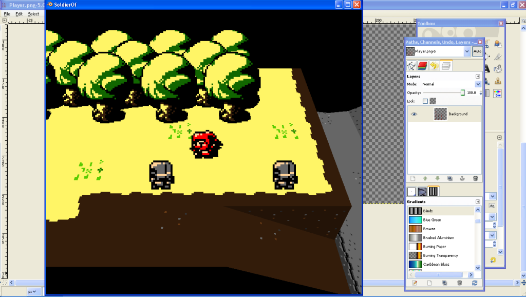
@Pemanent - Thanks. The thing about the footsteps is that when the player walks right, his animation's twice as long as when he's walking downwards or upwards - I drew extra frames. :S Soo, I need to fix that up somehow, maybe drawing the other foot moving for his horizontal movement so that the sound can play similarly for all animations, or something. Thank you, I hope I will keep up the devlog. Yeah, maybe the car should be 3D... I'll have to think about this. @J.R. Hill - Heh, it's funny how everyone sees the same thing differently. The gray things in the picture at the top of this page are robot soldiers!  They animate and explode and everything. Are you sure that they look like tombstones?  But, if you see that it's supposed to be a smashed car, then I've done something right. Anyway, here's another update - I made transitions between dirt and cement (and cement and grass) and fixed up the barriers to be 2D. Better? Worse? I'm trying to get a definite feel for this game in terms of graphical quality and style, but I also don't want it to look bad or incoherent. Also, the top barrier's skewing. I'm not sure how, but I should prolly fix that... 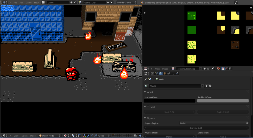 |
|
|
|
|
Logged
|
|
|
|
|
Dr.Electro
|
|
« Reply #22 on: December 10, 2011, 03:23:08 AM » |
|
i really like it and its pretty cool that you create it with the bge!
some things i want to point out:
- try to keep the same texel-density for sprites and 3d objects.. you have improved on that but it can be optimized even more
- set the camera to orthographic .. or tweak the focal length.. so you dont have the problem that textures gets noisy in distance.. this would also give you a oldschool isometric look
- i am not so familiar with the bge itself and dont know if it possible: what about render at half size and blew the resolution up?
very cool work so far!
|
|
|
|
|
Logged
|
|
|
|
|
Franklin's Ghost
|
|
« Reply #23 on: December 10, 2011, 05:28:20 AM » |
|
Games coming along nicely, nice work  Really like the character design and also just wanted to say definitely think the new barriers look alot better and work really well with the overall look of the game. |
|
|
|
|
Logged
|
|
|
|
|
SolarLune
|
|
« Reply #24 on: December 10, 2011, 07:17:59 AM » |
|
@Dr. Electro - Thanks. 1. I believe the pixel density in the tiles and sprites are exactly the same. The player's 16x16, each tile is 16x16, and a 32x16 barrier is two player-widths wide. 2. That would give me the oldschool look - but if I wanted a 2D game, I'd use a 2D engine. The point of the game is to be GBC in 3D.  Then again, what does everyone else think? Should I focus on making it 2D, or should I keep the 3D look? 3. Right now, it's just running in Blender, so there's not really any resolution, it's just the size of the screen itself. When I export it to a run-time, I'll see about the resolution. Right now it's set to 640x576, because the GBC had a resolution of 160x144, or something like that. I'll test out a runtime right now... |
|
|
|
« Last Edit: December 20, 2011, 03:28:20 PM by SolarLune »
|
Logged
|
|
|
|
|
SolarLune
|
|
« Reply #25 on: December 10, 2011, 07:44:52 AM » |
|
    GUI works and everything. It was painless, but only because I had worked with this issue before. In order to run the game without mipmapping, you have to use a command line argument. Since I would rather not have to distribute batch files, I made a game scene that checks to see if the game was run without mipmapping enabled. If not, it starts the game again with mipmapping disabled (command line argument) and closes the current game. The result is that the game comes up for a second or two, closes, and starts again. The second time, mipmapping is disabled, so the game continues to the first in-game scene. It's not painless, but it works. For some reason, it only works with SingleTexture mode (the simple graphical mode I'm working with) or GLSL mode (the most advanced graphical mode; shaders, per-pixel lighting, normal maps, shadows, etc). The console is present, too, but I think I can disable that with a command line argument, as well. |
|
|
|
|
Logged
|
|
|
|
|
Dr.Electro
|
|
« Reply #26 on: December 10, 2011, 09:53:47 AM » |
|
2. That would give me the oldschool look - but if I wanted a 2D game, I'd use a 2D engine. The point of the game is to be GBC in 3D. i think you know that an orthographic camera doesnt make a 3d game 2d. you dont give up anything but "proper" perspective which in your case results in messy textures.. so why not give it a try? |
|
|
|
|
Logged
|
|
|
|
|
SolarLune
|
|
« Reply #27 on: December 10, 2011, 01:17:30 PM » |
|
I'm not sure where you see messy textures. They all seem crisp to me. Yeah, an orthographic camera won't make a 3D game 2D, but it won't quite look correct because the textures on the ground aren't drawn straight on, and so will draw 'half-sized' (i.e. those pixels are half-height, while other pixels are correctly-sized). In addition, any platforming will be a little more difficult, particularly if I plan multi-level areas, as the upper levels will always draw over the lower levels (i.e. the camera can't pass under them). I'll give it a try, though. Here's a quickie comparison. Anyone have any thoughts? 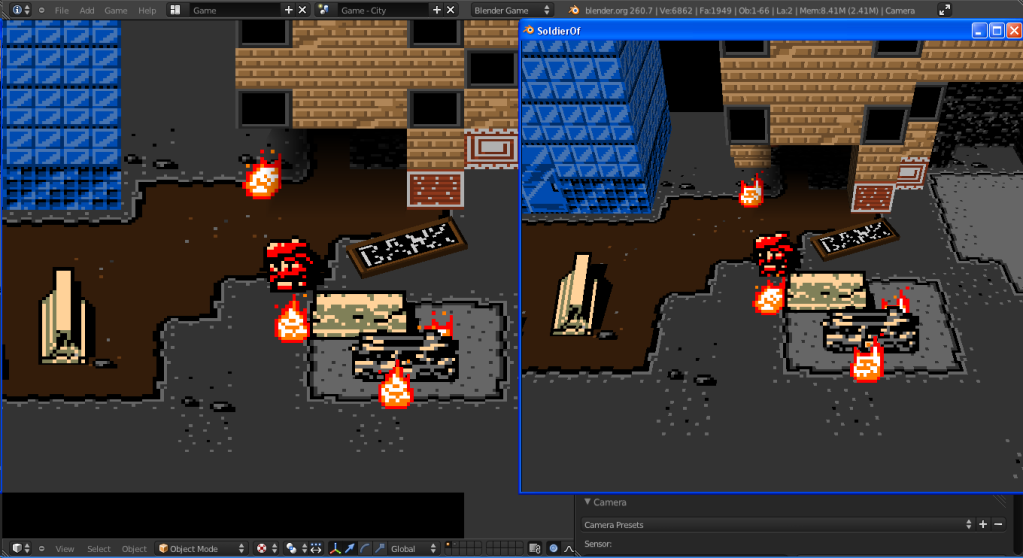 |
|
|
|
|
Logged
|
|
|
|
|
Dr.Electro
|
|
« Reply #28 on: December 10, 2011, 03:40:07 PM » |
|
but it won't quite look correct because the textures on the ground aren't drawn straight on, and so will draw 'half-sized' thats true.. but it works pretty good for isometric views. check out this example: http://www.polycount.com/forum/showpost.php?p=840354&postcount=1181anyways.. judging from you comparison i would say keep it real 3d.  |
|
|
|
|
Logged
|
|
|
|
|
J. R. Hill
|
|
« Reply #29 on: December 10, 2011, 04:09:32 PM » |
|
@J.R. Hill - Heh, it's funny how everyone sees the same thing differently. The gray things in the picture at the top of this page are robot soldiers! They animate and explode and everything. Are you sure that they look like tombstones? I'm sure it's a lot more clear in motion, all in all I'm liking the vibe of this game. |
|
|
|
|
Logged
|
hi
|
|
|
|
moi
|
|
« Reply #30 on: December 11, 2011, 06:56:42 AM » |
|
I'm not sure what you're trying to achieve, but the version on the left looks nice to me |
|
|
|
|
Logged
|
subsystems subsystems subsystems
|
|
|
|
laxwolf
|
|
« Reply #31 on: December 11, 2011, 11:03:43 AM » |
|
I'm not sure where you see messy textures. They all seem crisp to me. Yeah, an orthographic camera won't make a 3D game 2D, but it won't quite look correct because the textures on the ground aren't drawn straight on, and so will draw 'half-sized' (i.e. those pixels are half-height, while other pixels are correctly-sized). In addition, any platforming will be a little more difficult, particularly if I plan multi-level areas, as the upper levels will always draw over the lower levels (i.e. the camera can't pass under them). I'll give it a try, though. Here's a quickie comparison. Anyone have any thoughts? I think it'd be better looking and smarter to go with an orthographic lens. You might face more problems in the future with a perspective lens. All depends on what you are going for with the 3d models, good luck SolarLune! - Laxwolf |
|
|
|
|
Logged
|
Solo artist, modeler, designer, and programmer.
|
|
|
|
birdcloud
|
|
« Reply #32 on: December 20, 2011, 12:14:06 AM » |
|
With a head-on orthographic projection, I have to wonder why you'd bother modeling anything. It's essentially 2D. An isometric or other axonometric projection might be worth trying. But I dunno, I really like the discordant look of proper perspective & sprites. I also think the cleaned-up shots & gradient shadows look a little lifeless, so whaddaiknow.
|
|
|
|
|
Logged
|
|
|
|
|
BlueSweatshirt
|
|
« Reply #33 on: December 20, 2011, 12:21:01 AM » |
|
I think some sort of mixed projection would work best. Ortho for sprites like character/fire/etc. Try it out?
|
|
|
|
|
Logged
|
|
|
|
|
SolarLune
|
|
« Reply #34 on: December 20, 2011, 06:55:40 AM » |
|
With a head-on orthographic projection, I have to wonder why you'd bother modeling anything. It's essentially 2D. An isometric or other axonometric projection might be worth trying. But I dunno, I really like the discordant look of proper perspective & sprites.
Exactly. Why have sides to everything if you won't be able to see them? I also think the cleaned-up shots & gradient shadows look a little lifeless, so whaddaiknow.
Hmm... I'm going to have to work on it - maybe I can find a nice medium. I think that the real gold to be found here is to get it to a point where it's a mix of old and new graphical style - true 3D, perhaps physics-based mechanics, etc. next to the old-school sprites and art style. @Jakman4242 - Sounds like an interesting idea. So would that look like billboarding - always facing the camera, or otherwise trying to keep them from skewing? Sorry about not working on this in awhile - I didn't have time, but now I do, so expect updates. |
|
|
|
|
Logged
|
|
|
|
|
SolarLune
|
|
« Reply #35 on: December 20, 2011, 03:21:55 PM » |
|
Alright, so I worked a little on the park. 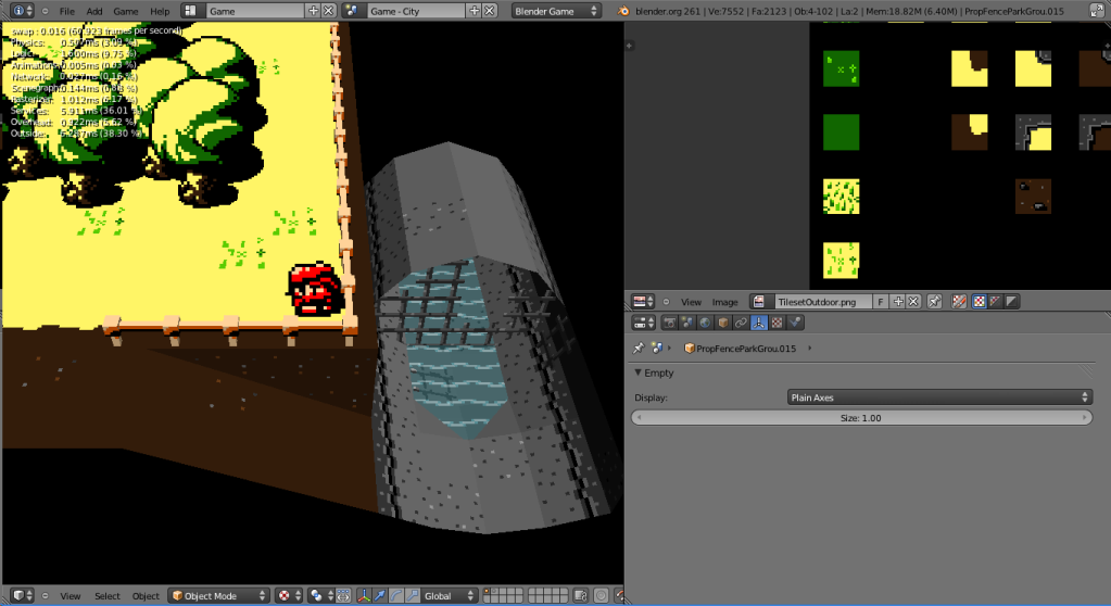 It's got animating transparent water and everything. The fence is still a little off, though. Fortunately, it's group-instanced, so I can go back to change it. I need to find a good style... Maybe if I used just planes (tiles) for the fence? I'm not sure. Maybe I'll just focus on making the important parts, and then going back to fix visual stuff. |
|
|
|
« Last Edit: December 20, 2011, 03:31:24 PM by SolarLune »
|
Logged
|
|
|
|
|
BlueSweatshirt
|
|
« Reply #36 on: December 20, 2011, 04:57:34 PM » |
|
Yeah, keeping them from skewing and keeping them facing the camera.(I believe the former is achieved by implementing the latter)
Sometimes I feel as if there are style conflicts in your scenes. For instance in the screenshot above the trees are sprites but the fences are models, so in a way it feels like there's a lack of consistency.
Also I really feel like your colors need some work. The trees can look a bit unwieldy and that blank, vibrant yellow-beige ground really puts a number on my eyes at times.
|
|
|
|
|
Logged
|
|
|
|
|
SolarLune
|
|
« Reply #37 on: December 20, 2011, 06:05:31 PM » |
|
Thanks, I think you're right. I thought that the grass was green enough, but on further inspection, it's way too yellow. Thanks for the suggestion!
|
|
|
|
|
Logged
|
|
|
|
|
SolarLune
|
|
« Reply #38 on: December 24, 2011, 11:28:08 PM » |
|
Hey.
. This one just shows a little bit more of the park's completed state. Haven't been able to do a lot in the past week and a half or so, but I should have more time now.
|
|
|
|
|
Logged
|
|
|
|
|
SolarLune
|
|
« Reply #39 on: January 03, 2012, 12:06:50 AM » |
|
Sorry about the lack of devlog updates - stupid games have been taking up far too much of my time. LAWLZ 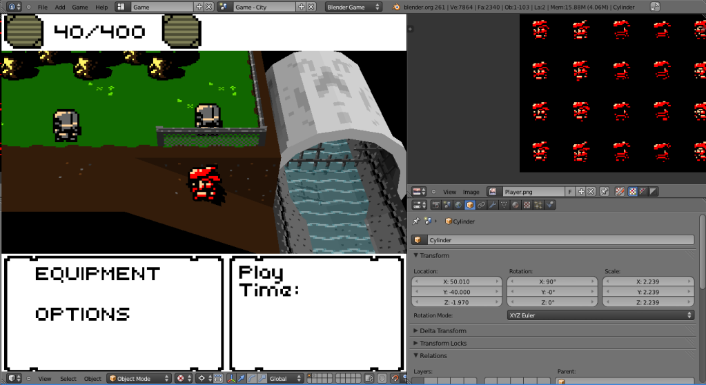 So, I'm working on fixing up the GUI. I've got the primary weapon ammo counts (currently in clip / maximum available) working, and the rest are just labels. The reason that the two icons on top are pushed over so much is because I thought of having cash in the game, but decided against it. I was thinking that enemy robots could drop the cash when defeated, and you could use the cash to purchase weapons and sub-items from human merchants still around in the area. I ended up deciding against it. Basically, it would work against the Metroidvania feel of the game. Without the mechanic of cash, I'll be forced to have lots of hidden areas and interesting branching paths to host all of the different weapons and items. However, there now won't be too much interactivity with other NPCs in the game, and you won't have a huge reason to attack any of the enemy robots, as they won't drop anything more than health or ammo. I also am working on a more 3D tunnel (it's a WIP), as the original was quite flat. I also fixed up Simon's walking animation to animate correctly at the same speed as the forward and downward animations (finally). I've also been working on music for the game, creating different tracks and seeing what from my old tracks I could use, if anything. Anyway, that's about it. |
|
|
|
« Last Edit: January 03, 2012, 12:17:09 AM by SolarLune »
|
Logged
|
|
|
|
|
 Community
