|
Zorg
|
 |
« Reply #4300 on: July 26, 2015, 01:09:37 AM » |
|
I'm not fully sold on the silhouette myself, but it was a bit of fun. I just kind of wanted to explore the versatility of the logo. More important to me is the minute font adjustments, because I'm a tremendous type nerd:  The alignment (centered) and kerning are definitely an improvement, in my eyes. But i don't like the W modification, and i think you overdid the R a little. An R between the original and your modification would be nice. |
|
|
|
|
 Logged
|
|
|
|
|
JLJac
|
|
« Reply #4301 on: July 26, 2015, 01:11:20 AM » |
|
Oh interesting! I'm not convinced about those Rs of yours, to me they have a bit of club foot with that one leg being thicker and extending to outside of the curved line, but I really like that W! The font is based on a public domain font called rodondo, but has undergone some modifications where I've for example made it thinner and adjusted a bunch of stuff around. If you look at the R there you'll see that it's actually even more pinched together than the one I'm rolling, I've been moving that leg out a bit. So I agree with you in kind but not in scale, if that makes sense  The all white slugcat looks pretty nice IMO! Actually I have been doing a few tests like that myself as well, as a logo needs to be able to work in one color print. Maybe the silhouette could be a bit more distinctive in some places, but as said we're rushing to a deadline right now and it's pretty likely we'll return to this down the line. As for the reduced color count on the slugcat, that was my attempt to clean it up a bit and make it closer to the graphics of the game, but I would be totally up for seeing what a smooth unlimited color finish would look like as well! As long as the outline is sharp rather than blurry and there's a way to get around obvious brush strokes. Maybe when we get Del back! |
|
|
|
|
Logged
|
|
|
|
|
tortoiseandcrow
|
|
« Reply #4302 on: July 27, 2015, 09:51:32 AM » |
|
I think we might just end up disagreeing on the Rs! It's not uncommon for many typefaces to have the leg of the R extend beyond the bowl, which I like because I think it provides more balance to the negative space of the letter. However, I definitely wasn't careful when tracing the font so you're correct in noticing that the leg is thicker.
Feel free to use the W modification if it pleases you!
|
|
|
|
|
Logged
|
|
|
|
|
JLJac
|
|
« Reply #4303 on: July 27, 2015, 12:11:49 PM » |
|
Thanks! As I said I'm pretty sure we'll return to it for polish, so I'll try it out then  Update 458 Update 458New creature coming up!  The idea is that this critter will be able to lay on the floor like a big sea elephant/grub, but then it can also shoot up in the sky with looooong extendable legs. I'm very inspired by Dali's long legged elephants for this one.  With these long legs it will be able to stride across the worm grass fields and then pull them in and lay down to eat some sort of plant in its grazing pastures in between. The leg movement is supposed to be a little bit less clumsy, though I don't know how good I can make it. Good thing it's all fantasy creatures  I'll work a bit more on locomotion, and then my plan is that in the skinning phase I will draw legs on top of these tentacles that are only somewhat true to their orientation, hopefully enabling me to fake a slightly less wobbly movement haha! |
|
|
|
|
Logged
|
|
|
|
|
Christian
|
|
« Reply #4304 on: July 27, 2015, 12:20:21 PM » |
|
Reminds me of the stilt walkers from Mad Max Fury Road  Sounds like a herbivore. Is it a backer creature? |
|
|
|
« Last Edit: July 27, 2015, 12:25:29 PM by Christian »
|
Logged
|
|
|
|
|
tortoiseandcrow
|
|
« Reply #4305 on: July 27, 2015, 01:02:09 PM » |
|
Perhaps you could disallow movement forward unless there is a leg connected to the ground in front of it? That way it has to put a foot down and then move forward, rather than have the legs try to catch up with an independently moving body? (obviously this is probably much more complicated than that)
|
|
|
|
|
Logged
|
|
|
|
|
adge
|
|
« Reply #4306 on: July 27, 2015, 01:38:30 PM » |
|
BROOOOOOOOOOPPP!  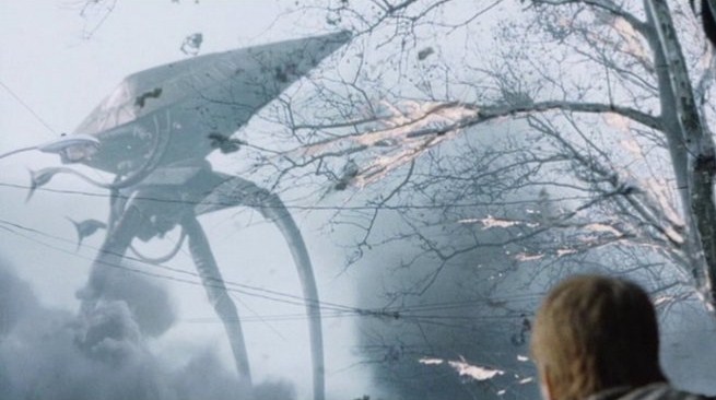 Tripods from War Of The Worlds. Maybe watch the movie for more inspiration.. |
|
|
|
« Last Edit: July 27, 2015, 01:50:13 PM by adge »
|
Logged
|
|
|
|
|
b∀ kkusa
|
|
« Reply #4307 on: July 27, 2015, 03:34:54 PM » |
|
or the myst  |
|
|
|
|
Logged
|
|
|
|
Teod
Level 1


|
|
« Reply #4308 on: July 27, 2015, 07:40:21 PM » |
|
It just has to have a flat top and be rideable. It could even look like a simple brick, since you talked earlier about adding more artificial elements to the creatures.
|
|
|
|
« Last Edit: July 28, 2015, 12:27:22 AM by Teod »
|
Logged
|
|
|
|
|
SafetySnail
|
|
« Reply #4309 on: July 27, 2015, 07:53:08 PM » |
|
Really hoping these are passive giants that more or less ignore you. Too eerie looking for interaction!
|
|
|
|
|
Logged
|
|
|
|
|
saluk
|
|
« Reply #4310 on: July 27, 2015, 08:39:29 PM » |
|
Or these guys from Dark Crystal:  |
|
|
|
|
Logged
|
|
|
|
Laukku
Level 0

|
|
« Reply #4311 on: July 27, 2015, 11:06:36 PM » |
|
The pear-shaped, bag-pants-wearing slugcat bothered me so I made some quick and dirty sketches to illustrate what I think is a more on-model one. Anatomy and posing is not perfect, and I even overcompensated the proportions a little on purpose. Keep in mind that these are my opinions.  The artist seemed to go for a squirrel/rodent kind of look, and I tried to do the same in a way that is leaner and bonier, with less distracting legs. I imagine the slugcat would use his spine and whole body instead of simply just legs to jump, so the legs need not that much emphasis. Overall the straights to curves ratio should be a little higher. The tail should also be somewhat solider, as was discussed much earlier in the thread when recreating the slugcat in the new engine. The bottom right is me trying to get the anatomy and foreshortening right. Also, aesthetically the style should lean towards Junji Ito or Corrado Roi (but not too much) rather than any kind of rubbery Disney appeal. |
|
|
|
« Last Edit: July 27, 2015, 11:13:58 PM by Laukku »
|
Logged
|
|
|
|
|
Crispy75
|
|
« Reply #4312 on: July 28, 2015, 12:13:55 AM » |
|
Oh I like that a lot.
|
|
|
|
|
Logged
|
|
|
|
|
jctwood
|
|
« Reply #4313 on: July 28, 2015, 01:00:16 AM » |
|
I thoroughly agree with Laukku and the strange bagginess of slug cat in the illustrations did take me by surprise.
|
|
|
|
|
Logged
|
|
|
|
|
BlackseaOdyssey
|
|
« Reply #4314 on: July 28, 2015, 04:34:39 AM » |
|
The graphics are BEAUTIFUL.  When do you plan to release the game and on what platforms? |
|
|
|
|
Logged
|
|
|
|
|
adge
|
|
« Reply #4315 on: July 28, 2015, 05:39:17 AM » |
|
NES and probably Atari, nov. 2017  |
|
|
|
|
Logged
|
|
|
|
|
tortoiseandcrow
|
|
« Reply #4316 on: July 28, 2015, 06:45:45 AM » |
|
Though I don't think Del's art is in need of defending (it stands up well enough on its own) I do want to point out how expressive and characterful the shapes are, and how necessary that is given the minimalist presentation of the character in-game. It's like extrapolating this:  from this:  In keeping with the subtle cartoonish charm that Joar has painstakingly maintained from the very beginning, the expressiveness of the character is more important than staying "on model". The exaggeration of the legs grounds the body, gives a sense of lithe power and fluidity to the character, makes for more dynamic poses, and is kind of cute. It actually reminds me of Rebecca Sugar's work, with its effortless sense of volume. Out of curiosity, Laukku, which elements of Junji (correct me if I'm wrong, but I presume you mean Junji Ito, yes?) or Corrado Roi's work do you think particularly lends itself to depicting the slugcat? They're both accomplished artists with very distinctive ways of drawing people, but I'm really not seeing anything in their oeuvre that particularly recommends them to this application. Even though the world is very, very scary, the slugcat is totally cute, and there's no getting around that. The more uniform tone of Junji or Corrado Roi doesn't seem like the most ideal touchstone for accommodating that range. I personally would be looking more towards something like Jeff Smith's work on Bone, since he does a really wonderful job of scaling stylistically between more simplified forms and incredible detail, as well as tonally between charming and incredibly dark. Which has me wondering - Joar & James, will you be getting Del to do illustrations for in-game stuff? I'd love to see that slugcat on an intricately drawn background. |
|
|
|
|
Logged
|
|
|
|
|
gimymblert
|
|
« Reply #4317 on: July 28, 2015, 07:10:31 AM » |
|
|
|
|
|
|
Logged
|
|
|
|
|
gimymblert
|
|
« Reply #4318 on: July 28, 2015, 07:14:05 AM » |
|
|
|
|
|
« Last Edit: July 28, 2015, 07:19:59 AM by Jimym GIMBERT »
|
Logged
|
|
|
|
|
gimymblert
|
|
« Reply #4319 on: July 28, 2015, 07:17:49 AM » |
|
I like 2 best  |
|
|
|
|
Logged
|
|
|
|
|
 Community
