|
Nix
Guest
|
 |
« Reply #20 on: June 29, 2012, 08:46:28 AM » |
|
It's really incredible how much better these are after only 10 days.
|
|
|
|
|
 Logged
|
|
|
|
waxx
Level 1

head to the right

|
|
« Reply #21 on: June 29, 2012, 10:14:45 AM » |
|
It just keeps getting better!
|
|
|
|
|
Logged
|
|
|
|
|
SundownKid
|
|
« Reply #22 on: June 29, 2012, 09:46:41 PM » |
|
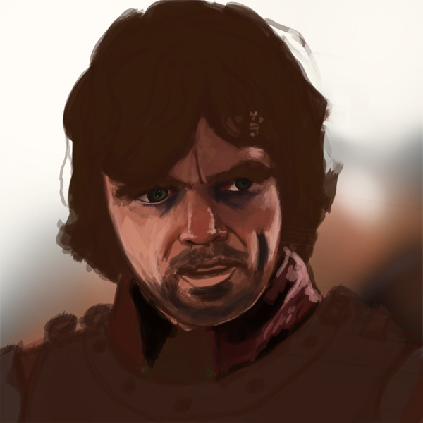
Perspective definitely looks better. Face, however, is too smooth (should be wrinkly, ESPECIALLY around the eyes) and symmetry is still a tad off. The wrinkles that are there are too hard-edged. I would suggest smoothing out the wrinkles, maybe drawing from a reference.
|
|
|
|
|
Logged
|
|
|
|
|
joseph ¯\_(ツ)_/¯
|
|
« Reply #23 on: July 01, 2012, 08:25:52 AM » |
|
Yo! Drawing from lines is a matter of taste, but It's typically a good idea. I didnt use any lines because I was painting over the base of your painting and staying pretty faithful to it, I typically would If i was painting a portrait. Sometimes i even go as far as to hatch out very simple shading in line and then paint over that.
The portrait of the guy in the hood is very good, nice, clear, easy to read forms that convey a lot of mass. How you handled stuff like the lower eyelid without a hard crease, just a change in form, is great. Do more like that! Excellent improvement.
|
|
|
|
|
Logged
|
|
|
|
|
ANtY
|
|
« Reply #24 on: July 03, 2012, 04:09:15 AM » |
|
The last posting from your IP was less than 30 seconds ago. Please try again later. FUCK YOU gosh, whole post lost....... anyway, I'll try to recreate my original post: @ Nix, waxx: thanks  @ SundwownKid: yes, I agree that there's something unreal with the surface of the last guy's skin. Actually I used a reference  @ Catguy: Good, I draw lineart before painting too! Thanks  Not that happy with this one and it for sure needs some more polishing, especially in the skull area.  On the other hand I'm pretty happy with this one, turned out better than I expected. |
|
|
|
|
Logged
|
|
|
|
|
ANtY
|
|
« Reply #25 on: July 03, 2012, 12:36:44 PM » |
|
 Tried to play with colors a little, dunno if I'm on a good track |
|
|
|
|
Logged
|
|
|
|
|
SundownKid
|
|
« Reply #26 on: July 03, 2012, 04:50:49 PM » |
|
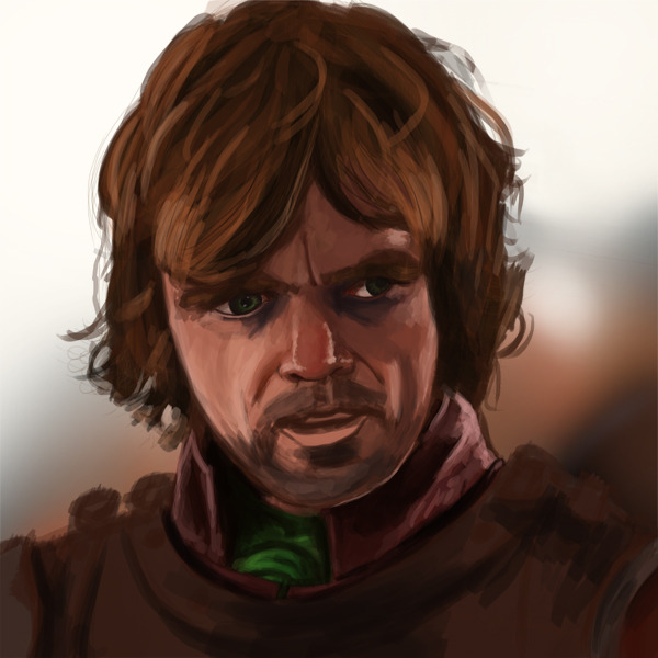
The armor definitely looks good, the skeleton is still not symmetrical enough, but drawing from an outline should help you with that.
EDIT: The thing about the guy's face that's a problem is that the colors aren't rich enough, it kind of makes the face look a bit clay-like instead of "alive". I think it could use some better contours to make it less flat.
|
|
|
|
« Last Edit: July 03, 2012, 09:15:48 PM by SundownKid »
|
Logged
|
|
|
|
|
ANtY
|
|
« Reply #27 on: July 05, 2012, 09:39:25 AM » |
|
Yeah, clay, that's what it looks like, but I'm not gonna fix it, he looks good enough in game and there is a ton more to do :d drew at 4AM yesterday and finished today  is sometimes using "dodge" tool when rendering armors "fair-play"? |
|
|
|
|
Logged
|
|
|
|
|
Joshua
|
|
« Reply #28 on: July 05, 2012, 01:59:55 PM » |
|
I'm really digging the rendering on this one. Maybe try some bounce light on the right side? You are making great strides, keep at it.
|
|
|
|
|
Logged
|
|
|
|
|
brettchalupa
Guest
|
|
« Reply #29 on: July 06, 2012, 08:06:57 PM » |
|
That definitely reminds me of the judges from Final Fantasy XII, which is always a good thing.  |
|
|
|
|
Logged
|
|
|
|
|
ANtY
|
|
« Reply #30 on: July 10, 2012, 07:14:18 AM » |
|
Hey, that's the guy that inspired me to make such horns on the helmet. Didn't know the game though. 2,5 hours photo study  |
|
|
|
|
Logged
|
|
|
|
|
Alevice
|
|
« Reply #31 on: July 10, 2012, 03:37:51 PM » |
|
Do you have the ref for comparison?
|
|
|
|
|
Logged
|
|
|
|
|
ANtY
|
|
« Reply #32 on: July 10, 2012, 03:59:51 PM » |
|
@Gabriel: thanks @Alevice:  |
|
|
|
|
Logged
|
|
|
|
|
Jesse
|
|
« Reply #33 on: July 11, 2012, 05:54:32 AM » |
|
That's a legit study dude! Great work. It's awesome to see you really putting in the time to improve your skills.
Agreed! Refreshing to see |
|
|
|
|
Logged
|
|
|
|
|
ANtY
|
|
« Reply #34 on: August 28, 2012, 02:36:28 PM » |
|
|
|
|
|
|
Logged
|
|
|
|
|
brettchalupa
Guest
|
|
« Reply #35 on: August 28, 2012, 09:42:38 PM » |
|
I like the style of the three ladies a lot. Very distinctive.
|
|
|
|
|
Logged
|
|
|
|
|
ANtY
|
|
« Reply #36 on: September 12, 2012, 02:51:27 PM » |
|
Thanks @topic: now I try to learn vector art, using Inkscape  |
|
|
|
|
Logged
|
|
|
|
|
ANtY
|
|
« Reply #37 on: March 14, 2013, 02:39:41 PM » |
|
|
|
|
|
|
Logged
|
|
|
|
|
ANtY
|
|
« Reply #38 on: March 16, 2013, 06:17:09 AM » |
|
 wip |
|
|
|
|
Logged
|
|
|
|
|
ANtY
|
|
« Reply #39 on: March 17, 2013, 12:45:39 PM » |
|
 wip2 |
|
|
|
|
Logged
|
|
|
|
|
 Developer
