|
TeeGee
|
 |
« Reply #160 on: September 23, 2013, 07:27:13 AM » |
|
A new update is out, with several important bug fixes and balance improvements. Also, a new gif. 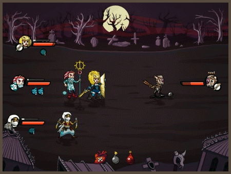 Here's the full list of changes. Here's the full list of changes. |
|
|
|
|
 Logged
|
|
|
|
|
TeeGee
|
|
« Reply #161 on: January 06, 2014, 12:03:35 PM » |
|
We're planning some bigger changes for the game, and it involves a complete art work revamp. 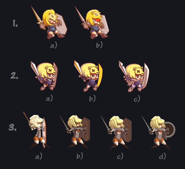 Which one works the most for you? |
|
|
|
|
Logged
|
|
|
|
|
Uykered
Guest
|
|
« Reply #162 on: January 06, 2014, 03:50:10 PM » |
|
1B is the best, followed by 2C (A and B's faces are confusing). Set 3 are pretty weak designs in comparison (no personality, very drab).
They look cool, hope this means more animations! :D
|
|
|
|
|
Logged
|
|
|
|
|
clockwrk_routine
Guest
|
|
« Reply #163 on: January 06, 2014, 04:42:45 PM » |
|
We're planning some bigger changes for the game, and it involves a complete art work revamp. Which one works the most for you? I actually like the classiness of 3, b is pretty nice for the outlines, though c is also working for me, they could use maybe more of a face definition, not crazy about the torso. I think 1B also is the most rendered is best looking of the bunch - it fits more with the original character designs. |
|
|
|
|
Logged
|
|
|
|
|
Konidias
|
|
« Reply #164 on: January 06, 2014, 06:40:01 PM » |
|
Yeah... 1B
|
|
|
|
|
Logged
|
|
|
|
|
Sved
|
|
« Reply #165 on: January 06, 2014, 09:50:20 PM » |
|
3d for me, and I would love to see how the monsters convert to that style.
|
|
|
|
|
Logged
|
|
|
|
|
TeeGee
|
|
« Reply #166 on: January 07, 2014, 07:34:13 AM » |
|
Thanks for your opinions, guys.
I admit I thought 1 will win by a large margin, but looks like a lot of people prefer the hipsterness of 3. I wonder if we're be able to pull off an entire game in that style. It would also require some changes in tone for everything to fit together.
I guess we'll just do some mockups with 1 and 3 and see how it looks, which is easier to produce/animate, and so on.
|
|
|
|
|
Logged
|
|
|
|
|
TeeGee
|
|
« Reply #167 on: July 12, 2014, 09:08:52 AM » |
|
Hey, so Kate (our artist) finally had the time to get back to this and prepare some better mockups: 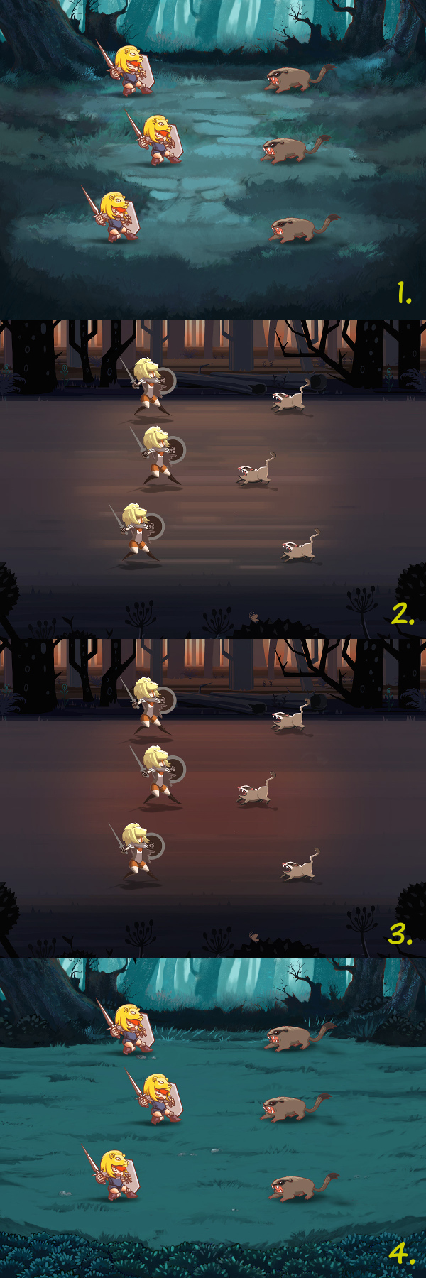 Which one leaves the biggest mark on your soul?  |
|
|
|
« Last Edit: July 12, 2014, 09:14:49 AM by TeeGee »
|
Logged
|
|
|
|
|
happymonster
|
|
« Reply #168 on: July 12, 2014, 10:58:32 AM » |
|
3: because it looks different than other games while still looking nice.
|
|
|
|
|
Logged
|
|
|
|
|
gimymblert
|
|
« Reply #169 on: July 13, 2014, 09:35:36 AM » |
|
1 & 4 should have been closer spatially because it became hard to compare and the style jump is significant between the two group of proposition.
I'll go with 4
2 and 3 are interesting but currently too dull, need more of something first
|
|
|
|
|
Logged
|
|
|
|
boxmonger
Level 0


|
|
« Reply #170 on: July 13, 2014, 09:47:55 AM » |
|
Man, that's hard. I like the overall style of 2/3 a lot, but I think the girl's character design in 1/4 is much stronger. The red hair draws your eye to the face, and the lion hat has a lot of character in that version. In the more stylized version of 2/3, your eye is drawn to her red pants instead!
That said, I'd vote 1>4 and 2>3 background-wise - I think the more painterly versions are a bit more interesting.
|
|
|
|
|
Logged
|
|
|
|
Silvestre
TIGBaby

|
|
« Reply #171 on: July 29, 2014, 08:47:43 PM » |
|
I like the 3rd style, but the other three are nice as well. How will the monsters look? Are the two kinds of monster a representation of a different style of the same one or different monsters?
|
|
|
|
|
Logged
|
|
|
|
|
Slader16
|
|
« Reply #172 on: July 29, 2014, 09:06:15 PM » |
|
I'm going with 4.  |
|
|
|
|
Logged
|
|
|
|
|
TeeGee
|
|
« Reply #173 on: July 30, 2014, 03:47:18 AM » |
|
I like the 3rd style, but the other three are nice as well. How will the monsters look? Are the two kinds of monster a representation of a different style of the same one or different monsters?
Same monster. Different style . |
|
|
|
|
Logged
|
|
|
|
|
jctwood
|
|
« Reply #174 on: July 30, 2014, 03:50:46 AM » |
|
Personally I would pick 3. but with the terrain of 1. I love those blue-green hues.
|
|
|
|
|
Logged
|
|
|
|
|
TeeGee
|
|
« Reply #175 on: September 12, 2014, 10:56:22 PM » |
|
Testing the new art style in action:  I think some tweaks to anim cross-fades are gonna be necessary, but overall I'm pretty happy with it. |
|
|
|
|
Logged
|
|
|
|
|
ANtY
|
|
« Reply #176 on: September 13, 2014, 01:06:04 AM » |
|
Looks pretty cool, though I think that you should switch to the attack frame earlier
|
|
|
|
|
Logged
|
|
|
|
|
TeeGee
|
|
« Reply #177 on: September 16, 2014, 03:07:47 AM » |
|
Yeah, working on it.  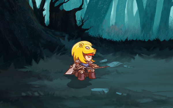 Meanwhile, The Knight ponders the future of the game... |
|
|
|
|
Logged
|
|
|
|
|
kruxus
|
|
« Reply #178 on: September 16, 2014, 03:18:25 AM » |
|
Yeah, working on it. Meanwhile, The Knight ponders the future of the game... Looks really cool, but the default stance of the characters seems quite off balance to me (if it is supposed to be the default pose that is), it works well as a "jump back" frame though. |
|
|
|
« Last Edit: September 16, 2014, 03:54:58 AM by kruxus »
|
Logged
|
|
|
|
|
TeeGee
|
|
« Reply #179 on: September 18, 2014, 06:55:20 AM » |
|
Mouse-over reaction: 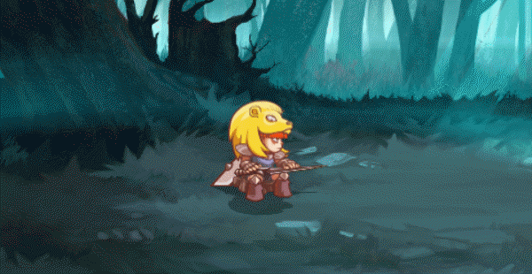 |
|
|
|
|
Logged
|
|
|
|
|
 Community
