|
Hipshot
|
 |
« Reply #180 on: March 19, 2013, 03:39:27 AM » |
|
A while since I showed some graphics, I'm pretty much done with the third theme now, called Archives, with books and such. Will most likely feature more magic based enemies like liches with various kinds of magic, wisps and similar... The other themes are included for comparison.  |
|
|
|
|
 Logged
|
|
|
|
|
tchassin
|
|
« Reply #181 on: March 19, 2013, 09:34:38 AM » |
|
Looks really neat! However, the colors may be a bit too close to the ones from the second theme.
|
|
|
|
|
Logged
|
|
|
|
|
FreshSheet
|
|
« Reply #182 on: March 19, 2013, 12:29:23 PM » |
|
Timed myself, and it takes me 11 minutes and 19 seconds to speedrun it with the paladin. I didn't count the queen since I can't beat her without upgrades; the worms are too strong for 8 damage swipes.
I actually think ranger would be the slowest, as there are important areas where you can't walk through the enemies (silver key on floor 2, entire area from the gold door to the arrow spitters on floor 3), where the paladin can dash through if you do it right and the wizard can just plow through with the right combination of fireball and firebreath. I'll time myself on wizard next.
|
|
|
|
« Last Edit: March 19, 2013, 12:36:08 PM by FreshSheet »
|
Logged
|
|
|
|
|
mauz
|
|
« Reply #183 on: March 19, 2013, 03:17:26 PM » |
|
The saving issue will ofc be fixed, the game is supposed to save at the checkpoints. Thank you for that, I'm really enjoying the game, but really need a save to finally finish the beta, because I can rarely play for long sessions.  Anyway, I really like the game, I have always loved Gauntlet and cannot understand why no one is doing that kind of game anymore (I was planning doing one myself ). The only thing that annoy me a bit is that -playing with a 360 pad- it's really hard with the archer to shoot perfectly vertical or orizontal (I have the same problem with the wizard, but the bigger "bullet" helps). Keep on the good work.  |
|
|
|
|
Logged
|
|
|
|
Grossmond
Level 0


|
|
« Reply #184 on: March 19, 2013, 04:08:15 PM » |
|
A few friends and I noticed that when we were playing Gold was 100% shared, as in when picked up and when spent, is this a feature that is set to stay or will it be changed up?
|
|
|
|
|
Logged
|
|
|
|
|
FreshSheet
|
|
« Reply #185 on: March 19, 2013, 06:12:28 PM » |
|
I think gold should be spent individually but picked up shared so that way everyone can get the upgrades they want.
|
|
|
|
|
Logged
|
|
|
|
|
tchassin
|
|
« Reply #186 on: March 19, 2013, 08:06:07 PM » |
|
I think gold should be spent individually but picked up shared so that way everyone can get the upgrades they want.
I second that |
|
|
|
|
Logged
|
|
|
|
|
Hipshot
|
|
« Reply #187 on: March 19, 2013, 11:36:03 PM » |
|
I think the theme might need some more saturation, the strong difference between theme a and b is because they are so raw and single colored, progressing towards the end theme, a lot more features are presented into the themes and this makes them more even in colors. I think gold should be spent individually but picked up shared so that way everyone can get the upgrades they want.
The gold spending have always been a bit of an issue. At first you think it might be a good coop feature, that you have to share with your friends and everything around that. But, when you're playing the game, it's always a bit annoying to have to tell people what they can and can't buy so everyone get's a bit of the loot. Especially if someone buys up all money at first and the others can't buy walk speed... In MP you get so much more money too, so someone can just go into a buying frenzy if they are just a bit faster than the others to the store. So, what you are saying here, I've been thinking about, especially lately, because I *think* you can exploit the gold feature in MP now too, not tested it though. But it's really an UI issue, we need to present the gold for every player individually. I wouldn't mind moving information to the tab screen, so remove the gold from the top bar and only have keys and life there. When you press tab (the map button) you get an extended information about gold perhaps... and this is also shown when you are in a store, of course. Maybe something like this:  Before anyone asks, why this info can't be above the player name in the bottom, this is because the store ui is above the player info sometimes in different resolutions. |
|
|
|
|
Logged
|
|
|
|
|
Hipshot
|
|
« Reply #188 on: March 19, 2013, 11:38:22 PM » |
|
The only thing that annoy me a bit is that -playing with a 360 pad- it's really hard with the archer to shoot perfectly vertical or orizontal (I have the same problem with the wizard, but the bigger "bullet" helps). Keep on the good work. Would it work better for you if the aiming snapped back at the graphical angle of the player when you release the stick, perhaps? |
|
|
|
|
Logged
|
|
|
|
|
Hipshot
|
|
« Reply #189 on: March 20, 2013, 12:12:02 AM » |
|
Timed myself, and it takes me 11 minutes and 19 seconds to speedrun it with the paladin. I didn't count the queen since I can't beat her without upgrades; the worms are too strong for 8 damage swipes.
I actually think ranger would be the slowest, as there are important areas where you can't walk through the enemies (silver key on floor 2, entire area from the gold door to the arrow spitters on floor 3), where the paladin can dash through if you do it right and the wizard can just plow through with the right combination of fireball and firebreath. I'll time myself on wizard next.
Tried the paladin, took a little less than 8 min for me, to get from start to the boss level. I did an attempt with the ranger, but it didn't work at all, I had an idea that you could drop bombs when you walked, but that didn't really work out as I intended =) So the paladin, probably is the easier. You should know, that the game has been tweaked a lot in our version, the default speed is faster and I also bought the speed upgrade, I'm not sure you did that at all. Taking time to buy mana might also be a good idea, then you can charge more, with in the end might reduce the total time. |
|
|
|
|
Logged
|
|
|
|
USteppin
Level 0
|
|
« Reply #190 on: March 20, 2013, 01:11:35 AM » |
|
Any tips for getting a wired xbox 360 controller with default Microsoft drivers working? The back (map) and start (menu) buttons work while in-game but no other buttons work and I can't rebind anything to the controller.
|
|
|
|
|
Logged
|
|
|
|
|
mauz
|
|
« Reply #191 on: March 20, 2013, 02:27:59 AM » |
|
Any tips for getting a wired xbox 360 controller with default Microsoft drivers working? The back (map) and start (menu) buttons work while in-game but no other buttons work and I can't rebind anything to the controller.
Strange, it works perfectly for me, just remember to plug the controller before launching the game. @hipshot: yes, i think it would work better |
|
|
|
|
Logged
|
|
|
|
Grossmond
Level 0
|
|
« Reply #192 on: March 20, 2013, 05:53:10 AM » |
|
I think the theme might need some more saturation, the strong difference between theme a and b is because they are so raw and single colored, progressing towards the end theme, a lot more features are presented into the themes and this makes them more even in colors. I think gold should be spent individually but picked up shared so that way everyone can get the upgrades they want.
The gold spending have always been a bit of an issue. At first you think it might be a good coop feature, that you have to share with your friends and everything around that. But, when you're playing the game, it's always a bit annoying to have to tell people what they can and can't buy so everyone get's a bit of the loot. Especially if someone buys up all money at first and the others can't buy walk speed... In MP you get so much more money too, so someone can just go into a buying frenzy if they are just a bit faster than the others to the store. So, what you are saying here, I've been thinking about, especially lately, because I *think* you can exploit the gold feature in MP now too, not tested it though. But it's really an UI issue, we need to present the gold for every player individually. I wouldn't mind moving information to the tab screen, so remove the gold from the top bar and only have keys and life there. When you press tab (the map button) you get an extended information about gold perhaps... and this is also shown when you are in a store, of course. Maybe something like this: Before anyone asks, why this info can't be above the player name in the bottom, this is because the store ui is above the player info sometimes in different resolutions. All I can say is Hooray on individual gold spending, that is what I was hoping you would say. As for the exloiting of the gold in MP I can say for LAN that you can indeed exploit it and I will get a friend to test it with me today if we get the chance. |
|
|
|
|
Logged
|
|
|
|
|
FreshSheet
|
|
« Reply #193 on: March 20, 2013, 12:07:27 PM » |
|
Tried the paladin, took a little less than 8 min for me, to get from start to the boss level.
I did an attempt with the ranger, but it didn't work at all, I had an idea that you could drop bombs when you walked, but that didn't really work out as I intended =) So the paladin, probably is the easier.
You should know, that the game has been tweaked a lot in our version, the default speed is faster and I also bought the speed upgrade, I'm not sure you did that at all. Taking time to buy mana might also be a good idea, then you can charge more, with in the end might reduce the total time.
Yea I didn't buy the speed upgrade or any upgrade, not because of route issues but because of money issues. Since you have to break tons of crates to get money there was no way for me to quickly do that. Otherwise it would be more time efficient for me to get those upgrades. Cuz when I ran it I literally did not stop once except at the arrow spitters and the spikes. |
|
|
|
|
Logged
|
|
|
|
|
airman4
|
|
« Reply #194 on: March 20, 2013, 06:36:09 PM » |
|
Neat graphic and atmosphere |
|
|
|
|
Logged
|
|
|
|
|
Hipshot
|
|
« Reply #195 on: March 21, 2013, 05:15:49 AM » |
|
Ok, here's two hud examples, I'm gonna see if we can implant anyone of these. The first one, is the hud with out any extra info, this is our current hud, no money and so are showing. When you press tab to view the map, extra info is added, I like #2 the most, it looks pretty neat, kinda extend the rest of the hud. #1 is good too, but it's the first one I made. What we see is gold for every player, what floor and act we are on, how many of the runes that have been activated to unlock the boss door, how many and what letters that have been found and also a new thing we talked about yesterday, to add a collectable like the stars in mario, could be fun (it will not be stars of course). 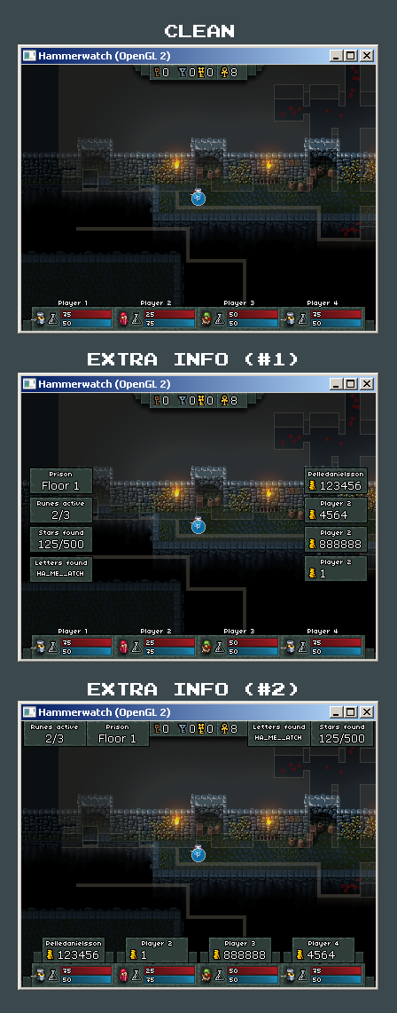 |
|
|
|
|
Logged
|
|
|
|
|
FreshSheet
|
|
« Reply #196 on: March 21, 2013, 11:51:05 AM » |
|
I like #2 the best. More organized and doesn't cramp the map.
|
|
|
|
|
Logged
|
|
|
|
|
pixhead
Guest
|
|
« Reply #197 on: March 21, 2013, 02:23:14 PM » |
|
Definitely #2
|
|
|
|
|
Logged
|
|
|
|
|
Seiseki
|
|
« Reply #198 on: March 21, 2013, 03:00:12 PM » |
|
You should be able to slim it down further.
For example, most of the labels can be removed and replaced by icons.
The gold can use the same small font as the hp.
And #1 would make sense if players hold down tab to see it, but not if they play with it on constantly.
|
|
|
|
|
Logged
|
|
|
|
|
08--n7.r6-79.84
|
|
« Reply #199 on: March 22, 2013, 12:32:22 AM » |
|
I think that the hud should be small and not too intrusive, so #1. Option number two is too cumbersome.
|
|
|
|
|
Logged
|
|
|
|
|
 Community
