|
08--n7.r6-79.84
|
 |
« Reply #120 on: October 08, 2013, 11:48:17 PM » |
|
Then question, guys. "Topology" of map is readable in puzzle area? 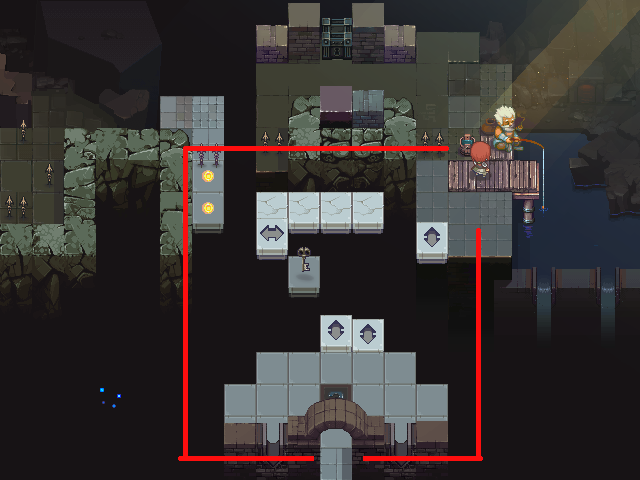 Cunnah Cunnah, thanx! ^__^ |
|
|
|
|
 Logged
|
|
|
|
|
Reilly
|
|
« Reply #121 on: October 09, 2013, 11:29:42 AM » |
|
I've noticed a lot of your terrain tiles don't have many overlapping bits, that might help add some dimension. Would make the whole thing look less like a harsh grid.
|
|
|
|
« Last Edit: October 09, 2013, 11:35:13 AM by Reilly »
|
Logged
|
|
|
|
|
Rat Casket
|
|
« Reply #122 on: October 09, 2013, 11:45:07 AM » |
|
A lot of the tiles also dont flow into each other. They look like they are just randomly placed around. I've highlighted these tiles in red. Also, as highlighted in blue, its impossible to tell what is the floor and what is the wall. It all looks really great but its not cohesive at all. It looks very very thrown together. There is little depth on most tiles. Especially looking at the right most blue box. Is that platform higher than the floor?  |
|
|
|
|
Logged
|
|
|
|
|
08--n7.r6-79.84
|
|
« Reply #123 on: October 10, 2013, 02:02:09 AM » |
|
Reilly, I see, thanks for advise!
Rabbit, I get it. Thank you very much for detailed answer! Will work on it and try to come up with a good solution.
|
|
|
|
|
Logged
|
|
|
|
|
kleiba
|
|
« Reply #124 on: October 10, 2013, 02:49:20 AM » |
|
Especially looking at the right most blue box. Is that platform higher than the floor?
A subtle shadow effect might help disambiguate such cases. |
|
|
|
|
Logged
|
|
|
|
|
08--n7.r6-79.84
|
|
« Reply #125 on: October 10, 2013, 03:16:50 AM » |
|
Especially looking at the right most blue box. Is that platform higher than the floor?
A subtle shadow effect might help disambiguate such cases. Oh it's good solution, thanks, I'll try it |
|
|
|
|
Logged
|
|
|
|
|
|
|
08--n7.r6-79.84
|
|
« Reply #127 on: October 10, 2013, 12:29:17 PM » |
|
This is a good example, I'll dig in this direction.  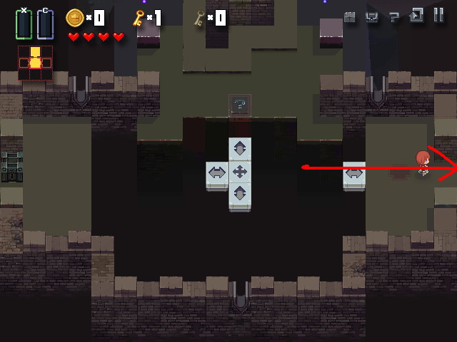 What about these pictures, I can leave it as is? Better, everything readable? (Pay no attention to the red arrow). |
|
|
|
|
Logged
|
|
|
|
|
Rat Casket
|
|
« Reply #128 on: October 10, 2013, 01:05:11 PM » |
|
Ah yes this is way better. I assume the floor is just placeholder, but yeah this is great. Much easier to read.
|
|
|
|
|
Logged
|
|
|
|
|
08--n7.r6-79.84
|
|
« Reply #129 on: October 10, 2013, 01:17:17 PM » |
|
Ah yes this is way better. I assume the floor is just placeholder, but yeah this is great. Much easier to read.
Cool! Well, BIG THANK YOU again, man. Your feedback has really helped. And yes, I will add some tiles to that "placeholder floor". Or maybe not. Perhaps I should leave player's attention clean, so it doesn't distract from puzzles on level. |
|
|
|
|
Logged
|
|
|
|
|
Rat Casket
|
|
« Reply #130 on: October 10, 2013, 01:18:39 PM » |
|
you could add some sort of pattern to it to break it up. its just a little flat and bland otherwise. just dont make it too demanding and youll be set.
|
|
|
|
|
Logged
|
|
|
|
|
kleiba
|
|
« Reply #131 on: October 10, 2013, 08:18:30 PM » |
|
What about these pictures, I can leave it as is? Better, everything readable?
(Pay no attention to the red arrow).
I agree it looks much better this way, but at the same time I think the shadow effect needs to be applied more consequently. For instance, I find it looks weird that the merlons don't cast any shadow at all. Also, if you look at the bright double-arrow tile under the red arrow and then gaze straight upwards then there is a wall tile that extends below the floor. Such walls might benefit if they're rendered a bit darker maybe to make it clear they're lower than the floor. At first I thought they should get a shadow cast on them from the floor above but the direction of light wouldn't license that. Still, it feels to me that lower == darker... ?! |
|
|
|
|
Logged
|
|
|
|
|
Pastywhite
|
|
« Reply #132 on: October 10, 2013, 08:54:50 PM » |
|
This looks really cool so far. The artwork is fantastic and the concept is there. From what I've read people seem to be pointing you in the right direction as far as any minor complaints I may have had upon first looking at it. Mainly the issues you've already been addressing with the floor tiles and the wall tiles. Overall the artwork is really fantastic though and I think this can prove to be a really really great game if you stick with it and work out those minor kinks. Great job overall.  |
|
|
|
|
Logged
|
|
|
|
|
08--n7.r6-79.84
|
|
« Reply #133 on: October 16, 2013, 05:29:59 AM » |
|
just dont make it too demanding and youll be set.
Yes, I understand this. kleiba, allright I'll add all shadows. Thanks for feedback and advices! Pastywhite, and ofcourse I'll consider all this in further work on game graphics.
Finished work on fishing guy and current location:  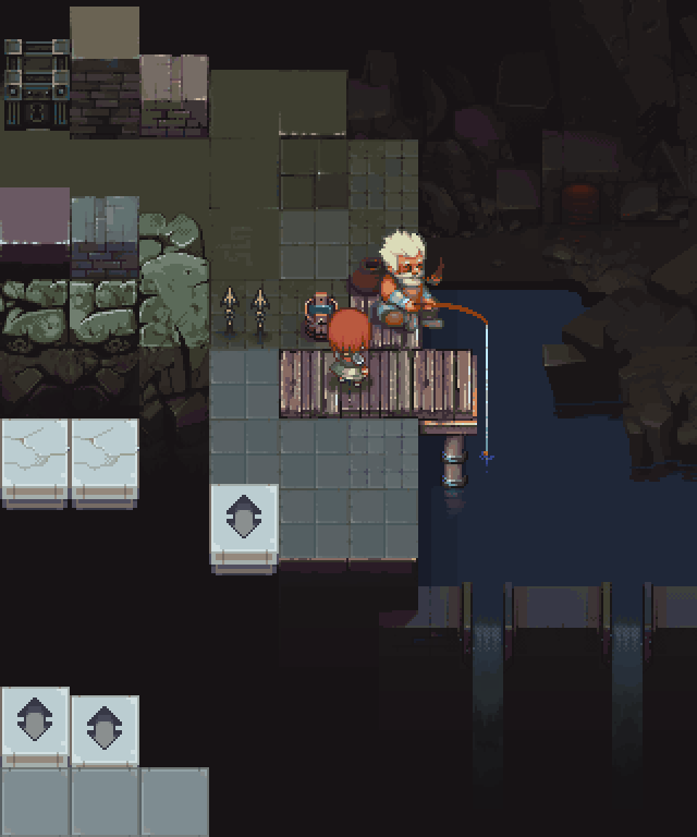 And if somebody is interested - short info about this character and its creation. |
|
|
|
|
Logged
|
|
|
|
Little Nando
Level 1

Working on Tough Coded Project


|
|
« Reply #134 on: October 16, 2013, 12:12:23 PM » |
|
Cool project!!! Keep it up!!
|
|
|
|
|
Logged
|
|
|
|
|
08--n7.r6-79.84
|
|
« Reply #135 on: October 16, 2013, 01:08:44 PM » |
|
Cool project!!! Keep it up!!
Glad you like it, thanks ^__^ |
|
|
|
|
Logged
|
|
|
|
|
BigDaveisCheap
|
|
« Reply #136 on: October 24, 2013, 02:59:03 PM » |
|
Just featured Maze in the latest episode of my show DevLogged. Really enjoying what you've shown so far please keep it up!
|
|
|
|
|
Logged
|
|
|
|
|
08--n7.r6-79.84
|
|
« Reply #137 on: October 25, 2013, 03:03:36 AM » |
|
Just featured Maze in the latest episode of my show DevLogged. Really enjoying what you've shown so far please keep it up!
Hey man, thank you sooo much again, for all kind words, really glad you like it! ^__^ |
|
|
|
|
Logged
|
|
|
|
|
Storsorgen
|
|
« Reply #138 on: October 25, 2013, 03:49:11 AM » |
|
I really like the look of this. I love it when developers dare to go for a more advanced graphical style. Keep up the good work!
|
|
|
|
|
Logged
|
|
|
|
|
08--n7.r6-79.84
|
|
« Reply #139 on: October 25, 2013, 04:26:50 AM » |
|
I love it when developers dare to go for a more advanced graphical style.
Haha, thank you! But this is the maximum of graphical style that we can afford so far. Much more attention and time needs to work on gameplay and puzzles. |
|
|
|
|
Logged
|
|
|
|
|
 Community
