|
Joh
|
 |
« on: May 01, 2013, 06:13:47 PM » |
|
Hi, I just made a little puzzle game. Im far from good at art and I don't really know how to make a nice interface. I've noticed a lot of puzzle games have a bland/blank back ground and a little border, sometimes fancy+(specific Hud).Other have nice artwork for background. Ive been thinking about a dynamic background (although thats likely beyond my abilities) that is either a still background with some elements moving (like leafs passing by, grass moving) Or a smooth slow moving one, similar to xmb(playstation) waves is that a good idea, or might it distract/ waste performance? (trying to keep it light) What kind of backgrounds do you think are better, what colors for the interface? Currently my interface is really bland, using only gradients,a border and a button. So do any of you have an idea on how to make it look better?  Theres also the stones, I made them myself, like I already said, I am not very good at art. (but I put effort) So do they look alright? Finnally, the font, should the font be something really simple for readabilty (more fancy for score pop ups) Any opinion and help would be greatly appreciated, thank you. |
|
|
|
|
 Logged
|
|
|
|
|
|
|
Joh
|
|
« Reply #2 on: May 02, 2013, 04:12:59 PM » |
|
Damn all of those look way too good... and smooth; is that vector art or are skill people really just that good?
Fixed backgrounds really seem to be the thing (although, i wouldnt really notice if they were moving..)
The background fit with the theme however, such as space in the alienny game your showing.
Not really sure what theme to go for with my stones (that also look like marbles)
So im still looking for feedback on the direction to take, although I do think ill change the layout.
I see zee keeper and it looks really good and simple, it also has many different fonts and looks fine. (i was thinking of avoiding multiple fonts)
As for the game, yea it will be a "match 3" game, ill be making it in 2 part (read that 2 games) A first pure puzzle, for the sake of having a game done. then I plan on placing it in a bigger game (i mean with progress, and oustide of puzzle gameplay)
|
|
|
|
|
Logged
|
|
|
|
blinkok
Level 1


|
|
« Reply #3 on: May 02, 2013, 05:30:09 PM » |
|
i think you need to think about theme, story and/or style.
is there are story there or one you can create?
what styles appeal to you? maybe google some images that appeal to you
maybe a theme; crocodiles, bugs, space, aircraft etc
once you start running these things through your head you will find you make connections and ideas and images will start to form
ps: if you post your progress here i'll try help out if you like
|
|
|
|
|
Logged
|
|
|
|
|
Joh
|
|
« Reply #4 on: May 03, 2013, 04:02:50 PM » |
|
Yeah, I have no story or theme (for part 1)
I do like the stones though so i'd like to keep them. Im also fond of abstract backgrounds, I googled that and it looks really good!
I think ill attempt and animated one, or at least a Hue changing one.
Do you want me to post my progress here, in art or on the game in general?
|
|
|
|
|
Logged
|
|
|
|
blinkok
Level 1
|
|
« Reply #5 on: May 03, 2013, 08:17:24 PM » |
|
here seems fine to me. i would seriously consider a theme though. i will create interest for the player. if you like the stones then maybe a western mining theme or a fortune teller/shaman type theme.
|
|
|
|
|
Logged
|
|
|
|
|
Joh
|
|
« Reply #6 on: May 03, 2013, 09:59:25 PM » |
|
Well, I managed to make a decent abstract background   The first one is with a bland gradient, the second is with an abstract background (which is not mine, but its what id aim for) I actually managed to make it move around, the waves sway slowly and also Hue switch. Still haven't changed the interface however,definitely thinking about changing the big red button, not sure by what however. But as I said, this is for part/phase one; making the pure puzzle game (a bit like bubble burst, bland, but working & fun). |
|
|
|
|
Logged
|
|
|
|
blinkok
Level 1
|
|
« Reply #7 on: May 04, 2013, 04:48:32 PM » |
|
they look good.
i think you need a more space around the play area. it all seems a little cramped at the moment.
i think the score probably needs to be up top (like most other games)
what does the button do? maybe that will define how it looks
unfortunately my monitor has just decided to go ape shit. so it might be a few days before i can create some example graphics.
|
|
|
|
|
Logged
|
|
|
|
|
Joh
|
|
« Reply #8 on: May 04, 2013, 07:19:09 PM » |
|
Well, I think i might as well explain how the game works! The reason why I put the score on the bottom is because the button is (was, since i changed that) filled with the current points you accumulated on the board.(Break 0) By pressing it, you break all the matches on the screen and get points for that. They are added to the score. (Score:0) All the block you broke will get replaced by new random ones. To get matches, you have to destroy (which is different from break) some stones, then one there is space free you can move around your stones and create matches. The destroyed blocks do not come back, which leads to game over at some point.  I was thinking of putting the Best highscore on top what do you think? I also feel its weird, one side is empty while the other has a score, until a chain happens, then I add the total (to save the user the maths) Should the total always be shown, even when its the same as the points? (1x multi) |
|
|
|
|
Logged
|
|
|
|
|
solkar
|
|
« Reply #9 on: May 05, 2013, 09:07:52 PM » |
|
If you have nothing going on over the top corner I'd put total score there. This way bottom area looks cleaner.
I liked the red button better. This round one looks more like a decoration than a button and it's probably for the sphere shape. Maybe if you add a border (like the red button had) to the sphere that would help.
|
|
|
|
|
Logged
|
|
|
|
blinkok
Level 1
|
|
« Reply #10 on: May 06, 2013, 04:25:03 PM » |
|
maybe if you made the outside area like a console. that would focus the attention on the stones and the game play area and help to clarify the buttons function
|
|
|
|
|
Logged
|
|
|
|
|
Joh
|
|
« Reply #11 on: May 07, 2013, 04:19:12 PM » |
|
Ok, had time to progress a bit, I added a border to the button, don`t know if it helps. I also changed the board border, although it still the old one, simply not flash yellow, The style could very well change, I think it looks simple, not sure if thats good or bad. I also added dark border on the side,although I feel it does add focus on the board itself, I feel the part of background it hides takes away a bit of the beauty of the flow. should I remove the side borders and only have some on top and bottom? (like the previous ones without the yellow line(border) on the sides) Although I havent added the highscore system yet, I placed it, to show what I meant by having it on top. I did shrink the score on the bottom though. Also added color to text, it like pretty much all elements changes color with the flow. What do you think about that, its very slow, so its not seizure inducing, but is it alright? hue changing background/Hud? Anyway, a gif! and a new shot (shows that it eventually goes to whole other colors)   What ill want to get to next is sweet explosions/shatters. Thanks for the support btw! |
|
|
|
|
Logged
|
|
|
|
blinkok
Level 1
|
|
« Reply #12 on: May 07, 2013, 05:21:33 PM » |
|
i think this is where starting with a theme helps.
right now it looks a little "stuck together".
some bits suggest sci-fi, some bit suggest fantasy and some bits abstract.
if you start with a theme the elements will ended up being obvious or at lest a lot easier to come up with.
|
|
|
|
|
Logged
|
|
|
|
|
Joh
|
|
« Reply #13 on: May 09, 2013, 05:00:29 PM » |
|
Abstract is more what im going for. I`d like to make something that looks neutral but good. A bit like this, simple, with a flowing backgrounds. The second one looks even closer to what I was going for, I guess waves do fit with sci-fi..   I guess the first idea came from bejeweled, a grid with a nice background, although instead of nice artwork (that I couldnt pull off) I thought smooth wave flow would look great. (which I do think it does.) 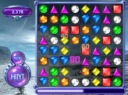 I didnt really aim for the sci-fi, I felt having a sphere for button (thats what gives of the sci-fi look right?) would fit with the stones on the field, then added the little decal to fill up the screen a bit more. I don`t really see the fantasy so curious about that. I also noticed, these game are way bigger then mine in term of grid/screen size. I want to make it mobile ready, but I should maybe start making a Pc screen version. (with that I guess I could make more space.) So thanks, please tell me how you think i could pull something more appropriate with the above exemples. |
|
|
|
|
Logged
|
|
|
|
blinkok
Level 1
|
|
« Reply #14 on: May 09, 2013, 05:10:41 PM » |
|
if you look at all those images they are very saturated (full of colour). they also have very dark areas right next to the colour (which makes it look even more bright).
now look at your stones (the fantasy element), they look washed out and desaturated.
the way they achieve the saturated effect is to make sure every part of the jewel/block is very close to the full saturated colour, so the highlights are not white but a slightly lighter version of the primary colour and the shadows are a slightly darker version of the primary colour.
the colour behind the blocks/jewels in EVERY case is black.
when working with colour it is always best to work in HSB (hue, saturation and brightness), not RGB.
one other thing they do to inject colour is hue shifting. when you colour the highlights and shadows make sure you change the hue a little.
ps: i would say the theme for the first one is abstract, the second one is sci-fi and the third one fantasy
|
|
|
|
« Last Edit: May 09, 2013, 05:45:35 PM by blinkok »
|
Logged
|
|
|
|
|
Joh
|
|
« Reply #15 on: May 10, 2013, 06:02:54 PM » |
|
Your making some very good observations, I think ill try an overhaul.
Redo the stones(more saturated), go with the dark behind grid, change the hud, perhaps even go Pc game style (way bigger like the bejeweled and second tetris shot)
Is more than a color for the stones alright? like the red one is actually red & yellow, the green one green and cyan, by making the more saturated I guess it`d make it more visible
|
|
|
|
|
Logged
|
|
|
|
blinkok
Level 1
|
|
« Reply #16 on: May 11, 2013, 03:38:08 PM » |
|
more than one colour is much better. similar to the hue shifting i was talking about.
|
|
|
|
|
Logged
|
|
|
|
|
Joh
|
|
« Reply #17 on: May 11, 2013, 09:36:52 PM » |
|
Ok, So I havent redone the Hud yet, but i did move stuff around and make a bigger play room. I also changed the stones, definitely more eye popping, although its slightly weird with the lighter background hues (like cyan).  hope it looks better... For the layout I think ill keep it that way, change the sphere button by a wide rectangle one, with a transparent dark (like behind the stones) rectangle placed behind the texts. |
|
|
|
|
Logged
|
|
|
|
blinkok
Level 1
|
|
« Reply #18 on: May 11, 2013, 11:32:17 PM » |
|
much better i think! very bright and colourful!
yes i think change the break button. i'd google (images) for "interface button" and see if you like anything there
it really does look good with the stones, background and all. great job!
|
|
|
|
|
Logged
|
|
|
|
|
Joh
|
|
« Reply #19 on: May 15, 2013, 04:40:44 PM » |
|
Ok, been a bit more busy, but managed to do some little modifications... So I changed the button into a rectangle one and added dark rectangles behind the texts.  also gave them some simple colorful explosions! that doesnt show on the picture of course. Do you think the green stones looks alright? should i change it to dark green & green, instead of cyan, i think it looks slightly weird. does it look better? also how should I go about reducing the number of columns.. shrink the whole thing? add more empty space? id like to go 6*8.. |
|
|
|
|
Logged
|
|
|
|
|
 Developer
