koiwai
Level 1


|
 |
« Reply #380 on: January 20, 2015, 09:38:39 PM » |
|
Good luck with finding an artist!  At these small sizes I wonder if a style of more solid shapes (rather than the outlined style in the prototype sprites) would work better. I'm not sure there is enough space for some objects otherwise.. Yeah, I agree that solid shapes should probably work better. The edges between differently colored areas can describe the form of the object. Smething like this, I guess:  Good luck with finding the artist! The task does not sound very standard for pixel artists, but on the other hand it makes it interesting. |
|
|
|
|
 Logged
|
|
|
|
|
Kyzrati
|
|
« Reply #381 on: January 20, 2015, 09:51:42 PM » |
|
Thank you for the references, nice look you've got there! I've received some concepts so far, and I'm sure more are on the way. I'll eventually put some up for discussion/fun.
One thing to remember is that individual players will not be seeing all the different sizes, as they'll generally pick a size and stick with it (not to mention the larger sizes won't even fit on small/medium desktops), so for these players larger sprites cannot serve as references for the smaller ones, which essentially have to stand on their own.
(By the way koiwai, Wanderers is looking good as usual.)
|
|
|
|
|
Logged
|
|
|
|
|
happymonster
|
|
« Reply #382 on: January 21, 2015, 03:30:49 AM » |
|
That looks good koiwai |
|
|
|
|
Logged
|
|
|
|
|
Christian
|
|
« Reply #383 on: January 24, 2015, 07:27:01 AM » |
|
I've probably asked already, but I don't recall at the moment: do you have plans for a Kickstarter?
|
|
|
|
|
Logged
|
|
|
|
|
Kyzrati
|
|
« Reply #384 on: January 24, 2015, 03:32:37 PM » |
|
I considered it for quite a while, and may have actually gone through with it if actually available in my own country. Instead, the alpha launch will be a sort of privately run crowdfunding campaign with only one or two tiers.
|
|
|
|
|
Logged
|
|
|
|
|
Kyzrati
|
|
« Reply #385 on: January 26, 2015, 04:47:04 PM » |
|
Tileset Concepts, an Open Poll[Cross-posted from the devblog here--follow link for better formatting and light-on-dark style.]The response to last week's advertisement for a pixel artist was overwhelming. I did expect a fair number of random artists from art forums just forwarding their portfolio, and certainly got that, but there were also a good number of applicants genuinely interested in the project itself. In total the ad had nearly 1,000 unique views, attracting 34 applicants. Of those, 17 provided concepts for a Cogmind tileset, which I'm sharing with you today (anonymously!). Of those who didn't provide concepts, 5 are qualified candidates to consider for hiring if we don't find any initial concepts that are already on their way to being a good fit for the game. But first, let's look at the concepts. Naturally these grayscale samples will feel somewhat different once colored in game, but the results will still be monochrome, painted with a fully-saturated color of varying brightness to reflect the tile's shading (if any). The list--order is random, click to open the image and make sure to zoom it to 100% size for details: 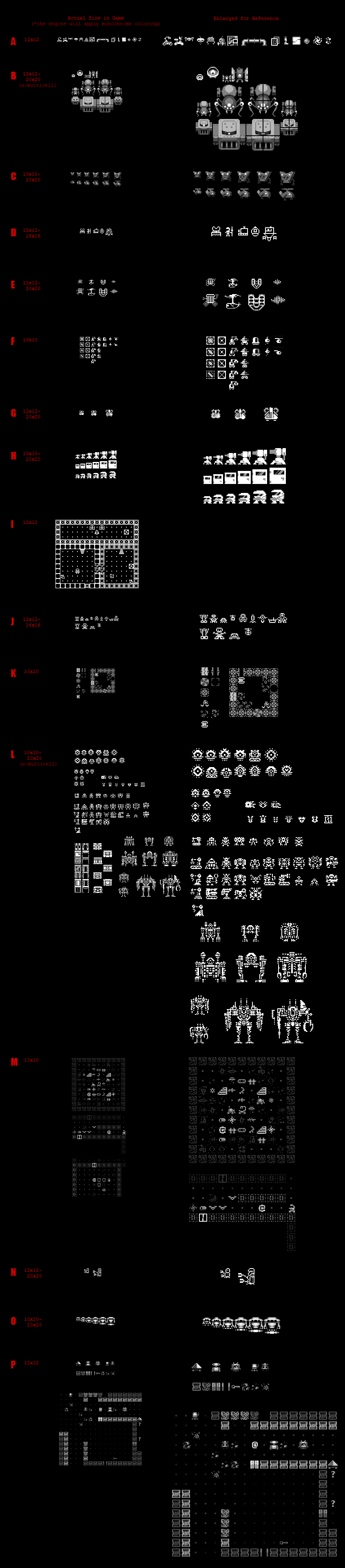 I'm not making my own criteria or critiques public yet, hoping to instead hear what you all have to say. Some of you (those not using ASCII) will be the ones to actually use these, so I want your input. Have opinions? Favorites? Suggestions or preferences regarding style? Which of the above samples would you like to see expanded to become the game's tileset and, more importantly, why? Leave a comment here or at any of the many other locations this post is mirrored. Next StepsIf enough of you concur that some of these concepts are something you'd like to see in the game, the selection process will continue as I contact those artists to work out the details, as well as compare candidates based on other criteria, like experience and, um... cost  Bonus Art Bonus ArtWhile we were only interested in concepts for tilesets, some applicants provided samples of other kinds of art, some of it pretty cool... This wasn't required, but let's not let those efforts go to waste :D. These are all different takes on my ASCII art for Cogmind: 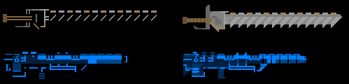 Chainsword and Quantum Rifle partially pixelized by Linus Chan. 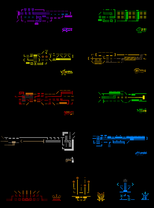 Mini-pixelized weapons and components by Gurkan Te ( ShroomArts).
|
|
|
|
|
Logged
|
|
|
|
|
Kyzrati
|
|
« Reply #386 on: January 26, 2015, 04:48:05 PM » |
|
koiwai, look closely and you'll notice I actually included your robot design in there ('G' for everyone else who didn't catch it earlier). I *really* like that style and wish I could see more :D. It's actually pretty close to what I was originally imagining, closer than I think any of the other concepts have come (it is only one robot, but still...). I have no idea if you'd consider actually doing the art given that you have your own cool roguelike project going, but I thought to include it so readers at other outlets could see and perhaps comment on the style  As a side note, whenever I look at it I imagine it as a good candidate for the Researcher. It even looks kinda like a test tube--bonus points! |
|
|
|
|
Logged
|
|
|
|
|
Zorg
|
|
« Reply #387 on: January 27, 2015, 08:44:15 AM » |
|
Tough decision. I like many of these designs. To get a feeling how these sprites would look in the game i made a mockup and added one 12x12 sprite from each artist in the old environment (cyan overlay):  In my optinion, the best results are sprites which are based on blocky shapes instead of single lines and at least one gray tone in addition to pure white. In the right corner i tried to add one gray tone to a line-only robot to connect the parts to one shape. Some of the sprites are a bit too dark, but well made. I'd pick a design which tries to show real robots and does no resemble symbols for robots (which is very difficult in small sizes, of course). Edit: 10x10 is too small, imho. |
|
|
|
« Last Edit: January 27, 2015, 01:50:47 PM by zorg »
|
Logged
|
|
|
|
koiwai
Level 1
|
|
« Reply #388 on: January 27, 2015, 11:27:26 AM » |
|
Hi, cool sprites! You've got many options to choose from! I think, my favorite is P. The robot designs look easily distinguishable from each other. I think, they will work very well once you color the sprites. The author was not economical with different shades of grey, but I think, that's fine, these smooth sprites look good and legible in small scale (only the wall tile is a bit too busy for my tastes). I even think that such smooth tiles may be an interesting alternative to the crispier ASCII graphics.. The next favorite is A. The third is B. Oh, this is very flattering to hear that you liked my robot and included it in the poll!  I would enjoy making graphics for the game, that's for sure, although I feel that may not be up to the task, and this is why I did not really apply for it. But I will do my best to make an unofficial tileset, when there is no time pressure or obligation to get it done  I liked a lot those mini pixelized weapons by Gurkan Te, btw. |
|
|
|
|
Logged
|
|
|
|
|
JobLeonard
|
|
« Reply #389 on: January 27, 2015, 03:16:57 PM » |
|
This is seriously hard to choose from, although I would go for readability - some of these have cool robots that aren't super-easy to distinguish (although I guess in the game they would get some colouring to help out there)
|
|
|
|
|
Logged
|
|
|
|
|
Kyzrati
|
|
« Reply #390 on: January 27, 2015, 04:18:37 PM » |
|
Tough decision. I like many of these designs. To get a feeling how these sprites would look in the game i made a mockup and added one 12x12 sprite from each artist in the old environment (cyan overlay): In my optinion, the best results are sprites which are based on blocky shapes instead of single lines and at least one gray tone in addition to pure white. In the right corner i tried to add one gray tone to a line-only robot to connect the parts to one shape. Some of the sprites are a bit too dark, but well made. I'd pick a design which tries to show real robots and does no resemble symbols for robots (which is very difficult in small sizes, of course). Edit: 10x10 is too small, imho. Thanks, zorg! I want to go back and do this with some of the more promising sets, though cutting down the group is going to be fairly difficult since almost every design has multiple people rooting for it  I agree that 10x10 is tough to impossible, so depending on the final artist/style I may leave that particular one ASCII only. My original idea was also to rely on blocky shapes and only two shading levels, full white plus one shade of gray. It's funny you had the *exact* same idea I did about taking 'L' and adding one more shading level to improve the look! I was going to do that myself soon for a bunch of the robots just to see how that would look on a map. Hi, cool sprites! You've got many options to choose from!
So many Oh, this is very flattering to hear that you liked my robot and included it in the poll! I would enjoy making graphics for the game, that's for sure, although I feel that may not be up to the task, and this is why I did not really apply for it. But I will do my best to make an unofficial tileset, when there is no time pressure or obligation to get it done That'd be awesome! You could also opt to significantly reduce the workload in that case since you could do *one* size, which may open up the design possibilities a little more. This is seriously hard to choose from, although I would go for readability - some of these have cool robots that aren't super-easy to distinguish (although I guess in the game they would get some colouring to help out there)
It is hard, and asking for opinions certainly isn't making it easier! Almost every design is supported by more than one person, all with good reasoning. Unfortunately the coloring won't help a huge amount in terms of bringing out detail on the robots, if only because there is no use of multiple colors which helps a lot with regular sprite work, but it will help distinguish some robots from one another since they'll be different colors in some cases. However, all "combat robots" of the main enemy faction for example use the same color scheme so they really need to look different. |
|
|
|
|
Logged
|
|
|
|
|
JobLeonard
|
|
« Reply #391 on: January 28, 2015, 04:08:01 AM » |
|
I'm actually not talking about distinguishing details so much, quite the opposite in fact: I meant readability more in terms of scanning the map at a glance and seeing what's going on. Some sprites are better suited for that than others, I think.
|
|
|
|
|
Logged
|
|
|
|
|
Kyzrati
|
|
« Reply #392 on: January 28, 2015, 04:20:55 AM » |
|
I'm actually not talking about distinguishing details so much, quite the opposite in fact: I meant readability more in terms of scanning the map at a glance and seeing what's going on. Some sprites are better suited for that than others, I think.
I wasn't sure which you were referring to, so I was trying to address both in the same. Any specific suggestions? You're like the only person out of dozens who hasn't mentioned specific letters |
|
|
|
|
Logged
|
|
|
|
|
Zorg
|
|
« Reply #393 on: January 28, 2015, 05:36:57 AM » |
|
I'd prefer L with the shading of O. |
|
|
|
|
Logged
|
|
|
|
|
Kyzrati
|
|
« Reply #394 on: January 28, 2015, 05:56:01 AM » |
|
I'd prefer L with the shading of O. :D I kinda got that from your mockup. I've been thinking the same thing, purely in terms of style anyway. There are are a few other behind-the-scenes considerations that make L a little less likely. I love the idea of adding another layer of shading to L, though... We'll see how the bigger mockup comparison goes. This whole artist thing is going to require a bit more work than I planned for |
|
|
|
|
Logged
|
|
|
|
|
JobLeonard
|
|
« Reply #395 on: January 28, 2015, 06:17:18 AM » |
|
There's good stuff in each of them, but none of them stand out to me enough to really warrant a vote. I can comment on what I dislike. First, none of the wall and floor tiles appeal to me. I think wall tiles should: - draw less attention than the robots running around in the room. Using darker shades of grey is appropriate, I think. Less "busy" tiles are also more appropriate (not the same as visual noise, which can work either way).
- visually merge into each other to form whole wall sections. Some distinction to make it possible to count lengths is good, but again most of the tiles shown are high-contrast.
With that in mind, I think the wall displayed by M on the bottom right is the only one that comes close, but I don't really like the design: it looks more like a cave wall than the wall of a base). The reason I never complained about these issues with the # is because the glyph has enough empty space surrounding it to give it some breathing space and not feel too busy, while the horizontal/vertical lines still suggest some connection between them. Similarly I want to vote against using L, because of the aforementioned readability issues. While the style is pretty to look at, it's cramming too much information in too few pixels, with the differences between sprites relying on subtle variations. It's literally much more effort to process the visual information in them. If you compare that to the sprites of, say, A or F, where the visual style is simpler in that it relies much more on the sprite as a whole than on the individual pixels, the latter two are much easier to read. |
|
|
|
|
Logged
|
|
|
|
|
Kyzrati
|
|
« Reply #396 on: January 28, 2015, 06:39:02 AM » |
|
Thank you for that detailed analysis. I especially like what you have to say about L. One of the other concerns I voiced elsewhere was that once you have a lot of the L sprites together in one area, it becomes a big jumble of pixels that are difficult to distinguish. The walls are definitely going to be tricky, but fortunately walls are pretty easy to make anyway, so we'll figure something out via iteration. It's even easier that each floor only has *one* type of wall glyph, with no variation whatsoever. They're definitely something we want to make sure is just "secondary visual information." I wasn't too interested in seeing submissions for walls, since they're a small minority of the tileset overall--robots and items are where it's at. Though interestingly almost no one provided item concepts, which are just as important... What I'm going to do for the next/final round is collect the many good arguments for and against certain style choices and include them along with the colored mockups so people have more context. This time was a "let's post everything I've got here and do a blind test full of assumptions" sort of thing . Lots of valuable discussion! Seeing as you wouldn't vote for anything here, but you mention A and F, how would you improve them? Since you mention they do already espouse the simpler style. (Or if you want to leave it at just not liking any of them I can understand that, too ) |
|
|
|
|
Logged
|
|
|
|
|
JobLeonard
|
|
« Reply #397 on: January 28, 2015, 11:49:21 AM » |
|
It's not that I don't really like them - they all have their own charm. It's just that none of them really feel Cogmindy enough (the pixelated weapons perform much better in that regard, but we weren't talking about them). And I really wouldn't know what the best way is to nail that aesthetic in sprite form.
Simple clean geometric line art with a bit of filling?
|
|
|
|
|
Logged
|
|
|
|
|
Kyzrati
|
|
« Reply #398 on: January 28, 2015, 04:14:08 PM » |
|
I see what you mean--that's a very meaningful comment coming from someone who's been following the project for a very long time I'd have to agree on that. I would think that L comes closest to being Cogmindy (by sheer coincidence--that particular artist happens to always use that pixel art style). Mostly due to its emphasis on pure shape and overall flatter "I'm printed on a retro UI" look. Though we've also identified its other problems. What you're suggesting sounds almost like it would end up being an "alternative ASCII," an extremely simple symbolic representation. I think that's what attracted me the most about koiwai's sample (though it still falls under the sprite category). That was something I was considering early on, assuming sprites might not actually work well at such a small size. Unfortunately none of the applicants decided to take that approach, but I guess that would require more direction from me, while the submissions are mostly in line with what we think of as pixel art for roguelikes/games. It would be difficult to ask for something like that at this stage, though maybe whatever artist is chosen could play with that idea. |
|
|
|
|
Logged
|
|
|
|
|
JobLeonard
|
|
« Reply #399 on: January 29, 2015, 12:50:41 PM » |
|
Yes, I agree that L comes closest - and it is aesthetically pleasing (and seriously, I think most of them are). It just has readability issues.
About giving stronger direction: I think that when you are asked to create a matching tile set for an upcoming Roguelike that, among other things, stands out for it's amazing, distinct ASCII aesthetics, it's only fair to be asked to do you homework and do justice to the style.
The key is to then make that style your own, blend it with your own strengths and skills.
Ironically, the one I like the most aesthetically on its own terms is B, but that one is the least "Cogmindy of all! I fear it would totally ruin the mood as it is.
|
|
|
|
|
Logged
|
|
|
|
|
 Community
