Paul
Level 1


|
 |
« Reply #160 on: May 30, 2014, 04:15:40 AM » |
|
Looks great so far and I'm loving the detailed updates! Definitely one of my favourite devlogs
|
|
|
|
|
 Logged
|
|
|
|
Green Gospod
Level 1
|
|
« Reply #161 on: May 30, 2014, 06:55:09 AM » |
|
This game looks quite fun, though the player's face really bothers me. Ignorantly enthusiastic boy, with a big happy smile and it's curious big eyes that never blink. What the hell is he doing in such a dark robotic wasteland? I mean, I know what, he's blowing up barrels with a hammer...
|
|
|
|
|
Logged
|
|
|
|
|
Bakuda
|
|
« Reply #162 on: May 30, 2014, 11:07:38 AM » |
|
This looks awesome! I absolutely love Spelunky and can see where that was a big inspiration for this. I actually disagree with the previous post...I love the cheesy smile.
|
|
|
|
|
Logged
|
|
|
|
|
adnzzzzZ
|
|
« Reply #163 on: May 30, 2014, 11:52:11 PM » |
|
What the hell is he doing in such a dark robotic wasteland? I mean, I know what, he's blowing up barrels with a hammer...
I am HIGHLY autistic about world building in general and reasons as to why things and people are in the places they are. Right now it doesn't make much sense because we're still building the base of the game, but once we start focusing on content and presentation alone things will come together more clearly. I added room transitions and persistence between rooms:  as well as a minimap:  The map won't be like placed like that in the final game, it's just overlayed like that for testing... Anyway, the way rooms work is that, for various reasons, with the way I coded things, I only have one active room at a time. In the future I'll change this but for now this is how it is. Having only one active room limits me a bit: I can't do smooth transitions between rooms with the camera tweening from one to the other, because as soon as I change to the next room I have to remove the stuff from the previous one. This means that transitions have to be sort of abrupt and sudden. This isn't entirely bad though: if the room sizes are big enough, since it's always instantaneous, people never seem to notice it. A game that does this is Rogue Legacy:  In terms of transitions, the main difference from Rogue Legacy's gif and our game's is that in ours the borders from one room to the other are visible. On top of that, the "void" in which each room is placed in is also visible. This creates a sort of discontinuity in the world that shouldn't exist, so we need to fill it with either more tiles in all directions or something else that would make sense, like rocks or dirt. |
|
|
|
|
Logged
|
|
|
|
|
adnzzzzZ
|
|
« Reply #164 on: June 02, 2014, 02:19:01 PM » |
|
Added a bunch of stuff that gets me closer to having the high level structure of the game ready for something playable. http://gfycat.com/WarlikeMaleHornedtoad(video is kinda slow at the start because my computer sucks at recording) The loading screen is there because the dungeon generation algorithm takes a while to be ready, since it has to save/load a bunch of files containing each room, and that's always slow. But now at least we can edit levels as we play the game, i.e. you're playing and you see that a room has a problem, so just click the "Edit" button, edit the room, save it and then go back to playing. The nature of having randomized rooms makes this approach easier than just making maps separately and then seeing how they play together. |
|
|
|
|
Logged
|
|
|
|
|
matwek
Guest
|
|
« Reply #165 on: June 08, 2014, 01:54:21 AM » |
|
I've started adding in some broken and damaged tiles to mix things up a bit. What do people prefer? Bright & in your face or Muted & slightly atmospheric? 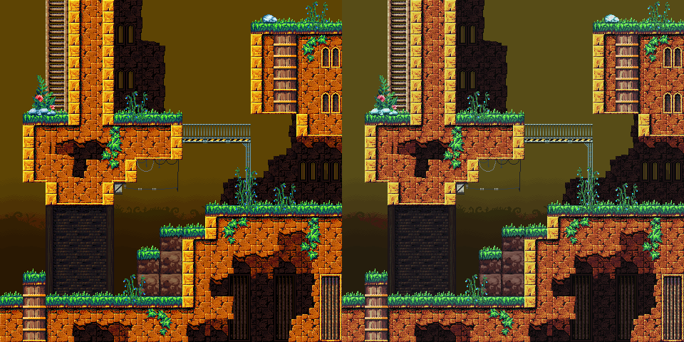 |
|
|
|
|
Logged
|
|
|
|
|
Triturus
|
|
« Reply #166 on: June 08, 2014, 02:05:44 AM » |
|
It all depends on where you want the attention to be but for terrain like that I'd say the muted colors are better, otherwise it's very eye catching which can be a good or a bad thing depending on your intentions.
|
|
|
|
|
Logged
|
|
|
|
Green Gospod
Level 1
|
|
« Reply #167 on: June 08, 2014, 03:07:12 AM » |
|
I've started adding in some broken and damaged tiles to mix things up a bit.
What do people prefer? Bright & in your face or Muted & slightly atmospheric?
Personally, because of the setting, I'd prefer everything to be slightly less bright though. I suggest you take all the tiles and open them in something like Photoshop, then just paint over with different opaque and transparent colors or use different filters and layer effects. That way you'll quickly see many different looks for your game. Doing this changed the whole tone of my game to the better. This game looks quite fun, though the player's face really bothers me. Ignorantly enthusiastic boy, with a big happy smile and it's curious big eyes that never blink. What the hell is he doing in such a dark robotic wasteland? I mean, I know what, he's blowing up barrels with a hammer...
I've meant this in the best of ways. I like when characters are ridiculous or not your typical heroes. Right now he looks like some deranged miner's kid that got lost, but he's still cheerfully and ignorantly exterminating everything in his path.  Other way would be to make him a badass miner, that adds plates of armor to his attire as he grows stronger. |
|
|
|
|
Logged
|
|
|
|
|
matwek
Guest
|
|
« Reply #168 on: June 08, 2014, 03:55:41 AM » |
|
I've meant this in the best of ways. I like when characters are ridiculous or not your typical heroes. Right now he looks like some deranged miner's kid that got lost, but he's still cheerfully and ignorantly exterminating everything in his path. Other way would be to make him a badass miner, that adds plates of armor to his attire as he grows stronger. We've tried a few changes to the character but we haven't settled on anything yet (You can see some of them if you skim back through the topic). The only reason we're still using the kid in shorts is because thats the design we had the most animations finished for, and we didn't want to do the full set of animations again until we decide on the redesign. That being said, I think we're likely to be keeping the cheerful bouncy look and feel of the main character. Just changing the outfit and hair/hat. |
|
|
|
|
Logged
|
|
|
|
|
adnzzzzZ
|
|
« Reply #169 on: June 09, 2014, 02:12:40 AM » |
|
I made a text lib that let's me act on individual characters from a text, applying effects to them. For instance, this:  Becomes this:  c.position contains the position of each character, so you use that to increase a character's red value and you get that. You can do more though:  Using a periodic function you can make each character look kinda wavy, and then you apply that to certain parts of the text and:  You can also apply it to the whole text and you can combine multiple effects:   You can pass parameters from the text itself:  And then do whatever with them in the appropriate function. In this case I'm passing a set color, so the output looks like this:  Also line breaks and escaping special characters ([, ], (, ) and @, which is the escape character):   And you can also set line heights and wrap widths:   Since any function is available and you're only limited by your own imagination, you can go pretty bananas:  |
|
|
|
« Last Edit: June 09, 2014, 02:42:27 AM by adnzzzzZ »
|
Logged
|
|
|
|
|
matwek
Guest
|
|
« Reply #170 on: June 25, 2014, 01:50:21 PM » |
|
Trying out a new robot design...  Not sure what his attack will be yet. |
|
|
|
|
Logged
|
|
|
|
|
ekun
|
|
« Reply #171 on: June 25, 2014, 09:40:08 PM » |
|
This game makes me want to learn LOVE. Keep up the good work guys  |
|
|
|
|
Logged
|
|
|
|
|
matwek
Guest
|
|
« Reply #172 on: July 09, 2014, 07:44:08 AM » |
|
Started doing some Sprite Lamp tests. Its a lot of work but I think we can probably use it to good effect. Here is a test I posted in the GIFs topic.  I'm going to have a go at doing the same with some of our tilesets to see what I can come up with. Starting basic and adding stuff as I go. |
|
|
|
|
Logged
|
|
|
|
Green Gospod
Level 1
|
|
« Reply #173 on: July 09, 2014, 09:31:33 AM » |
|
That looks freaking awesome!  How do you do this? A different sprite for every direction? (that seems like lots of work) |
|
|
|
|
Logged
|
|
|
|
|
collider
|
|
« Reply #174 on: July 09, 2014, 09:49:59 AM » |
|
He did it with normal maps. You paint lighting profiles for front, top, bottom and sides, then run them through Spritelamp (there are other programs and ways you can do this, @matwek mentioned he used Spritelamp - I just happen to be using it right now as well, so thought I'd post) to get a proper normal texture. You then use a shader (I'm using Unity, easy once the shader is written) to react to the normal map. Here's the URL if you want to know more: http://snakehillgames.com/spritelamp/ |
|
|
|
|
Logged
|
|
|
|
|
matwek
Guest
|
|
« Reply #175 on: July 27, 2014, 08:04:29 AM » |
|
Trying to get the tilesets to work with SpriteLamp has been a real pain. Thats not to say the program isn't great, its just that as we already had a lot of the tilesets finished its getting tricky to get Sprite Lamp to come up with the same results. Its taken a fair bit of trial and error but I think I think I'm getting much closer to a version that looks similar to our original sprites but takes into account the lighting. What do you think? bearing in mind that its just a blank wall, it should look much better once I tweak it a bit more and we start adding in all the extra tiles and decorations we have.  |
|
|
|
|
Logged
|
|
|
|
|
SolarLune
|
|
« Reply #176 on: July 27, 2014, 08:46:37 PM » |
|
That looks great. The only thing is that it seems like it's not really influencing the diffuse color of the bricks - just the specularity of the edges. Otherwise, it's pretty solid!
|
|
|
|
|
Logged
|
|
|
|
|
matwek
Guest
|
|
« Reply #177 on: August 11, 2014, 01:35:41 PM » |
|
That looks great. The only thing is that it seems like it's not really influencing the diffuse color of the bricks - just the specularity of the edges. Otherwise, it's pretty solid!
Thanks. That was actually the plan, I didn't want to go 'full on' with the SpriteLamp effect, just add some extra touchs to the look of the game by having things highlighted by bright lights and explosions. I've also been messing with some Photoshop effects, nothing too fancy, just trying to find a style for the game that we can finalise. 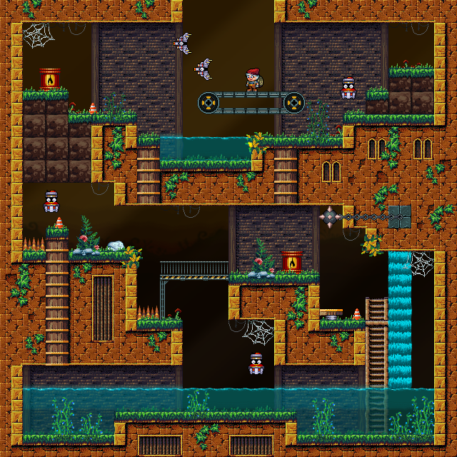 |
|
|
|
|
Logged
|
|
|
|
|
matwek
Guest
|
|
« Reply #178 on: August 15, 2014, 10:02:21 AM » |
|
Trying some new vegetation tiles and a wooden box... 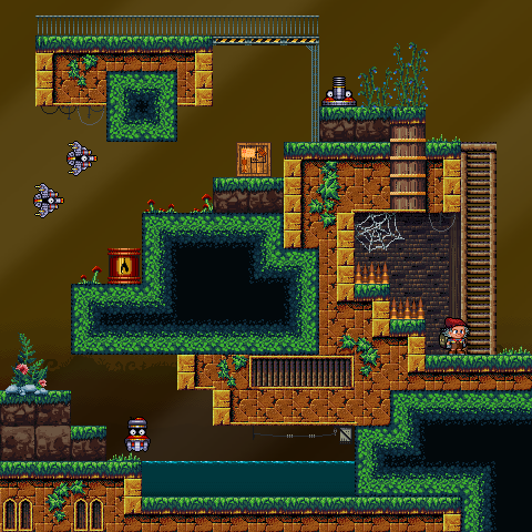 |
|
|
|
|
Logged
|
|
|
|
|
TheChaoticGood
|
|
« Reply #179 on: August 15, 2014, 04:16:31 PM » |
|
ok, I have to call you out. This game looks way more then 0% done.
|
|
|
|
|
Logged
|
|
|
|
|

