|
Demon Lizardman
|
 |
« Reply #10260 on: June 04, 2014, 01:23:55 PM » |
|
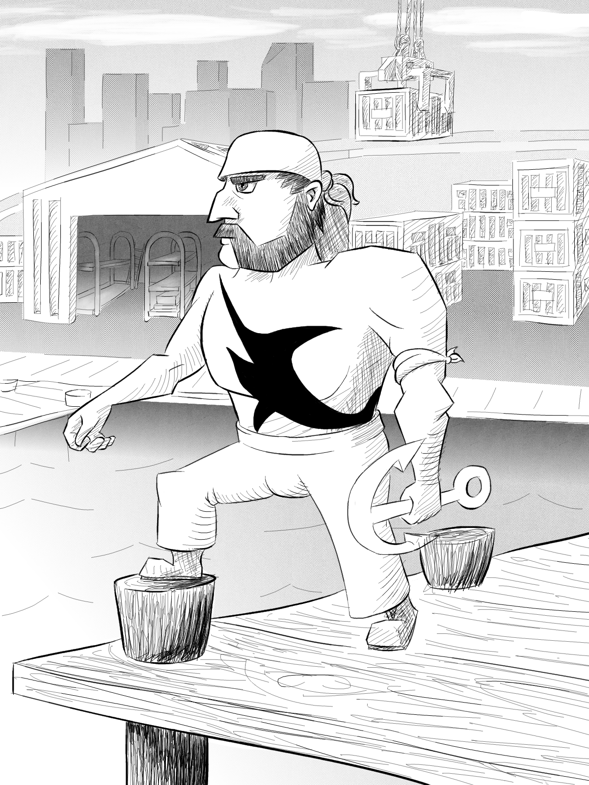
Tried using the chalk brush for my next piece  |
|
|
|
|
 Logged
|
|
|
|
|
McMutton
|
|
« Reply #10261 on: June 04, 2014, 11:49:58 PM » |
|
Nice one, Mankoon; me likey. Aaand I'm suddenly quite rusty; this took far longer than it should have.  |
|
|
|
|
Logged
|
|
|
|
|
Blambo
Guest
|
|
« Reply #10262 on: June 05, 2014, 07:03:04 AM » |
|
Tried using the chalk brush for my next piece great lighting on the hands! Will you go back with detailing and rendering? |
|
|
|
|
Logged
|
|
|
|
|
Demon Lizardman
|
|
« Reply #10263 on: June 05, 2014, 08:29:32 AM » |
|
Today I will get close up with the details, also thanks, hands are a pain to do.
|
|
|
|
|
Logged
|
|
|
|
|
Geti
|
|
« Reply #10264 on: June 05, 2014, 08:31:44 AM » |
|
 A more "practical" take on link - done while listening to Ephixia's Zelda remixes. Not so happy with how the sword turned out but I've really got to sleep :^) Wanted to make him a little bit less of a pretty boy than he has been in recent games; darker hair and a big nose, unshaven. Might play around with armoured link designs if I get some time over the next month or so... It might slip my mind of course. |
|
|
|
|
Logged
|
|
|
|
|
Cellusious
|
|
« Reply #10265 on: June 05, 2014, 11:31:17 AM » |
|
|
|
|
|
|
Logged
|
|
|
|
|
Blambo
Guest
|
|
« Reply #10266 on: June 05, 2014, 01:14:44 PM » |
|
Tried using the chalk brush for my next piece Today I will get close up with the details, also thanks, hands are a pain to do.
Something that can get neglected is the fact that skin isn't just one color or color ramp, there's also lots of blue and green local colors because of veins and stuff. There's enough color variation in there as it is though. |
|
|
|
|
Logged
|
|
|
|
|
Geti
|
|
« Reply #10267 on: June 06, 2014, 05:57:01 AM » |
|
@Cell: I thought you said less abstract on twitter  interesting forms though.  More Link stuff, at the opposite end of the day. Younger one, kokiri style. Need to do more clothes studies I think cause the tunic feels weak, but oh well. I know I said I'd do armoured stuff but hey, this came to my mind more than that kind of stuff, bad luck :^) |
|
|
|
|
Logged
|
|
|
|
|
Cellusious
|
|
« Reply #10268 on: June 07, 2014, 07:24:51 AM » |
|
|
|
|
|
|
Logged
|
|
|
|
|
gimymblert
|
|
« Reply #10269 on: June 08, 2014, 03:28:36 PM » |
|
awesome +100
level up!
|
|
|
|
|
Logged
|
|
|
|
|
Landshark RAWR
|
|
« Reply #10270 on: June 08, 2014, 08:33:38 PM » |
|
 something I forgot to post after making some time ago now. I though I would post it now because I'm starting another manga style thingy |
|
|
|
|
Logged
|
|
|
|
|
McMutton
|
|
« Reply #10271 on: June 09, 2014, 07:45:11 AM » |
|
Crosspost from my KoE thread. Sketched up a design for mounts that the characters use for mid-distance travel; basically the equivalent of horses or Loftwings.  These things sit somewhat like cats, so the things on the back of the saddle act as stair steps that allow for easy mounting. Steering is mainly done by leaning in whatever direction you want to go and allowing the creature to correct itself. |
|
|
|
|
Logged
|
|
|
|
|
Jad
|
|
« Reply #10272 on: June 10, 2014, 02:44:56 AM » |
|
lineart wip  it's for scrolls omg I'm spoilering youuuu super difficult facial angle btw. do tell me if I've fucked up majorly if I've fucked up only minorly I'm gonna go ahead and finish it up so that my company has reason to pay me EDIT:  |
|
|
|
|
Logged
|
|
|
|
|
|
|
Jad
|
|
« Reply #10274 on: June 10, 2014, 08:07:44 AM » |
|
 color blocking, looking super weird right now, haha. It'll look good when I'm done with it, I hope! eheh |
|
|
|
|
Logged
|
|
|
|
|
Killer Napkins
|
|
« Reply #10275 on: June 10, 2014, 12:55:26 PM » |
|
Finally finished messing with this fella. 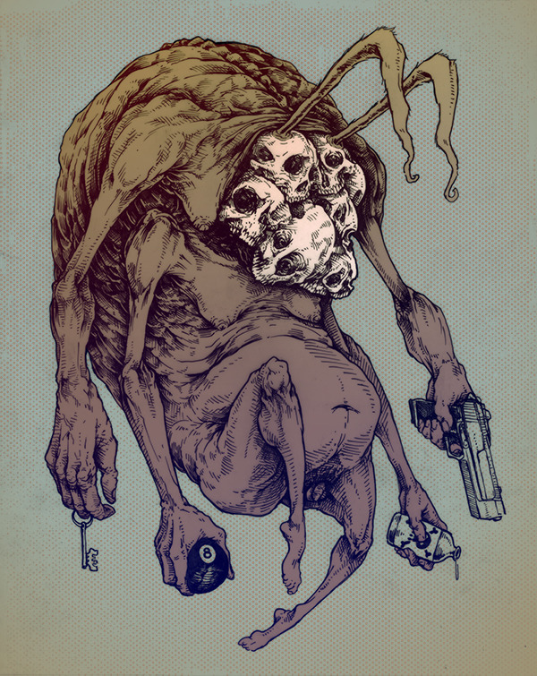 |
|
|
|
|
Logged
|
|
|
|
|
skittlefuck
|
|
« Reply #10276 on: June 11, 2014, 01:06:11 AM » |
|
Wow, pretty terrific design  |
|
|
|
|
Logged
|
|
|
|
|
Jad
|
|
« Reply #10277 on: June 11, 2014, 06:02:39 AM » |
|
More like pretty HORRIFIC design and also super good excellent too! Spammin' this thread right up yo yo more progress   EDIT: also I've been accidentally saving in the lowest possible jpg quality : DDD I'll treat you to a high-res version when I'm done started painting shadow with blue because blue makes more sense (layer blending set to multiply) then I painted all the blue over with red cause I want the light to feel greenish and the shadows to be complementary (in a stylized idea of how light works) and wow, that sure made things feel more interesting! |
|
|
|
|
Logged
|
|
|
|
|
SolarLune
|
|
« Reply #10278 on: June 11, 2014, 07:52:20 AM » |
|
That's pretty cool, Jad. It seems like the shadow on her neck should rise higher to convey her chin being tilted up (with her head back). I think her eyes are oddly, disturbingly open, as well, considering her tilt again. But I'm not really an artist, so I don't really know, haha.
|
|
|
|
|
Logged
|
|
|
|
|
Delicious
|
|
« Reply #10279 on: June 11, 2014, 01:50:35 PM » |
|
re-did this one quickly  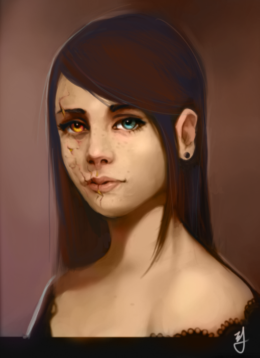 |
|
|
|
|
Logged
|
Blah Blah Blah <3
Twitter - Zjdelicious
|
|
|
|
 Developer
