|
Daray Manning
|
 |
« Reply #10660 on: October 14, 2014, 06:06:13 AM » |
|
|
|
|
|
|
 Logged
|
|
|
|
|
Saturator
|
|
« Reply #10661 on: October 14, 2014, 07:41:18 AM » |
|
Super cool photos!
|
|
|
|
|
Logged
|
|
|
|
|
mankoon
|
|
« Reply #10662 on: October 15, 2014, 07:55:12 AM » |
|
Daray, neat neat. Its awesome when some pipes make me crave cotten candy. <edit> somethings I'm working on.   |
|
|
|
« Last Edit: October 15, 2014, 11:30:10 AM by mankoon »
|
Logged
|
|
|
|
|
ink.inc
Guest
|
|
« Reply #10663 on: October 15, 2014, 11:40:54 AM » |
|
dig the top one mankoon
|
|
|
|
|
Logged
|
|
|
|
|
Raku
|
|
« Reply #10664 on: October 15, 2014, 02:33:35 PM » |
|
(Sorry for this tall post)  |
|
|
|
|
Logged
|
|
|
|
|
rj
|
|
« Reply #10665 on: October 15, 2014, 02:36:36 PM » |
|
dope
|
|
|
|
|
Logged
|
|
|
|
|
Cellusious
|
|
« Reply #10666 on: October 16, 2014, 02:18:13 AM » |
|
|
|
|
|
|
Logged
|
|
|
|
|
Jared C
|
|
« Reply #10667 on: October 16, 2014, 08:39:02 AM » |
|
cell, you should draw your characters in environments or interacting; i like the direction of the last drawing but none of them tell a story
|
|
|
|
|
Logged
|
|
|
|
|
gimymblert
|
|
« Reply #10668 on: October 16, 2014, 10:09:22 AM » |
|
sometimes style trump substance, cell is killing it with style
|
|
|
|
|
Logged
|
|
|
|
|
airman4
|
|
« Reply #10669 on: October 16, 2014, 10:48:54 AM » |
|
Another wip for the video game i'm working on 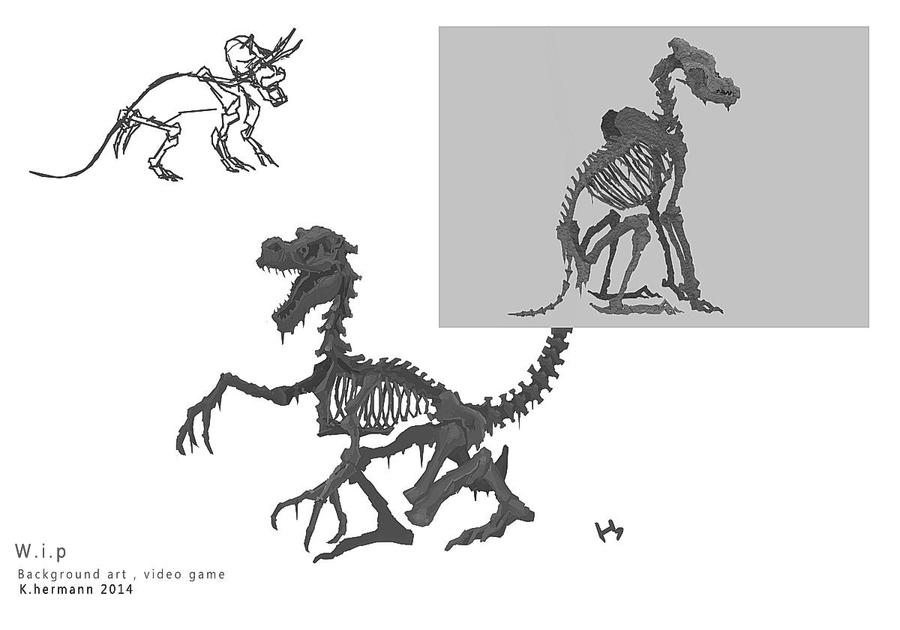 Some tiles for the background , i can't much post final version |
|
|
|
|
Logged
|
|
|
|
|
Demon Lizardman
|
|
« Reply #10670 on: October 17, 2014, 08:46:16 AM » |
|
Did some concept art for a game I am working on.  |
|
|
|
|
Logged
|
|
|
|
|
Blambo
Guest
|
|
« Reply #10671 on: October 17, 2014, 08:49:21 AM » |
|
hm the perspective is all screwy. elements above the horizon line that are parallel to the ground should not be horizontal.
|
|
|
|
|
Logged
|
|
|
|
|
rj
|
|
« Reply #10672 on: October 17, 2014, 08:52:35 AM » |
|
there's some wonky stuff, yeah. mostly with the cliffs (there's one in particular where it kinda draws attention to itself which makes it way worse) i do like the bionicle-y focal point. it's super gross! and i mean that positively. that gives me a gross vibe. reminds me a lot of michael deforge's work |
|
|
|
|
Logged
|
|
|
|
|
Demon Lizardman
|
|
« Reply #10673 on: October 17, 2014, 10:02:59 AM » |
|
I do agree the perspective is a bit off, maybe I should desaturate or move some of the cliffs from the left a bit to make it work more.
Never heard of that guys work, but I definitely see the resemblance. I was thinking of putting more detail in the face, but maybe I should keep it simple.
How do the colors look?
|
|
|
|
|
Logged
|
|
|
|
|
Blambo
Guest
|
|
« Reply #10674 on: October 17, 2014, 10:58:39 AM » |
|
tbh it almost looks like you painted it in black and white, then overlaid a single color on a separate layer without thinking about hue shifting, atmosphere, reflection, etc. that method works fine if you know what to do though.
I would add more variation in the hue of the shadows and midtones and stuff
|
|
|
|
|
Logged
|
|
|
|
|
Demon Lizardman
|
|
« Reply #10675 on: October 17, 2014, 11:48:08 AM » |
|
tbh it almost looks like you painted it in black and white, then overlaid a single color on a separate layer without thinking about hue shifting, atmosphere, reflection, etc. that method works fine if you know what to do though.
I would add more variation in the hue of the shadows and midtones and stuff
Actually, I did the sky first with various kinds of desaturated blues and greens and then started to work on the ground by making it a similar color for some stupid reason. This is a big issue for me when creating paintings with color in general. I mean, I was going for a gloomy depressing look, but I kind of want to improve my colors and make the painting more interesting to look at. I mean, there's nothing wrong with monochrome, but I want to add more color into my pieces because that's kind of what I want to do. So, I should add more color variation to the shadows and midtones and see how it looks. Thanks for the advice, Blambo! Also, I just got the James Gurney Color and Light book, hopefully that will help me improve. EDIT: Added and fixed some things, hopefully it looks better.  |
|
|
|
« Last Edit: October 17, 2014, 12:04:10 PM by Demon Lizardman »
|
Logged
|
|
|
|
|
Malloy
|
|
« Reply #10676 on: October 18, 2014, 01:18:01 AM » |
|
An item I made with a buddy for the Dota 2 workshop!
Dezun Desecrator! There is a concept piece in the title image beneath the description and a 3D turn table! Both 2D and 3D art is available to see  Please rate if ya like!  |
|
|
|
|
Logged
|
|
|
|
|
Cellusious
|
|
« Reply #10677 on: October 19, 2014, 03:04:24 PM » |
|
|
|
|
|
|
Logged
|
|
|
|
|
|
|
ANtY
|
|
« Reply #10679 on: October 24, 2014, 12:49:51 AM » |
|
this is so cool, dood
|
|
|
|
|
Logged
|
|
|
|
|
 Developer
