|
jiitype
Guest
|
 |
« Reply #40 on: February 27, 2015, 03:35:25 PM » |
|
Wow this game has a great atmosphere now. The jump between 2014 and 2015 protos is crazy!
|
|
|
|
|
 Logged
|
|
|
|
|
AD1337
|
 |
« Reply #41 on: February 27, 2015, 04:11:12 PM » |
|
I think blekdar has a point. The minimalistic design of the textbox doesn't match the vibrance of the ingame graphics. It would really help to adjust the design a bit to get it on a similar level.
Thirding this. I love the 3D, but your UI needs a lot of work. The white background with black outline is way too simple and not in an elegant way. The font choice could improve a lot too. |
|
|
|
|
 Logged
|
|
|
|
|
neko.works
|
 |
« Reply #42 on: February 28, 2015, 06:55:09 AM » |
|
Thanks everyone for your replies  @blekdar: Actually there is a border in the 2015 version. It is black, so not visible on this black background. I will try to change the white background though. @uga: Thanks! @ZeroTec, @AD1337: Here's a better shot of the UI dialog, as you can see, there is a transparent part in the top right corner. For the font, I'm using a mono spaced one as it is easier to implement (I'm using my own font display system). But obviously, my UI is not that appreciated  Any suggestions to improve it? A reference game maybe? What font do you suggest? (please click on the image to display it in full screen) 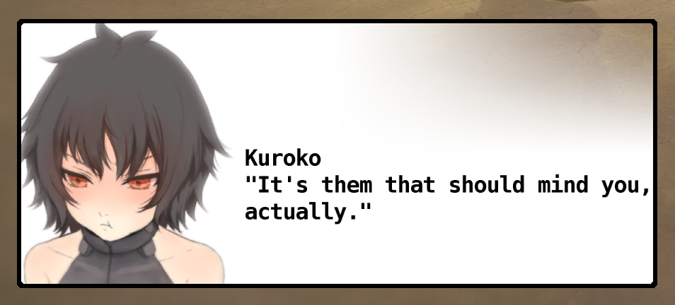 |
|
|
|
|
 Logged
|
|
|
|
|
ZeroTec
|
 |
« Reply #43 on: February 28, 2015, 08:30:21 AM » |
|
But obviously, my UI is not that appreciated  Any suggestions to improve it? A reference game maybe? What font do you suggest? (please click on the image to display it in full screen)  i made a quick mockup to show some ideas. i think your current UI has very bold lines and the huge amount of white is also quite dominant. it just doesn't match the delicate artstyle of your character portraits. another thing: never cut off your characters at the sides/top. they have a right to be shown as a whole ^^  |
|
|
|
|
 Logged
|
|
|
|
|
blekdar
|
 |
« Reply #44 on: February 28, 2015, 08:37:31 AM » |
|
@blekdar: Actually there is a border in the 2015 version. It is black, so not visible on this black background. I will try to change the white background though. @ZeroTec, @AD1337: Here's a better shot of the UI dialog, as you can see, there is a transparent part in the top right corner. For the font, I'm using a mono spaced one as it is easier to implement (I'm using my own font display system). But obviously, my UI is not that appreciated  Any suggestions to improve it? A reference game maybe? What font do you suggest?  I don't want to sound nit-picky, cause I really am enjoying what you have made so far. But for something like RPGs the dialogue bar is key. Take my advice with a grain of salt, but here's what I would suggest. First off, the bars are huge, and take up quite a bit of space. The portraits are very nice, but I feel they add needless bulk to the text bar, and cover up the gorgeous scenery. I could see this fixed one of two ways: Shrink the pic down and do chat bubbles a la Final Fantasy Tactics: http://3.bp.blogspot.com/-vkgFz8lNv5E/UFZ2Zb4v_3I/AAAAAAAAADk/B2AoEgxb5Vw/s1600/FINAL_FANTASY_TACTICS_-_THE_WAR_OF_THE_LIONS_IPA_v1.0.1.jpgOr have the portrait separate of the text bubble, and have a small outline to distinguish it, a la whatever this game is: http://www.gamesetwatch.com/ogre_dialog.jpgSecond, since the game seems dark, the text bubble should have a more contrasting boarder, so it doesn't blend in with the background. The colouring of the bar itself though, could be fairly dark or translucent. Take Secret of Mana here: http://quickman.gameological.com/wp-content/uploads/2012/11/121114_otl_secretofmana_art4.jpgand any Final Fantasy (except tactics, that game is pretty light) http://images.eurogamer.net/2014/usgamer/fflocalization-spot1.pngThere's a clear contrast between the bubble's border and the environment, but the actual bar is darker. Pokemon actually does the opposite due to the game being a lighter tone: http://s989.photobucket.com/user/DictatorCore/media/Chapter%2020/Screenshot_36_zpsf201f392.png.htmlFor text? Umm. Something thing and elegant would look good. The chunky text you got now kind of seems...childish might be the word I'm looking for. Anyways, that's about all I got for now. Hope you can get some use out of it! |
|
|
|
|
 Logged
|
|
|
|
|
jaharley94
|
 |
« Reply #45 on: February 28, 2015, 08:38:29 PM » |
|
Seriously can't wait to play this; the environments look great!
On the text box note, ZeroTec's mock-up looked quite nice...
|
|
|
|
|
 Logged
|
|
|
|
|
neko.works
|
 |
« Reply #46 on: March 01, 2015, 11:45:50 AM » |
|
Thanks everyone  I've prepared a new version for the dialog window. Mostly used the mockup of @ZeroTec, and separated the portrait a la Ogre Battle from @blekdar post. There are a few transparent parts, including soft drop shadows. I've also changed the font, not sure if it is good enough though. BTW, what font did you use in your mockup @ZeroTec? So, here it is, on a pure white background. Looks fine too on the other extreme (black BG). What do you think guys? (please click on the image to display it in full screen)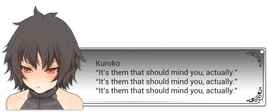 |
|
|
|
|
 Logged
|
|
|
|
|
neko.works
|
 |
« Reply #47 on: March 01, 2015, 04:06:34 PM » |
|
I've completed the implementation in-game. Here's how it looks: (please click on the image to display it in full screen)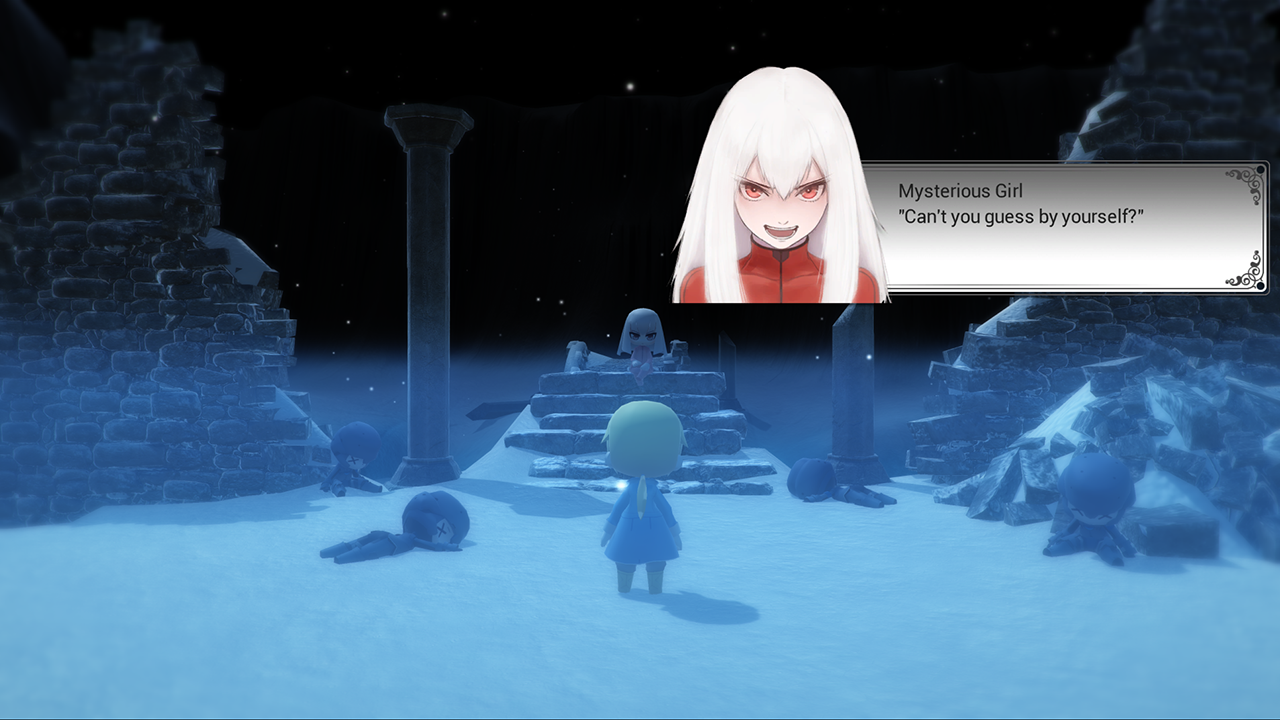 It does look much better now, but can it be improved even more? What do you think guys? |
|
|
|
|
 Logged
|
|
|
|
|
AD1337
|
 |
« Reply #48 on: March 01, 2015, 04:52:45 PM » |
|
It's looking much better now!
|
|
|
|
|
 Logged
|
|
|
|
|
ZeroTec
|
 |
« Reply #49 on: March 02, 2015, 12:29:25 AM » |
|
Thanks everyone  I've prepared a new version for the dialog window. Mostly used the mockup of @ZeroTec, and separated the portrait a la Ogre Battle from @blekdar post. There are a few transparent parts, including soft drop shadows. I've also changed the font, not sure if it is good enough though. BTW, what font did you use in your mockup @ZeroTec? So, here it is, on a pure white background. Looks fine too on the other extreme (black BG). What do you think guys? Hehe, I'm glad that you liked it ^^. I think it helps tremendously to free the characters from the letterbox. Gives them air to breath  Hmm, I don't remember what font I used for the mockup (I think it was Gill Sans), but it doesn't matter that much. I just wanted to point out that a more elegant font would look nicer next to your portraits. |
|
|
|
|
 Logged
|
|
|
|
|
blekdar
|
 |
« Reply #50 on: March 02, 2015, 08:18:06 AM » |
|
That is much better! Elegant and effective, and it doesn't take up a tonne of room. Nicely done!
|
|
|
|
|
 Logged
|
|
|
|
|
Nuprahtor
|
 |
« Reply #51 on: March 02, 2015, 10:50:39 AM » |
|
I've completed the implementation in-game. Here's how it looks: (please click on the image to display it in full screen) It does look much better now, but can it be improved even more? What do you think guys? The straight line under the character's portrait looks kinda off, maybe you can add a gradient with alpha cutoff to the bottom, or make something like that:  |
|
|
|
|
 Logged
|
Thank God For The Rain - a magical neo-noir JRPG - devlog, tumblr |
|
|
|
neko.works
|
 |
« Reply #52 on: March 02, 2015, 12:23:49 PM » |
|
@Nuprahtor: The bottom part of the portrait does look strait, but actually there is a soft drop shadow that makes it look better on clear backgrounds. Here's a new shot where it is more visible: (please click on the image to display it in full screen)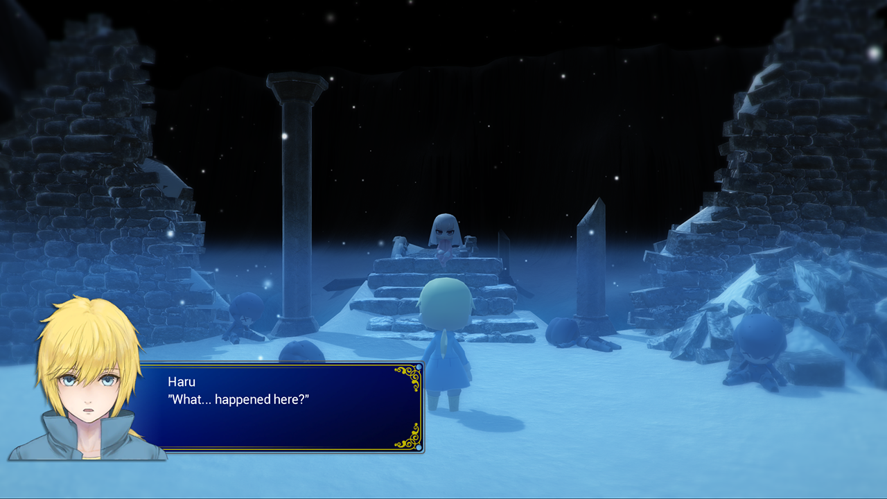 I did try your suggestions, but still prefer the drop shadow version. Also, I've been playing with the UI's color patterns, can you guess what game inspired this one?  I hope blue rectangles are not a Square-Enix patent  Anyway, I'm planning to make many UI themes that the player will be able to choose from. Like in many retro J-RPGs. |
|
|
|
|
 Logged
|
|
|
|
|
neko.works
|
 |
« Reply #53 on: March 26, 2015, 03:01:32 PM » |
|
|
|
|
|
|
 Logged
|
|
|
|
|
AD1337
|
 |
« Reply #54 on: March 26, 2015, 05:31:00 PM » |
|
I'll be honest: I think the 2D dialogue UI undermines the quality of the 3D art.
You have a very cute 3D art style mixed with these bland white boxes (they look a bit better now, but still bland) and generic anime portraits.
I don't know what the solution is, I just wish the 2D would match the quality of the 3D.
|
|
|
|
|
 Logged
|
|
|
|
|
Nuprahtor
|
 |
« Reply #55 on: March 27, 2015, 04:16:55 AM » |
|
|
|
|
|
|
 Logged
|
Thank God For The Rain - a magical neo-noir JRPG - devlog, tumblr |
|
|
|
Zorg
|
 |
« Reply #56 on: March 27, 2015, 04:51:27 AM » |
|
|
|
|
|
|
 Logged
|
|
|
|
|
neko.works
|
 |
« Reply #57 on: March 27, 2015, 06:11:15 AM » |
|
@AD1337: Thanks for your feedback. @Nuprahtor: Yep, I'm a huge fan of Windows XP  @Zorg: Thanks for the mockups! I will try some of those and see if it works better  |
|
|
|
|
 Logged
|
|
|
|
|
neko.works
|
 |
« Reply #58 on: April 10, 2015, 01:30:37 PM » |
|
New shot from the first area in the beginning of the game. (please click to zoom in!)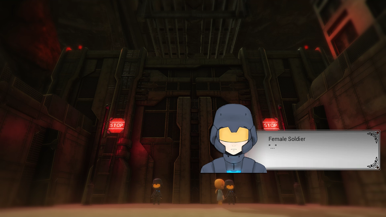 |
|
|
|
|
 Logged
|
|
|
|
|
b∀ kkusa
|
 |
« Reply #59 on: April 10, 2015, 05:57:49 PM » |
|
New shot from the first area in the beginning of the game. (please click to zoom in!) Followin. The new shot is really appealing. |
|
|
|
|
 Logged
|
|
|
|
|
 Community
 DevLogs
 [JRPG] Light Fairytale series (EDIT: physical release!)
 Community
 DevLogs
 [JRPG] Light Fairytale series (EDIT: physical release!)
