|
dukope
|
 |
« Reply #180 on: July 22, 2014, 09:47:24 PM » |
|
Will you be using any other colors for effect in game (emotional effect - not like tinted yellow because of a yellow light)
The whole game will be just 2 colors, but I may have selectable palettes or something for those 2. Now, this might make me a bit unpopular in this thread... but to be honest, I'm not quite sure yet what to think of the 1-bit style. [...]
I think part of the problem is the small relative size of the gifs. Stretched to fullscreen you definitely wouldn't say the resolution is too high  . Try watching the in-game hand footage (switch to 720p) at fullscreen to get a better idea. In motion the 3D all looks perfectly correct, which is probably also breaking the "old" look, where you'd expect more projection or accuracy errors. So as you say, it's a filter applied to standard 3D rendering and that's not something I'm fighting against. My goal is to take something you'd see on a Mac Plus (not DOS) and move all the engine stuff to modern realtime tech while leaving the display tech at 1-bit. Personally I think the 1-bit restriction, low resolution, inverse-lit wireframes, and exactly-one-pixel-wide lines give the game a very different feel to other b&w and wireframe-style games that have been released (Antichamber, Unfinished Swan, Within). But that's an opinion from the most biased person in this thread. (Sup Andrew! Say hi to your bro for me.) |
|
|
|
|
 Logged
|
|
|
|
|
Magnesium Ninja
|
|
« Reply #181 on: July 22, 2014, 10:07:17 PM » |
|
Your comment on the video you posted made me wonder:
Do you have any concerns that a lack of proper video quality on videos of the game will make it appear differently/uglier to people experiencing it for the first time on Youtube?
|
|
|
|
|
Logged
|
|
|
|
|
dukope
|
|
« Reply #182 on: July 22, 2014, 10:16:22 PM » |
|
Do you have any concerns that a lack of proper video quality on videos of the game will make it appear differently/uglier to people experiencing it for the first time on Youtube?
Yup! I'm experimenting now with ways to fix or at least improve the compression results. The main culprits are the contrast and the dithering - two cornerstones of the look I'm going for.  |
|
|
|
|
Logged
|
|
|
|
|
Canned Turkey
Guest
|
|
« Reply #183 on: July 23, 2014, 09:04:58 AM » |
|
Two things, where abouts is the FOV? It looks a tad low in the video. Also, when you look down and you're not next to a door, will you still see your arm?
|
|
|
|
|
Logged
|
|
|
|
|
dukope
|
|
« Reply #184 on: July 24, 2014, 04:36:33 AM » |
|
Two things, where abouts is the FOV? It looks a tad low in the video. Also, when you look down and you're not next to a door, will you still see your arm?
The vertical fov is 58.7, which IIRC is a horizontal fov of 90 at 16:9. As the fov goes higher, anything that connects the camera with the world (the reaching arm) looks worse and worse. 90 felt like a good compromise. Also, I'm trying to make the spaces on the ship feel tight and the fov has a huge effect on that. The arm only appears when you're near interactive stuff - doors, hatches, ropes you can climb, items you can pick up. Otherwise it's not visible. Even when offscreen it's still casting a shadow at the moment, which looks pretty weird. Making it completely disappear without weird shadow discontinuities is gonna take a little work I think. |
|
|
|
|
Logged
|
|
|
|
|
dukope
|
|
« Reply #185 on: July 25, 2014, 06:15:51 AM » |
|
Dither UpgradeBeen playing around with different dithering algorithms. There are two basic classes of dithering techniques: ordered and error-diffusion. Ordered is just using a repeating pattern to threshold your pixels. Error diffusion reads each pixel sequentially and updates the threshold value based on the accumulated error of how far your b&w image is from the original grayscale. From the wikipedia article on dithering: Floyd-Steinberg and Atkinson are both error-diffusion algorithms. Atkinson was a programmer at Apple in the old Mac days and his technique was used for a lot of Mac Plus imagery. It looks awesome. Unfortunately, error diffusion requires reading the image sequentially as you adjust your thresholding error - something that's not possible with shaders. As a result I've just been using the bog-standard bayer ordered dithering. After checking the wiki article again though, I noticed the ordered blue noise technique for the first time and thought it'd be worth trying out. It supposedly gets you an error-diffusion look with the ordered algorithm, just based on choosing a different dither matrix. So I spent a few hours and threw together a tool to generate the blue noise dither matrix based on this void and cluster research paper. Comparison of bayer and blue noise dither patterns In some places the difference is obvious and in some places more subtle. Blue noise loses a little range over the bayer matrix, but I prefer it overall for its smoother gradients and more unique look. I haven't tried compressing this to see how it fares on YouTube but hopefully the less-regular pattern will help there too.
|
|
|
|
« Last Edit: July 25, 2014, 06:22:31 AM by dukope »
|
Logged
|
|
|
|
|
AleHitti
|
|
« Reply #186 on: July 25, 2014, 09:38:14 AM » |
|
Judging by the second image in the GIF, I would go with the blue dither. It just looks more like a gradient and less like a pattern. Keep up the good work btw!
|
|
|
|
|
Logged
|
|
|
|
|
_metamythical
|
|
« Reply #187 on: July 25, 2014, 10:04:25 AM » |
|
I think Bayer looks better.
|
|
|
|
|
Logged
|
|
|
|
|
AleHitti
|
|
« Reply #188 on: July 25, 2014, 10:20:36 AM » |
|
Ummm... on second thought, I looked at it on my phone's tiny screen. Bayer looks a bit better on my PC screen.
|
|
|
|
|
Logged
|
|
|
|
illugion
Level 1


|
|
« Reply #189 on: July 25, 2014, 10:26:26 AM » |
|
Bayer is the easiest to my eyes in my opinion so i like it better It would be awesome to be able to use Atkinson, as it can achieve more contrast and detail from what I can see  Either way the game looks really awesome and unique, I wanna see more of that! |
|
|
|
|
Logged
|
|
|
|
|
0x0961h
|
|
« Reply #190 on: July 25, 2014, 10:29:12 AM » |
|
Bayer is less "chaotic" than Blue Noise, imo.
|
|
|
|
|
Logged
|
|
|
|
|
Goran
|
|
« Reply #191 on: July 25, 2014, 10:53:46 AM » |
|
Unless Blue Noise makes moving images too chaotic - it's the choice for me. In those static images it looks much better and it makes detail much clearer!
Good work!
|
|
|
|
|
Logged
|
|
|
|
|
FrankieSmileShow
|
|
« Reply #192 on: July 25, 2014, 11:05:01 AM » |
|
This devlog is great. Really impressed by the look, and I'm excited to see what the game will be about gameplay-wise.
About your hand moving to interactive objects, is it triggered only by proximity? Proximity + horizontally centering the object in view? Do you also have to look down a little bit for the hand to approach the door handle?
|
|
|
|
|
Logged
|
|
|
|
|
santarcade
|
|
« Reply #193 on: July 25, 2014, 11:37:48 PM » |
|
My brain prefers Bayer too. I find the squares, pluses and crosses of the skydome aesthetically beautiful.
I think the shader deserves an option in the menu and, why not, a key to hotswap it while playing!
I was thinking: what if instead of having a predefined tint of the B&W, you make it dynamic and context dependant: eg blueish on the outer deck, warmer near torches, gray-ish and less contrasted in darker areas?
|
|
|
|
« Last Edit: July 26, 2014, 04:40:50 AM by sanellix »
|
Logged
|
|
|
|
|
Magnesium Ninja
|
|
« Reply #194 on: July 25, 2014, 11:50:46 PM » |
|
I would vote for Bayer, blue noise makes it feel more crowded even in areas where the screen is relatively clear.
For example, with blue noise the sky in the second still looks more like rain to me.
|
|
|
|
|
Logged
|
|
|
|
|
SafetySnail
|
|
« Reply #195 on: July 26, 2014, 12:58:04 AM » |
|
Blue noise looks way nicer to me, the sky especially looks much cleaner in comparison to Bayer IMO. Could we perhaps see a moving comparison? Interested to see which one is more readable while in motion.
|
|
|
|
|
Logged
|
|
|
|
|
kleiba
|
|
« Reply #196 on: July 26, 2014, 01:16:02 AM » |
|
Blue noise obviously does more a sophisticated computation of approximating the gray scale, as can be seen in the gradient of the sky. But to me, Bayer is no doubt more in tune with the lo-fi style you're going to. As others have said, I find the blue noise too "busy", and Bayer simply more appealing aesthetically.
Choose not what might be technically superior, but what's best for this game.
|
|
|
|
|
Logged
|
|
|
|
|
gambrinous
|
|
« Reply #197 on: July 26, 2014, 02:04:27 AM » |
|
I like the blue colour rather than white in those screenshots.
|
|
|
|
|
Logged
|
|
|
|
|
dukope
|
|
« Reply #198 on: July 26, 2014, 07:39:12 AM » |
|
Some Dither TestingAlthough I generally like to experiment with stuff like this, my primary goal with changing the dither algorithm is to improve how the game looks after being compressed to video (and uploaded to YouTube). I understand the talk about authenticity, but I'd be happy with either of these dithers from an artistic or stylistic perspective. So what's left now is to figure out which one looks better after being compressed, uncompressed, and scaled for viewing. To test the two techniques, I recorded a quick video with both Bayer and Blue Noise dither matrices and uploaded the lossless video to YouTube. Comparable frame at 480p. No nearby keyframe. Comparable frame at 720p (cropped). Nearby keyframe. At 480p with no nearby keyframe, the blue noise holds up much better. Bayer cross-hatching introduces color shifts and smearing artifacts due to whatever's going on in the compressor. On the other hand, Bayer looks better at 720p when the full resolution is available and there's a keyframe. In the 720p case, the problem comes when the video content is scaled by the browser. Because Bayer uses a regular grid of pixels, even if it decompresses perfectly, it scales very poorly. With nearest neighbor scaling, the pattern starts to mosaic as it shrinks. Blue noise has no pattern to create this effect. If I had to decide right now, I'd pick blue noise. The game isn't finished yet though so I'll revisit this later when the content is more final. The whole thing may become less of a problem anyways. For one, the sky won't be a smooth gradient in the end, and that's where the dither is currently most egregious.
About your hand moving to interactive objects, is it triggered only by proximity? Proximity + horizontally centering the object in view? Do you also have to look down a little bit for the hand to approach the door handle?
Yeah it's based on proximity and view angle. You have to be looking in the general direction of the handle, but not directly at it. My brain prefers Bayer too. I find the squares, pluses and crosses of the skydome aesthetically beautiful.
I like Bayer too, but the main issue I'm dealing with is beyond how the dither appears in the game. I think if I can't get videos and images of the game to look acceptable in the wide variety of cases where they might appear then I'm pretty much screwed.
|
|
|
|
|
Logged
|
|
|
|
|
happymonster
|
|
« Reply #199 on: July 26, 2014, 10:25:45 AM » |
|
Have you tried 50% horizontal line dithering (as was used in Karateka)? 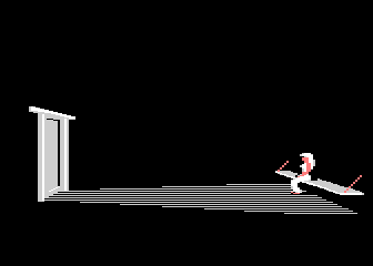 |
|
|
|
|
Logged
|
|
|
|
|
 Community
