|
Eigen
|
 |
« Reply #280 on: September 29, 2014, 07:35:29 AM » |
|
Honestly, it looks really good or even better without any dithering. I would use just two textures - solid color and a simple dither pattern - and use them sparingly, mostly on objects and areas which are of importance to the player or neccessary to help understand the shape of something. These objects and texture placements would have to be hand-picked to avoid clashing but I think it's doable. I dunno, something like.. 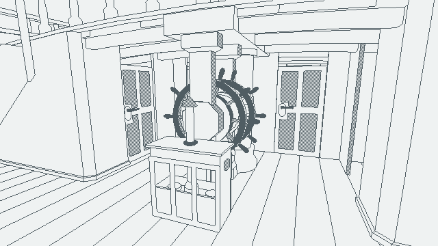 or  .. or maybe even try dithering the actual linework to make certain bits less prominent (eg. the floorboards). This might look terrible in motion, though.  |
|
|
|
|
 Logged
|
|
|
|
|
Panurge
|
|
« Reply #281 on: September 29, 2014, 10:48:09 AM » |
|
If that is not a pocket watch that rewinds time then you damn sure better stop making things that look like one.  |
|
|
|
|
Logged
|
|
|
|
|
Timo Vihola
|
|
« Reply #282 on: September 29, 2014, 04:30:52 PM » |
|
This solution might be tricky technically but one thing which could look decent on bigger resolutions is retaining the line width (about 4 pixels in the example below) and rendering everything at native resolution even if it's a huge resolution. It might prevent the problem from getting worse as new monitors are introduced. It might look something like this (a bit sloppy example as I didn't recreate the dither properly):  I really liked the strong distinction of light and shadow you had there and also the dither. The dither adds lots of texture to the floor and feeling that somebody has been on that ship. Without that stuff it starts to look a bit clean, like it just rolled out from the shipyard. When I see those items in the dark I get the urge to explore and examine - when it's lit brightly some of that mystery disappears. PS. That watch is awesome! |
|
|
|
|
Logged
|
|
|
|
|
HDSanctum
Guest
|
|
« Reply #283 on: September 29, 2014, 04:37:52 PM » |
|
The dithering adds a unique looks + grittiness + aged look. Removing it looks too clean.
|
|
|
|
|
Logged
|
|
|
|
|
Quarry
|
|
« Reply #284 on: September 30, 2014, 08:05:09 AM » |
|
Timo Vihola:
The primary problem that gives him is that the lines are a product of an edge shader, they are not really "drawn" in a sense that you can thicken them (at least that's what I think)
|
|
|
|
|
Logged
|
|
|
|
|
dukope
|
|
« Reply #285 on: October 18, 2014, 07:20:03 AM » |
|
Slight change of plans. A first playable build is coming in the next few days but I won't be submitting to the IGF this year. The build is a nice vertical slice but I think just not enough to stand up to serious judgement yet. |
|
|
|
|
Logged
|
|
|
|
|
hawken
|
|
« Reply #286 on: October 18, 2014, 09:13:36 PM » |
|
Every 3d app I've seen follows an old school "do it right the first time" philosophy. Editing a model, adjusting a rig, painting skin weights, etc. All of these things make step by step changes that can't be undone except sequentially. And if there are non-destrutive/non-sequential ways to do things (Maya's construction history or Max's modifier stack), many operations require you to collapse those edits in order to work properly.
Destructive editing like this is by far the easiest thing to program so it's no surprise that's how all these old apps work. But I'd really like to see a modern app using a more forgiving design philosophy to put the burden on the tool and not the artist. Node-based editors like Houdini go some of the way there, but nodes have a tendency to focus on minutiae that matter to programmers' logical minds, not artists' workflows.
Imagine something more like Photoshop layers - not just to show and hide objects, but to group edits. So if you're going to work on the face, you can create a new edit layer and make all your changes there. Or make a new layer when you start rigging. If you want to try again, just hide that layer and you're back to the original mesh. Just like in a layered PSD. You could also:
- Duplicate and group edit layers to get a really nice non-destructive workflow.
- Pull parts of edits from one layer and put them in a different one to try different iterations of one particular area.
- Collapse edit layers together once you're totally happy with them.
Max's modifier stack is the closest I've seen to this but the UI is really poor and it's mostly focused on per-object edits. The ideal non-destructive editor wouldn't be easy to implement but the usability would be through the roof. A guy can dream.
This is pretty much how Cinema4D works. You don't need to "flatten" as it were before saving to unity. The models get triangulated in the import process but are left as dynamic objects in C4D. It's not for everyone but the work flow sounds like something you mention above. |
|
|
|
|
Logged
|
|
|
|
|
tuglaw
|
|
« Reply #287 on: October 19, 2014, 06:44:05 AM » |
|
Base 640x360 stretched to 1920x1080 I have no problem with these beautiful chunky pixels. Making the lines thinner just loses the low res feeling. |
|
|
|
|
Logged
|
|
|
|
|
dukope
|
|
« Reply #288 on: October 21, 2014, 10:56:34 PM » |
|
First Playable Development BuildPlay through the first 15 minutes or so of the game. It's still very rough and very untested. For such a low-res game, performance is not great on a 2011 Macbook Air running BootCamp. Hopefully it runs ok on most machines. The core mechanic is only lightly touched on, but you should be able to mentally extrapolate out what's here to a full game. Give it a try and let me know what you think or if you have any problems. IGFMy original goal was to submit to the IGF this year. That deadline was pretty useful in getting me through these past few weeks of crunch, but in the end I've decided not to submit the game as it is. Maybe next year. DevlogI have a bunch of technical details and modeling videos I'll try to post up here in the next few days.
|
|
|
|
|
Logged
|
|
|
|
|
Ege
|
|
« Reply #289 on: October 21, 2014, 11:24:03 PM » |
|
Enjoyed every single minute of it! are you going to keep size modes in final release ? or are you just testing which one people going to like, imo looks best on small framed.
|
|
|
|
|
Logged
|
|
|
|
|
rj
|
|
« Reply #290 on: October 21, 2014, 11:41:59 PM » |
|
notes as i go, feel free to ignore:
- i'd speed up the time it takes before the 'space' appears and you can go on to the next line of text even more; i found myself reading faster than it would show up, and even though it's a split second of time, it felt like it broke flow somewhat. mostly a minor issue.
i assume you're just ensuring people don't skip through it; i wonder if it would be skippable on further playthroughs after your first? assuming, of course, that this game has multiple paths/endings/scenarios possible like papers, please, of course.
-when the text shows up instructing you to find the book and to hit space to use items i feel like it could perhaps be done a little more organically; if not placed directly onscreen while you're still allowed to move around and look, i'd at least make it follow the same logic as the dialogue, where you hit space to continue. the set timeframe coupled with the tutorial made it even more antsy!
-i'd make mouse sensitivity a lot lower by default and definitely editable, and i think walk speed could be comfortably bumped up a tiny half-notch just to give a lil' bit more of a spring to walking around
-it might be trite but i keep finding myself hitting shift to duck and maybe include ducking and crawling just for feel's sake
-i fucking love every ounce of the animation; hands etc feel very satisfying
-sound design is great too
-maybe boost the speed on how fast it takes for the hand to show up to indicate that something is usable up a notch
-i do like the delay on the text/timing in certain cases; the time it takes for the guy to yell that he's gonna just throw the box there is nice, the text slowly appearing when you open the box is nice. that was nice. i think pacing is important, here. it's very subtle, but sometimes you gotta speed the stuff along so that moments where it slows down hit harder, even on the tiniest level.
-music when using the watch was kinda nice
-voice acting! shocking! i wasn't expecting it and it's excellent
-holy fuck dukope did you make a first person ghost trick
-holy fuck dukope did you make a first person ghost trick
-ok the music that plays during the time rewind is a lil too midiish; i think that upping the production quality of the music is important here. it feels very thin and stock, and it doesn't have the wonderful effect i think you're going for here (the composition is great, mind!) and now that i think about it this applies to the music played when the pocketwatch opens as well, though it isn't as noticable because of how short it is
-ok maybe you didn't make a first person ghost trick and i got too excited
-same comment about initial instructions re: crew roll instructions
-voice acting is consistently great damn good job with these actors
-i keep finding myself wanting to interact with these time travel snapshots in some way
-some of the rendering gets weird with jittery pixel lines at times. there's a pixel line on the floor on the right side of the cabin (?) where there are two skeletons and it jitters like a bug
-each time i find a skeleton it is a delight. i welcome the training for the upcoming skeleton war
-it should probably be possible to exit each of the time warps without having to wait
-there's a really funny thing that happens over the skeleton that shot himself; if you just sit there perched over it, your arm keeps going out to indicate that you can do the time warp and then receding because your height puts you just out of reach of the Skeleton Zone when the boat's rising and falling causes you to be pushed upwards enough
there are probably other examples of this too but that was the one i noticed
-god this game is gorgeous, sorry. i'm playing at full giant full screen on sharp and it's so pretty
-aaaaand that's the end of the build. i love that the mystery of how all of these people died is the whole goal of the game; i wish it was more obvious that there was an actual matching game to it! it wasn't until the end of the build that i noticed the page flip on the manifest. i had assumed that going around and timehopping would automatically fill it in, in a point and clicky kinda way.
i'd just say to make it more obvious that the manifest works that way, i guess
-this game is great holy shit good luck
|
|
|
|
|
Logged
|
|
|
|
|
Lim-Dul
|
|
« Reply #291 on: October 21, 2014, 11:46:08 PM » |
|
Aaaah, so this is how the gameplay works (roughly speaking). That was unexpected. Some initial feedback: perhaps there should be a way to end the "time rewind" early (unless there already is and I missed it)? Also, invert mouse for the final version! So many devs forget about that when designing a first-person game and there are quite a few "inverts" (myself among them) out there... |
|
|
|
|
Logged
|
War does not determine who is right - only who is left. - Bertrand Russell
|
|
|
|
TautNerve
|
|
« Reply #292 on: October 22, 2014, 12:03:00 AM » |
|
Great build, I had lots of fun! First of all I'd like to say the the game is bea ut if ulI have one personal opinion suggestion though; Due to the mysterious atmosphere and setting of the game I found the "determine the fate of passengers" slide a little redundant. Some way to emphasize that it is possible to edit the fate column in the book within the interface is more preferable in my opinion, because one of the strong points of the game is that you board the ship without really knowing the purpose at first. Informative slides with objectives kind of pull me out of the enigmatic atmosphere, and like with the corpses (which you are not told to use the watch on) the player should have some visible que to understand that you can interact with the fate column in such way. I could say the same about the "find the book" slide, it is a little unnecessary because the player is given control for the first time and naturally self driven exploration will commence anyway. As I see it it's way more interesting keeping the whole purpose of your visit as enigmatic as the story of the ship itself, and that like the fate of passengers your goal in the game is unveiling as you progress, and without added "information slide for dummies". Also, like the others, I think that you should insert some way to exit a [memory?] before the time runs out, for cases in which you only want to check small details you might have missed or just a quick look at something. Again, great job and well done, I REALLY want to play this game. |
|
|
|
« Last Edit: October 22, 2014, 01:07:46 AM by TautNerve »
|
Logged
|
|
|
|
|
Fenrir
|
|
« Reply #293 on: October 22, 2014, 12:25:54 AM » |
|
Loved this first build!
About the rendering options, I prefered the "Full-size sharp".
|
|
|
|
|
Logged
|
|
|
|
|
William
|
|
« Reply #294 on: October 22, 2014, 12:47:09 AM » |
|
That was a nice playable build Congratulations. But I think I played it "badly". Visiting the past events, it seemed clear who was who, and who killed who. But when I reached the end, I didn't understand the sentence and...I never found any book. So I guess I've got to play it again... EDIT : Oh, ok, now I get it This will be so cool when finished! |
|
|
|
« Last Edit: October 22, 2014, 02:47:55 AM by William »
|
Logged
|
|
|
|
|
karlozalb
|
|
« Reply #295 on: October 22, 2014, 01:00:41 AM » |
|
Very interesting art style! and the death-clock is awesome xD
|
|
|
|
|
Logged
|
|
|
|
midgetcastle
TIGBaby


|
|
« Reply #296 on: October 22, 2014, 02:00:29 AM » |
|
I've been reading your devlog for Obra Dinn for a while now, and I always knew I was going to enjoy it, but that playable demo just threw my expectations out of the window. I loved the atmosphere, even though I played it with my shitty speakers, and I think that you've managed to get the dithered look really right, so well done on that!
One tiny complaint I might raise as a classicist is that the Latin is wrong, it's usually memento mori. However, I believe memento mortis is actually also right, since memini takes the genitive, and mortis is the gen. of mors
|
|
|
|
|
Logged
|
|
|
|
Armageddon
Level 6

|
|
« Reply #297 on: October 22, 2014, 02:19:28 AM » |
|
I like it a lot, I don't like that it's blurry fullscreen no matter what mode you set it to. I want to see some sharp fat pixels, man. Movement is really solid, I like the flipbook text for storytelling. Wasn't expecting voice acting.
The music of opening your watch and during the flashbacks got old very fast, and wasn't fitting at all for the suicide. I agree you should let players go back to the present instead of randomly going back, and the use key bringing up the watch weirdly.
I don't really see any actual gameplay, I go back in time and look a pretty pictures and then it lets me progress. I don't feel like I'm doing anything, shouldn't I be writing down stuff/clues? Maybe at the end you get to choose from a series of options and you'll be told if you guessed right or not.
Still looks amazing though, great work.
|
|
|
|
|
Logged
|
|
|
|
|
Ben H
|
|
« Reply #298 on: October 22, 2014, 02:28:42 AM » |
|
This is unbelievably awesome. I wasn't expecting the quality of the models. The way the hand goes out and grabs doors feels so immersive, I don't know why I've never seen other games do it before.
The only thing that bothered me was the quotation marks on the text are wrong. You're using curly close-quotes for both open-quotes and close-quotes. The font nerd in me cried.
I can't wait to see more!
|
|
|
|
|
Logged
|
|
|
|
|
Lim-Dul
|
|
« Reply #299 on: October 22, 2014, 02:32:28 AM » |
|
One tiny complaint I might raise as a classicist is that the Latin is wrong, it's usually memento mori. However, I believe memento mortis is actually also right, since memini takes the genitive, and mortis is the gen. of mors
Actually both are correct and the difference is that the first one uses an infinite verb construction (~remember to die; "that you have to" is implied) and the other one a noun in genitive (~remember [of the] death). The latter is much easier to understand and identify as correct if you know German, where a very similar construction is used: "gedenke des Todes". |
|
|
|
|
Logged
|
War does not determine who is right - only who is left. - Bertrand Russell
|
|
|
|
 Community
