|
ULFR
|
 |
« on: October 25, 2014, 08:13:48 AM » |
|
This is GRAVEMIR, a Horizontal SHMUP in demo stage, i need feedback for it so i can improve it, i give thanks in advance to everyone taking the time to go thru the 2 entire levels, it is not a web game but i deployed it as web to give ease of use for the testers http://abysswolf.itch.io/gravemirhere are some screenshots  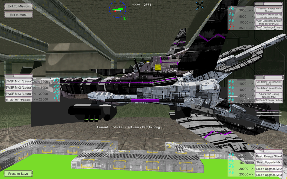  you can expect features of games lyke Tyrian, Galaga and Touhou like ship customization and enemy barrages |
|
|
|
« Last Edit: November 06, 2014, 03:30:31 PM by ULFR »
|
 Logged
|
|
|
|
|
dimoniy
|
 |
« Reply #1 on: October 25, 2014, 04:11:43 PM » |
|
Hi, there are definitely some problems with with the stuff happening on the screen.
* Lasers are very hard to distinguish from the background. You supposed to be dodging those so all of the stuff that can kill you should be clearly visible.Make it more contrasting color, add an outline, or something of sort.
* Same with obstacles. Those are at least in 3D, so it's lesser of a problem, but fist several times I wan't sure what killed me. Given that I was barely able to tell where bullets went, I fist thought that I just got hit by one of those.
* Homing pixels are annoying. They basically prevent you from going anywhere but the very bottom of the screen, but if you stay at bottom you almost immune to them?
* Ships constantly getting stuck at sides of the screen
Also, game design-wise: those kind of games rely heavily on being tough, but fair. When you are inta-killed by thing that you cannot see, it's not challenging, it's infuriating, and unless you're doing "I want to be the guy in space", this is not what you want. You should clearly communicate all of the threats which are on the screen, that includes enemy bullets, obstacles, and never-ever-ever put splash blocking the view while player is being shot at. What is this splash with preudo-code doing there? Telling me that mission began, I already know it since I'm being shot at.
I hope this does not come off at too negative. Keep doing what you doing and never stop polishing the game.
|
|
|
|
|
Logged
|
|
|
|
|
ULFR
|
|
« Reply #2 on: October 26, 2014, 07:16:34 AM » |
|
thanks for the input, trying to get as many as i can done for the next update  thanks ! |
|
|
|
|
Logged
|
|
|
|
|
ULFR
|
|
« Reply #3 on: October 26, 2014, 10:18:57 AM » |
|
i updated it and took in mind the input
|
|
|
|
|
Logged
|
|
|
|
|
Trane
|
|
« Reply #4 on: October 26, 2014, 12:48:23 PM » |
|
-The lasers definitely stand out from the background now. But the player's lasers are the same color as the enemies' lasers, which is still visually confusing.
-The obstacles are still kind of difficult to see. I'd recommend making them a different color - either a lot brighter, or maybe a lot darker.
-The player can just hold down the primary fire button to constantly fire. It's powerful, but not very interesting. A lower rate of fire would force the player to be more methodical about the shots they took.
-I didn't play the previous version, but it seems like the difficulty is better. I didn't get instakilled, and I don't think I got hurt by anything that was offscreen.
- The secondary fire looks nice and is useful, but like the primary weapon, there's no reason to not use it. Maybe it could be limited in some way?
|
|
|
|
|
Logged
|
|
|
|
|
ULFR
|
|
« Reply #5 on: October 26, 2014, 01:07:47 PM » |
|
the weapons like the ship and shield can be changed after you finish every level, currently, im updating obstacles a bit to make them more notorious
|
|
|
|
|
Logged
|
|
|
|
|
ULFR
|
|
« Reply #6 on: October 26, 2014, 04:17:12 PM » |
|
UPDATED !
|
|
|
|
|
Logged
|
|
|
|
|
dimoniy
|
|
« Reply #7 on: October 26, 2014, 11:34:49 PM » |
|
Those are some great improvements, good job!
Couple of issues still with game feeback:
- As Trane player's own bullets are cluttering the screen too much. While making those a different color would help, but leaving them as it is still covers up some of the enemy shots. Maybe make player's shots blue and make those appear behind enemy shots, so it's always clear that you are shot at?
- Still splash screen covering the action, less of the issue now, but still a bad design choice IMO.
|
|
|
|
|
Logged
|
|
|
|
|
ULFR
|
|
« Reply #8 on: October 27, 2014, 02:10:57 PM » |
|
UPDATED!
|
|
|
|
|
Logged
|
|
|
|
|
ULFR
|
|
« Reply #9 on: October 28, 2014, 11:38:37 AM » |
|
UPDATED AGAIN WITH INPUT OF OTHER FORUM |
|
|
|
|
Logged
|
|
|
|
|
ULFR
|
|
« Reply #10 on: November 06, 2014, 03:31:26 PM » |
|
UPDATED !
|
|
|
|
|
Logged
|
|
|
|
|
ULFR
|
|
« Reply #11 on: November 11, 2014, 02:19:55 PM » |
|
UPDATED !!!
|
|
|
|
|
Logged
|
|
|
|
|
 Developer
