Welcome, Guest. Please login or register.

Login with username, password and session length

 
Advanced search

1411430 Posts in 69363 Topics- by 58416 Members - Latest Member: JamesAGreen

April 19, 2024, 10:49:42 PM

Need hosting? Check out Digital Ocean
(more details in this thread)
TIGSource ForumsCommunityDevLogsLithium City - isometric cyberpunk tactical shooter
Pages: [1] 2 3 ... 5
Print
Author Topic: Lithium City - isometric cyberpunk tactical shooter  (Read 44459 times)
nicotuason
Level 0
**


View Profile WWW
« on: March 16, 2015, 05:37:07 AM »


You are a creature of Lithium City.
Born of lab-grown Nanocarbon muscle and Heisenberg Neuron Arrays.
You were made for one purpose - the projection of power.

(sorry been reading a lot of William Gibson lately)

Lithium City takes the shooting action of Hotline Miami and places it in a Ghost in the Shell-like cyberpunk setting,
with art inspired by Tron and 80's Neon for some reason. It's gonna be good I swear.


Target Platforms:
PC, Mac

Target Release:
2015

Engine:
Adobe Air + Starling framework

Team:
Nico Tuason (http://www.nicotuason.com/) - Design, Art, Programming
James Abels (http://www.jamesabels.net/) - Music

Website:
Under Construction

« Last Edit: June 07, 2020, 09:43:10 PM by nicotuason » Logged

JobLeonard
Level 10
*****


View Profile
« Reply #1 on: March 16, 2015, 05:48:19 AM »

with art inspired by Tron and 80's Neon for some reason.
That reason being having a great aesthetic taste? Kiss

GIF feels like the world is moving in slow-motion though. Very stylish, but wouldn't it feel sluggish to play after a while?
Logged
Paul
Level 1
*


View Profile
« Reply #2 on: March 16, 2015, 06:11:45 AM »

Looks good! Nice use of screenshake too. I almost expect to see scores popping off the enemies when they die! Will it be combo based? Interested in seeing this develop
Logged
jamesabels
Level 0
*


View Profile
« Reply #3 on: March 16, 2015, 12:36:51 PM »

Hey guys, composer here!

I haven't made anything for Lithium City yet, waiting for Nico to nail a few things down first, but I literally can't wait to get started.  Kiss

I will defiantly be exploring a lot of options musically, but instinct is telling me to shoot for a sort of darker synth style, but that is actually a bit more up beat and "dancy" if you will. Nico has also said there will be slower paced sections as well, and while playing the build he just sent me, this track, by one of my all time favorite producers, Johnny Jewel felt realy good.


So I'm defiantly leaning towards something like this, but more 80's, for the slower parts. Something like that may actually serve as a great juxtaposition for the faster paced parts as well, though I will have to see if it fits conceptually.

Also feeling this track while playing.


While both of these tracks have a 70's aesthetic, I will defiantly be leaning heavy on the 80's so something like these tracks mashed up with Powerglove's soundtrack for Blood Dragon.

https://www.youtube.com/watch?v=_HqkXyIHHKk

If you want an example of my 80's chops I just put this video up last night that I did over the weekend for practice.
https://www.youtube.com/watch?v=8F9S-1vlS74

Anyways, I will keep you guys up to date, and all of this is bound to change at any time, just my train of thought on the current build I've been playing with!
« Last Edit: March 16, 2015, 05:36:59 PM by jamesabels » Logged
nicotuason
Level 0
**


View Profile WWW
« Reply #4 on: March 17, 2015, 05:19:32 AM »

@JobLeonard - the gif is like 16MB so it's probably taking a while to load, sorry about that!

@Paul - I might add a benefit to doing quick combos, but not sure yet.

Today I added basic enemy AI. Here a short video clip:


The colors got a bit washed out during compression, but it should show the gameplay well at 60 fps!
Logged

JobLeonard
Level 10
*****


View Profile
« Reply #5 on: March 17, 2015, 06:12:31 AM »

No, it's fully loaded. But I think GIFs have a maximum framerate in browsers, so perhaps it ruins your 60FPS?

The floatiness is mostly gone in the video, so it probably is the GIF somehow.
Logged
ryansumo
Level 5
*****


View Profile WWW
« Reply #6 on: March 17, 2015, 06:18:17 AM »

Looking good Nico!  I remember us talking about how we just wish we could finish our game already, looks like you're on the right path!
Logged

nicotuason
Level 0
**


View Profile WWW
« Reply #7 on: March 17, 2015, 06:33:04 AM »

@JobLeonard - ohh never knew that, my browser displays it at 60fps so that's probably the issue. I should probably stick to lower frame rate gifs, but 60fps just looks soo smooth.

@ryansumo - Thanks! Haha yeah, this thing is taking way longer than I expected. I've just now settled on the visual style and theme of the game. Time to work on mechanics and levels!
Logged

blekdar
Level 3
***


Decisively Indecisive


View Profile WWW
« Reply #8 on: March 17, 2015, 06:46:57 AM »

"isometric cyberpunk tactical shooter"

Every word of that description excites me.

It's also sexy to boot, looks fun and damn man, that framerate. Add in some wicked music and you've got yourself a winner here, keep it up!
Logged

ryansumo
Level 5
*****


View Profile WWW
« Reply #9 on: March 17, 2015, 06:48:19 AM »

If you don't mind a bit of art advice I'd make the background image of the city and the actual gameplay level itself contrasting colors so that the level "Pops".  Right now things just feel a little TOO monochrome.
Logged

Christian
Level 10
*****


View Profile WWW
« Reply #10 on: March 17, 2015, 07:34:13 AM »

Is this based on your previous project CQB? Level design looks similar


Logged

Visit Indie Game Enthusiast or follow me @IG_Enthusiast to learn about the best new and upcoming indie games!
sam_suite
Level 1
*


View Profile WWW
« Reply #11 on: March 17, 2015, 07:37:57 AM »

aha, a kindred spirit!
Seriously, this looks awesome. Fantastic job so far.
Logged

nicotuason
Level 0
**


View Profile WWW
« Reply #12 on: March 17, 2015, 06:23:30 PM »

@ryansumo - Gonna try that out! Thanks, always appreciate art advice Smiley

@Christian - Yup it sort of evolved from Project CQB after I wasn't making any progress on it. I hope to return to that project someday with fresh ideas.

Which reminds me, I wanted to make a post about how the art style evolved from Project CQB to Lithium City.


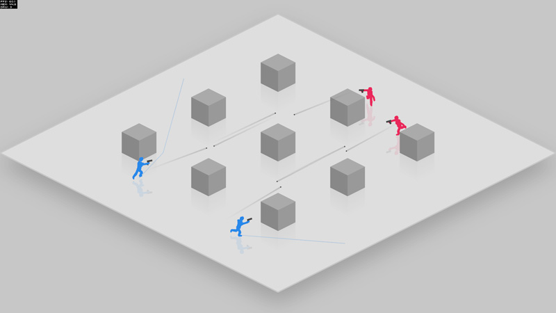
This is from the one of the earliest versions. I wanted to keep things minimalist so I could focus on the gameplay, but it got boring to look at pretty quickly.


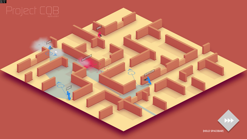
From there I applied a Gradient Map in Photoshop to turn the darker greys into red and the lighter colors yellow. I also added some subtle gradients to simulate an ambient occlusion effect. This looked good to me and I kept it this way for a while, but I soon realized that it was really difficult to add more colors without ruining the color scheme.


I was also getting stuck on the gameplay. Things did not progress for a month or two, and in desperation I turned to my old friend 3DS Max. I tried modeling a texture-less room with a Mental Ray daylight system + Global Illumination to create the shadows.


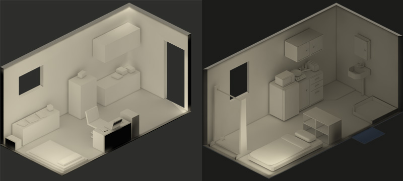
I only meant to see how a pre-rendered background would look compared to the minimalist vector art, but as I was modeling I got caught up and wanted to add more and more detail. Soon, I started creating a story about the person who was living in the this room... their job, habits, interests...


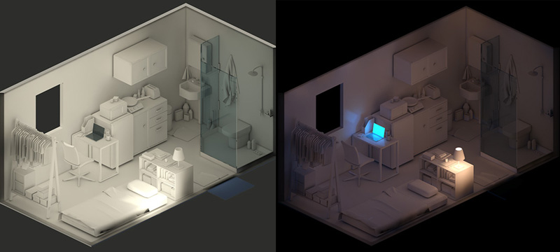
I finished it after more than a week, and by then my head was so full of stories that I desperately wanted to make a story-driven RPG. This little room would only be the start. There would be big levels with multiple paths and different skills and equipment and branching storylines and... then I regained control of myself.

Realizing I didn't have the time or money to create a game of that scale, I said goodbye to my little room and tried out an art style that James Abels (the game's composer) suggested - an 80's retro neon look.


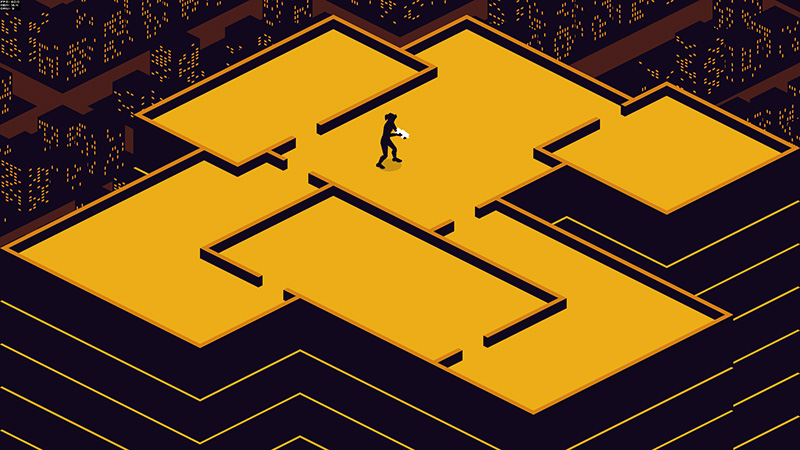
Not exactly neon, but I kinda liked the Kill Bill colors. I also added the city in the background after watching a video of this old Aimga game called

. After a while it started to look too simple and I wanted something more cyberpunkish, so I went with purple.


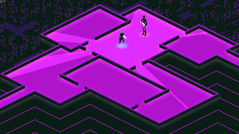
It felt like it needed more glowy things so I tried making the walls glow and added an overlay layer with a circular yellow gradient fading out to dark blue.


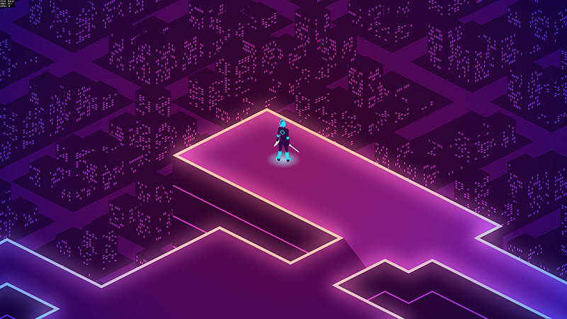
After increasing the brightness and adding glowy translucent walls, I finally had an artstyle I was happy with.


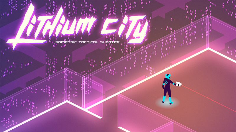
The artstyle also directly influenced the game's theme and title. A lot of articles I've read say to leave the art style for later, but personally I feel that a game's artstyle is tied so closely with it's theme and setting that it needs to be nailed down in the very early stages. I'm much more excited to work on this game now than if I has stuck to a blue square against a white background, and to a mostly solo dev like me excitement = productivity.
Logged

Christian
Level 10
*****


View Profile WWW
« Reply #13 on: March 17, 2015, 06:35:14 PM »

Very interesting to see how the art evolved. Is the current maze design the definite style for levels or place holder for more complex levels?
And will the enemies spray blood (or I guess here it would be pixels) like in CQB? I thought that added a cool satisfying touch to the action
Logged

Visit Indie Game Enthusiast or follow me @IG_Enthusiast to learn about the best new and upcoming indie games!
nicotuason
Level 0
**


View Profile WWW
« Reply #14 on: March 17, 2015, 11:59:49 PM »

@Christian - I'm planning on adding doors and some sparse furniture, but besides that I think this is the default level style. I want to keep the combat close and tight. I'm experimenting with blood spray but so far it doesn't seem to stand out well against the high contrast background. I tried adding more neon smoke and glass shards:


Working on hit effects is a lot of fun! I'm planning on experimenting with a tron-style "derezz" effect later on but it might prove too costly for performance. In the meantime, more smoke and shards!

Logged

nicotuason
Level 0
**


View Profile WWW
« Reply #15 on: March 18, 2015, 10:37:33 PM »

Done today - automatic sliding doors:


I considered making the doors "usable" so you had more control, but the automatic doors just felt more intuitive... and it was less work.
Logged

nicotuason
Level 0
**


View Profile WWW
« Reply #16 on: March 19, 2015, 12:15:53 AM »

Isometric Perspective Woes

Man, I thought isometric depth sorting was the worst of it. Aiming with the mouse is also turning out to be pretty tricky.

The problem is that when presented with an isometric view, players will intuitively try to play it like a top-down shooter, but the angled perspective causes problems with this. Here's an illustration of the problem:


The isometric perspective squashes circles down to 50% of their height, which is a problem because I use circles as the hit area for my units. In effect, with mouse-aim it becomes twice as hard to hit units on the left and right sides of the screen as it is for units on the top and bottom of the screen.

This is further complicated by the tallness of the units. To the game engine, units are just circles, but to the player they are 3D entities.


Possible solutions to this:
1. Some kind of compensating auto-aim that guesses what the player is trying to hit based on its on-screen distance from the mouse cursor.
2. Dynamically altering the size of a unit's hit area based on it's angle to the player.

It's gonna be messy either way. I'm gonna try solution # 2 first because I'd like the option to have auto-aim as an upgrade / augment for the player.
Logged

JobLeonard
Level 10
*****


View Profile
« Reply #17 on: March 19, 2015, 04:02:08 AM »

Honestly, I think the laser-scope kind of mitigates the issue for you: it shows if your line of fire overlaps with the enemy quite clearly.

I would make a tutorial suggest to aim "behind" the targets (larger circle = more precision with aiming) and use that laser-scope to check if you would hit the enemy.
Logged
nicotuason
Level 0
**


View Profile WWW
« Reply #18 on: March 19, 2015, 06:44:07 PM »

@JobLeonard - You're right about the laser scope, but some of your weapons won't have this attachment. I also want the player to be able to fire off a "snap shot" with very little aiming time, and still hit their intended target.

I think I've found an elegant solution! Instead of using circles as the hit areas, I used crosses like this:


I say it's "elegant" because the hit-testing for two line segments is actually faster than hit-testing a line segment against a circle, so this solution improves the game's performance as well Tears of Joy. The cross shape also neatly accounts for all possible aiming angles.
Logged

JobLeonard
Level 10
*****


View Profile
« Reply #19 on: March 20, 2015, 03:21:50 AM »

If my geometry intuition is correct you effectively get a diamond-shaped bounding box! Yep, that's probably a good enough approximation, as long as you align it right.
Logged
Pages: [1] 2 3 ... 5
Print
Jump to:  

Theme orange-lt created by panic