|
Suicid3Panda
|
 |
« on: June 06, 2015, 05:33:41 AM » |
|
Hey all! I'm currently working on a visual novel-type project. Rather than do the typical "character portraits over a background with text boxes" I decided to make a "living" comic book. In addition to the different format, I also wanted to give a lot of freedom of choice. This means that no two players will have the same exact story -- in fact, the way it's currently written there are 50+ endings with a variety of branching story paths. It would be a lot closer to classic choose-your-own adventure books, but with a visual side. Due to the nature of this idea (i.e. a TON of art required) I've lessened my workload by choosing a stylized direction for the art. I was hoping to get some initial feedback on the art in this game. In hindsight, I should have reached out for feedback sooner, but it is what it is... Please let me know what you think! Here are some early screenshots: 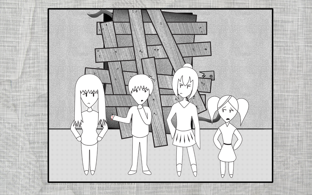 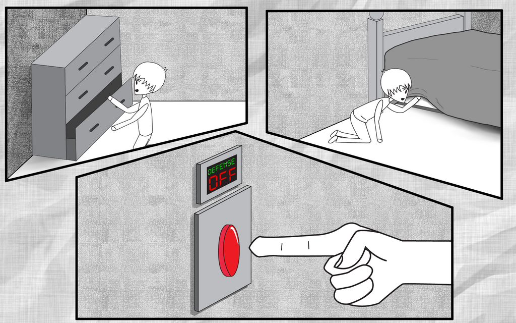 As you can see, the art is mostly black and white with splashes of color to illustrate key points of interest. One other thing, the "death scenes" and other key points will not be depicted in this art style. I am commissioning them out individually to artists. They will act as the "unlockable gallery" to support the traditional visual novel design. Their art is much more detailed. |
|
|
|
|
 Logged
|
|
|
|
|
Ark
|
|
« Reply #1 on: June 06, 2015, 05:53:26 AM » |
|
I like the backgrounds... but the characters... no. If I were you I would try to stylize the guys even more. I believe, you need something truly minimalistic - like this:  |
|
|
|
|
Logged
|
|
|
|
|
Suicid3Panda
|
|
« Reply #2 on: June 07, 2015, 04:42:00 AM » |
|
Thanks for the feedback! I was definitely going for a minimal approach with the art and characters, but I needed them to appear relatively human. The characters you see here are more or less "avatars" for their "true" forms that appear during major events. Since the fully drawn versions have a lot more character and detail, I need to represent that somehow in this version as well. I don't know how much more minimal I can make them while maintaining their individuality and keeping them relatable to their other selves.
|
|
|
|
|
Logged
|
|
|
|
|
slicky-grease
|
|
« Reply #3 on: June 07, 2015, 05:22:55 AM » |
|
I really like the concept of this, 50 ending. Wow, that's going to be a ton of work. I do like the simple designs of the characters,but make them more simplistic. I can see them with bolder lines. If you need some help designing them, I'd gladly help out. This can have a ton of potential:)
|
|
|
|
|
Logged
|
|
|
|
|
Ark
|
|
« Reply #4 on: June 07, 2015, 04:59:37 PM » |
|
The characters you see here are more or less "avatars" for their "true" forms that appear during major events. It makes harder to say anything now, without seeing the "true" forms... I don't know how much more minimal I can make them while maintaining their individuality and keeping them relatable to their other selves. May be... something like this would work  :  |
|
|
|
|
Logged
|
|
|
|
|
Suicid3Panda
|
|
« Reply #5 on: June 07, 2015, 10:24:39 PM » |
|
|
|
|
|
|
Logged
|
|
|
|
|
oahda
|
|
« Reply #6 on: June 08, 2015, 12:27:06 AM » |
|
I'd say the two characters to the right in the first picture have more personality whereas the other two to the left feel a lot like some sort of 1940's view of "girls have long hair and small feet and boys have short hair and big feet (also boys don't have eyelashes)" without any actual characteristic traits (or the fact that in a cast of three girls and one boy the second picture seems to suggest gameplay still focuses on the one boy, but I hope I'm just jumping to conclusions since you haven't shown us more).
I'd be interested in seeing these "true" forms too.
I think the biggest problem is that it looks like an attempt at a generic manga style (as supported by your avatar) – I've drawn very similar characters myself back in the day – when you might perhaps be better off developing your own style instead of trying to copy that (which might be difficult to achieve, too). Play to your personal strengths and try not to let other artistic ideals/standards (typical manga or typical superhero cartoon style or whatever) limit your creativity.
Not sure yet what I think of the textured style or the use of some colour in an otherwise mostly black and white style, but do keep us posted!
|
|
|
|
|
Logged
|
|
|
|
|
Suicid3Panda
|
|
« Reply #7 on: June 08, 2015, 03:51:41 AM » |
|
Allow me to quickly comment on my avatar.... my REAL avatar was too big despite how I re-sized it and the current one was a test that i quickly grabbed from a website and never ended up changing.  The character style itself was developed so that it would be easy to recreate over and over again, to maintain a consistent look to the characters from scene to scene. This is basically a comic book and the characters will need to be redrawn 100s of times versus a classic visual novel where a few portraits are recycled throughout the game. I will post the "real" forms of the characters here in my next post. As far as the cast, The girl on the far left is actually the main character. Making her somewhat generic was by choice to give that sense of "default character." Nope, the boy is not the main character. He just happens to be on that one page a lot.  I will also post some additional screenshots that feature the characters doing a bit more. As far as the color, the images in this game can be fairly gory. I like to represent blood in color, and I also went a bit further and made any major points of interest in color as well. It's very infrequent, but do you think I should scale it back? Thanks for the feedback! I really appreciate it!!!! |
|
|
|
|
Logged
|
|
|
|
|
Suicid3Panda
|
|
« Reply #8 on: June 08, 2015, 05:30:47 AM » |
|
Some additional screens: 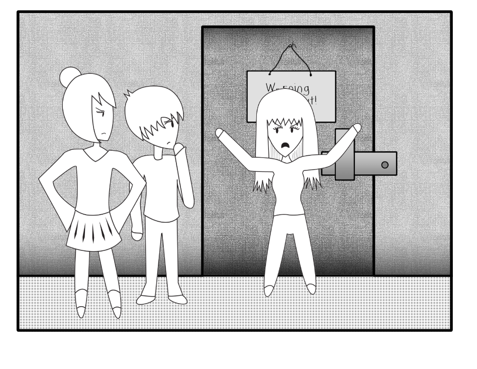 {Please ignore that terrible look of the floor its due to the way this picture was rendered.} 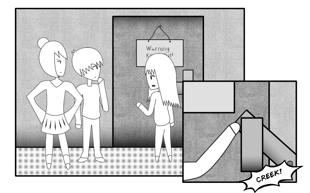 {Please ignore that terrible look of the floor its due to the way this picture was rendered.} 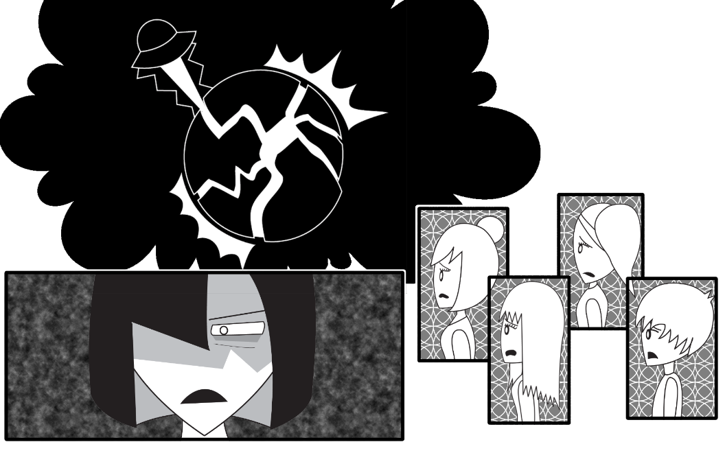 Here are some sketches of the characters in their "true" form: 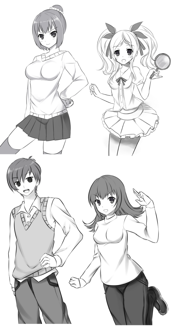 I was trying hard to carefully choose these screenshots, because I don't want to post anything that is misleading or will require a back story. Let me know if you have any questions. As far as the "simplified" versions of the characters. Do they really look like anime? I honestly wasn't going for that at all. They don't have the anime hair or eyes or anything like that. |
|
|
|
|
Logged
|
|
|
|
|
Schoq
|
|
« Reply #9 on: June 08, 2015, 05:37:52 AM » |
|
the selective shrinkwrapping on the boobs looks silly as heck
|
|
|
|
|
Logged
|
♡ ♥ make games, not money ♥ ♡
|
|
|
|
Suicid3Panda
|
|
« Reply #10 on: June 08, 2015, 05:51:58 AM » |
|
lol I see what you mean!  I will get with the artist to adjust that. |
|
|
|
|
Logged
|
|
|
|
|
Cobralad
|
|
« Reply #11 on: June 08, 2015, 06:04:09 AM » |
|
you should tell your artist to replace that programmer art in your comic
|
|
|
|
|
Logged
|
|
|
|
|
Suicid3Panda
|
|
« Reply #12 on: June 08, 2015, 06:32:21 AM » |
|
Thank you for you're tactful, constructive feedback, Cobralad.
|
|
|
|
|
Logged
|
|
|
|
|
b∀ kkusa
|
|
« Reply #13 on: June 08, 2015, 06:56:09 AM » |
|
Do they really look like anime? I honestly wasn't going for that at all. They don't have the anime hair or eyes or anything like that. error error they are so anime cliche . they have anime hair and eyes .... |
|
|
|
|
Logged
|
|
|
|
|
Suicid3Panda
|
|
« Reply #14 on: June 08, 2015, 08:13:41 AM » |
|
Seriously? how are those anime eyes? they are just black dots.
|
|
|
|
|
Logged
|
|
|
|
|
b∀ kkusa
|
|
« Reply #15 on: June 08, 2015, 08:27:53 AM » |
|
Still you put the eyebrows and eyelashes, it just looks like 10 years old deviantart anime drawer wannabe and it's ugly.
you should commission someone to do them SD style at least.
|
|
|
|
|
Logged
|
|
|
|
|
Muffinhat
|
|
« Reply #16 on: June 08, 2015, 11:24:15 AM » |
|
I like the direction, just keep perspective lines in mind when making indoor environments. The book case for instance looks wonky, almost as if it's drawn from an orthographic point of view.
|
|
|
|
|
Logged
|
|
|
|
|
Suicid3Panda
|
|
« Reply #17 on: June 08, 2015, 09:12:56 PM » |
|
So my plan is to create a demo as proof of concept. If it gets enough support, I can look into getting funding to redo the artwork and finish the project. Right now, paying an artist isn't feasible. It currently sits at 200 pages in comic book form. It's over 800 pages in length. I can only imagine the number of people it would take to redo that much art. The cost is well outside of a self-starting "indie" budget.
Unlike a standard visual novel, I can't commission someone to make a few portraits for each character, and swap them in and out. Each image would need to be individually hand drawn.
|
|
|
|
|
Logged
|
|
|
|
|
ryansumo
|
|
« Reply #18 on: June 09, 2015, 06:29:17 PM » |
|
TBH the art looks lazy more than anything. I understand the need for efficiency but Japanese art already does simplified chibi art really well, so why not draw inspiration from that? This may not be the best example, but mainichi kaasan has quite a simplistic style that is unique but consistent 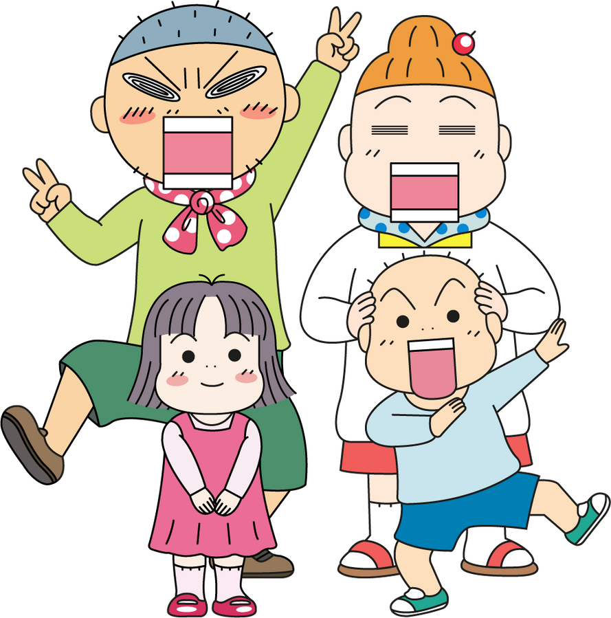 Regardless, best of luck with your game! |
|
|
|
|
Logged
|
|
|
|
6Focal
Level 0

Attitude...

|
|
« Reply #19 on: June 14, 2015, 03:36:33 PM » |
|
I started out reading how to draw manga books so my stuff looked like the 90's anime screenshots for a while... I've since tried to move into a more neutral look between western and Japanese.. I think your 'true' forms could benefit from that as well since right now they look like they could come from any low-budget GalGe.
As for the other style.. that just looks kinda unprofessional. Try to avoid the msPaint looking boxes if you can..
|
|
|
|
|
Logged
|
|
|
|
|
 Developer
