Welcome, Guest. Please login or register.

Login with username, password and session length

 
Advanced search

1411430 Posts in 69363 Topics- by 58416 Members - Latest Member: JamesAGreen

April 19, 2024, 07:21:03 PM

Need hosting? Check out Digital Ocean
(more details in this thread)
TIGSource ForumsDeveloperArt (Moderator: JWK5)Feedback and Suggestions for my game's Pixe Art
Pages: [1]
Print
Author Topic: Feedback and Suggestions for my game's Pixe Art  (Read 883 times)
jazzmaster9
Level 0
*


Avid Game Designer.


View Profile WWW
« on: June 09, 2015, 11:52:46 PM »

Hello Smiley
I've been making a series of Games called Operation: Tank Command.
With the third installment of my game, I wanted to refine my Art style and pixel art skills.

Here are some of the sprites and backgrounds in the upcoming game.

Static Objects:


Animated Objects:
 

Tiles and Backgrounds:
 

Ingame Screenshot


tips, suggestions and feedback on how to improve my art style will be very appreciated.

Thank you.
Logged

woodsmoke
Level 4
****


View Profile
« Reply #1 on: June 10, 2015, 12:25:33 AM »

The buildings have shadowing from the side, while the trees, tanks, plane have the shadows on the bottom.
I would remove the shadowing from the buildings totaly. Or make the light also come from the top.

The windows on the tall buildings are too big. I also wouldn't make them and the entrance 100% black.
The door on the plane moves down/out when it opens? I don't understand what's going on there.
The hangar/factory could use some more details.

I like the first 3 tanks the most. The airplane ist pretty good too.
I'm not a (good) pixel artist by the way.
« Last Edit: June 10, 2015, 05:08:44 AM by melerski » Logged

jazzmaster9
Level 0
*


Avid Game Designer.


View Profile WWW
« Reply #2 on: June 10, 2015, 09:57:01 PM »

Here are some more stuff.

Hud:
Nuclear Shell upgarde

Thermalbaric Shell upgarde


Static Objects:
Flame Tank

S-300 Grumble (no in-between frames yet)

Barricades

Gold


Animated:
Gatling Artillery


Any comments on how to improve them?
« Last Edit: June 10, 2015, 10:28:07 PM by jazzmaster9 » Logged

GhostBomb
Level 4
****


View Profile
« Reply #3 on: June 10, 2015, 11:23:16 PM »

The colors are very flat.  Everything seems to be the same grey, brown, or green with different shades and it's all very hard to read.  Try experimenting with different hues and saturation.  Sunlight will actually cast a yellowish tint on some objects and leave blueish shadows.  Even mundane things like vehicles and buildings have a lot of different colors you might not notice.

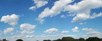
The sky becomes much lighter as it approaches the horizon.

A lot of the sprites seem to be have shading just because shading is some arbitrary requirement for objects to have, rather than actually adding depth to the object.  Rather than just slapping a gradient on something, try to visualize it in 3d and imagine how light would bounce off of it.  Shading is not easy, use references!

Objects that are part of the game should look bright (or dark, whatever makes it stand out more) and easily recognizable just from their basic shape and color.  Background art should be non-intrusive and have less contrast and saturation.

You don't really seem to be using all of your pixel real estate to it's full potential on some of these sprites.

This guide will be more helpful that I'll ever be: http://www.pixeljoint.com/forum/forum_posts.asp?TID=11299

Btw, most of us start out exactly like you.  You just need to practice a lot.
Logged

Current Projects:

UnEarth


Azure
jazzmaster9
Level 0
*


Avid Game Designer.


View Profile WWW
« Reply #4 on: June 18, 2015, 05:10:47 AM »

I made this using a premade pallete.
OLD:
original
NEW:
with better shading and colors

What do you guys think?
Logged

woodsmoke
Level 4
****


View Profile
« Reply #5 on: July 03, 2015, 12:50:52 AM »

Old is better.
New has too little contrast, which makes it hard to "read".
Logged

Pages: [1]
Print
Jump to:  

Theme orange-lt created by panic