|
Blambo
Guest
|
 |
« Reply #6420 on: March 30, 2013, 08:39:06 AM » |
|
Pre-prototyping an idea for some sort of destructible/constructable environment game. -living by the philosophy that if you can't get it to make sense with a photoshop mockup then you shouldn't try prototyping it yet. It's pretty messy.  I would love to see a 2d monsterhunter-style game in this style. |
|
|
|
|
 Logged
|
|
|
|
|
Greg Game Man
|
|
« Reply #6421 on: March 30, 2013, 12:08:08 PM » |
|
Delko - really dig your work, lookin forward to the swoooords sequel
|
|
|
|
|
Logged
|
|
|
|
|
soundlust
|
|
« Reply #6422 on: March 30, 2013, 01:16:45 PM » |
|
My first mockup, been trying to practice pixeling as much as possible.  |
|
|
|
|
Logged
|
|
|
|
|
rundown
|
|
« Reply #6423 on: March 30, 2013, 03:27:28 PM » |
|
 trying a new way of doing backgrounds. Might use this quick technique. |
|
|
|
|
Logged
|
|
|
|
|
Rat Casket
|
|
« Reply #6424 on: March 30, 2013, 03:36:09 PM » |
|
trying a new way of doing backgrounds. Might use this quick technique. Wonderful! Tell me your secrets! |
|
|
|
|
Logged
|
|
|
|
|
TNERB
|
|
« Reply #6425 on: March 30, 2013, 04:48:44 PM » |
|
Nine mini-mockups made with a vague idea about a Wario Ware-style game where you are constantly fed new challenges. Self-imposed limits: 10 color palette, resolution 48x72.  I really like that faux 3d ship mockup, the knight one is cool too. |
|
|
|
|
Logged
|
|
|
|
|
rundown
|
|
« Reply #6426 on: March 31, 2013, 03:43:51 AM » |
|
trying a new way of doing backgrounds. Might use this quick technique. Wonderful! Tell me your secrets! Just 2 layers of mountains with each a gradiant layer style. The background also has it's own gradiant layer style. And between the background and the mountains I swiped my brush on a new layer that is on lighten. Easy peasy! |
|
|
|
|
Logged
|
|
|
|
|
rundown
|
|
« Reply #6427 on: March 31, 2013, 12:43:08 PM » |
|
 made a mockup again today, really dig these minimalistic little guys I made. |
|
|
|
|
Logged
|
|
|
|
|
ompuco
|
|
« Reply #6428 on: March 31, 2013, 03:32:04 PM » |
|
A little old, but I'm planning on expanding on this, soon.  |
|
|
|
|
Logged
|
|
|
|
|
BomberTREE
|
|
« Reply #6429 on: March 31, 2013, 05:07:51 PM » |
|
And I wanted to make animal crossing.. 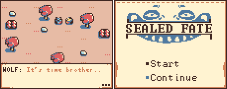 |
|
|
|
« Last Edit: March 31, 2013, 05:30:52 PM by kitheif »
|
Logged
|
|
|
|
|
surt
|
|
« Reply #6430 on: March 31, 2013, 06:19:51 PM » |
|
twingloxx: Hawt!
kitheif: Gorgeous colours.
|
|
|
|
|
Logged
|
|
|
|
|
Joshua
|
|
« Reply #6431 on: March 31, 2013, 07:04:06 PM » |
|
@kitheifSeconded. The colors are gorgeous. The title screen could use a little love though. 
|
|
|
|
|
Logged
|
|
|
|
|
BomberTREE
|
|
« Reply #6432 on: March 31, 2013, 11:19:53 PM » |
|
Thanks guys, @Joshua Yeah it could, I made it more symmetrical but I'm stuck with the simplicity  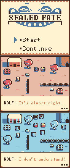 Exploring different ideas. |
|
|
|
|
Logged
|
|
|
|
|
twingloxx
|
|
« Reply #6433 on: March 31, 2013, 11:40:06 PM » |
|
@kitheif I like the colors!
@everyone Thanks!
Think I will have to expand on the concept of tiny-biplane-with-mounted-superweapon vs evil hi-tech empire.
|
|
|
|
|
Logged
|
|
|
|
|
happymonster
|
|
« Reply #6434 on: April 01, 2013, 12:09:32 AM » |
|
Kitheif: Nice colours and design, but I find the small characters hard to read. Maybe there is too much contrast in the shading for such a small size?
|
|
|
|
|
Logged
|
|
|
|
|
BomberTREE
|
|
« Reply #6435 on: April 01, 2013, 12:28:23 AM » |
|
@happymonsterThanks, I'll play around with them and see what I can do, sec. edit:   More readable? 
|
|
|
|
« Last Edit: April 01, 2013, 01:24:20 AM by kitheif »
|
Logged
|
|
|
|
|
happymonster
|
|
« Reply #6436 on: April 01, 2013, 01:31:03 AM » |
|
Yes, that works better I think!
|
|
|
|
|
Logged
|
|
|
|
|
happymonster
|
|
« Reply #6437 on: April 01, 2013, 01:39:12 AM » |
|
A little old, but I'm planning on expanding on this, soon. I like this.  |
|
|
|
|
Logged
|
|
|
|
|
Eigen
|
|
« Reply #6438 on: April 01, 2013, 02:19:38 AM » |
|
I like it too, but pretty please, reconsider the colors. White on black is really bad on the eyes and I don't undertand why so many people choose that color scheme. I would use more pastel colors while still sticking to 1-bit.
|
|
|
|
|
Logged
|
|
|
|
|
poe
Guest
|
|
« Reply #6439 on: April 01, 2013, 10:14:10 AM » |
|
@happymonsterThanks, I'll play around with them and see what I can do, sec. edit: More readable? Way better! |
|
|
|
|
Logged
|
|
|
|
|
 Developer
