|
standardcombo
|
 |
« Reply #260 on: December 13, 2014, 12:10:17 PM » |
|
Progress Update
Work on the demo is coming along and the finish line is in sight. I'm stringing together the levels, doing level design and filling in missing bits here and there, so there is not much to post but there is one set piece I'm working on which I'll post as soon as it's ready.
@blocks Thanks, if you have some of that art online feel free to post a link. I'm always curious to see what others come up with. There are so many different styles and classes, non-mono-spaced, asian, just to name a few, it's a fun space.
|
|
|
|
« Last Edit: December 13, 2014, 12:18:09 PM by standardcombo »
|
 Logged
|
|
|
|
|
standardcombo
|
|
« Reply #261 on: December 14, 2014, 10:48:46 PM » |
|
This one still needs a lot of work, but we have to keep moving. 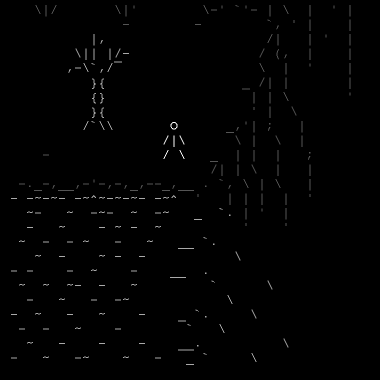 |
|
|
|
« Last Edit: June 30, 2018, 11:47:08 PM by standardcombo »
|
Logged
|
|
|
|
|
JobLeonard
|
|
« Reply #262 on: December 15, 2014, 03:26:06 AM » |
|
I guess the trick would be to accelerate the waves as they approach the edge, so the speed matches up, but that sounds pretty damn hard to pull off.
|
|
|
|
|
Logged
|
|
|
|
|
Kyzrati
|
|
« Reply #263 on: December 15, 2014, 04:01:49 AM » |
|
Dunno, I'd say he's already sorta pulled that off with the longer lines at the edge. Looks quite good, just a little disconnected at present (a bit much black space around the transition).
|
|
|
|
|
Logged
|
|
|
|
RUG
Level 0


|
|
« Reply #264 on: December 15, 2014, 06:17:17 AM » |
|
This is an interesting art style. How did you go about creating the ascii art?
|
|
|
|
|
Logged
|
|
|
|
|
standardcombo
|
|
« Reply #265 on: December 15, 2014, 09:45:57 AM » |
|
There are lots of frames skipped so it's certainly possible to accelerate the waves and put them at different speeds. One thing I feel is missing is some particle effects. I tried a couple of things but couldn't get it to work so I left the empty space. One more animation to the list of future work, but this will be a good placeholder and I think the background worked well.
@NukeTheWhales TextEdit and MonoDev but really any text editor that supports mono space, copy paste, and find replace (hey, it rhymes, maybe it could be a rap song, ala White 'n Nerdy)
|
|
|
|
|
Logged
|
|
|
|
|
Kyzrati
|
|
« Reply #266 on: December 15, 2014, 03:29:27 PM » |
|
Didn't even comment on it but the background is great, yes. Especially like the tree, so simple yet it has so much character  |
|
|
|
|
Logged
|
|
|
|
|
standardcombo
|
|
« Reply #267 on: December 15, 2014, 11:18:33 PM » |
|
|
|
|
|
« Last Edit: July 02, 2018, 01:18:30 AM by standardcombo »
|
Logged
|
|
|
|
|
Kyzrati
|
|
« Reply #268 on: December 15, 2014, 11:27:46 PM » |
|
New one wins by a long-shot  |
|
|
|
|
Logged
|
|
|
|
|
s-spooky g-g-ghosts
|
|
« Reply #269 on: December 15, 2014, 11:38:18 PM » |
|
Yeah, it's undeniably the best  |
|
|
|
|
Logged
|
|
|
|
|
oahda
|
|
« Reply #270 on: December 16, 2014, 12:17:44 AM » |
|
I think I like this one the most, only it's a bit tall: 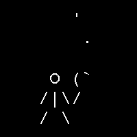 |
|
|
|
« Last Edit: July 02, 2018, 12:47:57 PM by Prinsessa »
|
Logged
|
|
|
|
|
christopf
|
|
« Reply #271 on: December 16, 2014, 08:05:37 AM » |
|
ha, i would go with prinsessa. but i also like the fourth' rhythm (they are all incredible good)
|
|
|
|
|
Logged
|
|
|
|
|
happymonster
|
|
« Reply #272 on: December 16, 2014, 10:10:19 AM » |
|
The new one is great |
|
|
|
|
Logged
|
|
|
|
|
standardcombo
|
|
« Reply #273 on: December 16, 2014, 02:30:43 PM » |
|
I think I like this one the most, only it's a bit tall: I really like that one too, and you can see the #6 was an attempt to contain it more. While I can see either design working, there is one bit of the game that I have not touched upon.. The HUD. In order to represent things such as resources and consumables, ammo and such, each item has a 1 line representation. For example The player itself \o/ Stone count o But for that torch design I am having a hard time shrinking into one line. The new one looks like this: -<~ which works |
|
|
|
« Last Edit: June 30, 2018, 11:47:41 PM by standardcombo »
|
Logged
|
|
|
|
|
oodavid
|
|
« Reply #274 on: December 17, 2014, 12:29:42 AM » |
|
I think the new one looks like it's pulsing too much, maybe you could try the other variants but use the grey tone as well? For the symbol:? |
|
|
|
|
Logged
|
|
|
|
|
christopf
|
|
« Reply #275 on: December 17, 2014, 01:49:40 PM » |
|
Na, the symbol is kickass, you can identify it immediatly. i think the _ in the new animation is just a little irritating
|
|
|
|
|
Logged
|
|
|
|
|
standardcombo
|
|
« Reply #276 on: December 17, 2014, 11:19:08 PM » |
|
Allright then, let's keep going =J Versions 8 and 9 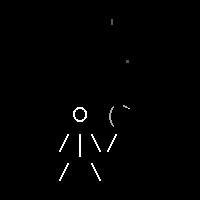  |
|
|
|
« Last Edit: June 30, 2018, 11:47:51 PM by standardcombo »
|
Logged
|
|
|
|
|
Kyzrati
|
|
« Reply #277 on: December 17, 2014, 11:24:49 PM » |
|
I really like both these new ones (the '_' bothered me in original new one as well). I think what really makes this general direction appealing is not only the grayness, but the way the parenthesis quickly morph into the quote/grave. Version 8 looks a little more alive simply because of its closer, and angled, connection to the player; 9 looks quite rigid by comparison.
|
|
|
|
« Last Edit: December 18, 2014, 05:54:14 AM by Kyzrati »
|
Logged
|
|
|
|
Green Gospod
Level 1

|
|
« Reply #278 on: December 18, 2014, 05:43:40 AM » |
|
This whole project is fantastic. I like version 8 the best. Simple, nice, groovy. Nice waterfall btw. Keep up the great work! |
|
|
|
|
Logged
|
|
|
|
|
oodavid
|
|
« Reply #279 on: December 18, 2014, 10:19:28 AM » |
|
 This one is perfect - if you're still worried about height maybe the smoke could linger? I think fire does that in the meat world. |
|
|
|
|
Logged
|
|
|
|
|
 Community
