|
J. R. Hill
|
 |
« Reply #200 on: November 24, 2010, 04:27:01 PM » |
|
Holy crap the waves on the Seascape one...  |
|
|
|
|
 Logged
|
hi
|
|
|
drChengele
Level 2

if (status = UNDER_ATTACK) launch_nukes();

|
|
« Reply #201 on: November 24, 2010, 06:55:35 PM » |
|
More LucasArts love: 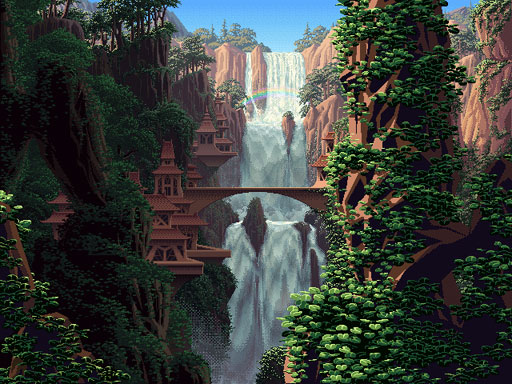 See more See more w/ animated color-cycling  That... is... words fail me. |
|
|
|
|
Logged
|
PraetorCurrently working on : tactical battles.
|
|
|
|
Ishi
|
|
« Reply #202 on: November 25, 2010, 10:34:41 AM » |
|
Yeah it's beautiful even when static. The fact that all the animated palette-swapping stuff is in there too adds a whole new layer to it. The rainy version of that scene is mind-blowing.
|
|
|
|
|
Logged
|
|
|
|
|
Hangedman
|
|
« Reply #203 on: November 25, 2010, 10:44:30 AM » |
|
Why has no one made gifs of all of those already? =/
|
|
|
|
|
Logged
|
|
|
|
|
Nugsy
|
|
« Reply #204 on: November 25, 2010, 11:36:21 AM » |
|
I remember seeing the colour cycled images a while back, they were linked from the Wolfire blog. They are really stunning.
|
|
|
|
|
Logged
|
|
|
|
|
BoxedLunch
Guest
|
|
« Reply #205 on: November 25, 2010, 03:03:35 PM » |
|
even better, the whole palette swapping makes the different times of day look like different scenes all together, just like in real life.
|
|
|
|
|
Logged
|
|
|
|
|
ras
|
|
« Reply #206 on: November 27, 2010, 04:28:26 PM » |
|
There are a lot of beautiful stuff in this thread, and it reminds me of a game I played ages ago on an Amiga. I only played it twice at a friends house, and this was, oh, I don't know, 10-15 years ago but I recall thinking the sprite art was wonderful. It was a platformer and you were some kind of mage/wizard little dude. One annoying thing with the game was that everything blended in with each other, it was hard to see the enemies etc sometimes. I haven't been able to find the game since, which sucks, esp. if it was as beautiful as I remember...
|
|
|
|
|
Logged
|
|
|
|
|
Paint by Numbers
Guest
|
|
« Reply #207 on: November 28, 2010, 12:41:20 PM » |
|
I haven't been able to find the game since, which sucks, esp. if it was as beautiful as I remember...
You might want to post in this thread. |
|
|
|
|
Logged
|
|
|
|
|
|
JutsBeaumont
Level 1
|
|
« Reply #209 on: November 28, 2010, 03:21:19 PM » |
|
I just wish it weren't so flat and outlined and, in the case of the tiles and backgrounds, over-shaded. i also don't really like the red tint everything has.
|
|
|
|
|
Logged
|
|
|
|
|
namragog
Guest
|
|
« Reply #210 on: December 05, 2010, 11:21:26 AM » |
|
I like Bangai-o spirits. the backgrounds are spectacular. no picture though hehe sorry  |
|
|
|
|
Logged
|
|
|
|
|
Bree
|
|
« Reply #211 on: December 05, 2010, 01:40:52 PM » |
|
I played "Pajama Sam in No Need to Hide When It's Dark Outside" all the time as a kid, and was delighted to find it again at a local Goodwill type store. While I feel like some of the graphics in this are hit-and-miss (some of the animated backdrops look terrible), the main screens have a nice look to them. I really like the use of blacks, especially since it seems like most kids' games won't dare use any kind of dramatic shadows.  |
|
|
|
|
Logged
|
|
|
|
|
|
|
s0
|
|
« Reply #213 on: December 06, 2010, 06:43:26 AM » |
|
I like Bangai-o spirits. the backgrounds are spectacular. no picture though hehe sorry Most of the time it looks like someone took a 16-bit pixel puke on the DS screen. And I mean that in the absolute best way possible. Bangai-O spirits is the embodiment of the beauty of chaos.   |
|
|
|
|
Logged
|
|
|
|
|
Ego_Shiner
|
|
« Reply #214 on: December 06, 2010, 07:10:25 AM » |
|
the bigger enemies are also really beautifully pixelled
|
|
|
|
|
Logged
|
Lo
|
|
|
|
Paint by Numbers
Guest
|
|
« Reply #215 on: December 06, 2010, 10:23:38 PM » |
|
I played "Pajama Sam in No Need to Hide When It's Dark Outside" all the time as a kid, and was delighted to find it again at a local Goodwill type store. While I feel like some of the graphics in this are hit-and-miss (some of the animated backdrops look terrible), the main screens have a nice look to them. I really like the use of blacks, especially since it seems like most kids' games won't dare use any kind of dramatic shadows.
I'm fairly certain the Pajama Sam games are hand-drawn. They still deserve to be in this thread, though, god damn Pajama Sam is beautiful. The first game had some amazing stuff you'd never see today in a kid's game. |
|
|
|
|
Logged
|
|
|
|
|
jwk5
Guest
|
|
« Reply #216 on: December 15, 2010, 09:57:02 AM » |
|
One game that really blew my mind in the NES era was Castlevania 2: Simon's Quest. The game's colors were really amazing (especially given the NES' limited color palette) and really helped set the gothic horror mood of the game (the music definitely helped this too). All the colors felt very cold, dirty, and decaying. Though the overall designs in the game were blocky (as far as the environments go) there was a surprising amount of detail put into the background buildings and wall textures (not to mention a good usage of shadows). This is why games are art to me, even in the early days of gaming the games showed a real collaborative artistic competence (i.e. how the graphics, sound, and game play came together much in the same way the different elements do in a movie).  |
|
|
|
|
Logged
|
|
|
|
|
pixhead
Guest
|
|
« Reply #217 on: January 08, 2011, 02:17:26 PM » |
|
Project Rhapsody  I wait for the day that development on this is started again. Fire Emblem  The Fire Emblem games for gba were great too |
|
|
|
|
Logged
|
|
|
|
|
Kramlack
Guest
|
|
« Reply #218 on: January 12, 2011, 03:20:53 PM » |
|
looked quite good at the time, and I think it's aged well. I find myself going back to it a lot for it's unique art style (among the other Dragon Ball SNES games).  |
|
|
|
|
Logged
|
|
|
|
|
ink.inc
Guest
|
|
« Reply #219 on: January 12, 2011, 03:22:19 PM » |
|
|
|
|
|
|
Logged
|
|
|
|
|
 Developer
