|
BlueSweatshirt
|
 |
« Reply #240 on: January 11, 2012, 06:31:09 PM » |
|
Unless the player needs to be playing the game at the same time, why not make those interfaces bigger? Larger text goes a long way for at-a-glance readability, which is important when rummaging through items, etc. It also gives you more stylistic flexibility if you wanna roll that way. Minimalism doesn't mean tiny haha.
I also don't think those green and pink bar colors work too well together.
|
|
|
|
|
 Logged
|
|
|
|
|
eigenbom
|
|
« Reply #241 on: January 11, 2012, 06:37:00 PM » |
|
The player can still walk around and attack while the inventories are up - the game doesn't pause - so I do need a bit of room around the center. I agree about the font size though, I might do a 'grandad' mode that chunks the font up to 16px.  And btw .. pink and green go perfect together! |
|
|
|
|
Logged
|
|
|
|
|
BlueSweatshirt
|
|
« Reply #242 on: January 11, 2012, 06:52:21 PM » |
|
They do! But they look best when you use the proper complement. Which, to your pink is #318A71.
Also those dots on the bars were hardly noticeable until I looked really closely to get a color sample.
Overall I think something a bit more vibrant and with a bit more contrast would look better.
|
|
|
|
|
Logged
|
|
|
|
|
eigenbom
|
|
« Reply #243 on: January 11, 2012, 07:07:20 PM » |
|
Oh yeh, whoops! I plan on spending a bit of time working out a nice palette at some stage -- probably soon -- as I'm tired of looking at the boring mix of colours I've got. The bars are transparent so the background dots come through.
|
|
|
|
|
Logged
|
|
|
|
|
|
|
eigenbom
|
|
« Reply #245 on: January 12, 2012, 11:45:31 PM » |
|
Update: Integrated the inventory into the game. The game auto picks up any items on the ground if there's room in the inventory. The bottom row of the inventory corresponds to the hotbar. You can pick up the whole set of items in a cell with left mouse, or pick up just half with the right mouse. When dropping, left mouse drops them all and right-mouse drops just one. If dropping onto an existing item, the items are swapped. Interestingly, the easiest way I found to do the inventory management was to add an extra "spare" slot to the inventory, so whenever you pick up an item with the mouse, that is the "spare" item. Then inventory operations just reduce to swapping items between slots (including the spare slot). Inventory operations get broadcast, so the gui knows to update (if for example an external event causes the inventory to change), or the (non-existant) sound system can catch the events and play sounds accordingly. The obligatory screenie ... 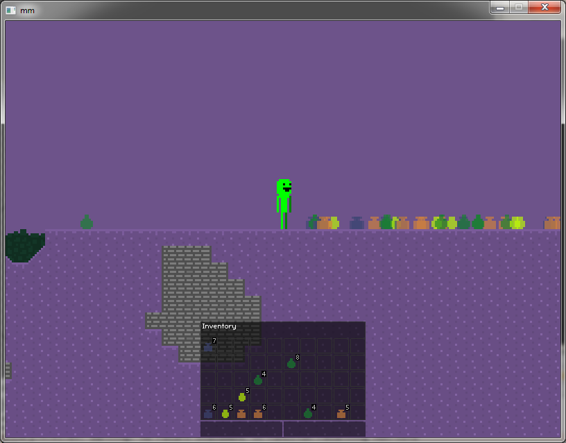 Overall its been a funny week and I've been feeling crappy all week. Going to recover on the weekend and then smash some more features in next week! Good day sirs. 
|
|
|
|
|
Logged
|
|
|
|
|
kamac
|
|
« Reply #246 on: January 13, 2012, 05:19:23 AM » |
|
I would love to see some current in-game footage.  |
|
|
|
|
Logged
|
|
|
|
|
eigenbom
|
|
« Reply #247 on: January 13, 2012, 07:48:03 PM » |
|
@kamac, not much to see atm, pretty much plays like the last vid i posted with the inventory added. I'll post a new vid at the end of next week, after tying together a few things. Update: Experimenting with simplified graphics and palette ... opinions? I'm a bit concerned that having complex lighting will make the colour relationships awkward, colour is especially important in moonman as the shapes are simple and there are no object outlines, so it might be better to have a simple lighting scheme - like four levels of brightness, or a simple dithering scheme (although dithering might make the scene too noisy...) 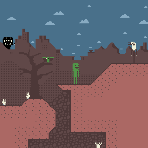 Edit: Edit: Second palette 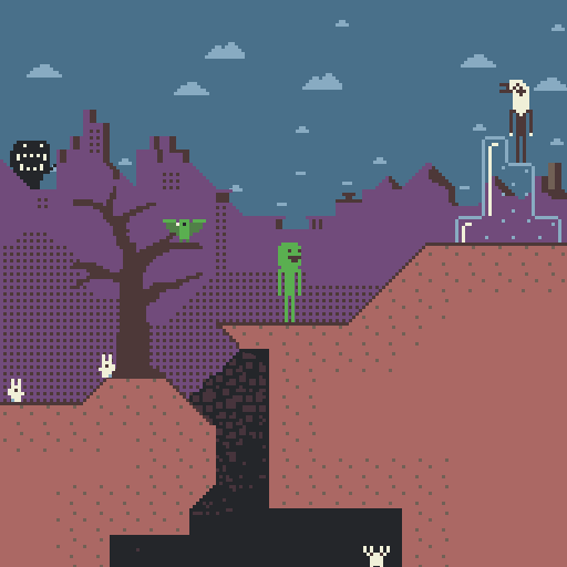 |
|
|
|
« Last Edit: January 13, 2012, 08:29:54 PM by eigenbom »
|
Logged
|
|
|
|
|
SolarLune
|
|
« Reply #248 on: January 13, 2012, 08:08:52 PM » |
|
Moonman seems definitely darker this time around than before. The eagle's a little hard to see, being so close to the background, so I would either change his color, or change the background. Having yellow mountains and underground areas might be helpful to differentiate between shapes. Also, I think it should get darker underground (just the background tiles, perhaps) - add a darker color.
|
|
|
|
|
Logged
|
|
|
|
|
eigenbom
|
|
« Reply #249 on: January 13, 2012, 08:31:49 PM » |
|
@solarlune thx, I added a second mockup. Darkened the underground, and accidentally changed the mountains to pink, which I'm starting to like better than the brown..
|
|
|
|
|
Logged
|
|
|
|
|
BlueSweatshirt
|
|
« Reply #250 on: January 13, 2012, 08:38:40 PM » |
|
I like the second palette better, a lot.
One thing though: ditch the brown outline on the foreground tiles. It just muddies up with the background.
By the way, I think your new palette is making the game look a lot better. You've got the right idea, and the results are good. I'd hate to see brown/purple the entire game though. Thematic variations would be greatly appreciated!
|
|
|
|
|
Logged
|
|
|
|
|
eigenbom
|
|
« Reply #251 on: January 13, 2012, 09:16:30 PM » |
|
thx jakman, yeh i like the second one better too. I got rid of the brown outline as u suggested, good to clean things up! Yeh I've put the colour choices off for too long, and couldn't bear to stand looking at it any longer... |
|
|
|
|
Logged
|
|
|
|
|
Ashkin
Guest
|
|
« Reply #252 on: January 13, 2012, 09:22:58 PM » |
|
If you want to use an outline still, maybe you could try a dark red?
|
|
|
|
|
Logged
|
|
|
|
|
McMutton
|
|
« Reply #253 on: January 14, 2012, 10:45:18 AM » |
|
If I may make a suggestion, with your minimalistic design, you might take a page from the original Castlevania:  Since their main character was entirely orange in hue, they had a ton of blue in the level palettes. And since blue and orange are complimentary colors, this made Simon stand out quite a bit. You could do the same thing with red in the level palettes: 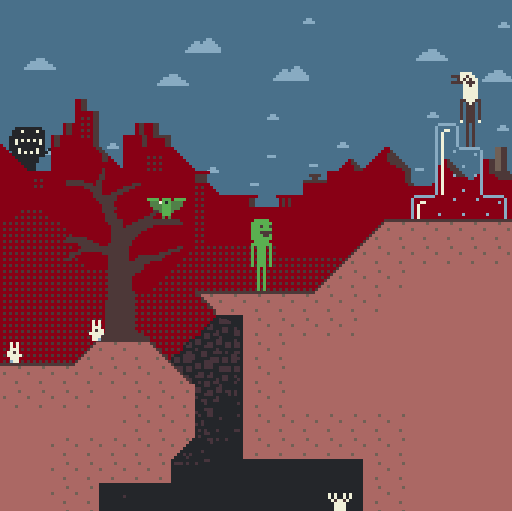 |
|
|
|
|
Logged
|
|
|
|
|
eigenbom
|
|
« Reply #254 on: January 14, 2012, 02:08:27 PM » |
|
Yo, isnt pink the complement of green? I think it works better than the red. Anyway I'll check out castlevania for some design tips, thx!
|
|
|
|
|
Logged
|
|
|
|
|
namragog
Guest
|
|
« Reply #255 on: January 14, 2012, 03:00:43 PM » |
|
NURP! Red is green's complement. I am... THE COLOR MANNNNNN
|
|
|
|
|
Logged
|
|
|
|
|
BlueSweatshirt
|
|
« Reply #256 on: January 14, 2012, 03:09:55 PM » |
|
It's a bit more accurate to say that purple is green's complement, because the complement to red is actually cyan, and pink is just a lighter shade of purple or red. http://www.colorpicker.com/Click on the button at the bottom that says "complement", and play with it a bit. [EDIT] I also found this concise little tutorial that explains complements, triades, analogs. Might be useful for you eigenbom. http://www.colorsontheweb.com/combiningcolors.asp |
|
|
|
|
Logged
|
|
|
|
|
eigenbom
|
|
« Reply #257 on: January 14, 2012, 03:52:19 PM » |
|
From wikipedia, complementary primary and secondary colours are: red and cyan green and magenta blue and yellow Edit: The above is true for additive systems. For subtractive systems (e.g., paint), red and green ARE complements. So everybody is correct, yay! Thx for the links Jakman, I've been browsing colourlovers for inspiration, they've got some very nice palettes there. |
|
|
|
|
Logged
|
|
|
|
|
eigenbom
|
|
« Reply #258 on: January 14, 2012, 04:47:56 PM » |
|
Another mockup, changed the bg pink to the exact complement of moonmans green, decreased contrast of bg, added water, changed some other colours ... all just experimenting at this stage ... 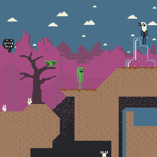 |
|
|
|
|
Logged
|
|
|
|
|
helgravis
|
|
« Reply #259 on: January 14, 2012, 07:00:08 PM » |
|
Hmm, it looks like the red color makes it more hellish looking, while the pink one looks more on the sunny side of the world.
I think you could still use the red setup if you have some kind of demon world setting, although I'd probably change the sky to something blackish.
|
|
|
|
|
Logged
|
|
|
|
|
 Community
