|
Conker
Guest
|
 |
« Reply #30500 on: December 06, 2015, 10:11:26 AM » |
|
All of your art is so damn good beetleking. Your pixel clusters are just so perfect.
Thank u bro very much! This means a lot for me because I have struggled a lot with art.. I always depress if I dont like my work... feel like I never progress... goes to show it doesn't matter how good you are that feeling never goes away  |
|
|
|
|
 Logged
|
|
|
|
|
Cobralad
|
|
« Reply #30501 on: December 06, 2015, 10:20:34 AM » |
|
i guess art is measured in the number of succesful projects and all good pixel artists are notoriously jobless.
|
|
|
|
|
Logged
|
|
|
|
|
aamatniekss
|
|
« Reply #30502 on: December 07, 2015, 09:53:03 AM » |
|
Martial arts.  |
|
|
|
|
Logged
|
|
|
|
|
JWK5
Guest
|
|
« Reply #30503 on: December 07, 2015, 11:26:54 AM » |
|
<IMAGE>
got the ramps & half tiles implemented, now it's time to start working on the teaser video!
 |
|
|
|
|
Logged
|
|
|
|
|
happymonster
|
|
« Reply #30504 on: December 07, 2015, 01:23:58 PM » |
|
Awesome help JWK5  Can I add that I think the background gradient is too strong and overpowers the scene? |
|
|
|
|
Logged
|
|
|
|
|
Conker
Guest
|
|
« Reply #30505 on: December 07, 2015, 03:26:45 PM » |
|
yeah the first thing I thought when I saw the bg was it doesn't do the art justice
|
|
|
|
|
Logged
|
|
|
|
|
JWK5
Guest
|
|
« Reply #30506 on: December 07, 2015, 04:51:55 PM » |
|
Maybe adjust the gradient to something less overpowering and better fits with the ambient colors in the scene?  |
|
|
|
|
Logged
|
|
|
|
|
happymonster
|
|
« Reply #30507 on: December 08, 2015, 12:20:15 AM » |
|
That fits really well |
|
|
|
|
Logged
|
|
|
|
|
happymonster
|
|
« Reply #30508 on: December 08, 2015, 12:21:15 AM » |
|
Saw this on twitter which might prove useful: 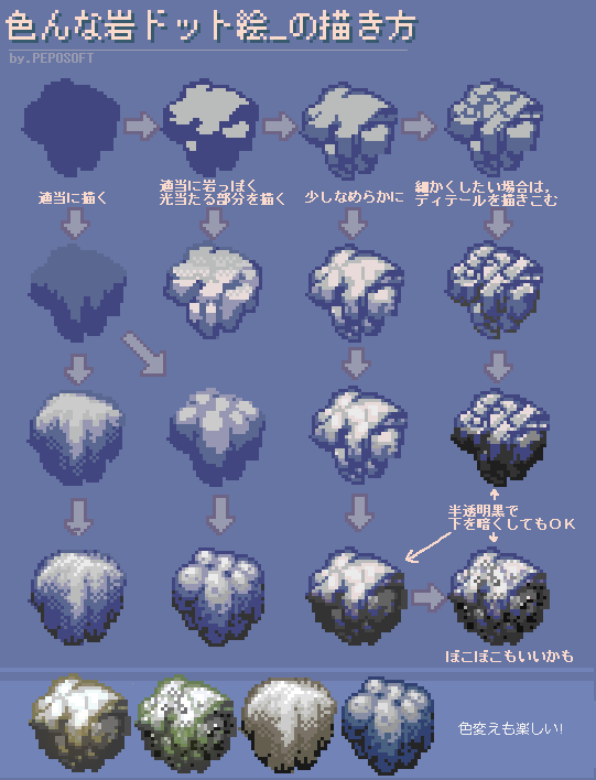 |
|
|
|
|
Logged
|
|
|
|
|
Cobralad
|
|
« Reply #30509 on: December 08, 2015, 12:26:31 AM » |
|
making stones look less like bublles would work better
|
|
|
|
|
Logged
|
|
|
|
|
pmprog
|
|
« Reply #30510 on: December 08, 2015, 12:37:22 AM » |
|
 Some profiles for a sequel to a game I wrote for my wife, whether they'll ever make it to a game, I'm not sure Edit: Using Arne's v20 palette |
|
|
|
|
Logged
|
|
|
|
|
happymonster
|
|
« Reply #30511 on: December 08, 2015, 01:42:05 AM » |
|
It was more to show the difference in shading/style. Currently the rocks are most like those on the left with a lot of shading |
|
|
|
|
Logged
|
|
|
|
|
beetleking22
|
|
« Reply #30512 on: December 08, 2015, 02:28:46 PM » |
|
Very quick water concept... Purple fits very well with the theme.. Bubbles and metroid like water effect might fitting as well..  Slopes wee  Test prototype Enemies...  |
|
|
|
|
Logged
|
|
|
|
|
Conker
Guest
|
|
« Reply #30513 on: December 08, 2015, 03:00:33 PM » |
|
beetleking, wow.. I love the 4th enemy especially. Nice colors. Really spooky atmosphere. i made some trees  |
|
|
|
|
Logged
|
|
|
|
|
Mattie
|
|
« Reply #30514 on: December 08, 2015, 08:29:37 PM » |
|
Very quick water concept... Purple fits very well with the theme.. Bubbles and metroid like water effect might fitting as well.. This reminds me of Rayman in a way. Your colors are fantastic.  |
|
|
|
|
Logged
|
|
|
|
|
SolS
|
|
« Reply #30515 on: December 08, 2015, 10:09:24 PM » |
|
Amazing work beetleking!
|
|
|
|
|
Logged
|
|
|
|
|
inca
|
|
« Reply #30516 on: December 09, 2015, 12:08:18 PM » |
|
Those look really great, beetle. My only concern would be the readability of any sprites done in that manner - it's pretty similar in contrast/brightness, no outlines, same shading style etc
|
|
|
|
|
Logged
|
|
|
|
|
Conker
Guest
|
|
« Reply #30517 on: December 09, 2015, 02:48:06 PM » |
|
|
|
|
|
|
Logged
|
|
|
|
|
unseven
Guest
|
|
« Reply #30518 on: December 09, 2015, 02:58:17 PM » |
|
Test prototype Enemies... I'm in love with this, seriously. Smooth colors, but crisp details, all in a god way. Are these for a real game? I'd play it just to see this kind of rendering! |
|
|
|
|
Logged
|
|
|
|
|
beetleking22
|
|
« Reply #30519 on: December 09, 2015, 03:22:50 PM » |
|
Ty guys! Those look really great, beetle. My only concern would be the readability of any sprites done in that manner - it's pretty similar in contrast/brightness, no outlines, same shading style etc
I totally agree.. That one thing that has been bothering me with these sprites. If i made them more brighter it might read much better. Test prototype Enemies... I'm in love with this, seriously. Smooth colors, but crisp details, all in a god way. Are these for a real game? I'd play it just to see this kind of rendering! Me and my Bro are making 2D Action adventure game with unity... Actually Im very amateur at animating and creating enemy anatomy.. My cluster might be reason why they look decent.. For example Walking animation    Jumping  Fish mouth.. |
|
|
|
|
Logged
|
|
|
|
|
 Developer
