|
Miko Galvez
|
 |
« Reply #20 on: June 10, 2012, 08:41:07 AM » |
|
I know there isn't a limit to what we can imagine but not everyone can imagine such designs for creatures such as the amazing ones you have just made. Exactly WHY is the imagination world producing such things? I think they should be uniform as well. I'm not really a fan of the first one of the newest batch you just posted. The one with the teeth without the yellow parts and the dress. That didn't seem to blend well with the others. Unless that one belongs in a different world or some sort. Anyway, I still love the progress  This requires some great ass creativity which you got man. |
|
|
|
|
 Logged
|
|
|
|
|
|
|
Angrymatter
|
 |
« Reply #22 on: June 10, 2012, 12:14:54 PM » |
|
Some classic monsters.   Classic? I dont even know half of these. They're still awesome. |
|
|
|
|
 Logged
|
*antymattar spends 8 months rigorously training to draw knees, even going so far as to have weekly appointments with his knee doctor.*
- Thatshelby
|
|
|
|
Azure Lazuline
|
 |
« Reply #23 on: June 14, 2012, 07:47:00 AM » |
|
I recommend playing through (or at least watching) some games in the Earthbound/Mother series. That's pretty much known for having cool/creepy/weird monsters.
|
|
|
|
|
 Logged
|
|
|
|
|
YellowLime
|
 |
« Reply #24 on: June 18, 2012, 02:35:06 PM » |
|
Your game is just too pretty to be scary! Obviously, if you go for disgusting you need an organic feeling, and that isn't going to happen with those highly stylized designs. You can't have them be so featureless. Same with scariness, the symmetry gives a sense of balance, and fear is about, among other things, not knowing how the dangerous creepy thing is going to act or move towards you. But maybe both of these suggestions are at odds with your chosen artstyle? tl;dr: Symmetric and featureless does not equal gross or scary  Anyway, your second try is definitely better in the creepy department. |
|
|
|
« Last Edit: June 18, 2012, 02:55:00 PM by YellowLime »
|
 Logged
|
|
|
|
|
eyeliner
|
 |
« Reply #25 on: June 18, 2012, 03:49:40 PM » |
|
Like stated, creepyiness can be explored with the way they move but also with the sound they make while interacting.
One of the most freaky creatures I encountered were
The spiders and the Hunters from RE1. The spiders because of their silent movement and the hunters because of their sounds and speed.
Most recently are the enemies that cry in Dead Space, the Guardians, when they moan before the attack. Freak me out, alright.
I didn't even pay attention to the Guardians' design, just their cry put on alert. Later I look at one and found it mildly disturbing visually, but their cry stuck to me from the first encounter.
Again, in Dead Space the impaler (The Hunter) proved the dementia of the designers because it is fairly normal, but when he attacks and eventually kills Isaac, you can never be allowed to say that you are not disturbed by the vision.
You don't need to make disturbing designs, but make them act disturbing.
Do you remember the first encounter with Ridley in Super Metroid? He doesn't do anything when he awakes, but you know you're done for when he moves...
|
|
|
|
|
 Logged
|
Yeah.  |
|
|
|
Kramlack
Guest
|
 |
« Reply #26 on: June 18, 2012, 10:00:02 PM » |
|
Ah, I was meaning to post this in here awhile ago. It's the method of monster creation in Silent Hill 2. It hammers home the point eyeliner made about movement. |
|
|
|
|
 Logged
|
|
|
|
|
eyeliner
|
 |
« Reply #27 on: June 19, 2012, 08:24:40 AM » |
|
Good watch. The part on Maria's detail, going to her belly to reinforce her personality is genius. Quite amazing, that part.
Thanks for the link.
|
|
|
|
|
 Logged
|
Yeah.  |
|
|
strazt
Level 0
 
tune on the radio

|
 |
« Reply #28 on: June 19, 2012, 03:56:41 PM » |
|
An Earthbound look seems to fit the bill. Anyway, neat enemies so far. I like 'em. |
|
|
|
|
 Logged
|
|
|
|
|
Quinn
|
 |
« Reply #29 on: June 21, 2012, 09:52:32 PM » |
|
I'm really digging the style MadWatch. Definitely a project I'll be keeping an eye on.  |
|
|
|
|
 Logged
|
|
|
|
|
FK in the Coffee
|
 |
« Reply #30 on: June 21, 2012, 10:27:02 PM » |
|
I love everything about the aesthetic this game has. Please keep us posted about its progress in DevLogs or something!
|
|
|
|
|
 Logged
|
|
|
|
|
MadWatch
|
 |
« Reply #31 on: June 22, 2012, 01:40:45 PM » |
|
Trying different color styles. Black and white like the character.  Black and yellow, more visible.  White and red, creepier I think.  |
|
|
|
|
 Logged
|
|
|
|
|
laserfire
|
 |
« Reply #32 on: June 22, 2012, 03:45:58 PM » |
|
 Negative Man from Mother 3 was pretty weird. Wrong kind of weird? |
|
|
|
|
 Logged
|
|
|
|
|
Rykuth
|
 |
« Reply #33 on: June 22, 2012, 04:09:12 PM » |
|
I agree that the white and red are creepier, but I think I prefer the black and yellow mainly because it's easier to distinguish between the player and the enemies. The others might be better in motion, but from the stills I think it's too hard to make out what's going on at a glance when the colors are the same as the player. That said all three look great. If you're still needing to make more enemies something you might want to try (it's one thing I've been doing to make alien enemies for my game) is to draw a field of random scribbles and try to pick out anything that looks like it could be a creature. It can result in some very otherworldly creatures.
|
|
|
|
|
 Logged
|
|
|
|
|
Bandages
Guest
|
 |
« Reply #34 on: June 22, 2012, 06:01:56 PM » |
|
Could we see more examples of each color-scheme outside of game?
I think red+white is a nice idea (purity+blood=whoah) but in the screenshot, one of the monsters is kind of... blurry? and the others are out of frame
|
|
|
|
|
 Logged
|
|
|
|
|
laserfire
|
 |
« Reply #35 on: June 22, 2012, 10:37:40 PM » |
|
But seriously, you should check out .  It has weird creepy crawly things that may interest you. |
|
|
|
|
 Logged
|
|
|
|
|
Quarry
|
 |
« Reply #36 on: June 23, 2012, 02:47:09 AM » |
|
Check out Patapon bosses, really interesting stuff there
|
|
|
|
|
 Logged
|
|
|
|
|
Eigen
|
 |
« Reply #37 on: June 23, 2012, 03:00:59 AM » |
|
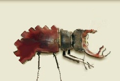
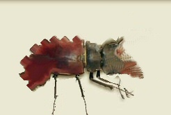
Nature is your best bet. Look at some images of insects or weird creatures. Grab a random one and play around with the shape and things. You could end up with something like this, maybe:  or this:  Here's the original |
|
|
|
|
 Logged
|
|
|
|
|
|
|
zez
|
 |
« Reply #39 on: June 23, 2012, 07:01:28 AM » |
|
First off these look amazing.
Second, is there any reason you couldnt use multiple pallets for enemys too match the mood of the current area? I feel like the black+white does a really good job of creating a general uniform ambience that could work really well for more exploration driven areas (zen platformer?) well the black + yellow would be wonderfull for action heavy sections, and the red and white could communicate that it is time get the hell out of there. Coupled with the right pacing and sound, it could be atmospheric gold.
|
|
|
|
|
 Logged
|
|
|
|
|
 Developer
 Art
Art (Moderator: JWK5)Inspiration for weird enemies
 Developer
 Art
Art (Moderator: JWK5)Inspiration for weird enemies
