|
Jad
|
 |
« Reply #1840 on: April 09, 2014, 03:19:34 AM » |
|
golemshaper, the game looks so good. But the comic text. It looks so bad. It doesn't mesh. I'll be back with better crits when I know why. Well, for one, the polygonal look and round text don't work well together. Also the text is so small while everything else is big color chunks. And the italicness doesn't really.. do it.
I'm being silly critical cause I have only stomach feel right now and I can't go more in depth right now. I will when/if I figure it out.
Right now though, GORGEOUS GAME, I feel humbled, jealous and excited. BUT THE TEXT. I DON'T LIKE IT.
BUT THE GRAPHICS. I LIKE THEM
|
|
|
|
|
 Logged
|
|
|
|
|
golemshaper
|
|
« Reply #1841 on: April 09, 2014, 03:44:54 AM » |
|
Thanks!! Could you suggest some fonts!?  |
|
|
|
|
Logged
|
|
|
|
|
Saturator
|
|
« Reply #1842 on: April 09, 2014, 06:36:19 AM » |
|
The day Satan took over physics & rendering  Awesome. How did you make that? |
|
|
|
|
Logged
|
|
|
|
|
|
|
SolarLune
|
|
« Reply #1844 on: April 09, 2014, 08:33:59 AM » |
|
@golemshaper - Really nice-looking game, seriously! Do you have a devlog yet? As for the font, it's a bit small to see and really critique effectively, but I like the Quicksand font for its solidity and smoothness. I believe it's free for commercial use. If you wanted a pixelly font, or perhaps one that kinda "feels" like Earthbound (which I think your game has some influences from), Prospero reminds me of a font from Earthbound a bit. |
|
|
|
|
Logged
|
|
|
|
|
Blink
|
|
« Reply #1845 on: April 09, 2014, 08:54:37 AM » |
|
I like Prospero, that's a good suggestion. golem: Kotaku did a small article a while back on fonts in RPGs (and when I say little, I mean little - it really doesn't give solutions or go into details, but worth a read). If you want that child-like feel, but with something less stylized (so it stands out less) you might want to aim for a middle ground like Poetsen. Personally, I'm always a fan of Haettenschweiler, but it may be too close to Impact for this project. If you want something less stylized with smooth edges, Calibri looks good (like a calmer version of the almost right Charcoal CY). Good luck! |
|
|
|
|
Logged
|
|
|
|
|
|
|
siskavard
Guest
|
|
« Reply #1847 on: April 09, 2014, 10:24:17 PM » |
|
|
|
|
|
|
Logged
|
|
|
|
|
Terrorbuns
|
|
« Reply #1848 on: April 10, 2014, 12:22:09 AM » |
|
that's one beefy taco 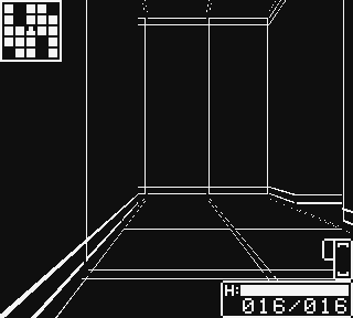 I spent pretty much my entire evening/6ish hours making a battle system but it's functional now! Next step is getting skills and items working @_@ [To answer any possible questions, you get two actions, Left Arm and Right Arm, hence why it's like "Arm used Attack".] |
|
|
|
|
Logged
|
|
|
|
LightEnt
Level 1

Power to the action-platformer


|
|
« Reply #1849 on: April 10, 2014, 01:15:11 AM » |
|
 Kapoof! Playing with fire effects and such. I'm a fan of simple magics evolving into rapidfire nukes. |
|
|
|
|
Logged
|
|
|
|
|
EvilDingo
|
|
« Reply #1850 on: April 10, 2014, 02:26:38 AM » |
|
Kapoof! Playing with fire effects and such. I'm a fan of simple magics evolving into rapidfire nukes. I think that looks really nice, but I think you could get a better result tweening the animation instead of using frames. Keep all the frame data you have, and tween the motions when you don't need to change the sprite. For example, her arm when she raises it to shoot. If you had that smoothly tweening into position it would look nicer without sacrificing the charm of the pixel art. The running animation too -- would look amazingly better if the legs were chopped at the knees and animated in two parts. Using this technique you might find you need many fewer frames and get a better result. I think this is also called 2D skeletal animation. |
|
|
|
|
Logged
|
|
|
|
|
Jad
|
|
« Reply #1851 on: April 10, 2014, 02:59:08 AM » |
|
just add more frames <- traditionalist
|
|
|
|
|
Logged
|
|
|
|
|
|
LightEnt
Level 1
Power to the action-platformer
|
|
« Reply #1853 on: April 10, 2014, 09:34:51 AM » |
|
Kapoof! Playing with fire effects and such. I'm a fan of simple magics evolving into rapidfire nukes. I think that looks really nice, but I think you could get a better result tweening the animation instead of using frames. Keep all the frame data you have, and tween the motions when you don't need to change the sprite. For example, her arm when she raises it to shoot. If you had that smoothly tweening into position it would look nicer without sacrificing the charm of the pixel art. The running animation too -- would look amazingly better if the legs were chopped at the knees and animated in two parts. Using this technique you might find you need many fewer frames and get a better result. I think this is also called 2D skeletal animation. That's an interesting idea. The pink energy sword she uses is a result of a similar technique because she acquires different weapons, and every attempt i've had make them look natural has sort of failed. Her motion stays the same, but I manually animate the sword and slashes for each weapon. As for running and shooting though, i've got some transitionals to add (starting/stopping, turning, ect), and each magic type has its own channel/casting animation. just add more frames <- traditionalist
^ Yeah, basically.  But thanks, i'll keep that in mind. I've never given tweening any real thought for anything other than bosses. |
|
|
|
|
Logged
|
|
|
|
|
Thomas Finch
|
|
« Reply #1854 on: April 10, 2014, 07:16:10 PM » |
|
|
|
|
|
|
Logged
|
|
|
|
yaomon17
Level 1
https://twitter.com/YaomonKS
|
|
« Reply #1855 on: April 10, 2014, 08:21:45 PM » |
|
Cool! Where does it lead to? |
|
|
|
|
Logged
|
|
|
|
|
Thomas Finch
|
|
« Reply #1856 on: April 10, 2014, 09:07:55 PM » |
|
Cool! Where does it lead to?
It's used as a door between any room. It floats like that until the player gets near, then it assembles. |
|
|
|
|
Logged
|
|
|
|
|
eigenbom
|
|
« Reply #1857 on: April 10, 2014, 10:18:05 PM » |
|
|
|
|
|
|
Logged
|
|
|
|
|
marquet
|
|
« Reply #1858 on: April 10, 2014, 10:32:23 PM » |
|
|
|
|
|
|
Logged
|
|
|
|
|
EvilDingo
|
|
« Reply #1859 on: April 12, 2014, 05:25:10 AM » |
|
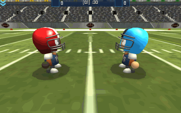 Coin toss! |
|
|
|
|
Logged
|
|
|
|
|
 Developer
