|
Geti
|
 |
« Reply #7620 on: October 29, 2013, 04:34:47 PM » |
|
@alex interesting, the skeleton feels kinda mexican "day of the dead". I like the crazy hue shifting. Re: double outlines - you rob yourself of yet another border pixel if you go that way though, not sure if it's worth burning the silhouettes of everything, especially if it will make them look really out of place in any darker settings.  @eobet http://androidarts.com/skeletonwars/ has a hex grid diversion at the bottom that might be of interest. Pretty sure hex grids have been used in many real-world games (maybe not city building?), but I do like the way that's looking, a bit oversharp perhaps but pretty clean and nice off white colours. |
|
|
|
|
 Logged
|
|
|
|
|
premonster
Guest
|
|
« Reply #7621 on: October 30, 2013, 08:21:44 AM » |
|
The angle on the monsters and player are completely wrong. |
|
|
|
|
Logged
|
|
|
|
|
migrafael
|
|
« Reply #7622 on: October 30, 2013, 08:39:07 AM » |
|
@08 I would drop the highlights and the hard black edges of the ground tiles. Really fade the contours until they are one with the floor. Apart from that it is looking goooooood!  |
|
|
|
|
Logged
|
On STEAM »  |
|
|
|
Raku
|
|
« Reply #7623 on: October 30, 2013, 01:15:01 PM » |
|
The angle on the monsters and player are completely wrong.
In 08's defense, it's tradition in a lot of top-down perspective 2d games to draw the sprites at an impossible angle to show more of the sides of the character, rather than just the top of their head for the entire game (which would be rather boring if you ask me). 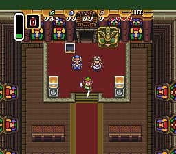 |
|
|
|
|
Logged
|
|
|
|
|
premonster
Guest
|
|
« Reply #7624 on: October 30, 2013, 01:31:51 PM » |
|
Wrong. Look how the angle fits in TLOZ:   You can always see some of the top of their heads (and almost no feet). And if you dont, the sprite was made by the intern. 08's sprites, on the other hand, look like they were made for a platformer. The back of the spiders is what disturbs the most. |
|
|
|
« Last Edit: October 30, 2013, 01:44:36 PM by premonster »
|
Logged
|
|
|
|
|
Lexonite
|
|
« Reply #7625 on: October 30, 2013, 02:36:49 PM » |
|
It's not wrong. It's an inconsistency, which can be perfectly right.
|
|
|
|
|
Logged
|
|
|
|
|
Geti
|
|
« Reply #7626 on: October 30, 2013, 06:57:11 PM » |
|
Wrong. Look how the angle fits in TLOZ:
Look a earlier zelda games for a lot of blatant voiding of geometric consistency; look at the side walls versus the characters even in that LTTP screenshot. That doesn't mean it's impossible to avoid of course, just that it doesn't seem to be something that bothers players as long as it looks "good", whatever that means :^) |
|
|
|
|
Logged
|
|
|
|
|
noumenus
|
|
« Reply #7627 on: October 30, 2013, 08:04:57 PM » |
|
Art is all about how well you break the rules  |
|
|
|
|
Logged
|
|
|
|
alex pang
Level 1


|
|
« Reply #7628 on: October 31, 2013, 12:10:24 AM » |
|
 A mockup of mine for GameboyJAM. Fits the topic too! @geti You are right, but still wanted to suggest an esier fix without having to redo lot of stuff he already made... (also I really like dem highlights  ) and thanks, the crazy hue shifts are from me not bothering with making a full palette  |
|
|
|
|
Logged
|
Follow me on twitter @alexolsenpang
|
|
|
|
i-kari
|
|
« Reply #7629 on: October 31, 2013, 03:14:13 AM » |
|
Look a earlier zelda games for a lot of blatant voiding of geometric consistency; look at the side walls versus the characters even in that LTTP screenshot. That doesn't mean it's impossible to avoid of course, just that it doesn't seem to be something that bothers players as long as it looks "good", whatever that means :^)
Yup. It doesn't have to be realistic to look good. |
|
|
|
|
Logged
|
|
|
|
|
premonster
Guest
|
|
« Reply #7630 on: October 31, 2013, 05:19:39 AM » |
|
The spiders looked pretty awful to me in 08's mockup due to their angle, mainly seen from the back, because they made me notice very clearly the wrong angle. It really bothered, felt wrong. Some games, like Power Heroes, dont have the same effect, and work pretty well.
08 should just finish Stealer and be all rich and famous, by the way. Guy's a modern platformer genius and keeps jerking around with top-down 8-bit crap.
|
|
|
|
« Last Edit: October 31, 2013, 05:35:18 AM by premonster »
|
Logged
|
|
|
|
|
terri
|
|
« Reply #7631 on: October 31, 2013, 05:57:54 AM » |
|
it isn't wrong though, its a choice. personally I think some hard shadows always help with this angle, it places the characters on the ground  |
|
|
|
|
Logged
|
|
|
|
|
|
Lee
Level 1
|
|
« Reply #7633 on: October 31, 2013, 09:36:13 AM » |
|
08/premonster discussion: I think I understand the issue, the player looks flat as if viewing perfectly from the side, whilst clearly it should have some depth. I gave it a shot:   I don't really understand the original design of the body/arm/gun well enough though so I changed it a bit (ideally I think it would be best to have the gun a different colour for this reason but the limitations are down to 08 I guess). Also it makes his head seem kind of oblong... at this scale a single pixel adds quite a bit of size to the object, maybe the original helmet design is as good as you can get? And the single pixel highlights on the feet are stupid of me, but I already uploaded so whatever cba to change it now. Olli, that looks pretty good but I think the gold is a tad bit too bright/yellow in that scene, especially in the foreground. Right now it kinda looks like walk-able terrain. Also with a setting or low sun you'd expect everything to be almost silhouetted, although there appears to be 4 suns, with two in each window and one main one at the bottom of the left window. |
|
|
|
|
Logged
|
|
|
|
|
Cellusious
|
|
« Reply #7634 on: October 31, 2013, 01:18:35 PM » |
|
snip
|
|
|
|
« Last Edit: October 31, 2013, 01:57:12 PM by Cellusious »
|
Logged
|
|
|
|
|
Carrion
|
|
« Reply #7635 on: October 31, 2013, 01:53:04 PM » |
|
Not a huge fan of your overhead stuff. Your platormer-esq art is good for how organic it is and how layered up and filtered the backgrounds are, that's obviously not going to be present here. Also is that character coming back to your new game or are you just re-using assets? |
|
|
|
|
Logged
|
|
|
|
|
noumenus
|
|
« Reply #7636 on: October 31, 2013, 09:30:58 PM » |
|
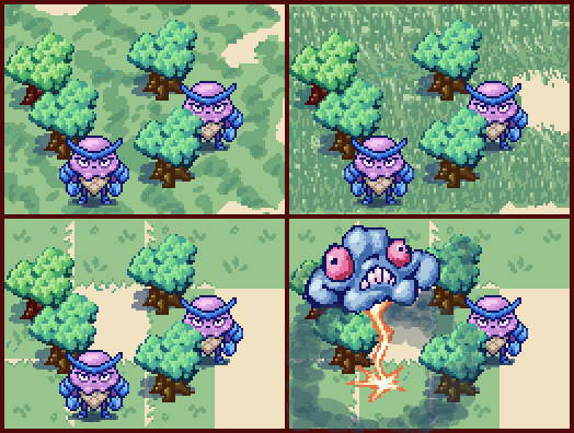 cross post from my devlogTrying to get a feel for the forest. |
|
|
|
|
Logged
|
|
|
|
|
Kian
|
|
« Reply #7637 on: November 01, 2013, 02:51:45 AM » |
|
x4 view of a section of level done in PS for planning before going in Tiled.  |
|
|
|
|
Logged
|
|
|
|
|
Havegum
|
|
« Reply #7638 on: November 01, 2013, 04:35:41 AM » |
|
Carrion said I should start posting here, so here I am, doing that! GameBoy mockup thing  |
|
|
|
|
Logged
|
|
|
|
|
Kekskiller
Guest
|
|
« Reply #7639 on: November 01, 2013, 04:41:12 AM » |
|
Wooaahh, this is creepy somehow.
|
|
|
|
|
Logged
|
|
|
|
|
 Developer
