|
jamesprimate
|
 |
« Reply #4260 on: July 22, 2015, 03:48:16 PM » |
|
sorry, bumping so it doesnt get lost in the page turn: it probably seems like quite a lot dropping all these ideas all at once, but we've been working on this in the dark for months and months and months of course, (with multiple graphic designers even!) and quite a lot is skipped over as well, haha. Note that the work Joar is showing here is about the font specifically, as the setting and use of the illustration are just quick mockups to show context. In that regard, *i humbly request that these not be shared around* as we intend to do a cool "Big Reveal" sort of thing when it is all polished and where we want it to be. The ceiling is MUCH higher than this  Those slugcat pics are sweet. Are they canon now? Have you contacted the author?
Yes indeed! We've been working with the extremely talented Del http://deldraws.tumblr.com/ for a couple of months now, and have some Big Plans in that direction. These just are some of the early pose sketches shes done for us so far:  Detail: https://i.imgur.com/sx89CJR.jpg@ Oldblood: indeed indeed! its a really big change from the past...3? 4? years. tbh I expected much more of a *cars flipped and trashcans on fire* sort of response, so im quite relieved, haha. The clean style of the fonts will follow through to the UI and blend really well with the updated aspects of the visual presentation, which is super essential. As much as we both liked the funky distorted style of the alpha and the clever architectural rain silhouettes, they just introduce too much visual noise to be able to do anything else with, meaning that we'd have to be introducing other fonts, figure out ways of making it work with the illustrations, and it just gets super messy. Perhaps most importantly, we came to the conclusion that the thing people care about in Rain World is THE SLUGCAT of course. So thats where we should to put the focus. Everything else should serve to support that, rather than fight for visual space. |
|
|
|
« Last Edit: July 22, 2015, 04:06:40 PM by jamesprimate »
|
 Logged
|
|
|
|
|
Christian
|
|
« Reply #4261 on: July 22, 2015, 04:35:29 PM » |
|
Those sketches look great, but I'm going to miss that more gritty, less stylized slugcat that's been in the logo.
|
|
|
|
|
Logged
|
|
|
|
|
Woodledude
|
|
« Reply #4262 on: July 22, 2015, 07:50:45 PM » |
|
I really like the slugcat sketches! Really a lot! THey're adorable, and yet also alien - They make you care about the slugcat, but also give you the feeling that this world is very different from yours...  The old ones were good, too, but the new ones, I must say, are invaluable. My two cents? Keep them. |
|
|
|
|
Logged
|
Fledgling game designer. Be prepared for walls of text with little coherency and much rambling. Thank you for your time, and tell me what you think.
|
|
|
|
adge
|
|
« Reply #4263 on: July 22, 2015, 10:26:59 PM » |
|
Nr 1 or Nr 10
|
|
|
|
|
Logged
|
|
|
|
Teod
Level 1


|
|
« Reply #4264 on: July 22, 2015, 10:40:10 PM » |
|
Those slugcat pics are sweet. Are they canon now? Have you contacted the author?
Yes indeed! We've been working with the extremely talented Del http://deldraws.tumblr.com/ for a couple of months now, and have some Big Plans in that direction. These just are some of the early pose sketches shes done for us so far: https://i.imgur.com/sx89CJR.jpg Good. I really like the thick legs on those sketches, they are way more realistic for jumpy creature. Will you change the ingame model a bit to add them? Because if nothing changed since this gif, they're just as thin as the hands are. It's not something that is seen too often, so it shouldn't affect the general feel of the creature, but it would be a nice detail. The clean style of the fonts will follow through to the UI and blend really well with the updated aspects of the visual presentation, which is super essential. As much as we both liked the funky distorted style of the alpha and the clever architectural rain silhouettes, they just introduce too much visual noise to be able to do anything else with, meaning that we'd have to be introducing other fonts, figure out ways of making it work with the illustrations, and it just gets super messy.
Perhaps most importantly, we came to the conclusion that the thing people care about in Rain World is THE SLUGCAT of course. So thats where we should to put the focus. Everything else should serve to support that, rather than fight for visual space.
Okay, this is good position to start with. But clean not necessarily needs to be smooth. 10, in my opinion, is an example of clean, but not smooth. And smoothness just doesn't feel right for Rain World. Very few things in the game are smooth, so why should the logo be? It's kinda unrepresentative. Those sketches look great, but I'm going to miss that more gritty, less stylized slugcat that's been in the logo.
Relax, those are just sketches, gritty details can be added later. |
|
|
|
« Last Edit: July 22, 2015, 11:15:45 PM by Teod »
|
Logged
|
|
|
|
|
Zorg
|
|
« Reply #4265 on: July 23, 2015, 12:53:24 AM » |
|
I'm sorry about my first reaction post to the new pictures. But the hollow eyes really creep me out. It's all about the missing highlights, i guess. In combination with the the liquid (blood) or knife-shaped typography it really looked like a horror movie poster to me.  The new anatomy of the slugcat is an improvement, because the legs in the current logo look rather designed for swimming (otter) than jumping and climbing (cat). The new hips/thighs emphasize the ability to move/jump fast on land (chinchilla?). But the new pear shape of the body does not match the in-game slugcat very well. Do you consider to adjust the legs of the slugcat in-game? |
|
|
|
|
Logged
|
|
|
|
|
Crispy75
|
|
« Reply #4266 on: July 23, 2015, 01:28:11 AM » |
|
There's definitely something I don't like about the new slugcat drawings but it's hard to articulate. I think it's to do with the incongruity between the in-game character, which is pure white with indeterminate anatomy, and the Hero drawing, which is a 3-dimensional creature with muscles and visible joints.
To me, the in-game slugcat isn't an abstracted thing, it's the thing itself. The Hero drawings add details to something that doesn't have any. Extrapolating the argument, are we going to see similar drawings of the lizards? I don't want to see what their skin looks like. As far as I'm concerned, they are a pure black shadow with brightly coloured highlights.
This is a bit like complaining about the buttons on Mario's trousers, which are not drawn in the NES game, so maybe it's just because the game came before the art. Still; I think the silhouette+highlights style of representing characters in the game is an important part of the game's identity. "Showing how the sausage is made" distracts from it.
|
|
|
|
|
Logged
|
|
|
|
|
jamesprimate
|
|
« Reply #4267 on: July 23, 2015, 03:56:12 AM » |
|
@ crispy: this aspect is something were really cognizant of, and plan on keeping the two visual realms as discreet territory so as to avoid visual conflict. in fact, thats one of the reasons why we stopped working on the "architectural letters" concept, was that it required a lot of already very visually-distinct elements to be represented in a different style. the characters are tiny, 24 pixels or whatever, so there is a lot more leeway. and if you are going to take that leap and do detail on *anything*, its got to be slugcat! its a tale as old as time though, and pretty much every videogame has to deal with this visual incongruity in one way or another and each path has its own potential pitfalls haha   |
|
|
|
|
Logged
|
|
|
|
Teod
Level 1
|
|
« Reply #4268 on: July 23, 2015, 04:08:12 AM » |
|
I'm sorry about my first reaction post to the new pictures. But the hollow eyes really creep me out. It's all about the missing highlights, i guess. In combination with the the liquid (blood) or knife-shaped typography it really looked like a horror movie poster to me. http://i.imgur.com/slDFM7D.pngInteresting, I have quite the opposite impression. Rain World balances between cutesy and creepy and those eyes manage to add a bit to both of those factors. Although I admit their creepiness varies from picture to picture and goes overboard in at least one of the sketches. It's hard to say what exactly nudges the look in one direction or another. |
|
|
|
|
Logged
|
|
|
|
|
Crispy75
|
|
« Reply #4269 on: July 23, 2015, 04:41:35 AM » |
|
OMG, Mario's buttons ARE drawn on the NES sprite. Great example, Crispy, great example :D
|
|
|
|
|
Logged
|
|
|
|
|
Zorg
|
|
« Reply #4270 on: July 23, 2015, 05:47:17 AM » |
|
Interesting, I have quite the opposite impression. Rain World balances between cutesy and creepy and those eyes manage to add a bit to both of those factors.
Although I admit their creepiness varies from picture to picture and goes overboard in at least one of the sketches. It's hard to say what exactly nudges the look in one direction or another. I think it's a combination of big eyes and missing reflections. The eyes in the current logo have a tiny light point, and that's enough to tell my brain that these black circles are eyes, not holes (The manga eyes in my previous post were obviously meant as a joke.) It's really interesting how the creepiness varies from pose to pose and little detail can change everything. My overpaint attempts always end in a totally cute slugcat.  By the way, Del's paintings (check out that tumblr!) are f***n' amazing and i'm sure everything will turn out great in the end!  |
|
|
|
|
Logged
|
|
|
|
|
Christian
|
|
« Reply #4271 on: July 23, 2015, 06:08:32 AM » |
|
@ crispy: this aspect is something were really cognizant of, and plan on keeping the two visual realms as discreet territory so as to avoid visual conflict. in fact, thats one of the reasons why we stopped working on the "architectural letters" concept, was that it required a lot of already very visually-distinct elements to be represented in a different style. the characters are tiny, 24 pixels or whatever, so there is a lot more leeway. and if you are going to take that leap and do detail on *anything*, its got to be slugcat! its a tale as old as time though, and pretty much every videogame has to deal with this visual incongruity in one way or another and each path has its own potential pitfalls haha Looking at Steam banners of games in my library, the Shelter games seem to be in line with your thinking. Clean font juxaposed by the rugged art style   Feist and Overgrowth have more stylized titles   |
|
|
|
« Last Edit: July 23, 2015, 06:20:12 AM by Christian »
|
Logged
|
|
|
|
|
gimymblert
|
|
« Reply #4272 on: July 23, 2015, 10:20:35 AM » |
|
Not the best at Photoshop, but mixed elements of my favorites (1,5,10) I love the colorful overgrowth, faded textures, and weird glyphs of 1, with the rain background and ruined debris look of 5, and the font of 10  forget what I sais, I like this concept better  |
|
|
|
|
Logged
|
|
|
|
|
Rojom
|
|
« Reply #4273 on: July 23, 2015, 11:57:37 AM » |
|
Not the best at Photoshop, but mixed elements of my favorites (1,5,10) I love the colorful overgrowth, faded textures, and weird glyphs of 1, with the rain background and ruined debris look of 5, and the font of 10 forget what I sais, I like this concept better I'm for this one, too. The rain silhouetting RAIN really makes it pop. |
|
|
|
|
Logged
|
|
|
|
|
|
|
cousin_it
|
|
« Reply #4275 on: July 23, 2015, 03:38:09 PM » |
|
Yes indeed! We've been working with the extremely talented Del http://deldraws.tumblr.com/ for a couple of months now, and have some Big Plans in that direction. These just are some of the early pose sketches shes done for us so far: If you want a high-res concept of the slugcat, IMO there's a lot of room for improvement. The shading is very coarse, the 3D shape of the face looks off, and I'm not sure that a slug-like tail can ever look good in high-res (as opposed to a furry tail). May I suggest doing a Google image search for "ermine", and using it as a reference for some of the trickier features?  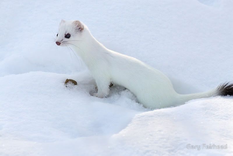 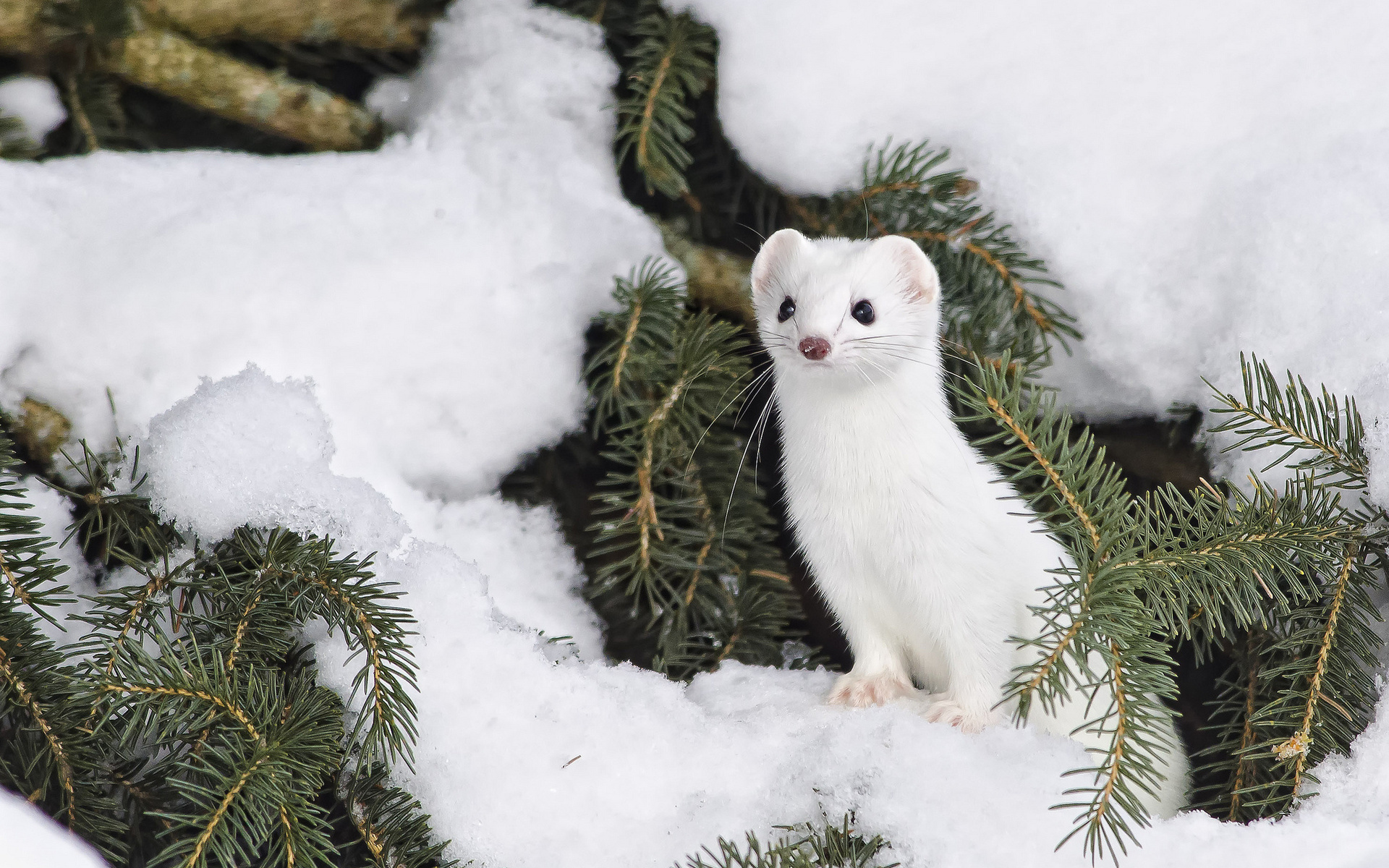 |
|
|
|
« Last Edit: July 23, 2015, 10:37:17 PM by cousin_it »
|
Logged
|
|
|
|
|
oahda
|
|
« Reply #4276 on: July 23, 2015, 03:52:00 PM » |
|
Omg It's a real slugcat <3
|
|
|
|
|
Logged
|
|
|
|
|
gimymblert
|
|
« Reply #4277 on: July 23, 2015, 06:42:04 PM » |
|
Interesting, I have quite the opposite impression. Rain World balances between cutesy and creepy and those eyes manage to add a bit to both of those factors.
Although I admit their creepiness varies from picture to picture and goes overboard in at least one of the sketches. It's hard to say what exactly nudges the look in one direction or another. I think it's a combination of big eyes and missing reflections. The eyes in the current logo have a tiny light point, and that's enough to tell my brain that these black circles are eyes, not holes (The manga eyes in my previous post were obviously meant as a joke.) It's really interesting how the creepiness varies from pose to pose and little detail can change everything. My overpaint attempts always end in a totally cute slugcat. By the way, Del's paintings (check out that tumblr!) are f***n' amazing and i'm sure everything will turn out great in the end! white pikachu |
|
|
|
|
Logged
|
|
|
|
|
JLJac
|
|
« Reply #4278 on: July 25, 2015, 01:52:49 AM » |
|
Hey everyone! We have a candidate now that both James and I agree is good and which has been getting generally positive responses I'm sorry if it feels like we're bulldozing a bunch of your opinions here, that's not at all our intention - but we are in a slight tight spot because we're stuck between a deadline and our talented illustrator being off to a convention, so we had to pick something and go with it for now.  It's pretty probable that the illustration might change - this one was actually created as a "sketch" by Del and then given a slight clean up and pixel finish by myself, so I think we'll give her an opportunity to do a final version at one point or another. Also I have this idea that I'd want to see a version similar to this but with the slugcat looking out to the left which would add a bit of drama to the composition, I imagine. That said, we are really stoked about the direction of this one - it's clean and stylish, legible contrary to the old one, and the slugcat hits that sweet spot between cute and creepy! As a result of showing the game at conventions we know from public feedback that to many people the game is "the slugcat game", meaning that the slugcat being the main character of the logo would make a lot of sense for public recognition. For this reason we also decided to go with a rather toned down version of the typography - the slugcat should draw the eye, the letters are there to discover next. You might also notice that the letters aren't quite as bright as the highlights on the illustration. Still the character is lit as if it was the typography giving off the light, bringing the two elements together and placing them in the same imagined space. (Edit - cropped it a bit so it fit in the forum formatting ~ ) |
|
|
|
« Last Edit: July 25, 2015, 02:10:03 AM by JLJac »
|
Logged
|
|
|
|
|
Christian
|
|
« Reply #4279 on: July 25, 2015, 01:56:55 AM » |
|
Huh, I actually really like that look. It's...elegant, probably the best word, and the slugcat being illuminated by the letters is cool
|
|
|
|
|
Logged
|
|
|
|
|
 Community
