|
HopFrog
|
 |
« Reply #40 on: February 02, 2016, 01:42:43 PM » |
|
Holy cow lobstersteve, that's a brilliant idea. I did some level design with the whole ice cube thingy and came up with some very cool puzzles already  Makes me wanna skip all the areas I had planned and start making that ice world zone right away! |
|
|
|
|
 Logged
|
|
|
|
|
lobstersteve
Guest
|
|
« Reply #41 on: February 02, 2016, 02:13:23 PM » |
|
 excited to see what you'll come up with
|
|
|
|
|
Logged
|
|
|
|
|
HopFrog
|
|
« Reply #42 on: February 03, 2016, 02:32:48 PM » |
|
Making bombs go boom now. Can't quite decide on an explosion sprite yet...  |
|
|
|
|
Logged
|
|
|
|
|
lobstersteve
Guest
|
|
« Reply #43 on: February 04, 2016, 01:52:36 AM » |
|
I'd go for something less fancy.
That Explosion looks like something from an anime and clashes a bit with your simple sprites. (I mean just the Explosion sprite at the beginning, the effects could turn out fine)
|
|
|
|
|
Logged
|
|
|
|
|
oahda
|
|
« Reply #44 on: February 04, 2016, 03:26:42 AM » |
|
Unless this is the first step towards a new style to "divorce it from Fez", as it were. :3
Fancy shaders in modern pixel games is always a funny "anachronism". I like it.
|
|
|
|
|
Logged
|
|
|
|
|
HopFrog
|
|
« Reply #45 on: February 04, 2016, 02:30:37 PM » |
|
So the very talented @Britt_t_Brady kindly made a quick mockup of a new art style for me. I am very much interested in hearing your thoughts on this!  Do you think it properly captures the game's feel so far? Is there something about this piece that you don't like? Is there something that you REALLY like? Do you think this is still too much Fez-Like? Thanks in advance guys, this is actually quite an important bit of the development process |
|
|
|
|
Logged
|
|
|
|
|
lobstersteve
Guest
|
|
« Reply #46 on: February 04, 2016, 02:37:08 PM » |
|
I like it It separates itself from FEZ well enough. When i see it, i don't immediatly think of FEZ. What i like: the tree, the mushroom, the colors, the grass. What i don't like that much: the pattern inside the purple thingy. What i totally don't like: the character  (but maybe that's just my personal taste) |
|
|
|
|
Logged
|
|
|
|
|
matwek
Guest
|
|
« Reply #47 on: February 04, 2016, 03:40:25 PM » |
|
I kind of like the character, but you're stil in 'Fez' territory with that art I'm afraid. I know how tough it can be to shake the comparison. I did art for a game called Poncho, and just because it was a puzzle platform game with an odd gimmick, we kind of got stuck with a 'Fez Clone' label. Which isn't a bad thing I guess, people like Fez. You can check it out here... http://store.steampowered.com/app/332620/Anyway, if you're looking for an artist to team up with and you want to move as far away from Fez as you can, I have a few tilesets that I'm working on that might be of use. They'll probably need a bit of tweaking to work with your game, but they seem fairly 'non-Fez-like' to me. |
|
|
|
|
Logged
|
|
|
|
|
HopFrog
|
|
« Reply #48 on: February 04, 2016, 04:17:33 PM » |
|
 Also I forgot to upload this! |
|
|
|
|
Logged
|
|
|
|
|
oahda
|
|
« Reply #49 on: February 04, 2016, 05:04:43 PM » |
|
I think the new art mockup looks great, and I don't agree that it still looks like Fez! It looks its own thing. The character is cute too! I like!
|
|
|
|
|
Logged
|
|
|
|
|
DifferentName
|
|
« Reply #50 on: February 04, 2016, 06:27:59 PM » |
|
So the very talented @Britt_t_Brady kindly made a quick mockup of a new art style for me. I am very much interested in hearing your thoughts on this! Do you think it properly captures the game's feel so far? Is there something about this piece that you don't like? Is there something that you REALLY like? Do you think this is still too much Fez-Like? Thanks in advance guys, this is actually quite an important bit of the development process I love the tree. It kind of gives a feeling of being inspired by lower resolution pixel art, but with softer corners and a bit extra depth. I'm not sure if the other stuff works quite as well though, like the grass that looks pretty chaotic. The character looks objectively better, but I'm not sure I would like it as much as a cute little animal. |
|
|
|
|
Logged
|
|
|
|
|
lobstersteve
Guest
|
|
« Reply #51 on: February 05, 2016, 02:26:02 AM » |
|
I think the new art mockup looks great, and I don't agree that it still looks like Fez! Yup. A lot of games use FEZ as a foundation to create their own style (Fez itself used Cave Story as inspiration), but evolve it into something very different. Another idea: maybe you've chosen the desaturated colors to also separate your art from Fez, but i think games that rely a lot on fun, should use brighter colors.  |
|
|
|
« Last Edit: February 05, 2016, 03:31:36 AM by lobstersteve »
|
Logged
|
|
|
|
|
oahda
|
|
« Reply #52 on: February 05, 2016, 03:04:57 AM » |
|
Still looks very saturated to me.
And the little character is perfect for the setting. ε:
Only critique: the edges of that mushroom are too blocky. Should be rounder IMO.
Love the Toy Story clouds. <3
|
|
|
|
|
Logged
|
|
|
|
|
washk
|
|
« Reply #53 on: February 05, 2016, 03:06:42 AM » |
|
Another idea: maybe you've chosen the desaturated colors to also separate your art from Fez, but i think games that rely a lot on fun, should use brighter colors.  New graphics + brighter colors = win for me. This looks great. |
|
|
|
|
Logged
|
|
|
|
|
lobstersteve
Guest
|
|
« Reply #54 on: February 05, 2016, 03:40:30 AM » |
|
Still looks very saturated to me.
And the little character is perfect for the setting. ε: Yeah, probably could use even more saturation...  And the character is basicly wiggly puff - now it's not a Fez, but a pokemon ripoff  But to be (more) serious: what i don't like that much about it, is it's "cute" look (and i don't like cute things  ). While more abstract characters, like Gomez, look more artsy - but well, that boils down to personal taste... |
|
|
|
|
Logged
|
|
|
|
|
oahda
|
|
« Reply #55 on: February 05, 2016, 03:51:35 AM » |
|
It's about as hard not to "rip off" Pokémon as The Simpsons; they've already covered every possibility. And usually even the Pokémon are based on something that existed before. So meh. 'S fine. We need more cute in this world.  But hey, it's up to OP in the end. You're automatically raising the cute by increasing saturation, tho, so this is partially your doing.  I know, deep inside, you do love the cute. I've nothing against a little extra saturation, tho. The edit looks fine too. |
|
|
|
|
Logged
|
|
|
|
|
Zorg
|
|
« Reply #56 on: February 05, 2016, 04:02:02 AM » |
|
Add some slopes, FEZ does not provide any slopes, ta da!
In my eyes, you should not use that much saturation, because it will be hard to set a highlight if everything is super saturated. The contrast between non-saturated and saturated pixels makes them 'pop' even more.
In the last mockup, the tree does not match the grass at all, imo.
|
|
|
|
|
Logged
|
|
|
|
|
oahda
|
|
« Reply #57 on: February 05, 2016, 04:17:49 AM » |
|
The grass does feel too bright in the last one. Also bright pinkish and bright greenish is a sort of objectively bad contrast, straining on the eyes, isn't it? That definitely works much better in the desaturated version.
|
|
|
|
|
Logged
|
|
|
|
|
HopFrog
|
|
« Reply #58 on: February 05, 2016, 08:03:17 AM » |
|
So I have decided to hire Brit, I just need to see how the payment process would work now that my country is basically a mess. I agree on most of your concerns (hey I like cute too ). We talked a little bit about it with Brit and it seems himself isn't very happy with the final product either. Given that it was only a 20min thing, that was to be expected anyway. We will need to start defining the style soon, I am thinking Fez + Wind Waker + The Witness. And yeah, I like bright, colorful and saturated too, but I am no artist and know nothing about choosing colours. So... Yeah, keep the suggestions coming please  |
|
|
|
|
Logged
|
|
|
|
|
HopFrog
|
|
« Reply #59 on: February 06, 2016, 10:06:30 AM » |
|
I started working on some really odd and ominous puzzles 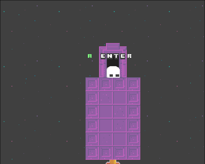 |
|
|
|
|
Logged
|
|
|
|
|
 Community
