Welcome, Guest. Please login or register.

Login with username, password and session length

 
Advanced search

1411641 Posts in 69394 Topics- by 58449 Members - Latest Member: pp_mech

May 14, 2024, 04:35:35 PM

Need hosting? Check out Digital Ocean
(more details in this thread)
TIGSource ForumsCommunityTownhallForum IssuesArchived subforums (read only)CreativeMaking iconic characters
Pages: 1 [2]
Print
Author Topic: Making iconic characters  (Read 11896 times)
Kazerad
Level 1
*


Should really make more games.


View Profile
« Reply #20 on: December 23, 2010, 03:56:41 AM »

Personally, I think creating an "iconic character" is the entirely wrong goal. Instead, I think it's better to dig a little deeper: what are you trying to do with the character? Look at some examples:


This is the Spy from TF2. I think someone mentioned this earlier in the thread, but TF2 was designed with a major emphasis on readability; characters' traits and abilities are supposed to be easily determined from their appearance. This guy is kind of scrawny, wearing a business suit in the middle of a battlefield, and carrying a knife. If you see him you're not supposed to run away, and this is clearly conveyed in his appearance. As a character, he accomplishes his purpose well.


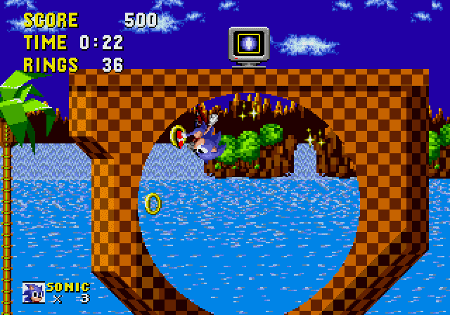
Here's Sonic. Unlike the Spy above, it isn't really important for Sonic to be readable; the player learns right away that Sonic is way faster than he looks. Instead, Sonic is designed with a very strong visual style. He's basically two spheres stuck together. He runs around on loop-de-loops collecting rings. Look at those spherical trees in the background. The villain is just a sphere too, as are most the enemies. The whole game has this sort of recurring visual motif of spheres and circles, giving it a style that makes it easily recognizable when compared to other games.

Most people playing the game probably know almost nothing about Sonic as a character, and that's okay. They don't remember "a fast hedgehog, how original!", they remember the game and its visual style as a whole. Personally, I think the later games didn't catch on as well because they moved away from this strong visual style. This is also why games like Minecraft are so easily recognizable; the Minecraft "style" can be recognized in an instant.


Here's GLaDOS. You don't even see her until the end of the game, yet she is undeniably the most recognizable character from Portal - most people don't even know the protagonist's name. GLaDOS was specifically designed to provoke and taunt the player, being an interesting antagonist. What people remember about GLaDOS is her personality: her dry humor, strange promises, and eerie dialogue. She is very much an iconic character because of her writing.

These are just a few examples of pretty good characters, but I think they illustrate my point well. Sonic would not have gained much from making his character design "look" fast. The Spy would not have gained much from a more original personality. GLaDOS would not have gained much from looking similar to all the other characters in the game. Each of these character designs could be considered iconic, but they are really just accomplishing a very specific purpose. If you want to create an iconic character, I think you should just figure out the character's purpose and then streamline him to fill that role as elegantly as possible.

That's my take on it anyway.
Logged

gunswordfist
Level 10
*****


View Profile WWW
« Reply #21 on: February 09, 2011, 01:47:16 PM »

Let's take a look at a few iconic characters and see what they've all got in common. Say, Mario (Super Mario Bros.), Wolverine (X-Men), and Kratos (God of War).


[1]Color Scheme: Each of these characters have a simple (but harmonious) color scheme that is easy to "read" and recognize. With mario the dominant colors are red and blue and are and there are touches of white, brown, black, peach, and yellow. Other than black and white, you'll note that most of these less dominant colors in the scheme are close to either red or blue on the color wheel. Wolverine has a similar deal going on only with yellow and blue being dominant. With Kratos white and red are clearly dominant, and the less dominant copper color is pretty close to red on the color wheel.

It is not just the colors themselves that are important, but also their arrangement. The red on Mario's arms keep them separated from the blue of the legs and body and allows the player to easily spot their placement at all times. Because the white and brown are used sparingly they draw attention to themselves which is useful for adding emphasis to Mario's punching actions (breaking blocks, etc.) and foot placement.

Wolverine and Kratos share a very similar color composition that places emphasis on their legs, arms, and pelvis. This is a very key element to designing characters who are centered around combat as it makes their action poses very readable (and keeps your attention on where they are striking). The emphasis of the pelvis makes poses where the upper body overlaps the lower body more "readable" because there is a clear color separation (so the overlap is more apparent). Since Kratos and Wolvering both center around weapons attached to their hands and arms putting emphasis on their arms is crucial.

[2]Form: Both Kratos and Wolvering are clearly built for fighting. You don't just see it in their muscular bodies but also on their faces and posture. Mario's cartoony composition gives off a much less serious feeling. The exaggeration of his hands and feet tell you that they are important aspects of his character and help describe what he is about (jumping, stomping, punching, etc.) and his pudgy belly tells you that you probably won't see him at the gym any time soon (though you'd think all that cardio from the running and jumping would make him much slimmer) but his general posturing tells you despite that fact he is pretty mobile. Kratos and Wolverine are usually posed in ways that suggest they are very lithe and fast despite their size and the way Mario looks when he runs and jumps (very haphazard) helps define his comical nature.

[3]Costume and Equipment: Mario's plumbing attire obviously helps explain that he is a plumber, but as mentioned the emphasized white gloves and brown shoes show that his hands and feet are very important aspects of his character. With wolverine his costume is almost a series of arrows pointing into his body and down to his feet suggesting a lot of foot action, and his gloves break away from the main flow of the body costume design giving them emphasis. Kratos' costume is very barbaric and helps put emphasis on his savagery and having the chains wrapped around his arms (a lot of small details) draws a lot of attention to them.


There are a lot more descriptive elements you can look at, but the key word to remember here is "descriptive". From the arrangement of the colors down to the shape of the body all elements of the character should describe what the character is about. That is what makes them "iconic", their whole being serves as an "icon" that describes the idea behind them. It is easy to recognize iconic characters for pretty much the same reason it is easy to recognize programs by their icons on your desktop. If the icon is well designed (or otherwise stands out) you can spot it in a crowd and you can immediately recognize what it is meant to represent.


*take notes*
Logged

Indie games I have purchased:
Spelunky
Shoot 1UP
baconman
Level 10
*****


Design Guru


View Profile WWW
« Reply #22 on: February 11, 2011, 08:46:31 PM »

Also, a lot of what makes characters iconic and definable (as opposed to anymans) generally comes from personality typecasting in general. Look up the Meyers-Briggs Personality test, the OKCupid Test, or the TrueColors tests, or Zodiac assessments to get an idea of what I'm talking about. Often this presents a kind of motivation for characters, which can also help to shape their abilities, or their designs can be inspired by starting with their abilities and motivations, and working backwards from that.

Color families are just as important as color selections; pastels will always be more soft and feminine, neons will always be more energetic, earthy colors will always relate to nature and animals primarily, and bold colors will always be more bold. Ever notice how Sonic The Hedgehog games, in spite of starring anthromorphic animals primarily; always comes across as "bold" more than "animalistic/natural," for example? And how many superheroes do you see wearing pastels?
Logged

Trevor Dunbar
Level 10
*****


Working on unannouned fighting game.


View Profile
« Reply #23 on: February 11, 2011, 09:10:17 PM »

+Hit all the cliche' notes on the keyboard and win.

+Use silhouettes to make sure your character is recognizable, even at first glance.

+Use the Color Wheel to pick colors that fit your characters style and favor each other.
Logged

Toucantastic.
iffi
Guest
« Reply #24 on: February 14, 2011, 11:15:47 PM »

+Hit all the cliche' notes on the keyboard and win.

+Use silhouettes to make sure your character is recognizable, even at first glance.

+Use the Color Wheel to pick colors that fit your characters style and favor each other.
In addition to this:
+Use a silhouette that fits your character's style.
+Use the color wheel to pick colors to make sure your character is recognizable, even at first glance.
Logged
baconman
Level 10
*****


Design Guru


View Profile WWW
« Reply #25 on: February 15, 2011, 08:10:28 PM »

^ True.

Sonic = Blue = Cool
Knuckles = Red = Hot
Amy Rose = Pinky = Stinky
Tails = Tan = Homoerotic

 Shrug
Logged

Kicks
Level 1
*


View Profile WWW
« Reply #26 on: February 16, 2011, 04:07:36 PM »

Good silhouettes are very important.
Good simple color scheme.
A good balance of design as well as emptiness allows people to project themselves into the character without being generic.

Many game characters become awesome from their actions. Games are defined by actions and many great game characters are as well. Having the experience of the game with the character helps you relate them better and remember them.

Mario jumps.
Simon whips.
Sonic runs.
Ryu fireballs.
Mega Man shoots.
Kirby sucks. (the good kind!)

The rest boils down to how good the game is and how long it lasts.
Logged
:^)
Level 10
*****


wat a hell


View Profile WWW
« Reply #27 on: February 16, 2011, 05:58:53 PM »

In games everything is viewed and remembered as a whole.

You could have some pretty great characters on their own. Add them to a crappy story, frustrating controls... Boom, now your characters stink more than they did on their own.

And vice versa.

Plus people have different opinions. Example: I personally don't like Mario all that much.

Are you asking what makes a character well known? Or how to make characters that you are proud of?

I think the answers to both of these questions are pretty easy to figure out.
Logged
gimymblert
Level 10
*****


The archivest master, leader of all documents


View Profile
« Reply #28 on: February 17, 2011, 06:51:59 PM »

Once you assimilate all those advice, you have to apply to a single strong concept, the character concept should sound like a pitch. It should be as simple to grasp as a stereotype or best an archetype (but doesn't have to be one of them). Basically integrate rules of logo design.

A good concept provide interest or contrast and convey all the basic information. It should be strongly distinctive.

But a character does not have to be as simple as its pitch. You must also provide nuance that expend the concept for the iconic effect last.

Sonic was about speed (main concept) and momentum (nuance), woodland creature against mechanical creatures, carefree vs taking risk. It's a hedgehog so it can roll, It have quills so you can hurt with them. The shoes are red because he go fast, the world design is abstract to emphasis dynamism. Almost everything is strongly distinctive (or was). That's not just random, that's fitting, the concept is so strong than even when the game are bad or barely good it sells in the 1M-2M range to a new public. It's a design with impact.
Logged

Ninja Disguise
Level 1
*


View Profile
« Reply #29 on: February 17, 2011, 08:44:51 PM »

Speaking of Kratos, I watched a short documentary about the design process. Lots of different concepts got thrown around with Kratos in armor etc. They eventually found that the less the character wore, the more the concept of 'rage' was communicated. Kratos' design is, first and foremost, an idea. They had a character and they wanted a design that reflected his personality without needing to elaborate.

This also reminds me of Mario. His design is almost entirely because of technical restrictions. The reason he has a red shirt and blue overalls is because, on the NES, that was a good way to make his running animation readable (his arms move). The mustache made his face stand out more.
Logged
Tiderion
Level 0
***


Game Writer/Designer


View Profile
« Reply #30 on: February 24, 2011, 10:28:44 AM »

Iconic characters are truly never made. No one will ever know their creation will become iconic when it is made. To me, what makes a character in any media iconic tends to be a mixture of popularity after creation, the appropriate suspension of disbelief, and easy readability.

I think most people like characters that are easily recognizable in a lineup of characters. They look for characters with whom they identify. Sometimes, the character is someone with whom they absolutely cannot identify (which is in itself identifying with the character, go figure). While most fictional characters are recognized as being fictitious, the characters we love the most are beyond belief but not quite beyond our believing in them.

Mario has a simple color palette and an outfit that is simple and conveys what he is. His form tells you his background. He travels through pipes and fights monster with nothing but extreme jumping powers that defy his girth, but somehow these facts are not completely unrealistic to us.

Solid Snake has a simple form and outfit with the exception of his bandanna (his easily recognizable trait). He is apparently the world's best sneak, sniper, fighter, soldier, etc. He can kill hundreds of super soldiers or just walk through their lines into an extremely heavily guarded facility and blow it all to hell and still escape.

Characters like these are iconic because they make sense in the environment in which they exist. Through playing them in their game we believe in them. The situation in which they are presented may be just as ridiculous but we believe in that too. And so, in playing them and enjoying the game in which they exist, we spread our enjoyment of them. They become popular and then they become iconic.

It's not just the character. It's everything else too.
Logged
Pages: 1 [2]
Print
Jump to:  

Theme orange-lt created by panic