|
Jad
|
 |
« Reply #30440 on: November 23, 2015, 02:07:19 AM » |
|
raku, i'm become wowed
|
|
|
|
|
 Logged
|
|
|
|
|
muki
|
|
« Reply #30441 on: November 23, 2015, 06:07:48 AM » |
|
something for a thing 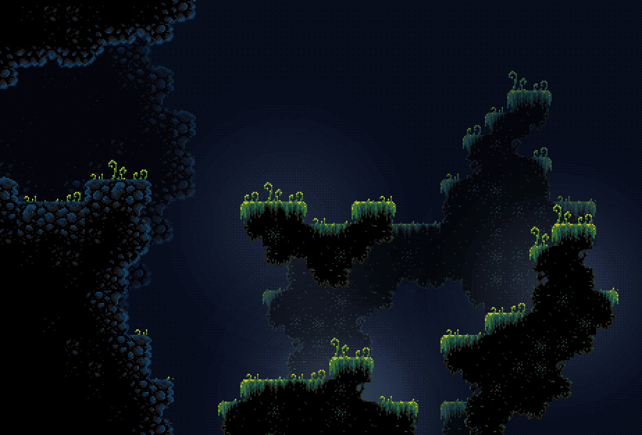 Does the thing made for a thing has some sort of another thing linked to it? Maybe a game or a devlog topic thing? The thing looks good, i bet the other thing will kick ass (only if there is another thing OR this thing is just a thing). Hope I made myself clear Thank you! Too early for a devlog. Right now it's just some tilesets, some ideas in my head, and a basic engine (and that screenshot was taken from pyxeledit, not engine). It's meant to be underwater on an alien planet. Dunno if I can pull it off yet. |
|
|
|
« Last Edit: November 23, 2015, 06:48:19 AM by muki »
|
Logged
|
|
|
|
|
RujiK
|
|
« Reply #30442 on: November 23, 2015, 09:19:02 AM » |
|
This weekend I made a jungle temple thing for my game.  |
|
|
|
|
Logged
|
|
|
|
|
|
|
muki
|
|
« Reply #30444 on: November 23, 2015, 10:27:08 AM » |
|
 time for me to "wow" everyone with my impressive art time for me to "wow" everyone with my impressive artAmazing, I love how dynamic this is! Only things that pop weirdly for me are that one transparency pixel in between the hairs on the left-most side of the first frame. And the extra pixel on the right tooth of the last frame. Such minor nitpicks. |
|
|
|
|
Logged
|
|
|
|
Alex N.
Level 1

game dev!? so you play all day?


|
|
« Reply #30445 on: November 23, 2015, 01:17:37 PM » |
|
Dunno if I can pull it off yet. Pull it off you shall! Users interested in evolution there are! Hmm |
|
|
|
|
Logged
|
|
|
|
|
noxoc
|
|
« Reply #30446 on: November 23, 2015, 02:00:39 PM » |
|
something for a thing  really love the colors/mood! |
|
|
|
|
Logged
|
|
|
|
|
Bobert
|
|
« Reply #30447 on: November 23, 2015, 03:26:48 PM » |
|
  yesterday's pixel dailies theme was bastion (i touched this up just a little since yesterday though since i kinda rushed it) @RujiK: very nice! i like the soft colors and the subtle textures on those tiles |
|
|
|
|
Logged
|
|
|
|
|
matwek
Guest
|
|
« Reply #30448 on: November 24, 2015, 02:51:39 AM » |
|
Which do people think is better/more fitting...? (ignore the black boxes, I haven't finished spriting what goes in these sections yet). Also I'm not sure if the turrets at the bottom of the screen look out of place compared to the enemy spaceship. I think they might have too much detail.   |
|
|
|
|
Logged
|
|
|
|
|
aamatniekss
|
|
« Reply #30449 on: November 24, 2015, 03:29:40 AM » |
|
It looks pretty strange, like the enemy ships are from top-down perspective but everything else from sideview. But I like the right one better.
|
|
|
|
|
Logged
|
|
|
|
|
matwek
Guest
|
|
« Reply #30450 on: November 24, 2015, 04:38:52 AM » |
|
It looks pretty strange, like the enemy ships are from top-down perspective but everything else from sideview. But I like the right one better.
The ships are supposed to look like they're flying straight down at you... |
|
|
|
|
Logged
|
|
|
|
|
aamatniekss
|
|
« Reply #30451 on: November 24, 2015, 04:53:26 AM » |
|
Ahh yeah, anyway, still looks strange to me, maybe it's just the ship design. Those round forms.
|
|
|
|
|
Logged
|
|
|
|
|
|
|
matwek
Guest
|
|
« Reply #30453 on: November 24, 2015, 06:04:55 AM » |
|
Ahh yeah, anyway, still looks strange to me, maybe it's just the ship design. Those round forms.
Part of the reason might be the difference in styles with the turrets below, I think I need to make the turrets look more 'rounded' and 'cartoon-like' to match up with the enemy ships. ...Anyway. Some other bits i've been messing with. Taking pixel art and adding some effects to it to give a movie style over the top retro PC feel  |
|
|
|
|
Logged
|
|
|
|
Lee
Level 1
|
|
« Reply #30454 on: November 24, 2015, 11:06:44 AM » |
|
Hey Matwek, Like that colour distortion you have there. However, as with the others I will have to agree that your ships are conveying a different perspective than you actually want. The thrusters are placed behind the ship as the dark outline separating the body from the engines implies that they are beyond the lip of the curve. The lighting on the ship body has the front receiving more light than the back, implying that the body is slightly tilted. With the two openings of the ship body at the front the viewer probably believes the top and bottom connection to the core runs parallel, so because you can see inside this must mean that the body is tilted back. Also the front of the torus is thicker than the back, which looks like it could be foreshortened (although it doesn't necessarily mean it is, but from the other cues it looks like it). Forgive the real crappy edit but hopefully this explains what I'm talking about:  Also those backgrounds are beautiful, but the left one is done in perspective. In the context of the first background the ships actually look correct whilst the gun array is flat and wrong, whilst in the context of the second background the gun array is correct and the ships are wrong because they have perspective. |
|
|
|
« Last Edit: November 24, 2015, 11:12:58 AM by Lee »
|
Logged
|
|
|
|
|
BBreakfast
|
|
« Reply #30455 on: November 24, 2015, 12:24:03 PM » |
|
 feeling a LOT better about this map after some revisions made (based off Jad's critique thank you!!).  |
|
|
|
|
Logged
|
|
|
|
|
Conker
Guest
|
|
« Reply #30456 on: November 24, 2015, 01:23:17 PM » |
|
Wow nice improvement
|
|
|
|
|
Logged
|
|
|
|
|
inca
|
|
« Reply #30457 on: November 24, 2015, 03:39:46 PM » |
|
|
|
|
|
|
Logged
|
|
|
|
|
gggfhfdh
|
|
« Reply #30458 on: November 24, 2015, 07:33:50 PM » |
|
|
|
|
|
|
Logged
|
|
|
|
|
Conker
Guest
|
|
« Reply #30459 on: November 24, 2015, 08:04:21 PM » |
|
tasty
|
|
|
|
|
Logged
|
|
|
|
|
 Developer
