|
Destral
|
 |
« Reply #40 on: November 01, 2012, 09:41:57 AM » |
|
EDIT: As a side-note, I like the style and proportions you have there. I think her 'light' and 'dark' colors are too similar, and her face changes on the frames, but it's pretty good. Thanks for the link, was kinda cool to watch the sprite while listening to it. As for the colors, yeah, I'm not 100% happy with them either, I used a color picker for the pallete hues, but the saturation and values could probably use some tweaking. I'll have to go back to it and mess around some more. |
|
|
|
|
 Logged
|
|
|
|
|
Destral
|
|
« Reply #41 on: November 27, 2012, 10:33:54 PM » |
|
 I changed the color of the pants, tweaked the pallette some to try and create more contrast between the clothes and hair and the skin, and added another frame of animation to the drop from the cheer. I'm thinking about having the hair jostle some, so I'll probably mess around with that some more. |
|
|
|
|
Logged
|
|
|
|
|
Destral
|
|
« Reply #42 on: December 01, 2012, 12:26:57 AM » |
|
 Made a simple walk cycle. Again, the hair definitely needs to look a little more alive. |
|
|
|
|
Logged
|
|
|
|
|
Destral
|
|
« Reply #43 on: December 02, 2012, 12:04:59 AM » |
|
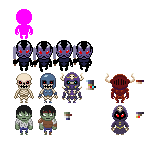 some assorted humanoids, slightly bigger scale (20x32), with a sample walk cycle. |
|
|
|
|
Logged
|
|
|
|
|
Destral
|
|
« Reply #44 on: December 06, 2012, 12:56:40 AM » |
|
Used the animation cycle from the horned purple dude and applied it to the skeleton, with a few improvements (shading to insinuate motion, in the torso specifically):  |
|
|
|
|
Logged
|
|
|
|
|
kamac
|
|
« Reply #45 on: December 21, 2012, 01:12:30 PM » |
|
Used the animation cycle from the horned purple dude and applied it to the skeleton, with a few improvements (shading to insinuate motion, in the torso specifically): This is so nice. Good work  |
|
|
|
|
Logged
|
|
|
|
|
Destral
|
|
« Reply #46 on: January 06, 2013, 05:21:43 AM » |
|
Thanks, Kamac Here's something new to start off the new year*: 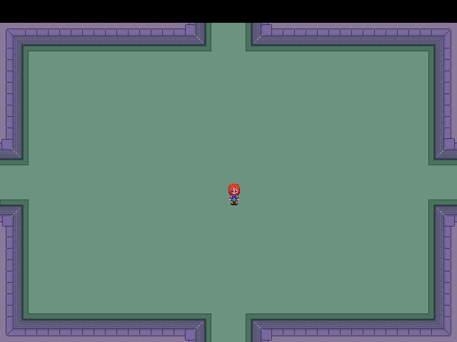 I was not really feeling up to anything, but figured I should come back to practicing my spriting, so I decided to give backgrounds another try, since I've been working so much on characters recently. After a while I got annoyed at how much I sucked, and decided to watch some LttP videos on Youtube to see if I could learn something. I'll readily admit I ripped off freely in terms of 'how do they do wall bricks?', 'oh, there's dark lines here to further emphasise the separation between wall and floor', etc. I did try to give things my own spin, and tried to make it so I can turn the room into a 32x32 tileset to use later. After a couple of hours I was feeling pretty good with where it was at, and decided to brush off the sorceress girl I'd been working on. Since the room is made with a 32x32 tileset in mind, I took the previous sprite I had for the her and made it 16x32, then touched up the hair and put a shadow at her feet. Once again I was getting rather miffed at how much I sucked, so I went back to the well internet and found this and decided to use that as a basis for how to do the hair. I'm not completely satisfied with her torso, but I feel at least the hair is improved, and she doesn't look too terrible against that background. The other thing I'm probably going to have to change is the slanted bricks on the walls. As it is now each quadrant of the room has a different set of walls, each with bricks slanted towards the center of the room, and in the end I don't think it's noticeable enough to warrant the additional hassles it will entail to have to use 4 different walls depending on what part of the room they're in. *(yeah, I know, I know) |
|
|
|
|
Logged
|
|
|
|
|
Destral
|
|
« Reply #47 on: January 06, 2013, 05:47:23 AM » |
|
And because I can:  |
|
|
|
|
Logged
|
|
|
|
|
Destral
|
|
« Reply #48 on: January 06, 2013, 07:50:02 AM » |
|
... and while checking the walk animation I'd been working on I noticed that the 16x32 character is too tall for the walls...  So I went and found a spritesheet for link from LttP and did a paintover to see if 16x24 would work, and then I copied over the other 16x24 sprite I had for her, to see how they all compared to each other: 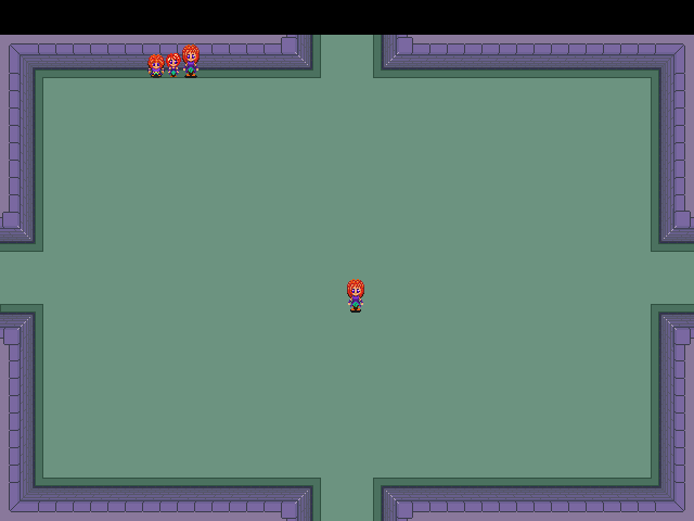 And it looks like even 16x24 is too tall. So at this point I'm thinking I either need to redo the walls so they are taller, or try to give the sprite more of a top-down perspective and less of a frontal one - but looking at the link paintover, even that last option might not work... Maybe change the angle/perspective of the walls? |
|
|
|
|
Logged
|
|
|
|
|
Destral
|
|
« Reply #49 on: January 06, 2013, 10:09:36 PM » |
|
I went ahead and changed the walls, made them somewhat higher, and added some WIP doors: 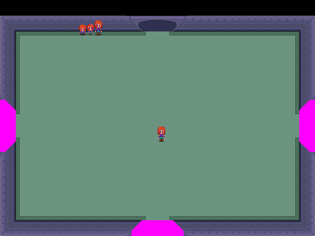 |
|
|
|
|
Logged
|
|
|
|
|
Miko Galvez
|
|
« Reply #50 on: January 09, 2013, 07:20:17 AM » |
|
Hi there! Just want to say that the perspective of the characters is wrong. You'll need to look at Legend of Zelda sprites to get what I'm saying. On my mobile so just want you to know.
|
|
|
|
|
Logged
|
|
|
|
|
SolarLune
|
|
« Reply #51 on: January 10, 2013, 11:51:32 PM » |
|
Medevenx is correct that the perspective of the characters is different from the world - we shouldn't be able to see so much of the character's eyes and face. It should be closer to the bottom of their heads. The perspective of Zelda LTTP is also off, though.
|
|
|
|
|
Logged
|
|
|
|
|
Destral
|
|
« Reply #52 on: January 11, 2013, 08:54:02 AM » |
|
Agreed, but as SolarLune says, LttP and NES Zelda both do the same thing. I also find it really hard to do a sprite of the character in the correct perspective and still have it look like an interesting character, rather than just the top of someone's head. I much prefer being able to see the character from a wrong perspective than just showing the top of a head and some shoulders. So I'm just going to go with what I have, especially since I've already animated 4-directional walk cycles for her and everything  |
|
|
|
|
Logged
|
|
|
|
|
caffeine
|
|
« Reply #53 on: January 11, 2013, 11:14:45 AM » |
|
Hello Destral. Interesting design. I think the faked perspective is a bit much on your doors. And once again your colors are all over the place. Your characters seem much too saturated, as usual, and the walls are actually very desaturated and lack contrast. As for the character design, I think your first character fits the view the best. 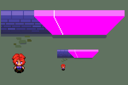 Here's is a little "pixelover" I hope it helps. |
|
|
|
|
Logged
|
|
|
|
|
Destral
|
|
« Reply #54 on: January 11, 2013, 02:25:19 PM » |
|
Oh green, your pixelovers make me weep with both joy and despair   The fuchsia doors are placeholders though, the WIP door is the one on the top of the room (maybe it didn't stand out very much, because it's a WIP and, as you pointed out, the walls lack contrast and I used the same set of colours for the door). I see what you mean about the colours, and yeah, I started out trying to use only three shades of each, but even that's probably too much. I was also purposefully trying to keep the doors in line with the walls so there wouldn't be issues with the player hugging the wall and getting snagged on the door frames Re: the character, the shortest one is the one I finally settled on, since the other two were simply too tall to fit in properly with the rest of the room. I really like what you did with the contrast of the character's hair and the floor, I definitely need to shift closer to that, it makes her stand out so much more. Once again, thanks for the feedback |
|
|
|
|
Logged
|
|
|
|
|
Destral
|
|
« Reply #55 on: February 26, 2013, 08:56:55 PM » |
|
Took a break to go on vacation and have been working mostly on code before and since, but here's something I'm working on right now. I'm trying to make a sprite for a top-down game of the egg ronin I posted on page 2: 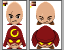 Lighting/shading and color are still WIP, right now I'm focusing mostly on the perspective. Top is without the helm, and bottom is with the helm - I'm going to try to make the sprite a separate sprite that I can switch out so he can have several different ones to equip. Thoughts? |
|
|
|
|
Logged
|
|
|
|
|
Destral
|
|
« Reply #56 on: May 01, 2013, 09:00:43 PM » |
|
Newer version of egg ronin, no helmet:  I like the colors and shading better overall, although the highlight on the top of its head is probably sub-optimal. I think the eyes look better, but they might be too close together. All in all, I think it's an improvement over the previous ones. |
|
|
|
|
Logged
|
|
|
|
Nikas
Level 1

drink drank drunk


|
|
« Reply #57 on: June 09, 2013, 04:08:02 AM » |
|
You have such a tallent ;_;
|
|
|
|
|
Logged
|
|
|
|
|
 Developer
