charliecarlo
Level 1

The Duke of Dementia

|
 |
« Reply #80 on: August 03, 2015, 04:58:53 PM » |
|
These graphics are pretty nice.
My favorite is the furry things with wooden masks.
I have two suggestions:
-Overlay a paper or parchment texture over the screen.
I think that'd further your style of trying to look like woodcut prints.
-Add some shadows (could just be a black oval) beneath characters.
It would add a better sense of where they are.
Right now they are floating ambiguously in white.
|
|
|
|
|
 Logged
|
|
|
|
|
J.D.
|
|
« Reply #81 on: August 07, 2015, 04:19:36 PM » |
|
These graphics are pretty nice.
My favorite is the furry things with wooden masks.
I have two suggestions:
-Overlay a paper or parchment texture over the screen.
I think that'd further your style of trying to look like woodcut prints.
-Add some shadows (could just be a black oval) beneath characters.
It would add a better sense of where they are.
Right now they are floating ambiguously in white.
Thanks a lot for the input! No lie, I've considered both of these things, but I haven't had any luck with a paper overlay yet. Just need to keep looking, I suppose. But yes, shadows will be happening! In other news, here's a little progression of where an enemy type has gone over the course of a year. Hope you think it's improved. 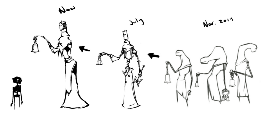 |
|
|
|
|
Logged
|
|
|
|
|
jctwood
|
|
« Reply #82 on: August 10, 2015, 02:59:10 AM » |
|
This aesthetic is just incredibly beautiful. What are you building the game in?
|
|
|
|
|
Logged
|
|
|
|
|
J.D.
|
|
« Reply #83 on: August 10, 2015, 03:02:51 PM » |
|
This aesthetic is just incredibly beautiful. What are you building the game in?
My partner (@LostKing9) does all the heavy lifting, I just draw the pictures. He's developing the game in Java.  |
|
|
|
« Last Edit: August 10, 2015, 03:08:15 PM by J.D. »
|
Logged
|
|
|
|
|
A Strange Bird
|
|
« Reply #84 on: August 14, 2015, 05:53:13 PM » |
|
Gosh, I love this already! When is the demo coming out (if you know)?  |
|
|
|
|
Logged
|
|
|
|
|
vividhelix
|
|
« Reply #85 on: August 14, 2015, 08:41:46 PM » |
|
If you even need a alpha tester, hit me up. Still looks amazing!
|
|
|
|
|
Logged
|
|
|
|
|
J.D.
|
|
« Reply #86 on: August 17, 2015, 11:02:57 AM » |
|
Gosh, I love this already! When is the demo coming out (if you know)? Hopefully soon! Keep an eye out for it. Thanks so much for the compliment. If you even need a alpha tester, hit me up. Still looks amazing!
We'd love for you to check out the demo when we finish it up, thanks a ton! |
|
|
|
|
Logged
|
|
|
|
|
A Strange Bird
|
|
« Reply #87 on: August 17, 2015, 03:22:41 PM » |
|
I wanna draw fan art, can I? |
|
|
|
|
Logged
|
|
|
|
|
MannequinRaces
|
|
« Reply #88 on: August 17, 2015, 08:02:06 PM » |
|
Quite frankly, this looks pretty badass. Keep it up!
|
|
|
|
|
Logged
|
|
|
|
|
nnyei
|
|
« Reply #89 on: August 17, 2015, 08:29:04 PM » |
|
I really love the style and the mood in this. Will definitely follow this!
|
|
|
|
|
Logged
|
|
|
|
|
J.D.
|
|
« Reply #90 on: August 18, 2015, 03:34:44 PM » |
|
Here's a new monster concept! 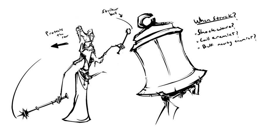 I wanna draw fan art, can I? I'd be honored! :D Quite frankly, this looks pretty badass. Keep it up!
Thanks a ton, every comment like this means a lot. I really love the style and the mood in this. Will definitely follow this!
I'm glad you like it, thank you. :> |
|
|
|
|
Logged
|
|
|
|
|
J.D.
|
|
« Reply #91 on: August 21, 2015, 02:31:21 PM » |
|
 Fun with physics! |
|
|
|
|
Logged
|
|
|
|
|
J.D.
|
|
« Reply #92 on: October 22, 2015, 05:54:48 PM » |
|
|
|
|
|
|
Logged
|
|
|
|
|
Christian
|
|
« Reply #93 on: October 22, 2015, 06:02:37 PM » |
|
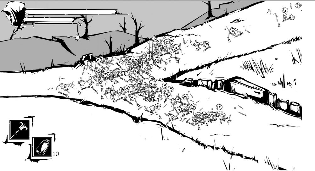
I feel like the mock-up is too dark IMO. Kind of covers up too much of the environments. What about, rather than having so much dark, kind of integrate the UI into a border? Like how a woodcut might have a border   And then add some clouds in the skies to break up the white backgrounds |
|
|
|
|
Logged
|
|
|
|
|
plauk
|
|
« Reply #94 on: October 22, 2015, 08:14:47 PM » |
|
(... light and dark explanation...)
This is pretty much what I was thinking while reading through the thread. The art is all really great, but there is too much white. Maybe try experimenting with some kind of hatching/dither for your mid-tones? That would fit with the wood-cut style, I think. |
|
|
|
|
Logged
|
|
|
|
charliecarlo
Level 1
The Duke of Dementia
|
|
« Reply #95 on: October 23, 2015, 08:54:07 PM » |
|
That last image doesn't look like light in the dark; it looks more like the gamespace has been reduced to a circle. You should draw a scratchy gradient between the light and the dark.
Although that might require some creative solutions to keep it from looking like the light orb is static in shape, it is possible.
|
|
|
|
|
Logged
|
|
|
|
|
J.D.
|
|
« Reply #96 on: October 24, 2015, 08:53:12 AM » |
|
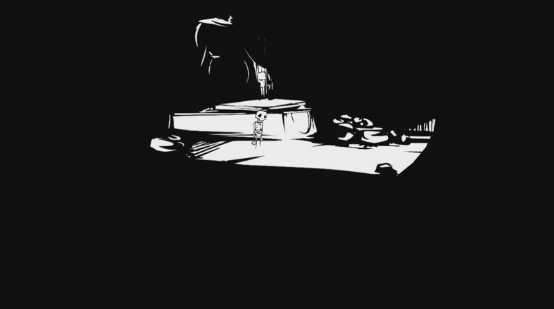
Thanks for all the thoughts, guys. I'll experiment more with hatching and maybe adding some gray tones once the lantern is figured out code-wise. Here's some skull-floaty follower goodness, much more fluid now! 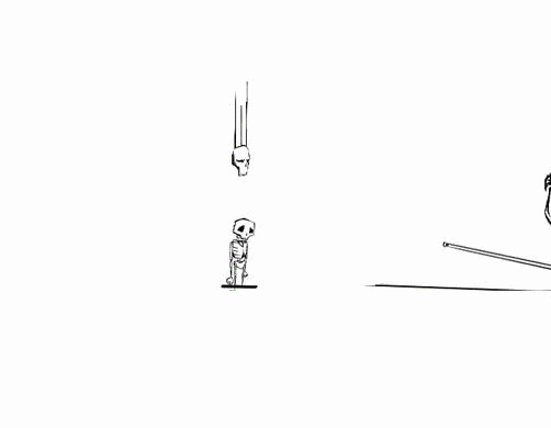 |
|
|
|
|
Logged
|
|
|
|
vitorlanna
Level 1
|
|
« Reply #97 on: October 24, 2015, 12:52:03 PM » |
|
So, it looks great! Reading the topic I had the same thought that others already have said - the white and black are a bit too tiring. And also it's not immediately clear what are the important elements on the screen. I think the tiring part could be solving just changing both the white and the black to shades of gray! 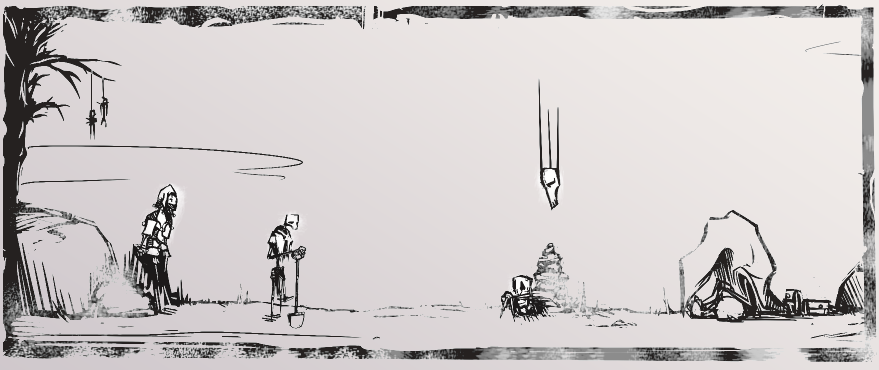 I took these shades of gray from that first reference image you posted! Also I agree that the crosshatching and darker areas should help a lot with the contrast issue! |
|
|
|
|
Logged
|
|
|
|
|
J.D.
|
|
« Reply #98 on: October 28, 2015, 05:03:28 PM » |
|
 Testing out some new ideas for lighting, what do you guys think? |
|
|
|
|
Logged
|
|
|
|
|
b∀ kkusa
|
|
« Reply #99 on: October 28, 2015, 05:19:05 PM » |
|
simple & effective, i like the way it is.
i'd like how efficient it is when he is encountering other characters.
|
|
|
|
|
Logged
|
|
|
|
|
 Community
