Watching the video, this looks really neat, it looks great in motion. Can I ask why you chose grey as the predominant colour? The screenshots, in comparison to the video, look a bit dull, and I would have thought an abstract puzzle game like this would have been perfect to apply some nice colour schemes to different levels. Is that something you've considered? A mostly grey game might be a bit of a hard sell to customers otherwise. I had to design my abstract puzzler around cats to get interest.
Hello fellow abstract puzzle game maker! I had a quick look at The Cat Machine and it looks great. I would like to give it a try! I'm always interested to find out about other abstract puzzlers out there, it seems like a fairly obscure genre these days, on PC anyway, which, if true, would be rather a shame.
I have received a bit of negative feedback about the greyness. But actually this was only in a couple of comments on the Greenlight page and one person at GameCity. In its very early stages, before this devlog started and before the "tricone" objective became central, the game had different coloured cells in. Not sure if I still have any screenshots from that era. But I just was not happy with the aesthetic, and after I tried the grey look I really liked it. I think it looks quite science-y and textbook-y. There's no accounting for taste I suppose. Perhaps I also thought the maths-y academic-y look emphasises the central point of the project which is that it is not a casual game, it is about some pretty hardcore topological reasoning. I also have a principle, which the game adheres to (99% anyway): you can see something in the game if and only if it has a gameplay consequence. So, adding different colours may dilute that principle a little.
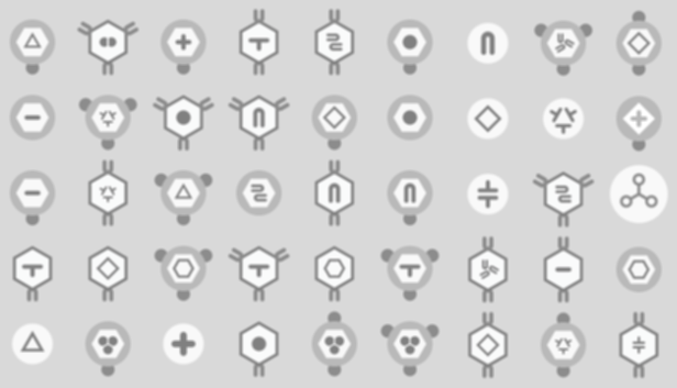
I also found that lining up large numbers of different monochrome node types from the game has a rather pleasing effect (to me anyway):
I'm an avid board gamer, of course I play colourful board games which have back-stories and characters etc, but I think I may have been influenced by venerable board-game purist
Kris Burm. He makes monochrome abstract 2-player strategy games, with no narratives, colours or characters and small, focused rule sets. This was quite a mainstream approach in the 1970s but then fell badly out of favour in the mid-late 80s and later. So I am following this design aesthetic both in gameplay and presentation terms I guess -- I am putting the abstractness front and centre. Maybe in a marketplace full of colours and cute characters, an aesthetic of hardcore monochrome abstractness can find a small niche?
 Community
