|
Derqs
|
 |
« Reply #2000 on: May 09, 2014, 03:04:06 PM » |
|
Here I randomly drew some alternate sprites if you wanted them   I like those colours! xpost from devlog  |
|
|
|
|
 Logged
|
|
|
|
Lee
Level 1


|
|
« Reply #2001 on: May 09, 2014, 03:24:27 PM » |
|
I think another frame with a swing blur or something would help there as it is it's two frames, needs some swoosh or something: . ~ ,,
____ ____ ' '
__| . .| | > <| \ \
<__| - |'' | 0 |___ ______
/ , | | / , |___';______>
\_;__ |- \_;__ |
|/ |/ |/ |/
|
|
|
|
|
Logged
|
|
|
|
|
rikfuzz
Guest
|
|
« Reply #2002 on: May 10, 2014, 04:19:48 AM » |
|
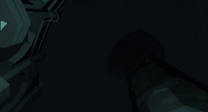
 Working on the hazardous elements of the first level. This is kind of the way to test if you've learnt anything from playing the rest of the level. If you gonna use a version of my dust animation, you may as well use all the frames:  |
|
|
|
|
Logged
|
|
|
|
|
havocplague
|
|
« Reply #2003 on: May 10, 2014, 07:07:42 AM » |
|
Working on the hazardous elements of the first level. This is kind of the way to test if you've learnt anything from playing the rest of the level. If you gonna use a version of my dust animation, you may as well use all the frames: Yeah, sorry about that, probably should have mentioned that it's a placeholder  I was studying your work to see how you got it to appear so fluid, and I guess I just got a bit too carried away about copying it. As you can see it's not even working properly yet, but you are right, I should have included your animation as a reference.  This is how it looks at the moment, when I've started redoing all the placeholders. Still a lot of work to be done though. |
|
|
|
|
Logged
|
|
|
|
Nu-Type
Level 1
Pathfinder
|
|
« Reply #2004 on: May 10, 2014, 12:07:30 PM » |
|
Being the sucker that I am for Advance Wars, I really like this. |
|
|
|
|
Logged
|
|
|
|
|
Derqs
|
|
« Reply #2005 on: May 10, 2014, 01:14:11 PM » |
|
I think another frame with a swing blur or something would help there as it is it's two frames, needs some swoosh or something: . ~ ,,
____ ____ ' '
__| . .| | > <| \ \
<__| - |'' | 0 |___ ______
/ , | | / , |___';______>
\_;__ |- \_;__ |
|/ |/ |/ |/
Thanks!, looks a lot better already  |
|
|
|
|
Logged
|
|
|
|
|
rikfuzz
Guest
|
|
« Reply #2006 on: May 10, 2014, 02:42:05 PM » |
|
Yeah, sorry about that, probably should have mentioned that it's a placeholder No worries at all, keep up the good work! |
|
|
|
|
Logged
|
|
|
|
|
Pol
|
|
« Reply #2007 on: May 10, 2014, 03:28:49 PM » |
|
 Please bear with me as I upload this 10Mo gif :I |
|
|
|
|
Logged
|
|
|
|
|
Geti
|
|
« Reply #2008 on: May 10, 2014, 05:37:58 PM » |
|
Please consider uploading webm or to gyfcat or something dude. 10mb gifs are silly.
|
|
|
|
|
Logged
|
|
|
|
|
|
|
Flex
|
|
« Reply #2010 on: May 11, 2014, 01:49:52 AM » |
|
OBS is getting some improvements with a ton of new assets.  |
|
|
|
|
Logged
|
|
|
|
|
Geti
|
|
« Reply #2011 on: May 11, 2014, 03:49:49 AM » |
|
Yo flex that's really awesome looking and I wish you many successes with it. One thing that could use more awesomeness is the tide coming in and out, just a band of white at the area of overlap would look sweet enough but atm its probably the weakest part of the scene.
Trent, don't stop screwing around, that looks fun.
|
|
|
|
|
Logged
|
|
|
|
|
Flex
|
|
« Reply #2012 on: May 11, 2014, 05:02:55 AM » |
|
Yo flex that's really awesome looking and I wish you many successes with it. One thing that could use more awesomeness is the tide coming in and out, just a band of white at the area of overlap would look sweet enough but atm its probably the weakest part of the scene.
Yeah, for the moment, it's just a plane going up and down, I have no idea how I could make a cool looking foam without having to model the whole island outline. Any suggestion ? |
|
|
|
|
Logged
|
|
|
|
coah
Level 1
|
|
« Reply #2013 on: May 11, 2014, 02:33:04 PM » |
|
Yo flex that's really awesome looking and I wish you many successes with it. One thing that could use more awesomeness is the tide coming in and out, just a band of white at the area of overlap would look sweet enough but atm its probably the weakest part of the scene.
Yeah, for the moment, it's just a plane going up and down, I have no idea how I could make a cool looking foam without having to model the whole island outline. Any suggestion ? I tried to figure out some simple solution and the best I could come up with is to add another white 50% transparent ocean plane on top. It looks really awful, but maybe there's something to be explored there, different blending methods perhaps. |
|
|
|
|
Logged
|
|
|
|
|
BorisTheBrave
|
|
« Reply #2014 on: May 11, 2014, 03:02:51 PM » |
|
Yeah, for the moment, it's just a plane going up and down, I have no idea how I could make a cool looking foam without having to model the whole island outline. Any suggestion ?
I can think of a few ways, but is to use a custom vertex shader to take the island mesh and flatten it to a 2d plane, while keeping the height attribute available for the pixel shader. Then in the pixel shader you can use the height in a color ramp that picks the surf color out at the appropriate height. Dunno, might be expensive to render a second copy of your island mesh. Edit: I had a go at this, it looks worse than I imagined. Kinda nice how there's less surf near cliffs  A slightly cheaper way could be to render the sea as a flat plane, twice at different heights. The second, higher, render is stenciled to not overwrite the first. So it'll only be visible near the shoreline (ugh, and the horizon...). |
|
|
|
« Last Edit: May 11, 2014, 04:16:42 PM by BorisTheBrave »
|
Logged
|
|
|
|
tanner bananer
Level 1
aspiring train conductor

|
|
« Reply #2015 on: May 11, 2014, 04:58:09 PM » |
|
Hey look at this thing that I started.  |
|
|
|
|
Logged
|
|
|
|
|
Geti
|
|
« Reply #2016 on: May 11, 2014, 05:07:26 PM » |
|
Yeah, for the moment, it's just a plane going up and down, I have no idea how I could make a cool looking foam without having to model the whole island outline. Any suggestion ?
Blend against the scene depth; if the difference between the old depth and the new depth is under some threshold, render white. You can do fancy blending things with noise to offset the difference and so on but I think with your current super geometric look just a simple threshold will look fine. |
|
|
|
|
Logged
|
|
|
|
|
Trent
|
|
« Reply #2017 on: May 11, 2014, 06:00:28 PM » |
|
Trent, don't stop screwing around, that looks fun.
Thanks. I'm actually doing it to help someone on the PlayMaker forums. Pretty much doing other people's work for them.  |
|
|
|
|
Logged
|
|
|
|
framk
Level 2
I don't know anything
|
|
« Reply #2018 on: May 12, 2014, 02:05:00 PM » |
|
Hey look at this thing that I started.
That looks really awesome. I quite like 1-bit art |
|
|
|
|
Logged
|
|
|
|
|
John McDonald
|
|
« Reply #2019 on: May 12, 2014, 07:04:14 PM » |
|
Experimenting with widening the power line to indicate more power flow. This would be absolutely maxed out, and you're probably only going to see this once or twice during gameplay, and when you do, you know you're dealing with some serious power requirements. What do you think?  |
|
|
|
|
Logged
|
|
|
|
|
 Developer
