Welcome, Guest. Please login or register.

Login with username, password and session length

 
Advanced search

1411589 Posts in 69386 Topics- by 58443 Members - Latest Member: Mansreign

May 07, 2024, 01:58:03 AM

Need hosting? Check out Digital Ocean
(more details in this thread)
TIGSource ForumsDeveloperArtWorkshopMy turn to be critiqued
Pages: [1]
Print
Author Topic: My turn to be critiqued  (Read 2122 times)
thedaemon
Level 2
**


View Profile WWW
« on: May 18, 2011, 02:52:26 PM »

So it's about time I get some serious critiques. I'm working on a tile set, with which I little experience and skill. So I'd like to improve as much as possible as I'm programming this game as we speak (which is also a learning experience). I forgot to scale the images by 2, so they are tiny right now.Sorry about that. I'll post my animations and such here as well, but photobucket's being a jerk right now.

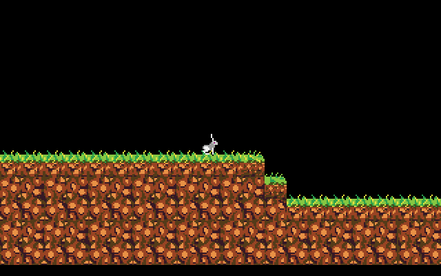
In this mock up you can see my starting to flesh out my ideas of the tile set. I played with colors a bit but I couldn't do the hue shifts I wanted without it looking terrible. I haven't decided what to put in the background, as that's a whole new can o' worms for me.


EDIT:
Progress of rabbit so far.


latest:


Bigger
« Last Edit: May 18, 2011, 02:59:11 PM by thedaemon » Logged
Theophilus
Guest
« Reply #1 on: May 18, 2011, 02:56:28 PM »

I think the colors could be toned down a slight bit (Depends on the game and what the background will be, though, for perfection).

Tileset is not great. I can see a line running throughout the whole X axis on the dirt tiles. Remove this and some of the monotony of the repeated lighter-brown rocks.
Logged
thedaemon
Level 2
**


View Profile WWW
« Reply #2 on: May 18, 2011, 03:01:52 PM »

Thanks for the quick reply, my thoughts on the colors are as follows: I have a very desaturated character sprite, I plan on having very desaturated sprites in general (for all mobs, etc) so I figured I would have a more saturated tileset. As I assume a desaturated tileset would just make all my sprites blend in and not be seen.

EDIT:
Working on this now per your suggestions besides color right now. Trying to get better rock shapes, what you think?
« Last Edit: May 18, 2011, 03:52:40 PM by thedaemon » Logged
Hempuliā€½
Level 10
*****


Sweet potatoes.


View Profile WWW
« Reply #3 on: May 19, 2011, 02:01:31 PM »

There's still quite a visible line between tiles. I've marked the most jarring ones here:


Basically the problem here is that you hesitate to continue rocks over the border of a tile. Try adding some tiles that don't 'fit', and then continue them from the bottom part of the tile. That creates a feeling of a continuous pattern. Also, the human eye is really good at forming patterns where there is none, so try to avoid any recognizable formations that'd reveal where the pattern repeats. Such are usually lines made by pixels too similar and too close to each other. Usually you can note them easily by looking at the tile pattern from a bit further away; that way the details will be lost but the illusory line/unwanted pattern can still be seen.
Logged

im9today
Guest
« Reply #4 on: May 26, 2011, 11:35:27 AM »

trick for making repeating tiles easily: take the first four or five rows of pixels at the top and move them to the bottom. make everything match. now take the four or five from the left and move them to the right. do this until everything is seamless

also darken your brightest 'brown' a good bit, make the next to darkest brown match the color ramp
Logged
thedaemon
Level 2
**


View Profile WWW
« Reply #5 on: June 14, 2011, 12:02:23 PM »

Ok, I have started using Arne's palette v20. I started over on the tile set. What do you think so far?


EDIT: Did more today.
« Last Edit: June 14, 2011, 02:59:17 PM by thedaemon » Logged
jotapeh
Level 10
*****


View Profile
« Reply #6 on: June 14, 2011, 12:32:33 PM »

Um. Yeah. Good. This is good.

edit: Kiss
Logged
thedaemon
Level 2
**


View Profile WWW
« Reply #7 on: June 18, 2011, 07:25:38 PM »

update
Logged
Relix
Level 4
****


View Profile
« Reply #8 on: June 19, 2011, 10:21:16 AM »

The highlight on the water makes it look like ice. I think that's not your intention, so maybe if you toned it down a little?
Logged

Pages: [1]
Print
Jump to:  

Theme orange-lt created by panic