|
stef1a
Guest
|
 |
« on: August 11, 2011, 07:10:42 AM » |
|
Check it out:    It's one of my first pieces that doesn't look terrible, imo. How can I improve? I think I want to add clothing next, but I'd also be somewhat interested in animating him and moving him in different directions. About the hair: I think the second is better than the third. I thought the hands and feet were too blocky, so I chopped a pixel off of each:  Advice appreciated. EDIT: Clothing edit:  |
|
|
|
« Last Edit: August 11, 2011, 10:33:11 AM by stef1a »
|
 Logged
|
|
|
|
|
QOG
|
 |
« Reply #1 on: August 11, 2011, 07:35:20 AM » |
|
It looks like he's wearing a sheet. Or is a mutant starfish.
Try separating the limbs a bit.
|
|
|
|
|
Logged
|
|
|
|
|
Carefree games
Guest
|
|
« Reply #2 on: August 11, 2011, 09:55:25 AM » |
|
The last sprite there with the pixels chopped off looks better than the others. As for hair the bald ones look good, and I agree that the second is better than the third. The arms and legs should be more defined, as QOG suggested. Maybe darken the lines which seperate arm from body/leg from leg or move them farther apart.
I like these.
|
|
|
|
|
Logged
|
|
|
|
|
stef1a
Guest
|
|
« Reply #3 on: August 11, 2011, 10:17:03 AM » |
|
I tried separating the limbs more:  Gonna work on clothing now... EDIT: He has some clothes! I feel like the head is too "flat" in relation to the rest of his body now. Also, is it just me, or is his head to blocky? |
|
|
|
« Last Edit: August 11, 2011, 10:29:03 AM by stef1a »
|
Logged
|
|
|
|
|
Carefree games
Guest
|
|
« Reply #4 on: August 12, 2011, 04:49:03 PM » |
|
If your concerned that the head is too blocky, round out the jaw(not the chin). The shirt has too much shading on the right and left, and also makes the arms not look quite right. Try changing the dark skin-colored pixels at the bottom of the hand into black. Pants are good.   |
|
|
|
|
Logged
|
|
|
|
|
Kevin
Guest
|
|
« Reply #5 on: August 13, 2011, 10:34:17 PM » |
|
For some reason, I'm rather enamoured of 16x16 sprites. So, in the spirit of love, I did a little edit. ♥  The first thing I noticed is that your palette lacks contrast. At x1 zoom, I thought the naked guy was a 3 colour sprite (black outline and the skin tone and one shade). The shading on the head/face is pretty much indistinguishable even zoomed in. That said, I upped the contrast, and removed some colours that I felt were to close in value. I also hue-shifted the skin tones (shadows = more blue-ish, highlights = more yellowed). I made his chin one pixel longer, which I think takes care of the 'boxiness' you mentioned in your previous post. I changed the shading a bit on the face, and lowered the eyes by 1 or 2 pixels to give it an overhead-ish perspective. I also added clothes for fun. One thing I did change about the body was the legs. I think separating them, and 'opening' the bottom outline by add 1-pixel shoes makes them a little more well defined (though this might ruin the style you're going for? I dunno, I'm just playing around with it). Most of the changes are just me playing, now that I think of it, because aside from a few things, I think the original look fine the way it is. Most important thing here, I think, is the contrast issue in the palette. |
|
|
|
|
Logged
|
|
|
|
|
stef1a
Guest
|
|
« Reply #6 on: August 15, 2011, 08:31:40 AM » |
|
For some reason, I'm rather enamoured of 16x16 sprites. So, in the spirit of love, I did a little edit. ♥ The first thing I noticed is that your palette lacks contrast. At x1 zoom, I thought the naked guy was a 3 colour sprite (black outline and the skin tone and one shade). The shading on the head/face is pretty much indistinguishable even zoomed in. That said, I upped the contrast, and removed some colours that I felt were to close in value. I also hue-shifted the skin tones (shadows = more blue-ish, highlights = more yellowed). I made his chin one pixel longer, which I think takes care of the 'boxiness' you mentioned in your previous post. I changed the shading a bit on the face, and lowered the eyes by 1 or 2 pixels to give it an overhead-ish perspective. I also added clothes for fun. One thing I did change about the body was the legs. I think separating them, and 'opening' the bottom outline by add 1-pixel shoes makes them a little more well defined (though this might ruin the style you're going for? I dunno, I'm just playing around with it). Most of the changes are just me playing, now that I think of it, because aside from a few things, I think the original look fine the way it is. Most important thing here, I think, is the contrast issue in the palette. Thanks! I like your edit. I wasn't really aware of the whole contrasting issue. I think I like your style better, what with the legs separated and the top-down view.  |
|
|
|
|
Logged
|
|
|
|
|
stef1a
Guest
|
|
« Reply #7 on: August 16, 2011, 06:29:09 AM » |
|
|
|
|
|
|
Logged
|
|
|
|
|
caffeine
|
|
« Reply #8 on: August 16, 2011, 10:41:09 AM » |
|
In my opinion Kevin adressed most of your "problems" already. Also, in small sprites a "topdown lightsource" will usually suffice. One more tip I could give you is, try to make your lines less jagged, it will make your sprites more natural looking. 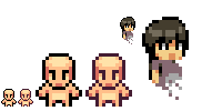 keep it up. |
|
|
|
|
Logged
|
|
|
|
|
stef1a
Guest
|
|
« Reply #9 on: August 17, 2011, 06:05:07 AM » |
|
In my opinion Kevin adressed most of your "problems" already. Also, in small sprites a "topdown lightsource" will usually suffice. One more tip I could give you is, try to make your lines less jagged, it will make your sprites more natural looking. keep it up. Thanks! I don't quite know what you mean by jagged. How can I eliminate the jagged quality? Also, how do you draw shapes that aren't jagged? I don't have a tablet, so I'm best at symmetrical things, but I want to start making more non-standard objects, like the head and body of the guy with the weird eyes. |
|
|
|
« Last Edit: August 17, 2011, 06:12:47 AM by stef1a »
|
Logged
|
|
|
|
|
|
|
stef1a
Guest
|
|
« Reply #11 on: August 18, 2011, 06:44:15 AM » |
|
Thanks -- looks like un-jaggediness basically means smoothly connected lines.  I don't like the hat and how it looks with the face. I either need to redo the hat, the head, or both. |
|
|
|
|
Logged
|
|
|
|
|
Kevin
Guest
|
|
« Reply #12 on: August 20, 2011, 07:34:03 PM » |
|
 Ears, or ear covering hair? |
|
|
|
|
Logged
|
|
|
|
|
JasonPickering
|
|
« Reply #13 on: August 21, 2011, 09:46:36 AM » |
|
second one. definetly.
|
|
|
|
|
Logged
|
|
|
|
|
 Developer
