Spincut
Level 1

Playing the games you make


|
 |
« Reply #120 on: July 16, 2009, 03:02:11 PM » |
|
As someone who's performed Commedia Dell'arte (albeit in a very minimal fashion), I must say that this is looking like a lot of fun if you pull it off correctly, which from what I've seen you're well on your way to doing. Keep up the great work!
|
|
|
|
|
 Logged
|
|
|
|
|
Bree
|
|
« Reply #121 on: July 16, 2009, 04:32:50 PM » |
|
Thanks! Malec, I just sent you some more assets. I haven't started on the crowd yet- would we be able to get away with making one 'row' and then moving and repeating it, to get the same look as in the mockup?
|
|
|
|
|
Logged
|
|
|
|
|
Alec S.
|
|
« Reply #122 on: July 17, 2009, 10:34:38 AM » |
|
I think it would look really cool if we could have the gridlines on a separate layer that could run behind the player characters, as seen in my mockup. The area of hit detection would need to be tweaked, of course, but I think it would look very pleasing. For moving a character, would it be better to have an arrow to pick your location, a la Advance Wars, or to somehow highlight the spaces you can move to?
Alright, when you send me the new grid lines, It will be an easy change to make movement and collision based on the tilesize rather than the character size. For the grid lines, just send a square the size of one tile with a box on the outside for whatever color you want the grid lines. As for movement, we could go either way. I'll probably try to switch to an advance wars style movement system eventually, but that's not a priority right now. I'll try to set up a system for showing all the tiles the character could reach. This area would decrease as the player uses up their moves. I'm trying to decide whether we should have a series of sprites showing the decreasing areas, or if I should just generate it using primitives. Let me know what you want the highlighted spaces to look like. Malec, how should I make up the assets for the meters? My thoughts were that the center color could rise and fall, so I'm guessing that I'll need a separate layer for the color.
I think that should probably work. I'll have to do some experimenting to figure out how to do this in GameMaker. Thanks! Malec, I just sent you some more assets. I haven't started on the crowd yet- would we be able to get away with making one 'row' and then moving and repeating it, to get the same look as in the mockup?
Thanks, I started putting them in the game. I think that should be fine for the crowd. |
|
|
|
|
Logged
|
|
|
|
|
Bree
|
|
« Reply #123 on: July 17, 2009, 01:03:51 PM » |
|
Sent more stuff- the crowd tile's a bit bigger than the screen so you can move it over like I had in the mockup without needing an extra one.
Maybe instead of ticking off the steps they took, maybe we could just show the furthest range- sort of like a radius that they can't step out of. We could highlight the available squares with a blue transparency, the same color as the rest of the grid. That way, they wouldn't have to be afraid of wasting their turns, or get pissed off at not being able to go anywhere.
As for the meters, I faintly remember a Gamemaker tutorial for a shmup that had a section on meters. I don't know if they'd be the kind I was thinking of, but I'll dig around and see if I can find it.
|
|
|
|
|
Logged
|
|
|
|
|
Bree
|
|
« Reply #124 on: July 20, 2009, 12:11:51 PM » |
|
Here's a fresh mock-up, trying to squeeze all the new stuff on one screen. 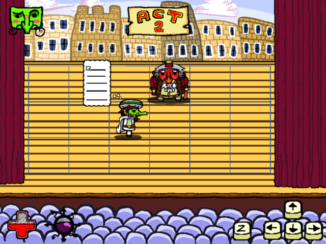 |
|
|
|
|
Logged
|
|
|
|
|
ChevyRay
Guest
|
|
« Reply #125 on: July 24, 2009, 07:31:45 PM » |
|
Malec, how should I make up the assets for the meters? My thoughts were that the center color could rise and fall, so I'm guessing that I'll need a separate layer for the color.
I think that should probably work. I'll have to do some experimenting to figure out how to do this in GameMaker. I have made you an example, if you haven't already figured this out.  Health Example Health ExampleAwesome to see steady progress on this so far!  Keep it up guys! EDIT: After a thought, I uploaded a 2nd example that supports drawing the health bar with a black-line at the top of the health pool, as in Theo's concept. Here it is: Health Example 2 |
|
|
|
« Last Edit: July 24, 2009, 07:45:35 PM by ChevyRay »
|
Logged
|
|
|
|
|
Alec S.
|
|
« Reply #126 on: July 24, 2009, 07:50:08 PM » |
|
Thanks!  |
|
|
|
|
Logged
|
|
|
|
|
Bree
|
|
« Reply #127 on: July 24, 2009, 08:31:43 PM » |
|
Awesome! I need to download another copy of Gamemaker to see this, but thanks a bunch. Now I just need to figure out how the meter is assembled...
|
|
|
|
|
Logged
|
|
|
|
|
Alec S.
|
|
« Reply #128 on: July 24, 2009, 09:06:55 PM » |
|
Basically, he has an image of the empty meter, an image of the full meter, and one with the inside of the meter filled with black (to be the black-line).
|
|
|
|
|
Logged
|
|
|
|
|
ChevyRay
Guest
|
|
« Reply #129 on: July 24, 2009, 09:10:39 PM » |
|
The meter is divided into three parts:  Filled Filled texture, Line texture, and Empty texture. And this is a diagram sort of explaining how it works:  Haha, it's kinda funky, because instead of drawing how much of it is filled, it draws how much is empty. But it works well this way, because your meter fills from bottom-to-top. |
|
|
|
|
Logged
|
|
|
|
|
Bree
|
|
« Reply #130 on: July 25, 2009, 05:55:34 AM » |
|
Wow, that's really damn clever. Thank you!
|
|
|
|
|
Logged
|
|
|
|
|
ChevyRay
Guest
|
|
« Reply #131 on: July 25, 2009, 07:29:45 AM » |
|
Anytime |
|
|
|
|
Logged
|
|
|
|
|
Eclipse
|
|
« Reply #132 on: July 26, 2009, 05:41:51 AM » |
|
Here's a fresh mock-up, trying to squeeze all the new stuff on one screen. looks awesome but the yellow stage is very bright, also why all those black lines? the background is awesome, so the people on the bottom |
|
|
|
|
Logged
|
<Powergloved_Andy> I once fapped to Dora the Explorer
|
|
|
|
Bree
|
|
« Reply #133 on: July 26, 2009, 07:07:35 AM » |
|
Hm, I've notice a lot of people don't like the stage colors. The brownish horizontal lines were meant to give the impression of wooden planks like on an old school stage, while the blue squares show where characters can move in a given turn. I guess I'm going to have to play around with the stage some more- should I just drop the horizontal lines?
|
|
|
|
|
Logged
|
|
|
|
Iamthejuggler
Level 6

|
|
« Reply #134 on: July 26, 2009, 11:41:27 AM » |
|
You could try making them a lot less dark. Still would give the feeling of planks, but would mean the blue squares are more obvious. I didn't realise they were meant to be there at first, i assumed they were just debugging markings.
|
|
|
|
|
Logged
|
|
|
|
|
Bree
|
|
« Reply #135 on: July 26, 2009, 12:35:19 PM » |
|
All right, how's this look then?  |
|
|
|
|
Logged
|
|
|
|
|
Eclipse
|
|
« Reply #136 on: July 27, 2009, 12:38:16 AM » |
|
how about something along those lines?   you could also add spotlights if the stuff you're using supports additive blending, and use them gameplay wise to highlight the current important characters or something |
|
|
|
|
Logged
|
<Powergloved_Andy> I once fapped to Dora the Explorer
|
|
|
|
HannesP
|
|
« Reply #137 on: July 27, 2009, 02:59:51 AM » |
|
* HannesP is a big fan of Eclipse's take on the floor |
|
|
|
|
Logged
|
|
|
|
Iamthejuggler
Level 6
|
|
« Reply #138 on: July 27, 2009, 12:06:31 PM » |
|
I reckon eclipses take on it is closer to what i would like as far as the colours are concerned (although i'd lighten it all up a bit myself). I wouldn't use the perspective on the planks though as it would clash pretty badly with the rest of the graphics and confuse the eye.
|
|
|
|
|
Logged
|
|
|
|
|
Eclipse
|
|
« Reply #139 on: July 27, 2009, 12:22:46 PM » |
|
having no perspective confuses me a lot more  he can still use the characters without having to scale them faking 3d too, i think it will work, maybe he can do it a bit less "3d" making the spaces beetween the lines more constant near the end than i did the planks could be more bright yeah, but not yellow like the older ones, less saturated perhaps, they need to serve as background, not melt around the characters. I bet that finishing all the stage (like making the pieces under the curtains and possibly drawing a shadow, could make it look a lot less confusing too, i just hadn't the time to do a polished mockup |
|
|
|
« Last Edit: July 27, 2009, 12:26:47 PM by Eclipse »
|
Logged
|
<Powergloved_Andy> I once fapped to Dora the Explorer
|
|
|
|
 Community
