|
Chris Koźmik
|
 |
« on: October 14, 2013, 03:59:58 AM » |
|
Note to people who followed my old topic: After a longer break (it really helped me to sort out my thoughts about the direction of the game) I resumed the work, here is the old topic http://forums.tigsource.com/index.php?topic=28610.0Do you remember these old First Person perspective RPGs where you were walking around able to rotate 90 degrees only and fighting monsters and having mindless fun? The good old times where RPGs were colourfull, without tons of text and without complex mechanics? You see a goblin, you slay it, without any lame karma system, balance between good or evil, reputation and all othe useless things? Are you sad that Dungeon Master, Eye of The Beholder, Champions of Krynn, early Might & Magic, Wizardry are not coming back? If you liked these, you probably will like that one too  * old, classic, retro western style RPG * first person perspective, 90 degree rotation * pixelated and simple yet colourfull graphics * not a remake, just a game following the spirit of the old era RPGs * no excessive fat that would get into the way of your fun 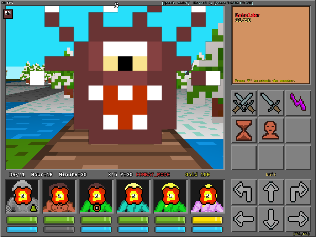 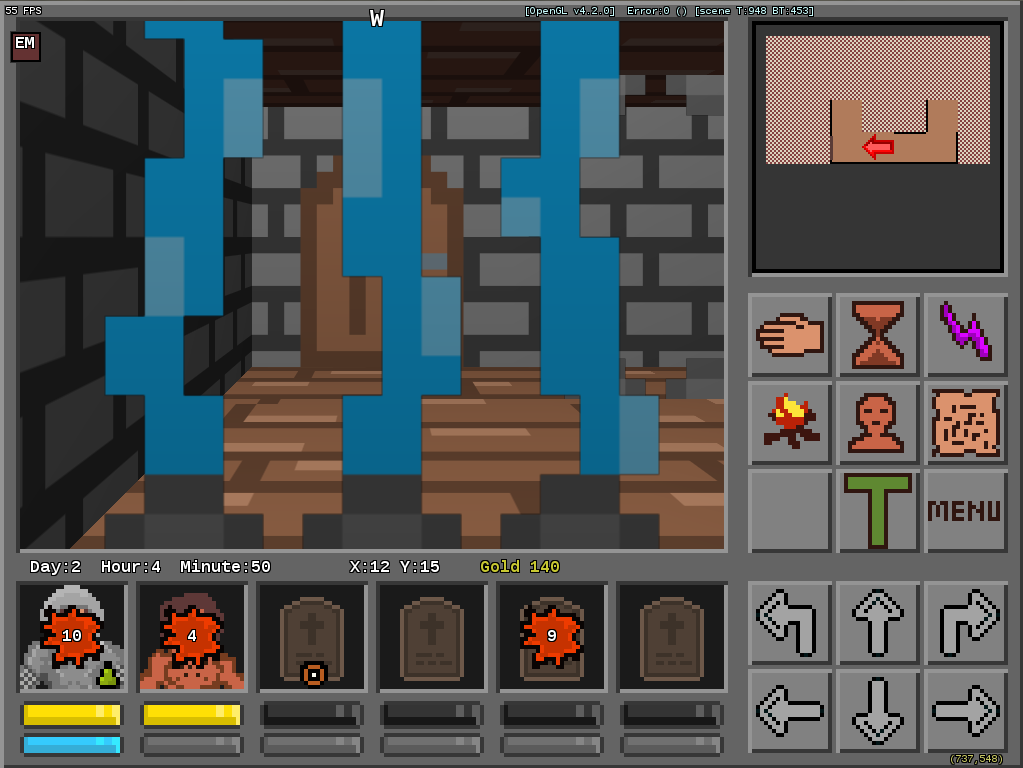 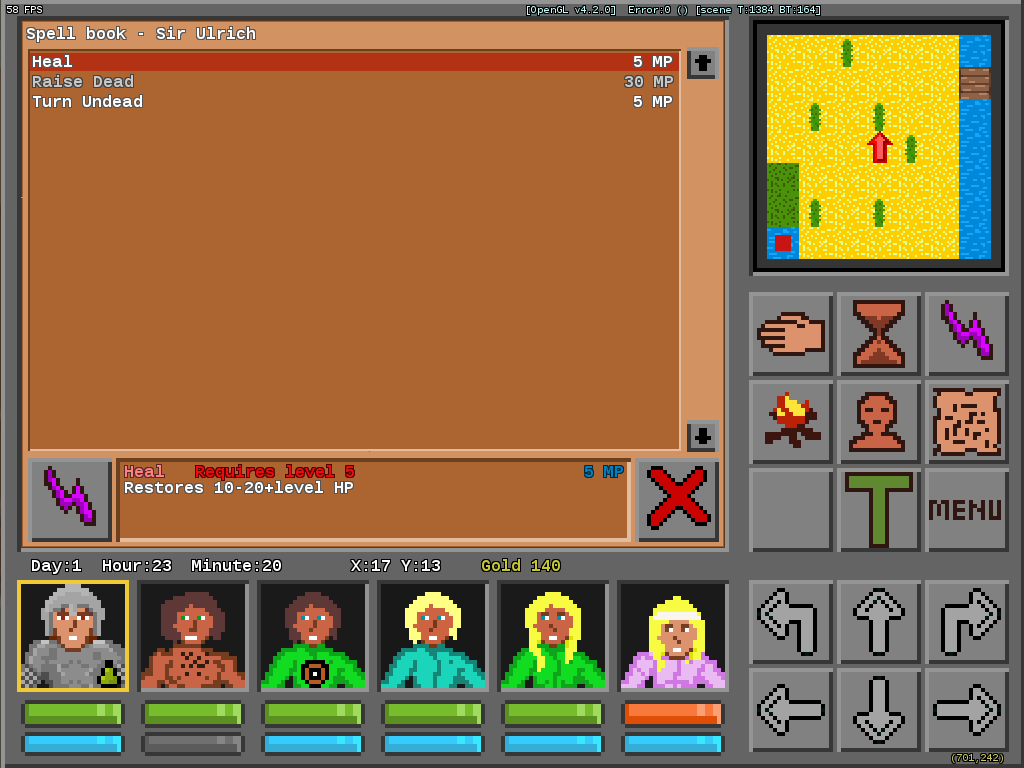 DOWNLOAD: NA (early alpha, unplayable, many things do not work yet, but you can get the feel of it from this)
|
|
|
|
« Last Edit: April 21, 2018, 07:22:55 AM by Chris Koźmik »
|
 Logged
|
|
|
|
|
|
|
eobet
|
 |
« Reply #2 on: October 18, 2013, 12:14:16 AM » |
|
Absolutely wonderful! I mean, it's better at recreating the classic M&M feeling than even the new MMX: Legacy effort by Ubisoft (the titles you mention in the first post do seem to be on the way to coming back with Legacy, Grimrock 2 and Deathfire on the way but the more the merrier).
That you uniquely visually represent all of the various traps you have is really cool. I hope all dungeons get their own unique textures too in the future.
The UI still feels very rough (perhaps you need to bring in a UI designer?) but damn good effort on the game. Feels quite far along, solid foundation with tonnes of potential.
One suggestion immediately came to mind: When monsters get hit, how about rotating them while shaking them slightly? Also, when they do hit back they should have a frame of animation and perhaps advance slightly towards the player. I'd suggest to make this animation very smooth (the polygon transformation I mean), to make it feel like traditional CRPG action in a modern engine (as well as an option for a super quick smoothly animated steps and turns like in Lands of Lore would be nice).
|
|
|
|
« Last Edit: October 18, 2013, 12:31:06 AM by eobet »
|
 Logged
|
|
|
|
|
Chris Koźmik
|
 |
« Reply #3 on: October 19, 2013, 11:34:08 PM » |
|
Thanks for feedback! The UI still feels very rough (perhaps you need to bring in a UI designer?)
In what sense? You mean graphics or functionality? One suggestion immediately came to mind: When monsters get hit, how about rotating them while shaking them slightly? Also, when they do hit back they should have a frame of animation and perhaps advance slightly towards the player. I'd suggest to make this animation very smooth (the polygon transformation I mean), to make it feel like traditional CRPG action in a modern engine (as well as an option for a super quick smoothly animated steps and turns like in Lands of Lore would be nice).
They come slightly into the direction of the player, also they turn red-like for a second if hit, they also move up/down slightly all the time. As for "shaking" I don't want it feel like a jRPG (in these it's used a lot). As for "rotating" I have doubts about retro feel and consistency. I mean, in these old games they did not have these capabilities... It would feel, well, 3D of sort :D Also, I'm not sure if making it feel like an "RPG in a modern engine" is desirable... I mean, I would not want to go half way, it either is a nostalgic retro RPG or not, doing both at the same time, well, usually proves not that great (like all those tiny directional keys (that you can even disable!) in several new RPGs (Grimrock, M&MX Legacy), it wastes the mood for me...) |
|
|
|
|
 Logged
|
|
|
|
|
Quicksand-S
|
 |
« Reply #4 on: October 20, 2013, 12:18:13 AM » |
|
Nice to see this updated after so long.
My critique of the latest version:
-I found the menu music (not the title music, just the menu) almost instantly irritating. The loop is just far too short.
-I still have an issue with the vertical field of view. It throws off my perception of how far away things are, so I kept accidentally entering buildings. When I then backed out of those buildings, I noticed a bigger issue. Backing out of a building turns me around to face the opposite direction. Anywhere else, backing up just backs you up without rotating you. I feel it should be the same when exiting buildings.
-The change from day to night was instant. I thought there was a transition before, but I'm probably not remembering right.
-A sound (even just a placeholder for now) when enemies hit my characters would be helpful. Half the time, I didn't notice when my people got hit because there was no feedback.
-Having so much shallow water on the map feels strange, like it's not even worth having there if I can just walk over it.
-I probably said this before, but I feel like the post-battle score/loot display is a bit frustrating. I'd try to move on after battle only to have my input not register as movement/rotation input while that post-battle info was being displayed. If I remember right, you had a reason for that. I'm not sure what it was, though.
Positives:
-I like most of the graphics. Did you up the contrast on the mountains or something? Looks better than I remember. The enemy sprites are still the highlight for me.
-The various environments look good and feel distinct from one another.
-Everything I tried worked, although not having my characters' health show threw me off a bit.
-A wizard retreated from me, which was kinda cool.
Questions:
-What causes "unconscious" status?
|
|
|
|
|
 Logged
|
|
|
|
|
Quarry
|
 |
« Reply #5 on: October 20, 2013, 02:40:22 AM » |
|
Inconsistent style and low resolution for the sake of being retro
|
|
|
|
|
 Logged
|
|
|
|
|
kleiba
|
 |
« Reply #6 on: October 20, 2013, 03:00:17 AM » |
|
Inconsistent style and low resolution for the sake of being retro
Could you elaborate, please? |
|
|
|
|
 Logged
|
|
|
|
|
Quarry
|
 |
« Reply #7 on: October 20, 2013, 03:04:21 AM » |
|
- Font is out of place and isn't pixellated like the rest of the UI elements
- Character style doesn't really match world elements or the UI
- A lot of banding on characters and UI elements
- Low contrast palette on the world and high contrast on everything else
- 3D display isn't scaled like the UI (except the font)
- Anti-aliasing in 3D display
|
|
|
|
|
 Logged
|
|
|
|
|
Chris Koźmik
|
 |
« Reply #8 on: October 20, 2013, 07:53:28 AM » |
|
-I found the menu music (not the title music, just the menu) almost instantly irritating. The loop is just far too short.
Heh, it was *me* who composed this "music" and I'm not a musicaian, even amateur one  The music is the first thing to go (I will get a real musician to do it). -Having so much shallow water on the map feels strange, like it's not even worth having there if I can just walk over it. You won't be able to swim at the beginning. You will need swimming skill for all characters. -I probably said this before, but I feel like the post-battle score/loot display is a bit frustrating. I'd try to move on after battle only to have my input not register as movement/rotation input while that post-battle info was being displayed. If I remember right, you had a reason for that. I'm not sure what it was, though.
I will deal with it. Please bug me about it again if I forget to do it by December  -I like most of the graphics. Did you up the contrast on the mountains or something? Looks better than I remember. The enemy sprites are still the highlight for me.
-Everything I tried worked, although not having my characters' health show threw me off a bit.
-A wizard retreated from me, which was kinda cool.
Questions:
-What causes "unconscious" status?
- I have not touched the contrast (I'm quite sure), it must be your eyesight getting worse/better/different with age (it was a while I did the previous release) :D Also I enchanced the menu buttons. - What you mean by no health shown? - The wizard retreating must have been a bug  I have not coded it (btw, I frequently get "your monsters are smart" from people when they see the behaviours of my simplistic and primitive pathfinding routine - which is kind of a phylosophical/behavioral topic I suppose :D) - Unconscious is caused by very low HP. - Font is out of place and isn't pixellated like the rest of the UI elements
I could not find a better free (TTF or OTF) font. If you know of any, please drop me a link. Unfortunatelly, it's beyond my current budget to rewrite it to bitmap font or to purchase a custom font  - Character style doesn't really match world elements or the UI
You mean the character portraits at the bottom are not fitting the rest of the layout and I should redo them? |
|
|
|
|
 Logged
|
|
|
|
|
Quarry
|
 |
« Reply #9 on: October 20, 2013, 08:45:26 AM » |
|
I'm not sure why it would be out of your budget to do a bitmap font, it's fairly trivial to be honest. Also I'd suggest finding and artist sometime instead of trying harder
|
|
|
|
|
 Logged
|
|
|
|
|
eobet
|
 |
« Reply #10 on: October 20, 2013, 08:59:18 AM » |
|
Judging from how you've responded to the comments so far I'm reinforced in what I suspected from the beginning and must be blunt and say that I think your sense of style and design probably isn't developed enough for me to give you more helpful feedback... hence why I suggested to get a dedicated UI designer. For example: - Character style doesn't really match world elements or the UI
You mean the character portraits at the bottom are not fitting the rest of the layout and I should redo them? Yes, it should be obvious that you either need to redo them in the style of the rest of the heavily pixellated monsters in the game or make the monsters equally detailed (if not for the simple reason that one wouldn't be far fetched to say that you borrowed them from FTL's Dungeon Master...) |
|
|
|
|
 Logged
|
|
|
|
|
Chris Koźmik
|
 |
« Reply #11 on: October 22, 2013, 01:32:43 AM » |
|
I found a pixelated ttf font! You were right, it looks much better  (the slight blur is because of the way the forum displays/resizes it, it looks sharper in reality; to see it properly click on the image and then on the small magnification icon in the bottom right corner) 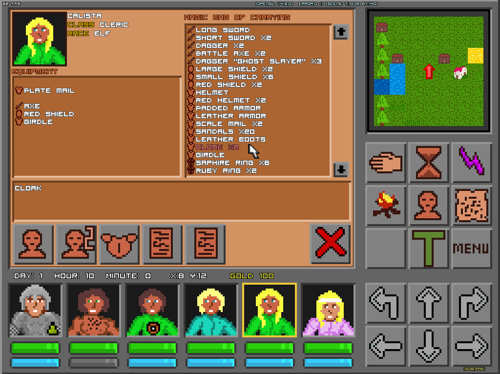 |
|
|
|
|
 Logged
|
|
|
|
|
Quicksand-S
|
 |
« Reply #12 on: October 22, 2013, 11:54:47 AM » |
|
What I meant when I said health wasn't shown is that when I see "health bars", I expect them to get smaller as health decreases. The ones that exist right now don't really show much, unless I hover the cursor over them in order to see a character's actual HP. In battle, it would be nice to know, at a glance, how damaged each character is.
Unconsious = low health? Does that mean characters with low health become useless? If so, that's...different. Could be interesting, but I imagine it would just get annoying in tough battles. Maybe a "weakened" state would make more sense, where characters can use certain abilities but not all (ex. use items but not attack, or something like that). This sort of thing needs a lot of play-testing to get the balance right.
That new font does look better, although that outline causes more of that visual "inconsistency" that Quarry was talking about. Everything in your game has differently-sized pixels. Your monsters are extremely low-res, while your character portraits are at least double the resolution. Now your font is pixelated, but the outline around it is skinnier than the pixels used in font.
Personally, the inconsistencies don't irritate me as much here as they would in other styles of game, since the UI and the viewing area are more separate. That said, visual inconsistency like this is still something that should generally be avoided.
|
|
|
|
|
 Logged
|
|
|
|
|
Chris Koźmik
|
 |
« Reply #13 on: October 24, 2013, 01:41:55 AM » |
|
Judging from how you've responded to the comments so far I'm reinforced in what I suspected from the beginning and must be blunt and say that I think your sense of style and design probably isn't developed enough for me to give you more helpful feedback... hence why I suggested to get a dedicated UI designer.
Dedicated UI designer is not an option  For more than one reason. I can order some graphics as replacement, but that's "ordering", it means I need to explain the artist what resolution the picture should be :D More about pixel size problem below. That new font does look better, although that outline causes more of that visual "inconsistency" that Quarry was talking about. Everything in your game has differently-sized pixels. Your monsters are extremely low-res, while your character portraits are at least double the resolution. Now your font is pixelated, but the outline around it is skinnier than the pixels used in font.
Personally, the inconsistencies don't irritate me as much here as they would in other styles of game, since the UI and the viewing area are more separate. That said, visual inconsistency like this is still something that should generally be avoided.
This whole "different-pixel size" thing has one little catch  Do you like the monsters? Do you want them replaced/redrawn? No, these has to stay, monsters (and especially the floating eye) have a significant club of fans, altering these would be the stupiest thing I could do. Which is the core of the problem  How can I make the monsters (huge pixes of like 10x10 sometimes) be consistent with anything else? How can I try to draw the character's pictures using 10x10 pixel size (that would be 3x3 pixels per face)? How could I make any font of such size? Or the minimap? The only way to perfectly and fully fix it is to switch to 1x1 or 2x2 pixel size, which would kill at least half of the mood of the game (and there won't be those cute monsters anymore). No, all I can do is try to "patch it" and make the pixel size uniform in some areas only. What I meant when I said health wasn't shown is that when I see "health bars", I expect them to get smaller as health decreases. The ones that exist right now don't really show much, unless I hover the cursor over them in order to see a character's actual HP. In battle, it would be nice to know, at a glance, how damaged each character is.
Unconsious = low health? Does that mean characters with low health become useless? If so, that's...different. Could be interesting, but I imagine it would just get annoying in tough battles. Maybe a "weakened" state would make more sense, where characters can use certain abilities but not all (ex. use items but not attack, or something like that). This sort of thing needs a lot of play-testing to get the balance right.
Hmmm, the health "indicator" changes colour to green/yellow/orange/red, isn't it sufficient? WOuld you rather see a standard health bar? Unconscious is actually making the gameplay easier to the player. Instead of waiting till all charaters are dead (high cost of bringing them back) you can try to finish the fight earlier (by expending spells you would save for later otherwise) if you see things are going bad and then rest. Probably I would also make it so monsters are less likely to target unconscious characters which would prevent some "unnecessary deaths" during combat  Also, don't forget there are 6 characters (not typical 4), so one being unable to fight due to unconsciousness is not that big of a deal (especially if it's the usual wizard who has fallen due to lousy HP :D). |
|
|
|
|
 Logged
|
|
|
|
|
eobet
|
 |
« Reply #14 on: October 24, 2013, 03:30:08 AM » |
|
The health indicators that only changed colors in Might & Magic worked because they used the metaphor for a gem, and you don't expect a gem to empty like a health bar. Yours are too abstract to read like a skeumorphic interface, and also the coloring to the right suggests a full bar like in fighting games more than anything else. Then there's also the issue of those who are color blind. You mention "ordering graphics replacement"... did you pay for those Dungeon Master look-alike portraits? They're not programmer art? I'm sorry but I'd ask for my money back. Again, you have a solid foundation, but the answer to most of your problems is design. |
|
|
|
« Last Edit: October 24, 2013, 03:55:33 AM by eobet »
|
 Logged
|
|
|
|
|
Quarry
|
 |
« Reply #15 on: October 24, 2013, 05:06:48 AM » |
|
I'm shocked at the fact that these aren't programmer art...
|
|
|
|
|
 Logged
|
|
|
|
|
Quicksand-S
|
 |
« Reply #16 on: October 24, 2013, 01:45:39 PM » |
|
I may like the creatures, but that's because of the kind of "cutesy" look (especially that Beholder). It's not because of the pixel count, which could be bumped up quite a bit without changing the overall "feel" of the creatures. There's no reason to have the images be at such an incredibly low resolution, even if you're going for a retro look.
Like the others said, I was pretty sure that you were doing the art yourself. If you're paying someone else to do it, I'd think you should try to get your money's worth as much as possible. Get yourself some higher-resolution creature art and some more appealing (and varied) character portraits.
|
|
|
|
|
 Logged
|
|
|
|
|
Chris Koźmik
|
 |
« Reply #17 on: October 31, 2013, 03:36:58 AM » |
|
Here is a version with removed font outline. Indeed it looks better, but it's harder to read (I guess changing the colours somehow could help?) http://silverlemur.com/work/MinotaursAndUnicorns-Test2.zipYou mention "ordering graphics replacement"... did you pay for those Dungeon Master look-alike portraits? They're not programmer art? I'm sorry but I'd ask for my money back. No, no, I did all the ceurrent graphics  I meant that I want to order a real gfx for the portraits. BTW, how did guess I used DM as an inspiration/reference for characters? I mean, mine are far uglier and I'm really flattered you find any similarity :D |
|
|
|
|
 Logged
|
|
|
|
|
Chris Koźmik
|
 |
« Reply #18 on: November 04, 2013, 03:20:12 AM » |
|
-I probably said this before, but I feel like the post-battle score/loot display is a bit frustrating. I'd try to move on after battle only to have my input not register as movement/rotation input while that post-battle info was being displayed. If I remember right, you had a reason for that. I'm not sure what it was, though.
New version uploaded, fixed the after battle screen  |
|
|
|
|
 Logged
|
|
|
|
|
Chris Koźmik
|
 |
« Reply #19 on: November 07, 2013, 04:13:17 AM » |
|
New character portraits. 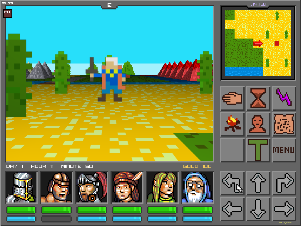 |
|
|
|
|
 Logged
|
|
|
|
|
 Community
 DevLogs
 Minotaurs & Unicorns (retro, nostalgic, pixelated RPG)
  Community
 DevLogs
 Minotaurs & Unicorns (retro, nostalgic, pixelated RPG)
