|
Dragonmaw
Guest
|
 |
« Reply #20 on: September 02, 2011, 09:21:42 AM » |
|
1982, what did i say in the VERY START OF THS THREAD.
Especially saying that stuff isn't manly enough and made by "gay hipsters." That's just rude!
Unless you are making a joke. Which I'm not entirely sure about since if you are it's buried in an otherwise excellent post.
|
|
|
|
|
 Logged
|
|
|
|
|
1982
|
|
« Reply #21 on: September 02, 2011, 10:16:51 AM » |
|
Unless you are making a joke.
Everything is a joke. |
|
|
|
|
Logged
|
|
|
|
|
AshfordPride
Guest
|
|
« Reply #22 on: September 02, 2011, 01:11:53 PM » |
|
stupid scanlines
Get out. |
|
|
|
|
Logged
|
|
|
|
|
Uykered
Guest
|
|
« Reply #23 on: September 02, 2011, 05:40:09 PM » |
|
Those scanlines were awfully done though, very inaccurate.
|
|
|
|
|
Logged
|
|
|
|
DavidCaruso
YEEEAAAHHHHHH
Level 10


|
|
« Reply #24 on: September 02, 2011, 05:55:50 PM » |
|
The screenshot in moi's post is resized, you can right click and view the full image. The effect in the full shot is still weird though, it's like 2 darkened lines with 1 regular line between them and then 2 more regular lines or something (and no contrast/brightness fixes to make up for dimmed color). Anyway retarded WACKY N KOOL character design updates aside ( no seriously), the Toki update doesn't look bad to me. The updated environments look a lot better than the old ones, and the outlines don't bother me because they're obviously going for a cartoony style anyway. The original seems to have bad contrast too, comparatively (though maybe that's just due to the scanline effect). Outlines aren't a post-SNES thing though, many of the best looking NES games (like Shatterhand, Kirby's Adventure, Gimmick!, or Batman) made heavy use of outlines and the color black in general. I usually don't like super dark outlines outside of that era but some games can still pull it off well. I guess it works best when characters are outlined and it's used to separate them from background. Also while I'm here talking about pixel art why does every major game site feel the need to resize games with pixel art (or low res 2D games in general) to random stupid resolutions and then save their screens as JPG on top of that, it pisses me off and then I have to go to Google Images advanced settings and enter the exact resolution of the game. Also moi you should have posted Golden Axe arcade version. The Genesis version looks awful in comparison. The backgrounds are still washed out though. Since I saw Braid at the top of the page: The backgrounds are awesome, but I never really liked its character designs (even if David Hellman managed to render them as best as he possibly could). Then again they were made by Edmund McMillen who recently gave us this character design disasterpiece (edit: hey look there are even outlines). |
|
|
|
« Last Edit: September 02, 2011, 06:19:37 PM by DavidCaruso »
|
Logged
|
|
|
|
|
leonelc29
Guest
|
|
« Reply #25 on: September 02, 2011, 09:34:26 PM » |
|
i don't really like the character design of Binding of Issac. it's like a meaty nude character with heavy outline. maybe that's what Team Meat like to do, like what they did to meat boy? meat boy is kinda okay for me, as it's really simple shape, which really work. the Issac guy are...erm...idk.  |
|
|
|
|
Logged
|
|
|
|
|
SolarLune
|
|
« Reply #26 on: September 02, 2011, 10:56:19 PM » |
|
Typed something longer, but here's my opinion: Games don't have to have a specific look, and they don't have to play a specific way. There's no 'right way' to make a game other than to make it fun. Graphics take a back seat. A game also doesn't have to be about violence or drugs or anything - I might stop playing games if every single game has to be like GTA! Games like Fez, Limbo, and Braid help widen the style of games on the market today (not just violent army / space marine shooters).
Back to the actual topic, I'd have to say that any non-ugly art style has its merits, and I absolutely love Braid's art style. It's bright, vibrant, and fits the game world exceedingly well. Regardless of whether you like it or not, you will never look at Braid and confuse it for another game. The graphics are top-notch.
EDIT: There's also a pretty good story in Braid, which helps it out. I'm sure Limbo's plotline is not as simple as it seems, either. Story contributes to the graphics. Without a story, the graphics can just be cobbled together tech demos or something, but with an overarching story, the graphics get meaning.
As David pointed out, outlines were in use far before SNES, and it continues to be used today. Examples that comes to mind readily are Little Nemo and Mega Man, all 10 of them (of course, the last four were not from the same era, but the graphical style is consistent). There's nothing wrong with outlines.
|
|
|
|
« Last Edit: September 02, 2011, 11:07:25 PM by SolarLune »
|
Logged
|
|
|
|
keoni29
Level 1

|
|
« Reply #27 on: September 03, 2011, 03:16:33 AM » |
|
1 bit :D I have programmed for the TI graphic calculators with monochrome graphics.
|
|
|
|
|
Logged
|
|
|
|
|
st33d
Guest
|
|
« Reply #28 on: September 03, 2011, 06:37:34 AM » |
|
Graphics take a back seat.
I'd just like to say that this is false. Not simply because I work for Nitrome and am pretty much spoilt for decent art for a game. But graphics communicate the mechanics of a game. You can literally ruin a game by having graphics that don't communicate what is going on: Background elements that aren't subdued and thus look like you can interact with them. Unreadable text. Poor camera work (why the fuck do most indies insist on locking the character in the center of the screen - why aren't they showing the area that the character is looking at so I don't have to make a leap of faith? It's not that hard to code, play more Mario, the camera work in New Super Mario is excellent). Bullets, whose bullets are they? Mine or the enemy's? Why can't I see the bullets? Why are the bullets so tiny? Collision areas not matching the graphics. Is that bit interactive? I thought it was decoration, why doesn't it look more functional? And so on. Graphics aren't just fluff and fireworks. They're at the frontline in getting the player to play the game and understand the game and most importantly enjoy the game. |
|
|
|
|
Logged
|
|
|
|
|
s0
|
|
« Reply #29 on: September 03, 2011, 06:46:36 AM » |
|
Graphics are important for real time action games but for turn based games they're pretty negligible.
|
|
|
|
|
Logged
|
|
|
|
|
1982
|
|
« Reply #30 on: September 03, 2011, 07:36:40 AM » |
|
Graphics are important for real time action games but for turn based games they're pretty negligible.
Seconded. This is main reason why I think Civilization series went plummeting down after Civ2. While there were great "under the hood" improvements in the series, overwhelming heavy graphics really screwed the whole thing. Civ4 was unplayable, never even bothered to try Civ5. |
|
|
|
|
Logged
|
|
|
|
|
st33d
Guest
|
|
« Reply #31 on: September 03, 2011, 09:23:31 AM » |
|
Graphics are important for real time action games but for turn based games they're pretty negligible.
I can't really accept the idea that visual communication is unimportant in any game. You could argue, "ah, but that's design, not graphics." You still have to bloody draw it at some point. |
|
|
|
|
Logged
|
|
|
|
|
Dragonmaw
Guest
|
|
« Reply #32 on: September 03, 2011, 11:24:52 AM » |
|
Civilization 4 is the greatest in the series by an absolute long shot. Civilization 5 is alright, but not a clear upgrade like Civ 4 was over the others. More of "another option." Anyway, here's my post about Hawken: The screenshots of Hawken look terrible. Not bad in that they aren't technically stunning (they are!), but rather because the composition is way too busy. There is an excessive amount of detail that makes static screens not nearly as appealing. However, when in motion, it is an absolutely stunning-looking game with a lovely art style.  Madworld, on the Wii, was the same way. Screenshots look so busy that you wonder if you would even be able to play the game. Then you see it in action, and it's fine.  I think the problem with looking at screenshots in regards to 3D gaming is that a lot of the character and personality comes not just from the visuals but also the animation of said visuals. 2D gaming doesn't seem to benefit from "just see it in motion" as much, though, as animation will never significantly change the composition of the piece like it might in 3D games. At least, i can't think of any 2D games that look messy in screens and lovely in motion. I am welcome to refutation though! |
|
|
|
|
Logged
|
|
|
|
|
JWK5
Guest
|
|
« Reply #33 on: September 03, 2011, 11:35:56 AM » |
|
Which is also why I don't generally comment (art-wise) on anything I haven't played very far into (unless it is to speculate). I've noticed with a lot of indie games I see the screen shots and they look kind of so-so but then when I actually play them I start to notice all sorts of unique visual twists that are subtly creeping up on me.
However, from a screenshot there are many things you can note (H/S/V color progression, general depth perception, shape and form, etc. While this doesn't allow you to determine that for the entire game, if you are very familiar with the game (have played it considerably) then it does at least give you a point of reference when you are discussing it with others.
Anyways, I agree on Madworld and Hawkens, they are games that really should be played (or at least watched in video) as their details are a lot more subtle in motion.
|
|
|
|
|
Logged
|
|
|
|
|
Dragonmaw
Guest
|
|
« Reply #34 on: September 03, 2011, 11:37:55 AM » |
|
I think the best way to put it is: screenshots of 3D games are condensing 3D composition into 2D composition. Screenshots of 2D games don't change how the game looks at all because the game is already 2D.
|
|
|
|
|
Logged
|
|
|
|
|
Bree
|
|
« Reply #35 on: September 03, 2011, 11:48:44 AM » |
|
Since other people have mentioned cel-shading, I figured I'd throw in my two cents. Is it technically possible to create a cel-shading renderer that would 'ink' outlines with more varied width? Take a look at a game like Borderlands- in fact, let's use the screenshot from earlier in the thread. 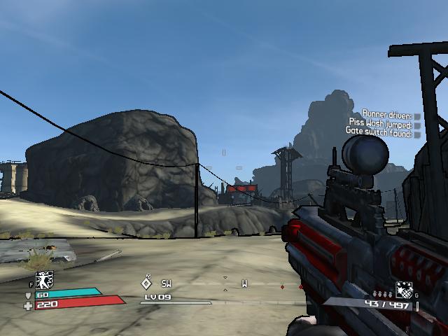 Looks pretty good, nice and clean. However... look at the cliff in the background. Why is that line as thick as the one wrapping around the player's gun? It doesn't really mess up depth perception, since there are still other indicators, but there's a missed opportunity here. On top of that, the inks are uniform, and kinda flat.  Here's a great example of what I'm talking about. This is a sample page from Katsuhiro Otomo's Domu, a precursor to Akira- note how on the bottom panel the playground is obviously in the foreground, while the buildings in the distance are drawn with a thinner line. There's still meticulous amounts of detail like modern gamers crave, but there's a greater sense of space. Even in the face on the top panel, one side of the face and body are given more visual weight. It's subtle, but it gives a greater sense of dynamism. Now I am coming from an artist's perspective, not a programmer, so I have no idea what it would take to implement an engine that varied line widths based on proximity to the viewer camera. It'd be awesome if one could even dynamically color outlines, so that objects in the distance could be given a lighter edge to increase visibility. An example:  |
|
|
|
|
Logged
|
|
|
|
|
s0
|
|
« Reply #36 on: September 03, 2011, 11:52:50 AM » |
|
Graphics are important for real time action games but for turn based games they're pretty negligible.
I can't really accept the idea that visual communication is unimportant in any game. You could argue, "ah, but that's design, not graphics." You still have to bloody draw it at some point. Nah, I just don't think readability is as important for turn based games because you have a theoretically infinite amount of time to "read" everything. Which is why turn based games can get away with stuff like extremely text-heavy cluttered interfaces, no animation, ASCII graphics etc. That's not to say that easy-to-read graphics aren't still a nice thing to have in a turn based game, but they're not absolutely essential the way they are in real time where you're forced to make split second decisions based on the information presented to you. BTW: I don't really like Borderlands' graphics. They have that "vanilla cel shaded" look. Functional but a bit bland. |
|
|
|
« Last Edit: September 03, 2011, 12:00:47 PM by C.A. Sinclair »
|
Logged
|
|
|
|
|
Bree
|
|
« Reply #37 on: September 03, 2011, 12:07:59 PM » |
|
I'd still say it's a nice thing to have: you can take as long as you like to read, say, a magazine spread, but you still need clarity.
I like Borderland's art style, but I agree about the cel-shading- hence my post above on what might possibly help.
|
|
|
|
|
Logged
|
|
|
|
|
Dragonmaw
Guest
|
|
« Reply #38 on: September 03, 2011, 12:18:00 PM » |
|
It's worth mentioning that the Borderlands screenshot there seems to be running the game at a lower setting. There's a significant amount of detail on higher settings. At least, on my computer the textures do not look flat and boring unless I crank them down. But that's not really the fault of the designers.
|
|
|
|
|
Logged
|
|
|
|
|
Bree
|
|
« Reply #39 on: September 03, 2011, 12:25:52 PM » |
|
It wasn't detail necessarily I was looking at in the Borderlands screenshot, only the outlines and overall visual clarity. Although...  A quick google shows me this example, which looks a little better. Foreground is clearly distinguished from background, partly due to contrast in the textures, but also a blue fog that obscures the outlines as well as the model itself. The lines are still pretty rigid, but it's improved. |
|
|
|
|
Logged
|
|
|
|
|
 Developer
