partymetroid
Level 1


|
 |
« on: January 20, 2009, 10:37:00 PM » |
|
I'm having trouble creating palettes for my game and colors in general. How does one choose colors for shades and highlights? I have a slight grasp of the concept of the color of the light and the reflections of the background colors (reflections from the environment, color of the sky)... but that's it: slight. Another question, too: how does one choose how saturated or unsaturated the color is? Anyone got any links to art theory websites?
I know that this is very broad, but any insight into the realm of colors would be appreciated!
|
|
|
|
|
 Logged
|
|
|
|
Ivan
Owl Country
Level 10

alright, let's see what we can see
|
|
« Reply #1 on: January 20, 2009, 11:00:29 PM » |
|
|
|
|
|
|
Logged
|
|
|
|
|
sereneworx
|
|
« Reply #2 on: January 20, 2009, 11:45:53 PM » |
|
Personally, I just go with my instincts. It makes me happy, however, that you are delving deeper into the subject  |
|
|
|
|
Logged
|
|
|
|
partymetroid
Level 1
|
|
« Reply #3 on: January 21, 2009, 07:38:55 AM » |
|
Personally, I just go with my instincts. It makes me happy, however, that you are delving deeper into the subject Thanks a lot! The ability to take pleasure from other people's growing is a great quality!  Btw, thanks a LOT for the links. |
|
|
|
|
Logged
|
|
|
|
|
pgil
Guest
|
|
« Reply #4 on: January 21, 2009, 08:28:21 AM » |
|
One thing I like to do is choose a palette that I like (3-5 colors) and then figure out what it is that makes those colors work together.. things like contrast and warm/cool relationship. Then find things that use a similar palette, like games, album covers, or advertisements.
Ugh.. I sound like a teacher.
|
|
|
|
|
Logged
|
|
|
|
fish
DOOMERANG
Level 10

cant spell selfish without fish

|
|
« Reply #5 on: January 21, 2009, 09:44:54 AM » |
|
i just go by eye and it takes for fucking ever.
|
|
|
|
|
Logged
|
|
|
|
|
JLJac
|
|
« Reply #6 on: January 21, 2009, 10:20:33 AM » |
|
Most times: make it a little less saturated than you think, it makes stuff more pleasant to look at. Also, when drawing shadows, try not to only make the color darker, down the saturation a bit too. One thing to think about is the color depth of a screen. The darkest a screen can get is as when shut down, and the lightest it can get is as when showing a completely white canvas in photoshop. Reality, on the other hand, can be as dark as pitch f**king black and as light as looking straight into the sun. When you look at stars on the night sky they are A LOT brighter than their surroundings, making them look like they are sparkling with light. You can not mimic this on a screen, because the color depth is not half as good. Even with blooming or lense flares you won't achieve the same effect. Because of this I sometimes choose colors that are not very extreme, I rather pick ones in the middle, so if I use completely black or white it really stands out. Take some screenshots of cave story and analyze them for a reference. The black colors, like the bats or some of the backdrops, are in fact a very weak blue or purple. The white colors, like the skin of Quote or Curly, are in fact pale greens. This also makes the colors look a little more alive than straight black or whites.  You see the black on the jellyfish and the weapon icons? That's a dark blue. Also the shading in the grass is blue, I think it's actually the same color. 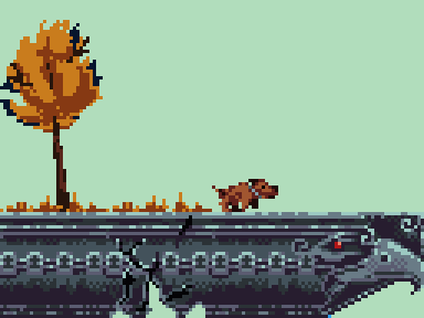 Work by Caliber9. The only black is in the cracks on the stones, and it really makes them stand out, right?  Work by me :D I'm kinda new to working with colors in any sensible way, but I think this one turned out pretty good. The sky is almost grey, and the mountains in the background are almost the same color as the sky, giving the impression of an atmosphere.   Annabelle Kennedy.  . This is an extreme example, there are none at all black in these. This makes it very pleasant too look at, the first one seems almost a bit dream-like. Note that the saturation is relatively low and the color's hues are not too far from each other in the backgrounds, making them look united and peaceful. Then of course you can do as Nic Destefano as well, but I strongly reccomend knowing the rules before you break them :D  Hope this was of any help, show us your progress!  EDIT: And yeah, you should check out sereneworx stuff too. The best of his images are way too large to attach here, but check out the café thread, the most stuff is in the first pages. It will freaking blow you mind  Sereneworx works with a little brighter colors and sharper contrasts than most of the examples I've shown here. Also, don't hesitate to steal others colors to begin with, try to modyfy them a little and play around. |
|
|
|
« Last Edit: January 21, 2009, 12:19:38 PM by JLJac »
|
Logged
|
|
|
|
|
JasonPickering
|
|
« Reply #7 on: January 21, 2009, 12:34:42 PM » |
|
another thing that I sometimes do is take a reference photo I like and try and draw a pallette from there, look at the green grasses or the color of the houses, and it doesnt even need to be a reference photo if you can think of something that has the colors you are going for you can search there. if you want some vivid blues and greens look at starry night, if you want a more water color earth feel try 300. i think in all art reference helps a lot. and also what someone said about leaving out pure blacks and white, this is super important, you rarely see pure black in nature it is a deep blue or purple that has been desaturated, also look at cool vs warm lighting for shadows and highlights, adding a little yellow to a highlight, and then a cooler shadow really makes it pop.
|
|
|
|
|
Logged
|
|
|
|
partymetroid
Level 1
|
|
« Reply #8 on: January 21, 2009, 12:44:56 PM » |
|
Most times: make it a little less saturated than you think, it makes stuff more pleasant to look at. Also, when drawing shadows, try not to only make the color darker, down the saturation a bit too. One thing to think about is the color depth of a screen. The darkest a screen can get is as when shut down, and the lightest it can get is as when showing a completely white canvas in photoshop. Reality, on the other hand, can be as dark as pitch f**king black and as light as looking straight into the sun. When you look at stars on the night sky they are A LOT brighter than their surroundings, making them look like they are sparkling with light. You can not mimic this on a screen, because the color depth is not half as good. Even with blooming or lense flares you won't achieve the same effect. Because of this I sometimes choose colors that are not very extreme, I rather pick ones in the middle, so if I use completely black or white it really stands out. Take some screenshots of cave story and analyze them for a reference. The black colors, like the bats or some of the backdrops, are in fact a very weak blue or purple. The white colors, like the skin of Quote or Curly, are in fact pale greens. This also makes the colors look a little more alive than straight black or whites. AWESOME USE OF HUES IN DARK COLORS You see the black on the jellyfish and the weapon icons? That's a dark blue. Also the shading in the grass is blue, I think it's actually the same color. BLACKS THAT POP OUT Work by Caliber9. The only black is in the cracks on the stones, and it really makes them stand out, right? Work by me :D I'm kinda new to working with colors in any sensible way, but I think this one turned out pretty good. The sky is almost grey, and the mountains in the background are almost the same color as the sky, giving the impression of an atmosphere. HOLY CRAP THAT IS IMPRESSIVE AS *says something sacriligious* Annabelle Kennedy. . This is an extreme example, there are none at all black in these. This makes it very pleasant too look at, the first one seems almost a bit dream-like. Note that the saturation is relatively low and the color's hues are not too far from each other in the backgrounds, making them look united and peaceful. Then of course you can do as Nic Destefano as well, but I strongly reccomend knowing the rules before you break them :D WOAH NEON Hope this was of any help, show us your progress! EDIT: And yeah, you should check out sereneworx stuff too. The best of his images are way too large to attach here, but check out the café thread, the most stuff is in the first pages. It will freaking blow you mind Sereneworx works with a little brighter colors and sharper contrasts than most of the examples I've shown here. Also, don't hesitate to steal others colors to begin with, try to modyfy them a little and play around. (Replaced images with comments to prevent the height from getting huge; except yours, to keep in a little "advertisement" since you helped me. ) Wow, those are GREAT examples of good color usage. To be honest, I DID steal some colors from Cave Story. I'm trying to find my own colors, but it's been rather hard. I'm keeping at it, though  Since you guys have been so nice, I'll show you some super secret terrain tiles I've been working on...  . My friend doesn't like me to show any of our work because of fear of thievery, but you guys are cool.  Besides, they're not great. All of those colors were hand-picked by moi. No colors taken from other games. Any criticisms or encouragement would be appreciated. [edit]JasonPickery, you posted while I was posting. Yeah, I've been looking at photos of earth split in half... specically, this photo: http://en.wikipedia.org/wiki/File:Rockhead1.jpg.JPG. Thanks for the comments! [edit2] ACtually tiled the tiles. :B |
|
|
|
« Last Edit: January 21, 2009, 12:54:54 PM by partymetroid »
|
Logged
|
|
|
|
|
Corpus
Guest
|
|
« Reply #9 on: January 21, 2009, 01:01:07 PM » |
|
i just go by eye and it takes for fucking ever.
It's slightly comforting to know that it doesn't come entirely easily/instantly for you. |
|
|
|
|
Logged
|
|
|
|
|
Shambrook
|
|
« Reply #10 on: January 21, 2009, 03:01:25 PM » |
|
If you're looking to see what colours go together to create moods and shit, there are some fantastic books you can pick up on the subject. They're basicly books that have hundreds of squares with three coloured stripes in them in sections explaing what mood they convey etc.
Would be a great place to start.
|
|
|
|
|
Logged
|
|
|
|
partymetroid
Level 1
|
|
« Reply #11 on: January 21, 2009, 08:06:59 PM » |
|
If you're looking to see what colours go together to create moods and shit, there are some fantastic books you can pick up on the subject. They're basicly books that have hundreds of squares with three coloured stripes in them in sections explaing what mood they convey etc.
Would be a great place to start.
Great! I'll check out my local bookstore! |
|
|
|
|
Logged
|
|
|
|
|
agj
|
|
« Reply #12 on: January 22, 2009, 12:08:15 AM » |
|
Think in terms of values instead of color names. Amounts of red, green and blue, or red, yellow and blue, or cyan, magenta and yellow. This way you're not limiting yourself to the color-with-a-name that's in your head, but the whole range. Also:   RYB and RGB color wheels. |
|
|
|
|
Logged
|
|
|
|
partymetroid
Level 1
|
|
« Reply #13 on: January 22, 2009, 12:14:36 AM » |
|
Think in terms of values instead of color names. Amounts of red, green and blue, or red, yellow and blue, or cyan, magenta and yellow. This way you're not limiting yourself to the color-with-a-name that's in your head, but the whole range. Also: RYB and RGB color wheels. I don't really think in amounts of color. I think in hue, saturation, and value.  But that way of thinking is a really good alternative when the first doesn't work. |
|
|
|
|
Logged
|
|
|
|
|
agj
|
|
« Reply #14 on: January 22, 2009, 10:21:43 AM » |
|
Yeah, that works for many things, but it still doesn't rid you of the habit of thinking of colors in term of their names, so you still have that mental palette that can be pretty rigid.
|
|
|
|
|
Logged
|
|
|
|
Ninja Disguise
Level 1
|
|
« Reply #15 on: January 22, 2009, 06:59:17 PM » |
|
Just a quick tip for you:
As colors become darker they become cooler
As colors become lighter they become warmer
So red can be shaded with a red-purple and highlighted with a red-orange. You will always want to adjust the warmth/coolness of a color when darknening or lightening it.
|
|
|
|
|
Logged
|
|
|
|
|
Lazer
|
|
« Reply #16 on: January 22, 2009, 09:06:11 PM » |
|
I dunno about you guys but I like to shade with fully saturated colors sometimes.
It looks fucking weird.
|
|
|
|
|
Logged
|
|
|
|
|
Biggerfish
Guest
|
|
« Reply #17 on: January 23, 2009, 06:49:09 AM » |
|
As colors become darker they become cooler
As colors become lighter they become warmer
Yeah, I was told something similar to this by someone with pretty amazing colour choice. Darker colours tend towards purple and lighter colours tend towards yellow. |
|
|
|
|
Logged
|
|
|
|
|
Jad
|
|
« Reply #18 on: January 23, 2009, 09:20:49 AM » |
|
You might also want to disregard those 'rules' sometimes! if you're in a leaf forest during sunlight, for example, both light and shadows will be tinted slightly green-ish and the sunlight in contrast will feel almost orangey when it hits stuff directly.
For drawing blood, shading orangey also takes away the signal red that makes our brains click, so yeah.
It's a good principle but you need to disregard it at times also! Always think about lighting conditions when making pictures and look at references for inspiration!
|
|
|
|
|
Logged
|
|
|
|
|
Loren Schmidt
|
|
« Reply #19 on: February 09, 2009, 08:48:09 PM » |
|
I can spend all day picking a color, then wake up the next morning and decide it's terrible :D One thing that's helped me a lot is realizing that colors are very relative. For instance, the flowers in this shot are actually very grey, but because everything else is green they look red.  < -- This is the actual color!  |
|
|
|
|
Logged
|
|
|
|
|
 Developer
