|
Bombini
|
 |
« Reply #100 on: May 08, 2014, 11:58:08 PM » |
|
The look of the game and the UI fit very well!
Its a pleasure to look at.
One thing i am wondering: Do the white targets need more contrast on bright background tiles?
One question: Do you need the star background? It takes away a bit of the atmosphere being in this world (maybe just me)
|
|
|
|
|
 Logged
|
|
|
|
|
Photon
|
|
« Reply #101 on: May 09, 2014, 02:53:58 AM » |
|
One thing i am wondering: Do the white targets need more contrast on bright background tiles?
For the attack reticules it doesn't look so bad but for the dotted texture I feel it might be a bit of an eyesore to identify. Also, it occurred to me: is this cross-device iOS or just iPad? As hard as this may be to play on my phone... who cares! My word, this looks sooooo amazing. |
|
|
|
|
Logged
|
|
|
|
|
Reilly
|
|
« Reply #102 on: May 09, 2014, 07:10:06 AM » |
|
@Bombini I think its fine, if we make it too opaque its hard to figure out what the targets are over. As for the star background, it needed something and we're trying to push the subtle sci-fi space vibe. @Photon I actually feel like the dotted movement tiles are a huge improvement over games like advance wars. It's way less distracting. To your second question, yes this is a universal iOS game, so you can play it on anything that supports iOS6 or later. iPad is definitely the superior experience but playing on the iPhone is great too.  |
|
|
|
|
Logged
|
|
|
|
|
Photon
|
|
« Reply #103 on: May 09, 2014, 07:43:39 AM » |
|
@Photon I actually feel like the dotted movement tiles are a huge improvement over games like advance wars. It's way less distracting. I do actually like it in some ways... maybe I just don't like the fact that the borders of the (maximum) range look so indistinct. Even a medium white line around the edges I think could make a huge difference. To your second question, yes this is a universal iOS game, so you can play it on anything that supports iOS6 or later. iPad is definitely the superior experience but playing on the iPhone is great too.
Ooh, good. I still have an iPhone4 (no S) so I'm running off of a version of iOS6. Yay.  |
|
|
|
|
Logged
|
|
|
|
|
Seiseki
|
|
« Reply #104 on: May 10, 2014, 12:44:02 AM » |
|
Graphically, I think it's hard to distinguish the capturable structures from the rest of the terrain, especially the mountains.. Units and terrain also seems hard to distinguish from one another. I looked at how Advanced Wars did it, and their buildings are gray while all the terrain is always colored, which makes them stand out quite well.. And they only ever use black on the units and gui, never in the terrain. The more you blend the terrain in with the map, the easier it will be to distinguish the units. The mountains right now seem just as dark as the units which makes them stand out just as much or more than the units. As I gui designer I learned that if you want your design to be more accessible, you should try squinting and see if you can still easily recognize individual parts of the design. I made a rough example in photoshop, looks weird because I just lighten them with a brush, but it's way easier to distinguish the units from the terrain. 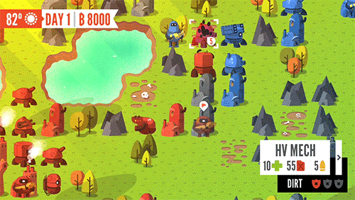 |
|
|
|
|
Logged
|
|
|
|
|
Photon
|
|
« Reply #105 on: May 11, 2014, 04:26:02 PM » |
|
I was looking over some of the screenshots and something occurred to me...
Is it bad/inconsistent that two of the infantry units are viewed from a different angle than all the other units (including the ranger infantry?)
|
|
|
|
|
Logged
|
|
|
|
jeffrobot
Level 1


|
|
« Reply #106 on: May 11, 2014, 08:30:32 PM » |
|
Wow, the intro to your trailer is fucking awesome. Kinda lost me at the game part, but... that trailer intro. Is one of you a professional video editor?
|
|
|
|
|
Logged
|
|
|
|
|
Vanhail
|
|
« Reply #107 on: May 12, 2014, 07:39:01 AM » |
|
Wow, the intro to your trailer is fucking awesome. Kinda lost me at the game part, but... that trailer intro. Is one of you a professional video editor?
We paid a friend to do it and he knocked it out of the park! He's definitely a pro. Credits are in the video description: The gameplay clips are admittedly rather weak. It was hectic trying to get it out at the right time and we changed a lot last minute. We'll be taking our time and learning from the experience when we make the launch trailer. |
|
|
|
|
Logged
|
|
|
|
|
Vanhail
|
|
« Reply #108 on: May 12, 2014, 07:44:57 AM » |
|
@Seiseki
I haven't had any reports of being unable to discern units from our test group. But thanks for the feedback, it's been noted.
In regards to the neutral structures and mountains being very similar in color, that's probaly something we should address now that I've had a good look at it. I'll have to take it up the the design half of the team :D
|
|
|
|
|
Logged
|
|
|
|
Birdorf
Level 1
|
|
« Reply #109 on: May 13, 2014, 09:03:51 AM » |
|
System seller! I liked the look of this so much, I actually bought an iPad.
|
|
|
|
|
Logged
|
|
|
|
|
Reilly
|
|
« Reply #110 on: May 14, 2014, 08:45:59 AM » |
|
Oh jeez, haha! We won't let you down! Seiseki, thanks for the feedback. I'll mess with all that when I have time. So I've been obsessing over the map selection UI lately, I think I'm happy with this...for now... >_> Maps now have a preview, because looking at a bunch of titles isn't fun. Map size is displayed. And since we don't plan on having a million different settings I broke them down into large on/off toggles on the side bar that you would progress through.  Tapping a map will name will bring up a bigger preview.  |
|
|
|
|
Logged
|
|
|
|
|
Photon
|
|
« Reply #111 on: May 14, 2014, 09:37:15 AM » |
|
Those map icons are just placeholders, right? Besides looking a little too similar to Advance Wars (mainly stuff like the buildings), the buildings don't seem to match well against their in-map counterparts. @Birdorf: It makes me want to get an iPad too... |
|
|
|
|
Logged
|
|
|
|
|
Reilly
|
|
« Reply #112 on: May 14, 2014, 10:26:42 AM » |
|
Yeah, thats just some old map image I had laying in my illustrator file. Need to update it. This is what the icons look like right now. Still need to work on readability of the factory and airport.  |
|
|
|
« Last Edit: May 14, 2014, 11:20:12 AM by Reilly »
|
Logged
|
|
|
|
Birdorf
Level 1
|
|
« Reply #113 on: May 14, 2014, 10:45:56 AM » |
|
I have to confess that I bought the iPad for FTL, but this is a massive bonus. I spend my days rocking back and forth, cursing Nintendo for not making another Advance Wars. It gets really bad at this time of the year, as I brace myself for another E3 disappointment. This could help kickstart the healing process.
|
|
|
|
|
Logged
|
|
|
|
|
Reilly
|
|
« Reply #114 on: May 14, 2014, 11:04:41 AM » |
|
I have to confess that I bought the iPad for FTL WARBITS CANCELED! |
|
|
|
|
Logged
|
|
|
|
|
bleek
|
|
« Reply #115 on: May 14, 2014, 11:30:55 AM » |
|
WARBITS CANCELED!
Shut up and take my money!  |
|
|
|
|
Logged
|
|
|
|
|
Photon
|
|
« Reply #116 on: May 14, 2014, 12:27:26 PM » |
|
I spend my days rocking back and forth, cursing Nintendo for not making another Advance Wars.
Advance Wars was done by a third party though, if I'm not mistaken. I have to say though that, should this catch on, there is a large iOS user base that would be great to take advantage of for this game. |
|
|
|
|
Logged
|
|
|
|
|
Reilly
|
|
« Reply #117 on: May 14, 2014, 03:01:01 PM » |
|
Advance Wars was made by Intelligent Systems, but they're pretty much married to Nintendo. Not sure who owns the IP. Photon, thanks for kicking my but into gear on the minimap, I haven't gone over these in ages. Pretty happy with these lil guys.   |
|
|
|
|
Logged
|
|
|
|
|
Photon
|
|
« Reply #118 on: May 14, 2014, 04:06:36 PM » |
|
Photon, thanks for kicking my but into gear on the minimap, I haven't gone over these in ages.
Pretty happy with these lil guys.
Wow, I didn't realize I was so good at butt-kicking. I did it pretty much without trying.  Those icons really look nice. Feel like maybe the contrast is a little much as is between the buildings and the terrain, but otherwise it looks good. |
|
|
|
|
Logged
|
|
|
|
|
Reilly
|
|
« Reply #119 on: May 14, 2014, 05:04:29 PM » |
|
As small as these will be on the phone, the structures really need to pop off the terrain.
|
|
|
|
|
Logged
|
|
|
|
|
 Community
