|
xrabohrok
|
 |
« on: December 12, 2011, 08:45:11 AM » |
|
Once upon a time, around the beginning of 2011, I was part of a project called "The Devil's Pit", in which a lone cowboy/sorcerer/protagonist storms hell and shoots a bunch of bad guys. We were inexperienced, and lo-and-behold, the project died. A few of the members, including myself, decided to give it another go. The project started to go down the same path, and I jumped ship. The project limped along until about a month ago, and then it died again. One thing I did was make sure that I retained ownership of the models I made, should the project die on the vine again. So I got back my models when it did indeed die again. So now, the purpose of this thread. The team consisted of great coders but terrible art/design critics. The most I ever got was "keep up the good work". That, and I just plain didn't get to show anybody what I was doing. So this thread is part me showing off, part asking for criticisms, and part recording lessons learned while making these things. Each one was time intensive, taking 20 hours-ish each, meaning it was done in about a week and a half when I mesh those 20 hours into a college lifestyle. Some of my personal projects are in there too, to spice things up. You will notice I render these things in the desert:  This for a couple reasons: it's a plain setting, it's easy to make, and it lends itself to bright lighting. The settings these characters were usually rendered in were dark. Here we go!... |
|
|
|
|
 Logged
|
A picture is worth a 1000 words, so naturally they save a lot of time.
|
|
|
|
xrabohrok
|
 |
« Reply #1 on: December 12, 2011, 09:07:58 AM » |
|
Submitted for your consideration... 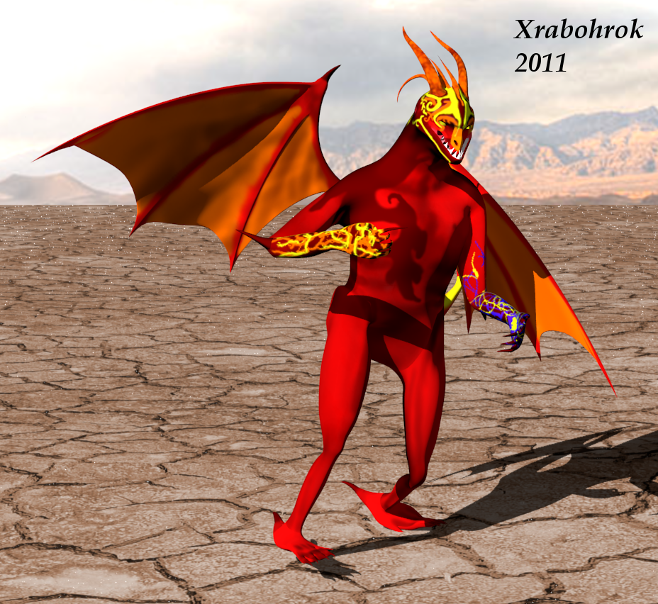 This imp was made with a gameplay purpose in mind, he was supposed to be the fast annoying enemy that would toss fireballs at the player. The way the game was written, you never saw less than 20 of these guys. You know how when you go through your old sketchbook, and you cringe at the stuff near the beginning of the book? Re-rendering this guy was like that. His rig makes it physically impossible to put him in a cool pose, for reasons I will iterate in a moment. His texture is fairly low quality which is most obvious at his hands. And his feet are funny. Most of that was because I free-handed the body, with no plan other than "he needs wings". Its not a complete wash. I like the head, or at least the idea of it, though it doesn't lend itself to any emoting. The fire tattoo is nifty, and the wings were the easiest thing to use on him. They even fold closed! He is also the only character in this collection with face morphs, meaning he can squint and grimace (not well, but hey). The skeleton is unworkable because of a screwed up heirarchy: the master bone is in his spine, so he can't bend over. Well, he can bend over, but he can't bend his back. He was my fifth model, and my favorite for a long time. I might redo him one day... |
|
|
|
|
Logged
|
A picture is worth a 1000 words, so naturally they save a lot of time.
|
|
|
|
xrabohrok
|
|
« Reply #2 on: December 12, 2011, 09:27:38 AM » |
|
Next up: 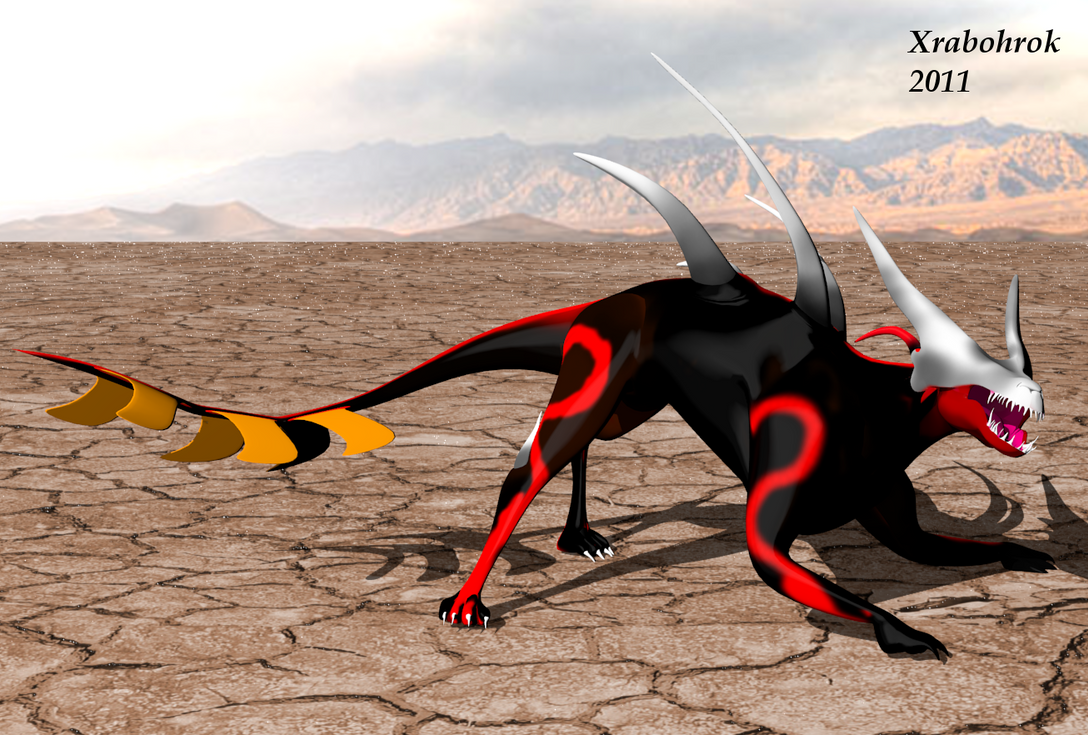 I'll cop to something: this creature design is not mine. For a brief, brief moment, we had a concept artist. This was the implementation of one of those creatures, a eyeless horned hell-hound. The colors were something I slapped together myself really quickly. The model came out nicely, and the rig was a huge improvement over the imp. It had preventative measures in place to prevent the animator from ripping apart the skeleton, and the root bone was not in the spine this time. If this model taught me anything, it is that a good rig feels good, and working from a plan is even better. The texture is lazy, this was before I really paid attention to some things. Looking at it now, I don't really like that pose, here is an alternate view. I'll continue this later... |
|
|
|
|
Logged
|
A picture is worth a 1000 words, so naturally they save a lot of time.
|
|
|
|
moi
|
|
« Reply #3 on: December 12, 2011, 09:56:44 AM » |
|
Quick opinion:
I can't make up my mind if these are cool surrealist designs (that would fit well with the "hell" theme) or just amateurish anatomy and texturing.
Consider me intrigued.
The first monster looks like a carnival devil from a carribean place. It could be interesting to have a game in such a style, if it was assumed
|
|
|
|
|
Logged
|
subsystems subsystems subsystems
|
|
|
|
xrabohrok
|
|
« Reply #4 on: December 12, 2011, 10:26:51 AM » |
|
Quick opinion:
I can't make up my mind if these are cool surrealist designs (that would fit well with the "hell" theme) or just amateurish anatomy and texturing.
You're right on both counts! It's supposed to be cartoony, with a toon material and whatnot, and these models are my early grapples with Blender  . It gets better, promise!  |
|
|
|
|
Logged
|
A picture is worth a 1000 words, so naturally they save a lot of time.
|
|
|
|
rivon
|
|
« Reply #5 on: December 12, 2011, 03:12:04 PM » |
|
The imp has really weird anatomy. The dragon/hell-hound thing looks quite good tho, even tho the colors/texture could be a bit modified. Also the "stings" on the tail are looking very flat.
|
|
|
|
|
Logged
|
|
|
|
|
xrabohrok
|
|
« Reply #6 on: December 12, 2011, 08:18:09 PM » |
|
I guess I should mention that the game was for a top-down shooter, that would probably illuminate some of these design choices... Alright, one more and I'm done for today: 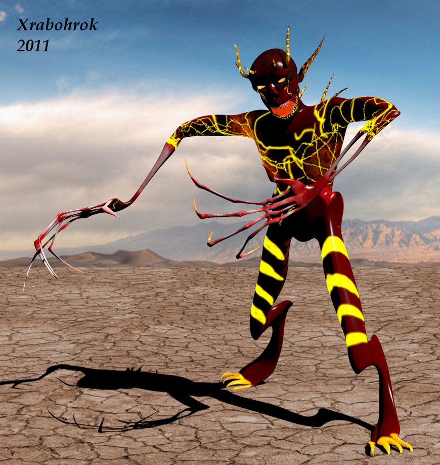 This guy was never used. The idea was "what happened when a Demon gets zombified?" It was my first exposure to lightmaps, though I may have overdid the effect. The hands are very similar to the hands of head-crab zombie victims, while the feet are once again digitigrade. I remember putting a lot of effort into the teeth for some reason. I didn't want to rig the eyes, I had some problems with the ones on the imp and didn't want to deal with that again, so I made a falloff map that transitions from red to yellow. I didn't apply the toon shader on this guy for some reason. The rig was alright. Posing challenge for this one was keeping manual track of all those digits. They were all reverse-IK rigged (2 second primer: Forward IK means the animator deals with each bone individually, Reverse IK means the animator deals with the ends of the chain and everything in between figures itself out), but they are incredibly long and spindly. The lesson I learned was not to model something you aren't willing to pose over and over. Also, the texture wasn't high enough a resolution. You can see the individual pixels on the star on his chest  . |
|
|
|
|
Logged
|
A picture is worth a 1000 words, so naturally they save a lot of time.
|
|
|
|
xrabohrok
|
|
« Reply #7 on: December 14, 2011, 09:05:47 PM » |
|
Ok, now on to some of my better work: 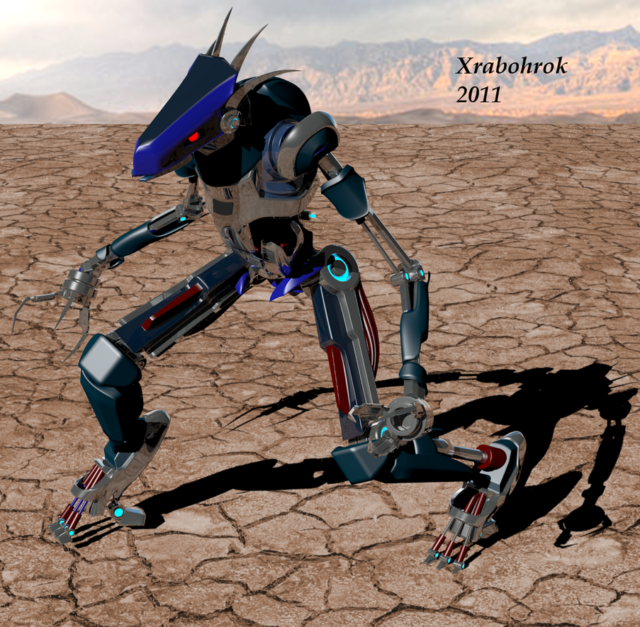 This guy is really kinda tragic. I really, really like the design for this robot, and the color choice isn't bad, for once. But there are things that have permanently destroyed any sort of chance to actually use him. I made him in Blender v2.53, which must've been when who had no idea what they were doing, because that Blender version is BORKED. "Cylinders" became "Tubes" for just this version, the .obj exporter was busted, and apparantly constraint values don't scale with the rest of the model. Also, "Tube" creation defaults to 36 sides per tube, and this guy has a lot of them. Adding a smooth modifier to get the creases to stand out with all those 36 sided ...Tubes... creates a couple million poly model. His rig is needlessly complex, with waaaay to many bones. This model isn't part of a game, either. It was my pet project, something I worked on when I was bored and in between monsters. In order to render these desert shots, I've had to scale most of these monsters to the right size. The robot's rig is so messed that he explodes when I try. So I scaled up everything else. |
|
|
|
|
Logged
|
A picture is worth a 1000 words, so naturally they save a lot of time.
|
|
|
|
rivon
|
|
« Reply #8 on: December 15, 2011, 07:20:54 AM » |
|
Actually I think the color choice is the worst part. Apart from that it looks great  |
|
|
|
|
Logged
|
|
|
|
|
gimymblert
|
|
« Reply #9 on: December 15, 2011, 11:52:04 PM » |
|
The color are great, the shading much less
|
|
|
|
|
Logged
|
|
|
|
|
InfiniteStateMachine
|
|
« Reply #10 on: December 16, 2011, 01:31:20 AM » |
|
yeah you are sorely in need to a good render environment. Does Blender not have any modering light gathering renders?
sadly, a good render can make all the difference in the world
|
|
|
|
|
Logged
|
|
|
|
|
xrabohrok
|
|
« Reply #11 on: December 16, 2011, 05:52:06 PM » |
|
Blender has something called LuxRender, which I guess would be the Blender equivalent to 3DS Max's Mental Ray. I plead ignorance to how to use it though, as it is extremely touchy. I never got it to work when I messed with it earlier. The environment shown is extremely simple, just a "sun" and a couple of lamps to soften the shadows. The renderer assumes real world scale...which means he is being rendered the size of a building... Here is an older render, when he was slightly less broken. My color choosing skills are not great. |
|
|
|
|
Logged
|
A picture is worth a 1000 words, so naturally they save a lot of time.
|
|
|
|
gimymblert
|
|
« Reply #12 on: December 17, 2011, 11:14:38 AM » |
|
Color are great for the chosen theme, some other aspect of the execution already mention (anatomy, shading) or not (texture blur, sloppy texture drawing, posing, etc...) but the design is great and original
|
|
|
|
|
Logged
|
|
|
|
|
xrabohrok
|
|
« Reply #13 on: December 19, 2011, 01:09:08 PM » |
|
At this point (about May) the project died and then underwent revivification. The coders decided to redo their code, so I thought I might as well redo my monsters. The first monster to undergo a re-factoring was my zombie. I will not show my very first zombie, as it is terrible. This one is much better, though there is always room for improvement: 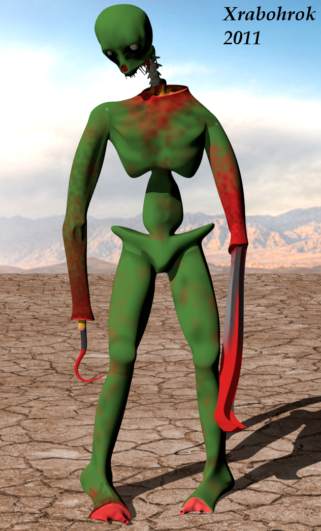 The idea was that zombies are manufactured in hell, and the visual design is (very) similar to that of the Gorefast from Killing Floor, albeit much cartoonier. This time, I tried attacking cartoony from a different angle as well, going for soft shadows and bright colors, as apposed to binary shadows and solid color blocks. Also, I made some strategic design decisions: This monster has pure white eyes, one less thing to animate. There are no fingers or hands to worry about, and not toes to mention. As a cannon-fodder enemy, he was very easy to rig and pose. I don't know about that green though. I guess I should go into intended use of these models: The game is a sprite based top down shooter, so each monster gets rendered from the top as a 128x128 alpha background sprite. I render each animation into a folder at about 12fps, and we had a script that would take each set in each folder and add it to a sprite sheet. I worry about the whole monster for three reasons: in case it falls over when it dies, to make the whole design make sense, and to allow reuse as box art or similar. |
|
|
|
|
Logged
|
A picture is worth a 1000 words, so naturally they save a lot of time.
|
|
|
|
xrabohrok
|
|
« Reply #14 on: December 20, 2011, 08:23:11 AM » |
|
An "upgrade" of the zombie above: 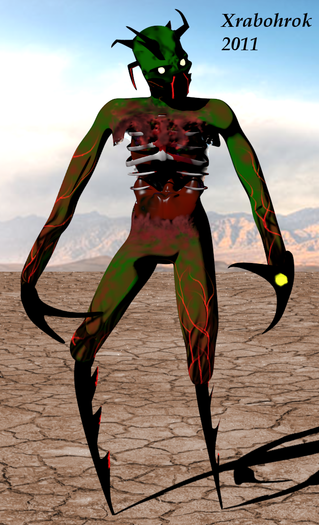 This is what would happen if a zombie got possessed by a shade. It would get new limbs, and some magical powers to boot. I know this design works at least a little because it freaks me out a little. This was my first experiment with glow and alpha maps. Figuring out how to get that all working was very difficult, but very worth it. |
|
|
|
|
Logged
|
A picture is worth a 1000 words, so naturally they save a lot of time.
|
|
|
|
st33d
Guest
|
|
« Reply #15 on: December 21, 2011, 05:10:33 AM » |
|
Until I read the first post I thought that the ominous white cube was some kind of monster.
"Ah, just a white cube. I wonder what it - AAAAAAAAAARRRRRRGHHHHHH!!!!"
|
|
|
|
|
Logged
|
|
|
|
swordofkings128
Level 6


|
|
« Reply #16 on: December 26, 2011, 10:26:55 PM » |
|
I really like these... sure, they might not have the most advanced rendering and best colors, but I think these models have a lot of personality to them. They remind me of early 3d models, which I've always been a sucker for(and not the ones use in games, like the ones used in old CG demonstrations and animations)
I really like the doggy one and the robot one, specifically. :D
|
|
|
|
|
Logged
|
|
|
|
|
 Developer
