|
thomasmahler
|
 |
« on: June 16, 2010, 07:55:37 PM » |
|
Hey guys, This is a game I've already spent quite some time with to create a 2d version. A couple of my buddies like the 2d version and we decided to make a 3d version out of it, using the same gameDesign and rules, but turning it into a FPS / RTS mix. You can play a first tech demo online here: http://www.warsoup.com/builds/dailyBuild.htmlControls are typical FPS style: WSAD to move around, LMB to shoot. Right now you're just shooting balls, but we're currently working on getting all the core mechanics in. We hope to design this in a way that allows very quick prototyping. Everything in this demo is still in its very early stages, none of it is final. The first goal was to create the fps mechanics, implement RTS-styled healthBars, being able to shoot and drain HP from enemies (menacing spheres!) and make them explode / die. Also, here: http://www.warsoup.com/boards/index.phpis a link to the developer forums. We have some art, animation tests, concepts and so on online. Here's a first version of our character model:  Earlier version:  (Really need feedback on this - some people love the char, others think it's too simple) First enemy design: 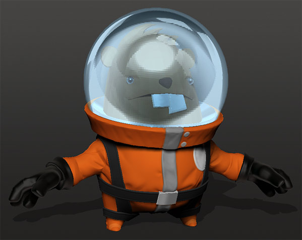 The idea is that there will be tons and tons and tons of comic violence, all based on the players weapon level. If you shoot a level1 enemy with a tier1 weapon, he'll just fall down and die. If you shoot the same enemy with a tier3 weapon, the area you shot at will explode. The reason is gratification - if you upgrade your weapon, you should feel, hear and see a difference. There's a whole upgrade / rts system we're currently programming. I quickly roughed out a first radial menu test that shows an early version of the menu that we'll be using to upgrade / buy stuff: http://www.warsoup.com/files/radialMenu_06.jpgetc. etc., you can find even more stuff on the boards  The whole idea behind Warsoup is to create a game that analyzes current FPS design, cuts out the dead weight and streamlines the whole approach while adding a full weapon upgrade / rts system on top of it. It's all about resourcing and map control. There's never a lot of 3d stuff here on tigsource, so I hope you guys don't jump me for posting about Warsoup here, but I always love to get feedback |
|
|
|
« Last Edit: September 11, 2010, 05:36:09 AM by thomasmahler »
|
 Logged
|
|
|
|
|
deathtotheweird
Guest
|
 |
« Reply #1 on: June 16, 2010, 08:25:06 PM » |
|
I love the look of the new enemy. It's a bit simple yeah, but I'm sure when you get him textured it will look awesome. Also the radial menu looks sweet, I just hope you aren't planning to use the TF2 font  Never seen the whole appeal for one to make an RPG/RTS hybrid. I haven't played one I enjoyed. If it played more like Sacrifice did it would be pretty awesome though, that was a great game. But if you've played any of the many rts/fps hybrid games based on the source engine they are all pretty .... not fun. |
|
|
|
|
Logged
|
|
|
|
ness io kain
Level 6

died and is a ghost.


|
|
« Reply #2 on: June 16, 2010, 09:36:06 PM » |
|
This is looking great!
Your characters are pretty incredible; I love the general style of the whole thing.
Your weapon system sounds pretty neat; I'll be interested to see how that works out.
|
|
|
|
|
Logged
|
|
|
|
|
Taiko
|
|
« Reply #3 on: June 17, 2010, 02:51:30 AM » |
|
Tech demo looks great - I'm loving the particle effects when the balls explode. Controls seem fine and the laser effects fit with the theme.
I did manage to fall off the edge though of the demo area, though, and the game froze.
|
|
|
|
|
Logged
|
|
|
|
|
♒ben
|
|
« Reply #4 on: June 17, 2010, 05:39:09 AM » |
|
(Really need feedback on this - some people love the char, others think it's too simple)
Not sure if you were referring to your character or enemy model but i'm really enjoying the character model at the moment. Simple is a good thing in my opinion as long as you can still convey character/personality, good job! Look forward to seeing more. |
|
|
|
|
Logged
|
|
|
|
|
s0
|
|
« Reply #5 on: June 17, 2010, 09:59:55 AM » |
|
Loving both the character and the enemy design, tech demo looks good too.
I can't really picture what the gameplay's gonna be like at this point though. Is it going to be like a singleplayer version of Natural Selection or something? I'd love to hear some more info in that department because the tidbits you posted sound quite intriguing.
|
|
|
|
|
Logged
|
|
|
|
|
thomasmahler
|
|
« Reply #6 on: June 17, 2010, 12:40:17 PM » |
|
Hey there, I wanna set up videos that show how you'll play the game and we'll do that very soon. We should have most of the core mechanics in there in the next couple of days, then it'll be easier to show everyone what it's all about. For Multiplayer, we're currently designing maps. I created a forum post that talks a bit about gameplay here: http://www.warsoup.com/boards/viewtopic.php?f=4&t=16For those that can't access the webPlayer:  There'll be more info soon |
|
|
|
|
Logged
|
|
|
|
|
thomasmahler
|
|
« Reply #7 on: June 17, 2010, 03:10:32 PM » |
|
Maybe somebody already saw it, but we added the resource element. Now a smaller mob gives you +1 and a boss is +15. Next up weapon upgrades and the radial menu |
|
|
|
|
Logged
|
|
|
|
|
Davioware
|
|
« Reply #8 on: June 17, 2010, 04:18:17 PM » |
|
Nice characters and game idea. I tried the tech demo and it seems pretty solid so far. The explosion effects lag the game however, they should be changed or optimized.
|
|
|
|
|
Logged
|
|
|
|
|
J. R. Hill
|
|
« Reply #9 on: June 18, 2010, 01:55:14 AM » |
|
I really like the first version guy. Even if the whole game was just recolored versions of him I think it'd be awesome. I think the beaver needs less-human-detailed eyes to fit in stylistically with the main character, plus I think it would also make him cuter.
Also, I found out by accident that if you hold jump while moving against a wall you just float up and over it and cause the game to crash.
|
|
|
|
|
Logged
|
hi
|
|
|
ness io kain
Level 6
died and is a ghost.
|
|
« Reply #10 on: June 18, 2010, 03:53:22 AM » |
|
I really like the first version guy. Even if the whole game was just recolored versions of him I think it'd be awesome. I think the beaver needs less-human-detailed eyes to fit in stylistically with the main character, plus I think it would also make him cuter. I agree with all of this. You should use some interesting colors, though... Not just medium red and blue or whatever. |
|
|
|
|
Logged
|
|
|
|
|
Tumetsu
|
|
« Reply #11 on: June 19, 2010, 07:58:22 AM » |
|
I like the designs. Very good though you could consider what JR Hill said about beawer's eyes. Not a big deal though. About the engine, well it ran smoothly but it seemed to be so early stage that I don't have much to say now. Good job so far and keep up good work! |
|
|
|
|
Logged
|
|
|
|
___
Vice President of Marketing, Romeo Pie Software
Level 10

|
|
« Reply #12 on: June 19, 2010, 09:57:09 AM » |
|
This is looking pretty slick, although I'm not a fan on how the movement feels for strafing and jumping.
|
|
|
|
|
Logged
|
|
|
|
|
thomasmahler
|
|
« Reply #13 on: June 19, 2010, 11:38:24 AM » |
|
Hey guys, thanks for all the feedback. I'm glad you guys like the current version, we'll have a new one up very soon. @JR Hill: Thanks for the suggestion, will do. @Turnsetsu: Right now it's important for us to get the framework right and to have all our core mechanics in the game, then we'll add more stuff and make sure there's a full game there @xerus: What don't you like? Do you have any references of shooters that handle things better than we do? |
|
|
|
|
Logged
|
|
|
|
___
Vice President of Marketing, Romeo Pie Software
Level 10
|
|
« Reply #14 on: June 19, 2010, 11:58:24 AM » |
|
@xerus: What don't you like? Do you have any references of shooters that handle things better than we do?
It sort of feels like Counter-Strike movement, but a little bit more... unresponsive. It's really hard to explain, as I'm very very picky about the feeling of movement in FPS games. I think Unreal Tournament (the original), Unreal Tournament 2004, and Quake 3 all feel pretty fantastic though, if you want to look at those. Quake 3 has the in-browser game now for Quake Live as well. |
|
|
|
|
Logged
|
|
|
|
|
The Monster King
|
|
« Reply #15 on: June 19, 2010, 01:49:11 PM » |
|
i feel like the enemy character has more personality than the main character but i guess this is less of an issue in a FPS
|
|
|
|
|
Logged
|
|
|
|
|
thomasmahler
|
|
« Reply #16 on: June 19, 2010, 11:56:51 PM » |
|
Hmm, since there are 2 opinions out there right now (beaver has more character vs. characters simpler artstyle works better), I changed the sculpt a bit, added more facialDetail to make him look a little meaner - it's a game about them killing one another after all.  With the added facial detail the space suit thingy isn't detailed enough anymore - but it'd be cool to hear some feedback. Which style do ou guys like better? The left one is a little inspired by the Gorillaz and that crazy UK underground art, whereas the right one was more of a 'let's keep it simple, maybe Dan Paladin'ish' thing. Closeup of the new face:  |
|
|
|
« Last Edit: June 20, 2010, 12:01:40 AM by thomasmahler »
|
Logged
|
|
|
|
ness io kain
Level 6
died and is a ghost.
|
|
« Reply #17 on: June 20, 2010, 12:43:29 AM » |
|
I definitely prefer the old version... The new one just seems to have too much detail.
Could you try something intermediate, though?
You could close up the mouth a little more (remove the teeth and tongue) and make the nose more subtle (less obvious nostrils, or none at all?)... but leave all the creases in the face.
|
|
|
|
|
Logged
|
|
|
|
|
starsrift
|
|
« Reply #18 on: June 20, 2010, 12:47:35 AM » |
|
I'm a fan of the old version.
But to my mind, cuter == better.
|
|
|
|
|
Logged
|
"Vigorous writing is concise." - William Strunk, Jr.
As is coding.
I take life with a grain of salt.
And a slice of lime, plus a shot of tequila.
|
|
|
|
thomasmahler
|
|
« Reply #19 on: September 11, 2010, 03:58:36 AM » |
|
Hey guys, Haven't updated this thread as much - we've been super busy making sure the whole pipeline works, the art direction is fixed and that we've got something good going Here's the webBuild: http://www.warsoup.com/builds/subD_17.html(Press ALT + Enter for Fullscreen) Or the older standAlone build for better performance: www.warsoup.com/builds/subD_16.zip (includes an early version of the 1v1 map we're planning for the vertical slice) Note that both builds aren't optimized at all yet, so they won't really run well on older computers. Our goal still is to make Warsoup look and perform excellent even on 3 year old boxes Here's a screenshot of the interface: http://www.warsoup.com/files/lookDev_12.jpgThere's a very slight parallax on it that separates the foreground elements from the background elements, neat little thing that doesn't really get in anyones way. We're currently designing the weaponTiers for the plasmaBuild to finally replace the blocked out models we've been using and I'm struggling a bit with the design, so I thought I'd post it here to get some good input. The whole idea is this: Every weapon has 3 tiers, for the plasmaWeapon it's plasmaGun, plasmaRifle, plasmaCannon - and every tier has 2 upgrade paths. We want to make sure that there's a little indicator, design-wise for each and every step in the build.  That was my first test, a little 'complex' in terms of forms, there's a lot going on, maybe too much for the stylized style we're going for.  Next test: What if we use a disc like object for the display?  Next idea: What if we actually use the disc not just for shape, but also for info? So the disc could become an indicator for health / energy by splitting that circle around the display in half and using the left side for health / right side for energy.  Next step: The disc sorta sucks, so let's go back to more angular forms for the plasma and use discs / cylinders for the railgun build.  Next one; What if we simplify the shapes and merge that part in the from, so that it becomes one bigger shape?  And this is my next idea: I'll take the turret designs that Johannes came up with and bring in some of the shapes we had there. Could need some input on this - which version do you guys prefer, maybe some help from the weapon-maniacs here? I'm playing around with the forms but can't seem to really find the one design that just clicks right now. And the part that really increases the difficulty on this whole thing - design wise - is that there have to be 3 tiers and various upgrades that have to work with the weapon designs. So any Feedback is appreciated |
|
|
|
|
Logged
|
|
|
|
|

