|
JMickle
|
 |
« Reply #21080 on: January 17, 2013, 04:19:12 PM » |
|
you need to lower the contrast on the wood by a huuuge amount. check the Value of the dark brown and change it so it isn't so far away from the Value of the other two colours (not too similar though). you might have to change the hue a little bit to make it look nice as well.
|
|
|
|
|
 Logged
|
|
|
|
|
poe
Guest
|
|
« Reply #21081 on: January 17, 2013, 04:32:35 PM » |
|
you need to lower the contrast on the wood by a huuuge amount. check the Value of the dark brown and change it so it isn't so far away from the Value of the other two colours (not too similar though). you might have to change the hue a little bit to make it look nice as well.
Alright I'll try that, thanks! |
|
|
|
|
Logged
|
|
|
|
|
gggfhfdh
|
|
« Reply #21082 on: January 17, 2013, 04:37:43 PM » |
|
 another thing for another person |
|
|
|
|
Logged
|
|
|
|
geepit
Level 1


|
|
« Reply #21083 on: January 17, 2013, 04:39:50 PM » |
|
The actual texture of the grass tile looks nice, but I think as a whole the grass looks slightly too tiled. Like you can see sort of grid lines over the whole area which breaks up the continuity, making it look like a bunch of tiles rather than a single field. If you see what i mean.
Looking at the tiles you posted as well i think the reason for this is actually in the middle of the individual tile, rather than the edges.
|
|
|
|
|
Logged
|
|
|
|
FishyBoy
Level 7

Make like a tree and get the hell out of here
|
|
« Reply #21084 on: January 17, 2013, 04:43:59 PM » |
|
Stanley, that animation is fantastic. He looks like he just lost his golden truck trying to cheat some mortal out of his soul.
|
|
|
|
|
Logged
|
|
|
|
|
siskavard
Guest
|
|
« Reply #21085 on: January 17, 2013, 05:55:54 PM » |
|
Just 'doodling' using only web safe colors. Very challenging. Any feedback is appreciated.  enhance:  |
|
|
|
|
Logged
|
|
|
|
|
SolarLune
|
|
« Reply #21086 on: January 17, 2013, 06:24:31 PM » |
|
The apple looks squashed (but that's obvious and looks stylistic, not wrong). The orange's specular highlighting should extend to further than just the outline - it should indicate volume, like the shadow does. The watermelon looks pretty cool. I think the shadow could be more curved like the orange, and it's pretty round for a watermelon (which should be more oblong-shaped), but otherwise, they're all pretty sweet.
|
|
|
|
|
Logged
|
|
|
|
|
Trystin
|
|
« Reply #21087 on: January 17, 2013, 06:46:56 PM » |
|
another thing for another person Hellboy/Scott Pilgrim |
|
|
|
|
Logged
|
|
|
|
|
siskavard
Guest
|
|
« Reply #21088 on: January 17, 2013, 06:48:59 PM » |
|
The apple looks squashed (but that's obvious and looks stylistic, not wrong). The orange's specular highlighting should extend to further than just the outline - it should indicate volume, like the shadow does. The watermelon looks pretty cool. I think the shadow could be more curved like the orange, and it's pretty round for a watermelon (which should be more oblong-shaped), but otherwise, they're all pretty sweet.
Thanks! The apple is actually a cherry, but either way, it's too squashed, you're right. The orange is pretty weak, I'll keep that highlighting in mind. Thanks for the feedback!  |
|
|
|
|
Logged
|
|
|
|
|
gggfhfdh
|
|
« Reply #21089 on: January 17, 2013, 06:57:02 PM » |
|
another thing for another person Hellboy/Scott Pilgrim |
|
|
|
|
Logged
|
|
|
|
FishyBoy
Level 7
Make like a tree and get the hell out of here
|
|
« Reply #21090 on: January 17, 2013, 07:20:49 PM » |
|
Made this little pig using Arne's palette for an fps thing I'm doing.  Was wondering if it reads well at all? |
|
|
|
« Last Edit: January 17, 2013, 09:35:39 PM by FishyBoy »
|
Logged
|
|
|
|
thekill473
Level 1
|
|
« Reply #21091 on: January 17, 2013, 09:22:57 PM » |
|
Can't see it. Try scaling it up with hard edges preserved so we can see it better.
|
|
|
|
|
Logged
|
|
|
|
|
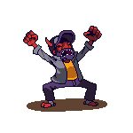
GhostBomb
|
|
« Reply #21092 on: January 17, 2013, 11:12:34 PM » |
|
This animation is a little bit slower than it is in the actual game. Making gifs out of GM8 sprites is a pretty big pain. :/  For my Zelda-like game. |
|
|
|
|
Logged
|
|
|
|
|
Belimoth
|
|
« Reply #21093 on: January 17, 2013, 11:17:42 PM » |
|
Very nice animation.
|
|
|
|
|
Logged
|
|
|
|
|
JMickle
|
|
« Reply #21094 on: January 18, 2013, 06:55:03 AM » |
|
you have a lot of frames which results in a very smooth animation but the entire body/head is completely static which looks a little off. (especially the legwear) I'd suggest drawing keyframes instead of just editing the first frame over.
The base sprite is pretty nice though, lots of recognizable detail!
|
|
|
|
|
Logged
|
|
|
|
|
Rat Casket
|
|
« Reply #21095 on: January 18, 2013, 07:02:36 AM » |
|
 Lil somethin somethin I'm working on. |
|
|
|
|
Logged
|
|
|
|
Fistberg
Level 0

|
|
« Reply #21096 on: January 18, 2013, 09:38:42 AM » |
|
Project I'm currently working on: The shirtless version is the original one I made, but the others asked me to add a labcoat. It made him look awfully like Dr. Light though...  And here are his robots clones I hate the pillow shading on the right side of his stomach. Anyone got any suggestions on how to improve it? |
|
|
|
« Last Edit: January 18, 2013, 03:44:02 PM by Fistberg »
|
Logged
|
|
|
|
|
JMickle
|
|
« Reply #21097 on: January 18, 2013, 09:54:51 AM » |
|
get rid of it? literally just change it all to the colour of the middle.
|
|
|
|
|
Logged
|
|
|
|
|
Joshua
|
|
« Reply #21098 on: January 18, 2013, 10:06:30 AM » |
|
Concerning the pillow shading: I would be more mindful of the light source.
|
|
|
|
|
Logged
|
|
|
|
Fistberg
Level 0
|
|
« Reply #21099 on: January 18, 2013, 10:39:53 AM » |
|
It's a tiny bit better, I guess.  There's also something about the arm that seems off to me. Eh, looking at it now the light source seems to be all over the place. |
|
|
|
|
Logged
|
|
|
|
|
 Developer
