|
Scut Fabulous
|
 |
« on: August 25, 2010, 10:50:40 AM » |
|
~~~ The Salvage is seeking YOUR help! ~~~ In the following thread you will discover a slice of the distant future described through my sketches, concept art, mockups, sprites and textures. There's a whole IP living in this thread, along with the art assets required to make a game. Are you a programmer? Do you feel that The Salvage is something worth salvaging? Perhaps you are more interested in creating a much smaller game using my art? Do you feel that The Salvage is something worth salvaging? Perhaps you are more interested in creating a much smaller game using my art? I'd love to hear from you. PM me, or email me at: Newest content on the latest pages of the thread.The Salvage is a game of science fiction treasure hunting. You play an adventurer on a dangerous planet, searching for ancient technological artifacts that are worth fortunes. Digging the artifacts out of the ground is a challenge, but there will be many hazards to deal with that will make simple survival difficult as well.
Download the last engine build. Oct 2010https://sites.google.com/site/testportfolionow/home/video-games/SalvagebuildOct11.zip?attredirects=0&d=1Extract and run salvage.exe. WASD keys move the player, click with the mouse to dig away ground. Please note that this build is old, and far from a game. Not even talking alpha here, but it shows a functioning engine with working animation and terrain lighting implemented.
Hyperduck sound diary can be found here:http://forums.tigsource.com/index.php?topic=16900.0Some of you might recognize this from the 'Mockups' thread. I was posting a fair number of updates there, and aeiowu suggested I start a devlog. The project started as a very rough mockup when I was thinking about a sleeping project by my friend jkd. I'm going to run this OP with a brief rundown of the development so far, in a rough chronological order.  http://scutanddestroy.files.wordpress.com/2010/07/salvage-concept-001.jpg http://scutanddestroy.files.wordpress.com/2010/07/salvage-concept-001.jpg http://scutanddestroy.files.wordpress.com/2010/07/salvage-concept-003.jpg http://scutanddestroy.files.wordpress.com/2010/07/salvage-concept-003.jpg http://scutanddestroy.files.wordpress.com/2010/07/salvage-concept-004.jpg http://scutanddestroy.files.wordpress.com/2010/07/salvage-concept-004.jpg http://scutanddestroy.files.wordpress.com/2010/07/salvage-concept-002.jpg http://scutanddestroy.files.wordpress.com/2010/07/salvage-concept-002.jpgThis was my main initial mockup / scratch pad, showing most of the raw game mechanic ideas. Digging, using some kind of devices to seek out treasure, hazardous encounters, fluids etc. You can also see that the terrain is being drawn with a very basic stroking system. When I began I was assuming the terrain would be drawn in real-time with a procedural method.  http://scutanddestroy.files.wordpress.com/2010/06/salvage-002.jpg http://scutanddestroy.files.wordpress.com/2010/06/salvage-002.jpgCharacter concept sketches:  http://scutanddestroy.files.wordpress.com/2010/07/salvage-thumbs-004.jpg http://scutanddestroy.files.wordpress.com/2010/07/salvage-thumbs-004.jpg http://scutanddestroy.files.wordpress.com/2010/07/salvage-thumbs-002.jpg http://scutanddestroy.files.wordpress.com/2010/07/salvage-thumbs-002.jpg http://scutanddestroy.files.wordpress.com/2010/07/salvage-thumbs-003.jpg http://scutanddestroy.files.wordpress.com/2010/07/salvage-thumbs-003.jpg http://scutanddestroy.files.wordpress.com/2010/07/salvage-thumbs-001.jpg http://scutanddestroy.files.wordpress.com/2010/07/salvage-thumbs-001.jpg http://scutanddestroy.files.wordpress.com/2010/07/salvage-thumbs-008.jpg http://scutanddestroy.files.wordpress.com/2010/07/salvage-thumbs-008.jpg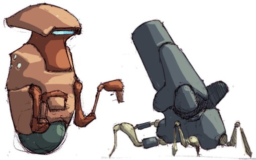 http://scutanddestroy.files.wordpress.com/2010/07/salvage-thumbs-007.jpg http://scutanddestroy.files.wordpress.com/2010/07/salvage-thumbs-007.jpg http://scutanddestroy.files.wordpress.com/2010/07/salvage-thumbs-006.jpg http://scutanddestroy.files.wordpress.com/2010/07/salvage-thumbs-006.jpg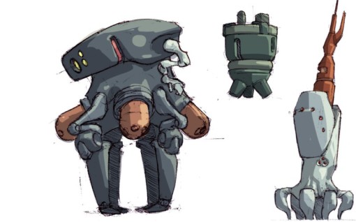 http://scutanddestroy.files.wordpress.com/2010/07/salvage-thumbs-005.jpg http://scutanddestroy.files.wordpress.com/2010/07/salvage-thumbs-005.jpgThis mockup introduced the idea of 'The Bankers'. They loan you exotic equipment for digging up artifacts. The player needs to always manage the risk of spending too much time labouring on the planet vs the risk of taking on more loans than one can afford. I also introduced an improved terrain texture here, trying to get more variation in.  http://scutanddestroy.files.wordpress.com/2010/07/salvage-bankers-vignette.png http://scutanddestroy.files.wordpress.com/2010/07/salvage-bankers-vignette.png  Rain and lightning mockup. Weather will be a regular hazard in the game. Flooding, electrocution etc. Depending on how fancy we can get with the terrain engine it might be cool to have erosion effects as well.  http://scutanddestroy.files.wordpress.com/2010/07/rain-003.png http://scutanddestroy.files.wordpress.com/2010/07/rain-003.png http://scutanddestroy.files.wordpress.com/2010/07/salvage-lightning-001.png http://scutanddestroy.files.wordpress.com/2010/07/salvage-lightning-001.png http://scutanddestroy.files.wordpress.com/2010/07/rain-001.png http://scutanddestroy.files.wordpress.com/2010/07/rain-001.png http://scutanddestroy.files.wordpress.com/2010/07/rain-002.png http://scutanddestroy.files.wordpress.com/2010/07/rain-002.pngEarthquake effects. In-game I'm planning this to be modeled simply by cutting up the affected ground into chunks and rotating some randomly left or right, and shift their neighbors accordingly. 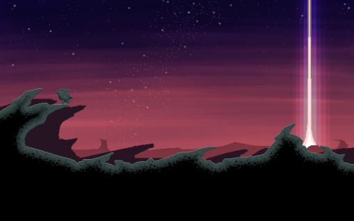 http://scutanddestroy.files.wordpress.com/2010/07/earthquake-before.png http://scutanddestroy.files.wordpress.com/2010/07/earthquake-before.png http://scutanddestroy.files.wordpress.com/2010/07/earthquake-002.png http://scutanddestroy.files.wordpress.com/2010/07/earthquake-002.png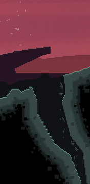 This is one of the tools you can lease from The Bankers. I'm calling it a 'Spike'. It buries itself in the ground and when it lifts again it takes a big chunk of earth with it.  http://scutanddestroy.files.wordpress.com/2010/07/spike-positioned.png http://scutanddestroy.files.wordpress.com/2010/07/spike-positioned.png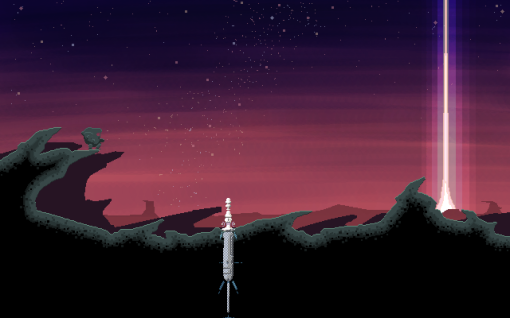 http://scutanddestroy.files.wordpress.com/2010/07/spike-buried.png http://scutanddestroy.files.wordpress.com/2010/07/spike-buried.png http://scutanddestroy.files.wordpress.com/2010/07/core-lift.png http://scutanddestroy.files.wordpress.com/2010/07/core-lift.png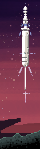 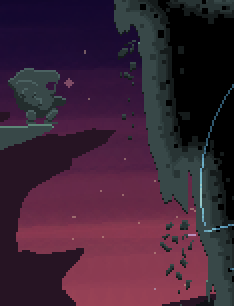 After I had posted up The Spike in the mockups thread, I got a lot of feedback regarding the 'pillow shading', and it had been sticking in my craw too but I thought it was unavoidable with the procedural system I had in mind. I talked to jkd about it and he said we could be much more flexible, so this was my first mockup of a better terrain shader, which you will see in further mockups below, gets vastly improved upon. Also, ASTEROIDS!  http://scutanddestroy.files.wordpress.com/2010/07/improved-shader-test-002.png http://scutanddestroy.files.wordpress.com/2010/07/improved-shader-test-002.pngWalkcycle and hero portrait 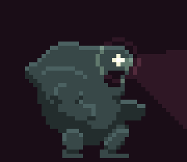  http://scutanddestroy.files.wordpress.com/2010/08/salvage-suit-sd.jpg http://scutanddestroy.files.wordpress.com/2010/08/salvage-suit-sd.jpg Here's where I think I pretty much nailed the right direction for terrain. I'll break it down into steps a bit further down, but in general terms instead of drawing a texture, it uses a masked tiling texture and then a lighting procedure. Oh, and insane tile shapes... what the hell was I thinking? I'm never gonna get these to convert to square tiles... can anyone rescue my ass on this? 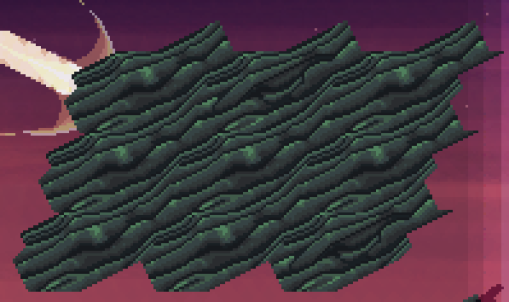 http://scutanddestroy.files.wordpress.com/2010/08/sediment-pattern-001.png http://scutanddestroy.files.wordpress.com/2010/08/sediment-pattern-001.png http://scutanddestroy.files.wordpress.com/2010/08/new-simpler-lighting-003.png http://scutanddestroy.files.wordpress.com/2010/08/new-simpler-lighting-003.png Cave-in mockup. Added a blue highlight to the underside of the darkest areas. Thanks for the tip Oddball. 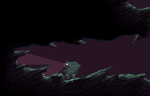   Okay, here's the breakdown of how my lighting system currently works: I start with my tiled texture which is masked to the shape of the terrain.  http://scutanddestroy.files.wordpress.com/2010/08/salvage-terrain-process-0011.png http://scutanddestroy.files.wordpress.com/2010/08/salvage-terrain-process-0011.pngThe bulk of the shading is done on a new layer, with a rough light source set 'above'.  http://scutanddestroy.files.wordpress.com/2010/08/salvage-terrain-process-0021.png http://scutanddestroy.files.wordpress.com/2010/08/salvage-terrain-process-0021.pngThat layer is set to 'multiply'.  http://go2.wordpress.com/?id=725X1342&site=scutanddestroy.wordpress.com&url=http%3A%2F%2Fscutanddestroy.files.wordpress.com%2F2010%2F08%2Fsalvage-terrain-process-0031.png&sref=http%3A%2F%2Fscutanddestroy.wordpress.com%2F http://go2.wordpress.com/?id=725X1342&site=scutanddestroy.wordpress.com&url=http%3A%2F%2Fscutanddestroy.files.wordpress.com%2F2010%2F08%2Fsalvage-terrain-process-0031.png&sref=http%3A%2F%2Fscutanddestroy.wordpress.com%2FHighlight layer  http://go2.wordpress.com/?id=725X1342&site=scutanddestroy.wordpress.com&url=http%3A%2F%2Fscutanddestroy.files.wordpress.com%2F2010%2F08%2Fsalvage-terrain-process-0041.png&sref=http%3A%2F%2Fscutanddestroy.wordpress.com%2F http://go2.wordpress.com/?id=725X1342&site=scutanddestroy.wordpress.com&url=http%3A%2F%2Fscutanddestroy.files.wordpress.com%2F2010%2F08%2Fsalvage-terrain-process-0041.png&sref=http%3A%2F%2Fscutanddestroy.wordpress.com%2FHighlight set to 'dodge'. 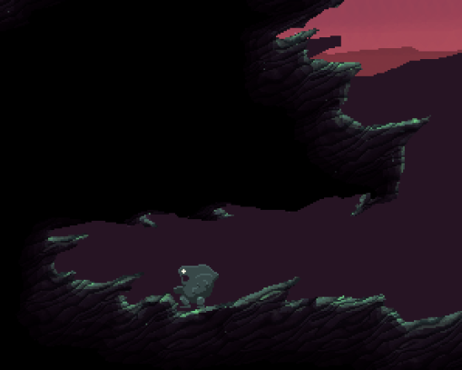 http://go2.wordpress.com/?id=725X1342&site=scutanddestroy.wordpress.com&url=http%3A%2F%2Fscutanddestroy.files.wordpress.com%2F2010%2F08%2Fsalvage-terrain-process-0051.png&sref=http%3A%2F%2Fscutanddestroy.wordpress.com%2F http://go2.wordpress.com/?id=725X1342&site=scutanddestroy.wordpress.com&url=http%3A%2F%2Fscutanddestroy.files.wordpress.com%2F2010%2F08%2Fsalvage-terrain-process-0051.png&sref=http%3A%2F%2Fscutanddestroy.wordpress.com%2FThin blue underline to soften the darkest edges.  http://go2.wordpress.com/?id=725X1342&site=scutanddestroy.wordpress.com&url=http%3A%2F%2Fscutanddestroy.files.wordpress.com%2F2010%2F08%2Fsalvage-terrain-process-0061.png&sref=http%3A%2F%2Fscutanddestroy.wordpress.com%2F http://go2.wordpress.com/?id=725X1342&site=scutanddestroy.wordpress.com&url=http%3A%2F%2Fscutanddestroy.files.wordpress.com%2F2010%2F08%2Fsalvage-terrain-process-0061.png&sref=http%3A%2F%2Fscutanddestroy.wordpress.com%2FHeadlamp painted with LOS taken into account. 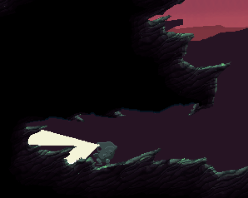 http://go2.wordpress.com/?id=725X1342&site=scutanddestroy.wordpress.com&url=http%3A%2F%2Fscutanddestroy.files.wordpress.com%2F2010%2F08%2Fsalvage-terrain-process-0071.png&sref=http%3A%2F%2Fscutanddestroy.wordpress.com%2F http://go2.wordpress.com/?id=725X1342&site=scutanddestroy.wordpress.com&url=http%3A%2F%2Fscutanddestroy.files.wordpress.com%2F2010%2F08%2Fsalvage-terrain-process-0071.png&sref=http%3A%2F%2Fscutanddestroy.wordpress.com%2FHeadlamp set to 'soft light'.  http://go2.wordpress.com/?id=725X1342&site=scutanddestroy.wordpress.com&url=http%3A%2F%2Fscutanddestroy.files.wordpress.com%2F2010%2F08%2Fsalvage-terrain-process-0081.png&sref=http%3A%2F%2Fscutanddestroy.wordpress.com%2F http://go2.wordpress.com/?id=725X1342&site=scutanddestroy.wordpress.com&url=http%3A%2F%2Fscutanddestroy.files.wordpress.com%2F2010%2F08%2Fsalvage-terrain-process-0081.png&sref=http%3A%2F%2Fscutanddestroy.wordpress.com%2FA few more lamp doo-dads.  http://go2.wordpress.com/?id=725X1342&site=scutanddestroy.wordpress.com&url=http%3A%2F%2Fscutanddestroy.files.wordpress.com%2F2010%2F08%2Fsalvage-terrain-process-0091.png&sref=http%3A%2F%2Fscutanddestroy.wordpress.com%2F http://go2.wordpress.com/?id=725X1342&site=scutanddestroy.wordpress.com&url=http%3A%2F%2Fscutanddestroy.files.wordpress.com%2F2010%2F08%2Fsalvage-terrain-process-0091.png&sref=http%3A%2F%2Fscutanddestroy.wordpress.com%2FOkay... wow. Long-post is long. That's pretty much the bulk of the work I've done so far. There are a few things floating I need to process and post etc. Aesthetically, I think I need to brighten things up a couple notches. What do you think? Too dark? |
|
|
|
« Last Edit: February 14, 2012, 12:14:10 PM by Scut Fabulous »
|
 Logged
|
|
|
|
|
speeder
|
|
« Reply #1 on: August 25, 2010, 11:03:08 AM » |
|
Really cool! I would put some colour in the protagonist, yet make it remain dark, maybe a dark orange... I really like the graphics, I hope you manage to do it  And, depending on the ending, nowdays there are no need of square tiles, you can make them whatever shape you want, if you see the devlog of the art of braid (it is on gamasutra), you will see that they have tiles in all bizarre shapes, and that alpha blending make them fit (but you don't need to use alpha blending, only masking is sufficient). |
|
|
|
|
Logged
|
|
|
|
|
Noel Berry
|
|
« Reply #2 on: August 25, 2010, 01:44:59 PM » |
|
The art is really amazing.  The player sprite (seen in the last few mockups) seems a little dull in terms of colour though, as Speeder said. It's just flat out grey. Maybe adding some different shading, and a bit of colours here and there, would make it more interesting? It just doesn't seem to reflect the wonderfully drawn mockup of the space/digging suit as much as it could, I think. |
|
|
|
|
Logged
|
|
|
|
|
Scut Fabulous
|
|
« Reply #3 on: August 25, 2010, 02:48:38 PM » |
|
Yeah I'm going to need to tweak the sprite, it hasn't seen any changes since I began the project. One thematic element I had wanted to keep was that the character would be the same palette as the terrain. The idea was to keep a drab feeling, that your character is relatively poor compared to galactic standards. Notice how the Bankers and the tools they lease are contrasting white with ruby highlights.
Anyway, I'll work on the character. I'm sure I can make him pop some more.
|
|
|
|
|
Logged
|
|
|
|
|
idoru
|
|
« Reply #4 on: August 25, 2010, 05:06:15 PM » |
|
I've been looking in on this occasionally in the mockups thread and have been loving it. I love the style and palette being used. Nice to see the concept art.
I agree on the character sprite. To be honest, until now I thought the character was some sort of rock being with glowing eyes. I think the reason is not only because the sprite is the same color as the terrain but also that it is very organic. It doesn't look particularly man-made; if it's supposed to, I think it needs some hints in that direction.
But overall, I love everything else, so don't take that the wrong way. Just trying to be helpful.
|
|
|
|
|
Logged
|
|
|
|
|
Geti
|
|
« Reply #5 on: August 25, 2010, 08:31:06 PM » |
|
The idea was to keep a drab feeling, that your character is relatively poor compared to galactic standards. Notice how the Bankers and the tools they lease are contrasting white with ruby highlights.
I think it'd be nice to have the player feel raggedy without keeping to the same grey, as it'll make reading the game hard. Maybe a brown/grey palette with orange detailing? |
|
|
|
|
Logged
|
|
|
|
|
kwakkie
|
|
« Reply #6 on: August 25, 2010, 11:59:20 PM » |
|
At first I thought the character was a rock golem/cyclops thing that always had its mouth open, now that I have seen the concept art it is still quite hard to think of it as a space suit. Out of all the concepts I dislike the one you picked the most. Other than that this game seems sweet and Id love to see you finish it!  |
|
|
|
|
Logged
|
|
|
|
|
McMutton
|
|
« Reply #7 on: August 26, 2010, 10:13:06 AM » |
|
This is a really cool idea. If I may, I'd suggest separating the suit a bit with some of those lines that you have on the concept, as well as making the visor a bit more glass-like: 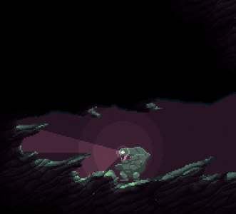 |
|
|
|
« Last Edit: August 26, 2010, 10:19:16 AM by McMutton »
|
Logged
|
|
|
|
|
aeiowu
|
|
« Reply #8 on: August 26, 2010, 11:42:50 AM » |
|
i just wanna say. this thread is my favorite thread.
<3
|
|
|
|
|
Logged
|
|
|
|
Sir Raptor
Level 6


|
|
« Reply #9 on: August 26, 2010, 11:44:34 AM » |
|
This is amazingly sexy.
Maybe you could make different parts of the main character's suit to be different shades of gray, so that it's still at least a little more visually appealing. He looks like a golem the way it is.
|
|
|
|
|
Logged
|
|
|
|
|
Ant
Guest
|
|
« Reply #10 on: August 26, 2010, 12:49:09 PM » |
|
 Wow I don't how your coder friend can possibly resist cracking on to make this project more than just awesomely drawn concepts. This game could be epic.
|
|
|
|
|
Logged
|
|
|
|
AuthenticKaizen
Freeware Ninja
Level 10

*Prestige Worldwide*

|
|
« Reply #11 on: August 26, 2010, 01:14:13 PM » |
|
looks great! |
|
|
|
|
Logged
|
|
|
|
|
Scut Fabulous
|
|
« Reply #12 on: August 26, 2010, 03:37:57 PM » |
|
|
|
|
|
« Last Edit: August 28, 2010, 07:12:49 AM by Scut Fabulous »
|
Logged
|
|
|
|
|
idoru
|
|
« Reply #13 on: August 26, 2010, 07:05:07 PM » |
|
The version on the far right is the same as the one on the far left, except I've removed the outline. I like this one best. The drab green with pinkish highlights makes it look like worn, burnished metal of some sort. I like the "head" design better; the circle in the middle one looks like an eye which makes the visor opening look more like a mouth. The outline does make the character stand out more, but nothing else seems to have an outline so it seems a bit inconsistent. After all, the character will be moving which will create some separation from the background. |
|
|
|
|
Logged
|
|
|
|
|
PsySal
|
|
« Reply #14 on: August 26, 2010, 07:20:41 PM » |
|
Your power armour is amazing, this game looks so good. My fave of the three pics is the one in the middle, but do what you think is best!
|
|
|
|
|
Logged
|
|
|
|
|
Rykuth
|
|
« Reply #15 on: August 26, 2010, 07:38:12 PM » |
|
First lemme say this is looking amazing. I was blown away by the first mock-up, and the stuff you've got going on now is even more awesome looking. As far as the character designs go I like the middle one the best. It seems to have the most dimensionality. Though I have to say, there was something I kinda liked about everything being grey, but the original sprite definitely had some readability issues. Out of curiosity what are the other suits in that first mock-up image? Are they other suits you could purchase from the bankers or are they NPC-kinda things. Also I kept thinking your name reminded me of something but I didn't know what. Then I realized: http://www.scud.com/index.html |
|
|
|
|
Logged
|
|
|
|
|
|
|
Scut Fabulous
|
|
« Reply #17 on: August 27, 2010, 07:10:03 AM » |
|
First lemme say this is looking amazing. I was blown away by the first mock-up, and the stuff you've got going on now is even more awesome looking. As far as the character designs go I like the middle one the best. It seems to have the most dimensionality. Though I have to say, there was something I kinda liked about everything being grey, but the original sprite definitely had some readability issues. Out of curiosity what are the other suits in that first mock-up image? Are they other suits you could purchase from the bankers or are they NPC-kinda things. Also I kept thinking your name reminded me of something but I didn't know what. Then I realized: http://www.scud.com/index.htmlWith the whole 'everything being grey' issue, yeah that was on purpose at the time. I thought I would do a very minimal graphic design, make a mockup then move on. That mockup seemed to have legs, so I kept pushing... Now I have set myself a standard that's way beyond anything I've done before, hah, but it seems to be working out so far. The other suits in the first mockup were literally just drawn on the fly, I was trying out a few designs on the screen to see what worked. I was thinking early on that the game might have you control multiple characters, now I think one is plenty, but co-op is an idea I think would work well in this game. Depending on time I could draw up alternate characters, or perhaps suits with different abilities. I'd like to avoid a linear tech-progression that most games have. I hate when you go through the 'research' or 'upgrade' portion of a game and wind up using a few high-end devices for 90% of game-time. Not only does this stick in my craw from a game design standpoint, but I hate that someone spends equal time making all sorts of assets only to have most of them ignored. I vaguely remember Scud! Didn't Sega or some console company license him for a game? I didn't realize the Clonk sourcecode was available, thanks. I'm not sure if I mentioned it in the OP but jkd has a prototype engine from an older project. I'll have to look at Clonk again though. |
|
|
|
|
Logged
|
|
|
|
|
Izzimach
|
|
« Reply #18 on: August 27, 2010, 08:29:19 AM » |
|
I really dig the suit and 'banker' art style, and the game concept (mining for alien artifacts) was one I wanted to try myself, so this looks very appealing. Will the challenges be non-violent, puzzle type problems, or will it be killer robots with laser beams? The stuff I've seen so far suggests the threat is mostly environmental and/or financial.. Also, there was a Sega Saturn game called Scud, the Disposable Assassin. I recall it was pretty terrible. |
|
|
|
|
Logged
|
|
|
|
|
Scut Fabulous
|
|
« Reply #19 on: August 27, 2010, 11:06:19 AM » |
|
I really dig the suit and 'banker' art style, and the game concept (mining for alien artifacts) was one I wanted to try myself, so this looks very appealing. Will the challenges be non-violent, puzzle type problems, or will it be killer robots with laser beams? The stuff I've seen so far suggests the threat is mostly environmental and/or financial..
Interesting you brought that up, as I didn't talk about it in the OP. I want to avoid active threats and combat in this game; so no killer robots with laser beams. I still want it to be very 'lethal', but through environmental hazards as well as financial pitfalls. The finance side is something which I think will be tricky to balance, but can really add depth to the game. My idea is that the player can choose to make planetfall with all sorts of tech, but the gear is leased, so you're forced to really make the expedition pay and therefore take on a lot of risk if you want to come away with a profit. The other method for leasing will be by calling the bankers to inspect your dig personally, and they will offer lease terms based on how many artifacts you've located or partially extracted. More info leads to better terms. This will be the method best for new players, as they can decide to only lease the equipment they need at the time, under more reasonable terms. I need to make some infographics or mockups to illustrate this. I hate concepts that are just wordswordswords  |
|
|
|
|
Logged
|
|
|
|
|
 Community
